Pages

Wednesday, March 31, 2010

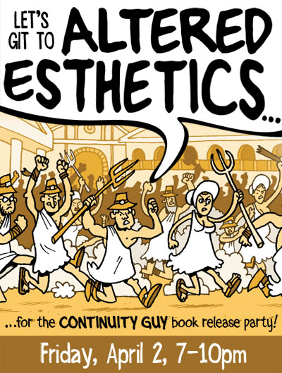
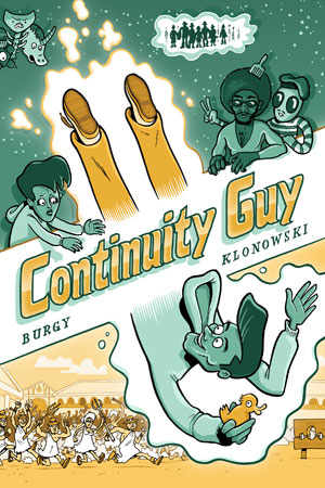
CONTINUITY GUY Book Release Party This FRIDAY!


Local comics legends BUD BURGY and DANNO KLONOWSKI have finally wrapped up their 45-week serialized time-traveling, universe-shifting, gender-bending space opera, and they're throwing a party to celebrate! Bud and Danno will be on hand at Altered Esthetics this Friday night to celebrate the release of CONTINUITY GUY, which they've collected into a beautiful little book. The cover, I should note, is of my doing and I look forward to seeing how it looks in person.

Here's more info on the release party, which coincides with the opening reception of Altered Esthetic's art show, "Creative Collaborations."

Tuesday, March 30, 2010

Friday, March 26, 2010

Lutefisk Sushi Volume D

Ladies and gentlemen, it's time for another round of Lutefisk Sushi!


Pretty much everyone reading this blog is either a) familar with Lutefisk Sushi, or b) on the Lutefisk Sushi planning committee, but for those not in the know, here's a rough outline:

Lutefisk Sushi is a nearly-yearly art show that invites Minnesota cartoonists to create and submit 160 copies of an original mini-comic. These comics then get divvied up into 160 screen-printed bento boxes (hence the "sushi"). Submissions are due June 15, but the fun starts in August when the actual gallery show opens at Altered Esthetics. The show features the sushi boxes, as well as original art from the mini-comics. Best of all, the show is NOT curated, so any Minnesota cartoonist who can print up 160 comics will get in the box.

The home base for everything sushi is: www.cartoonistconspiracy.com/sushi.

To be involved, just follow these simple steps:

1) Be a Minnesotan.

2) Create a mini-comic. How? Check out this pdf for a handy tutorial.

3) Make 160 copies of your mini. A "mini-comic" can be anything, as long as it fits in a 6" x 8.5" box. Read this to find out how to get a discount on printing in the Twin Cities.

4) Scan your cover. You will need a jpeg of it for the next step.

5) Fill out a submission form HERE.

6) Drop off or mail your mini-comics to: Altered Esthetics, 1224 Quincy St NE, Minneapolis, MN 55413 Comics must be received by JUNE 15, 2010.

7) OPTIONAL: Frame your original art from the mini-comic. Although it's not a requirement, we HIGHLY encourage you to frame and submit your art to the show -- the more art on the walls, the better! You may sell your art or label it NFS (not for sale). Mail or drop off art at the address above. Clearly label all pieces with your NAME, TITLE, MEDIUM, and PRICE. Frames should be black and NOT have glass (i.e. use plexiglass).

8) Get the word out! Blog about Lutefisk Sushi using the jpegs below, follow the show on Twitter, and most importantly... become a FACEBOOK FAN!

9) Finally, toss these dates on your e-calendar:
  1. JUNE 15 -- Mini comics due
  2. JULY 31 -- Framed artwork due.
  3. JULY 31, 1-3pm -- Artists' Potluck (come and hang out, meet fellow cartoonists, and drop off your artwork).
  4. AUGUST 6, 7-10pm -- Show opens at Altered Esthetics.
  5. AUGUST 21, evening -- Party at AE with the Sushi crowd and the folks from the Minneapolis Indie Xpo.


If you have any more questions, check the website or email artist liaison Dan Olson: bewilderedkid [at] gmail.com with the subject line "Lutefisk Sushi Question." If you have questions specifically regarding the gallery show or about submitting framed art, contact Kristin at kristin [at] alteredesthetics.org.


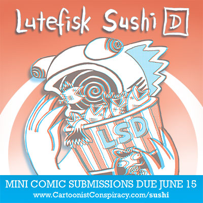
One of the cool thing's about this year's show is that the featured artist, Danno Klonowski, has drawn the cover in classic red/blue 3D. Your comics are obviously not required to be in 3D (because that would be a huge hassle), but if you like a challenge, consider doing a 3D comic or submit some 3D art to the show. Each box will come with 3D glasses, so go wild! Over the next few weeks I'll be writing tutorials on how to create 3D comics.

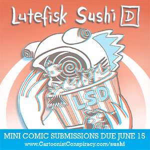
If you want to help spread the word about Lutefisk Sushi, here's some art you can use:


Alright, now get drawing! We (the sponsors and organizers) can't wait to read this year's batch of minis!

Thursday, March 25, 2010

Big Time Attic: The Comic


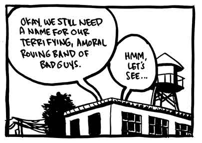
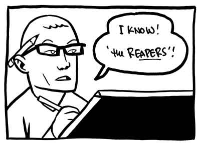
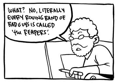
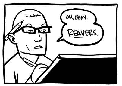
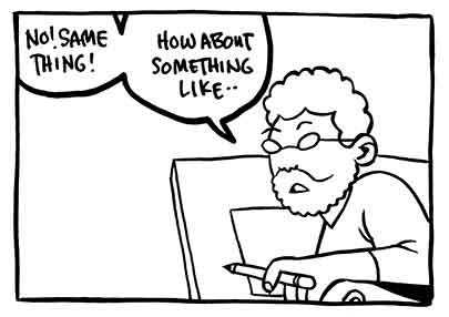
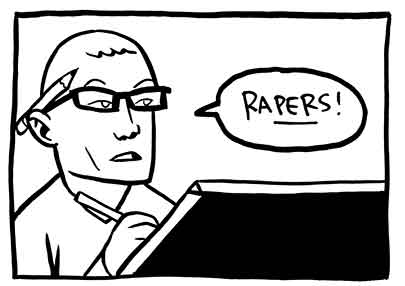
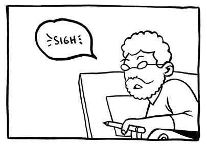
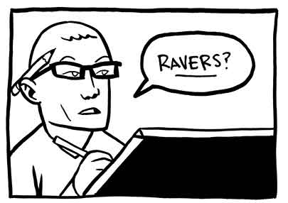
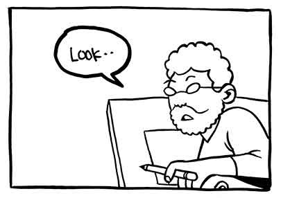
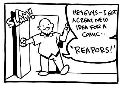
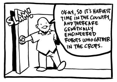
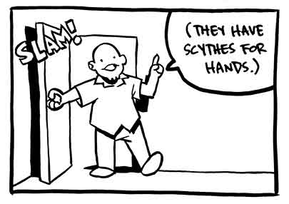
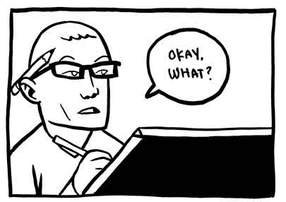
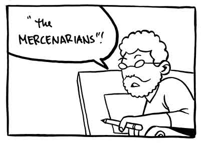
The impetus for this comic is the excellent game Just Cause 2, in which a group of amoral revolutionaries are called, you guessed it, 'The Reapers'. Does no one notice that every single ominous band of killers is called 'The Reapers'? Or 'The Reavers'? I'm sorry to say that what once might have been a cool name now makes me just roll my eyes every time I hear it. So for this comic, Kevin will be playing me, I will be playing a terrible straw man argunment, and Shad will be playing Donn Ha.

Oh, and the punchline came from me actually asking Kevin what he would call a group of amoral bad guys. No hesitation; he just said "Mercenarians."

Wednesday, March 24, 2010

City Sound Tracks Maps


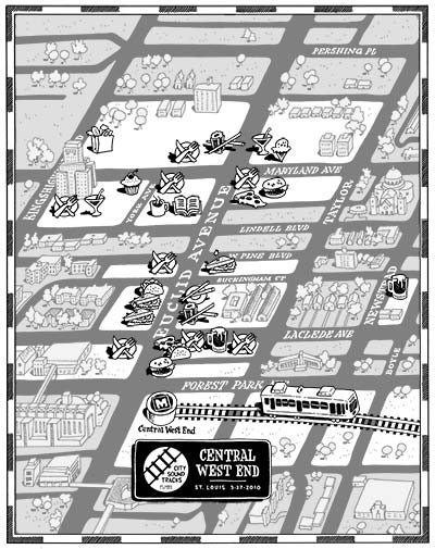
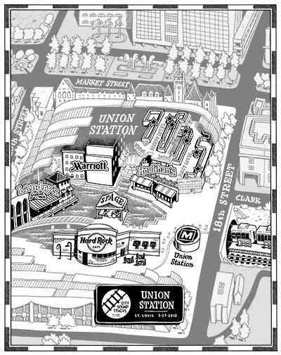
Entrepreneur, music lover, and fellow Grinnellian Alejandro Oyarzabal recently asked me to draw some maps for a rock festival happening this weekend in St. Louis. City Sound Tracks features 30 bands split between two venues along the MetroLink light rail line. The maps serve to show people how to get to the venues, and to highlight various sponsors around the area.

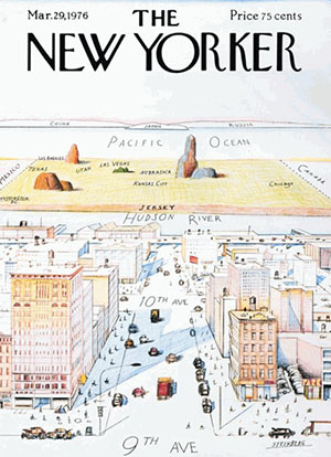
I've got to hand it to Alejandro for being courageous enough to hire me to draw a functional map -- my maps tend to be more psychological portraits of a place than actual navigable references. This New Yorker gag is the inspiration for every map I do, because it's such an honest statement about how we view the world. That is, what we know is big, and everything else is pushed off to the side:


Anyway, here are the two maps, which will be printed side-by-side on a tabloid sheet. Note that these maps are just the art files; they don't show the business names or the ad blocks. Click the maps for a larger version.

CENTRAL WEST END:


UNION STATION:


Part of the fun of this project (as well as others, like Mark McGinty's Ybor City map) is that I came into this knowing NOTHING about St. Louis aside from the arch. And now after spending hours pouring over google street view and google earth, I'm sure I would feel quite at home walking around the Central West End or downtown area.

So if you're in St. Louis this Saturday swing by one of the venues and grab a map! If you want to learn more about the festival, check out citysoundtracks.org...

Thursday, March 18, 2010

Klonowski on Klonowski


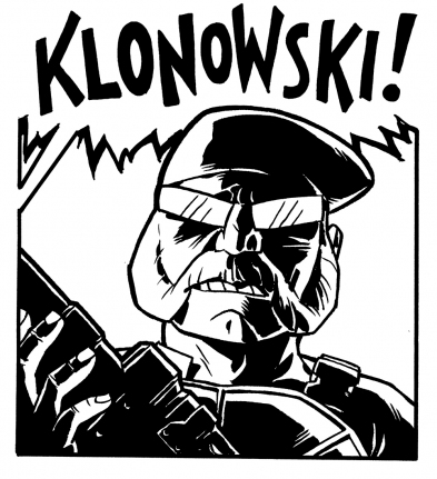
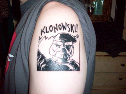
Danno Klonowski, local comics raconteur, has paid me a significant compliment. When told his name and his/his character's likeness would be used in a Transformers comic that I was scripting, he boldly declared that he would get a tattoo of the panel in which the character appeared. Well, I made darn sure that that character got a panel in which he was prominent, and brandished a large weapon. Yes, my storytelling choices are influenced by only the highest muses.

As for what happened then, Danno tells the whole story in some detail at his blog, StapleGenius. But here's a hint:


Holy crap.

Friday, March 12, 2010

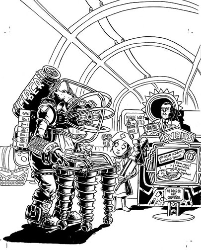
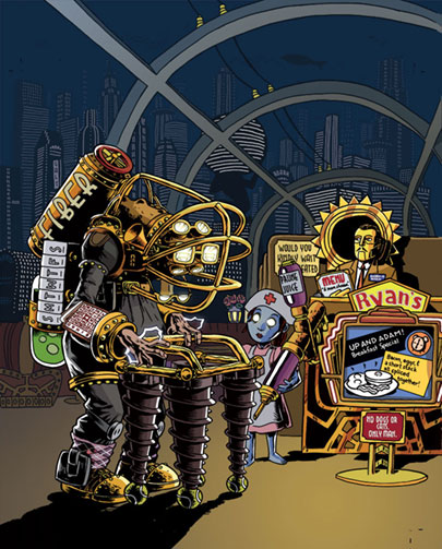
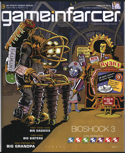
Bioshock 3 Game Infarcer cover!

[click on images to see a larger size]
It's that hilarious time of year again, at least as far as magazines are concerned. The April issue of Game Informer magazine, out this week, has a small section inside called Game Infarcer, which mercilessly mocks all the games that they stare at all year. This year: Bioshock 3. HA! Take that, 2K games! We love your game enough to mock it!

This issue marks our fifth year drawing the cover to the section (Thanks, GI!), and to celebrate, we'd like to go through the process of creating the cover, from concept to delivery.

CONCEPT

At the beginning of every February, I start wondering when someone from Game Informer is going to call for the Game Infarcer cover, and sure enough, Bryan Vore calls up and sets up a meeting, and asks if this cover can be "in a more realistic style". Naturally, I say sure thing, then end up drawing it the way I draw everything. Professional secrets revealed!

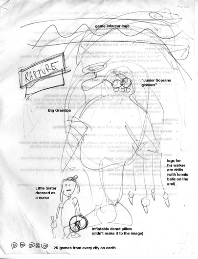
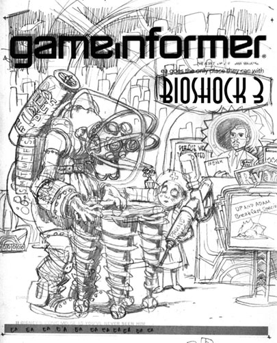
When I get to Game Informer World Headquarters (about 3 miles from here), the guys all sit down with me and give me the pitch: Bioshock 3, with Big Grandpas. But the best part is: they give me a sketch.


[notation added by me]
I love it when people do sketches. Sometimes people think I'm going to laugh at them or are embarrassed to show what they've done, but I love seeing what people have in mind visually even if they "can't draw a straight line", because it saves me from trying out all the composition pyrotechnics at my disposal. Any artist knows there are millions of ways to lay out the same picture, but the simplest ones are frequently the best, and if that's what the client has firmly in mind, it's usually a good idea to go for it. In the process of making the sketch, the client can also see some potential for ideas and put them down, instead of just making a list or having to remember them. It also lets them see if they can even envision a visual way to communicate the joke, which is a good indicator as to whether I can, as well.

During the meeting, since everyone could see the sketch, we could jump off into ideas a lot faster, and we quickly came up with things like the daily pill container, the Fiber valve (that was Joe Juba), Android Ryan (also Joe), the idea of being at a Denny's-like breakfast place, the Rapture background, and the Prune Juice syringe. These sorts of "list" drawings--ones that contain subtle in-jokes around a given topic--are always my favorite because they're very information-heavy, and are less concerned with rendering, which I enjoy, but is not my particular forte.

Also, Joe lent me a Big Daddy doll--er, action figure at the meeting, which was very helpful in drawing details.

INITIAL PASS

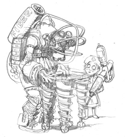
What I like to do when I start a job is to try to ride the wave of enthusiasm as much as I can, and frequently this means I can really make some headway. When I come back from a meeting with the guys at Game Informer, we've been brainstorming and joking about the image, and the game, and other funny obscurities that could make it in there, and so I'm bursting at the seams with ideas. So even though it was late in the day and I needed to get home, I quickly sat down and sketched out what was in my head for the Big Grandpa and the Little Sister Nurse.


This gave me the chance to distill down some ideas, cement some gags in there, and think of some new ones when a corner of the drawing is looking kind of lonely. As you can tell, it also allowed me to basically lock in the general "camera angle" of the drawing. This was a pretty lucky break--it doesn't always happen that way--but just dashing stuff down without overthinking it often gets the simplest (and best) results.

The next day, I took another sheet of paper and drew around all the other elements of the drawing: the environment, the signs, the greeter, etc. I married these two images in Photoshop and dropped in a Game Informer logo and Bioshock 3 graphic for placement so that I could send it off to the guys for feedback.


This part also allowed me to add more jokes--the Denny's-like Ryan logo, the sign advertising the specials that looks like the Plasmid upgrade graphic, the Little Sister ornate escape hatch, the detailing on the seats and host stand that are similar to the doors in the game, and the gold-glowing rose in the tonic container way in the background. If you look closely, there's even a cash register on the far right, just like in the game. But then I realized host stands don't have cash registers. This drawing will be nothing if not accurate!

PENCILS AND INKS

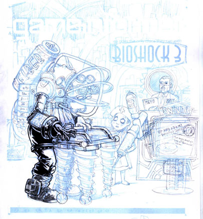
The sketch is relatively tight, as you can see from how similar it is to the final drawing, so the next step is to blow it up in Photoshop and print it out in 10% cyan on a big sheet of paper. From there I can go in with pencil and brush and create the final linework.


Now, normally, people pencil the whole image before inking, but I'm kind of impatient, and sometimes if you're sure about a section of the drawing (that is, you're sure it's going to be in shadow or something), it can be useful to go ahead and ink it. It can frequently give you better ideas on how to pencil the rest of the page, and it sets a certain style.


When I was finished with the foreground inks, I sent the image to Game Informer again, just to show them some progress, and it yielded a valuable addition. While I had added jokes to the sign and the menu, I had entirely neglected the "Please wait to be seated" placard. If you've played Bioshock, you know that there is a perfect addition to make to this sign, and Jeff Cork pointed it out. "Please..." was changed to "Would you kindly..." and our drawing was now officially stuffed as full of jokes as we could make it.

COLORING


Coloring is difficult for me, particularly things that have to be relatively atmospheric. I tend to like to color with flat colors rather than with a layered, textured look, but I tried to blend the two for this illustration.

For the background, I drew outlines of the buildings with dots for windows, then made several layers, each with a layer of blue to indicate distance. Here was the final opportunity to make jokes, so I threw in a few Ayn Rand references (the signs saying "Roark" and "Galt", two Randian heroes, and the Atlas-shaped building (pre-shrug). In case you don't know, Ayn Rand's works, particularly Atlas Shrugged, were a major influence on the philosophy of Bioshock and Rapture, its underground city.

Gloomy blue and glowing gold were the basic colors for the game of Bioshock, so I created a warm gold light spot in the lower right to focus attention, then colored all of the figures with gold highlights coming from that direction to unify the scene. The background could stay a largely uniform neutral blue that would pop out the figures. As a final consideration, I did something I rarely do--I added a glow to certain things: the Big Grandpa's eyes, his lightning bolts on his hands, and the Little Sister's eyes. When put into an image that is mostly flat colors, effects like that can be quite striking.

PRINTED IMAGE


When the image makes it into the magazine, I always hold my breath a little, hoping that it will look okay. These days you can be pretty sure that what's on your screen will print out okay, but you never REALLY know. I was thrilled when I got this one in the mail. As you can see, they moved the image up and zoomed in a tiny bit, overlapping the top of Big Grandpa's fiber tank with the logo (I provided another layer of just the top half of that figure in case they wanted to do that), and they extended the shadow in the lower left to get in the copy for the joke, which I'm glad they did. I feel like the image is solid, and a good joke, but it does need a little explaining.

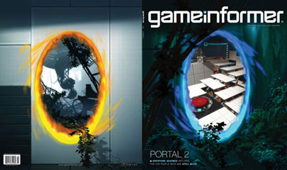
So go out and find the April issue of Game Informer! It's the one with the Portal 2 cover. Ah, not only a drawing in an issue of Game Informer, but one about the sequel to my favorite game. It's the icing on the cake.
Monday, March 08, 2010

Busy August for Minneapolis Cartoonists


Prepare for two big cartooning events to drop in Minneapolis this August. First is the nearly-perennial Lutefisk Sushi mini comics show at Altered Esthetics (view last year's website). I'll have much more to say about this show at the end of the this month, but for now just know that it's happening, and it's time to start planning your mini comic.

The other big event is the first ever MIX: Minneapolis Indie Expo, organized by Sarah Morean and Andy Krueger. The show is a one-day celebration of indie comics and local talent, and there will be a bake sale! The show is free for visitors if you want to just wander around, but if you want to sell some stuff the table rates are cheap! Sign up here. The official bullet point list of amenities is as follows:
  • Affordable exhibition space (starting at $20)
  • Free admission
  • Plenty of outlets for electronics
  • Free wi-fi on site
  • A reading room
  • A bake sale
  • And more!

It all drops August 21, 2010 at The Soap Factory, with a major party at Altered Esthetics afterwards.
But don't take my word for it ... check out the King Mini-adorned website, and see how many local cartoonists you can spot in the intro video:

mplsindiexpo.com