Pages

Friday, March 30, 2007

GALLERY SHOW TOMORROW NIGHT

Come on down to see Shad, Vincent, Tim and a bunch of great artists and designers from Minneapolis screen print over top of each other's stuff.

There is also a cool gallery show with BTA spin-off PUNY showcasing blunders and over-prints...live music..and booze:

Influences: Eastman and Laird

In the tradition of the Socratic dialogues, Kevin and I will jointly proclaim our reverence for Kevin Eastman and Peter Laird, creators of the Teenage Mutant Ninja Turtles.

Zander: I was first introduced to the Ninja Turtles by my neighbor, Mike McKenna, who said that 1) they were awesome, and 2) that the first issue was already worth something like three hundred bucks. By the time I started reading the issues, the black-and-white comics and mini-comics boom of the 1980s had begun, and there were tons of imitators and spiritual descendants of the Turtles on the racks. What grabbed me about TMNT was the roughness and rawness of their art style, and the way that you could kind of see how they were done (though the toned paper that they used was awfully mysterious to me). I liked the idea that with some art supplies, some imagination, and fifty years of monster movies, samurai manga, and other comics to crib from, you could create an entire world.


Kevin: I honestly can't remember how I got hooked on TMNT. My earliest memory is of sitting on a bus in New York and reading the "book 2" graphic novel. I'm flipping through it right now (not having done so in ten+ years) and every quip and sound effect is coming back to me. I think what hooked me on these turtles was that they were so REAL, at least compared to your standard superheroes. Flying guys in tights were a joke compared to these reclusive, aggressive thugs who bled when cut. So anyway, once I got the bug, my whole world revolved around the TMNT franchise. I spent a lot of my money on the toys, but I still remember being a snob about the comics, even at age ten. Actually, I don't remember knowing anyone else who read the comics; they all just seemed to be into the TV show and the movies. The thing that moved me about the comics was the perpetual dance everyone was always in during the fight scenes. No one could stay still. And there were so many weapons flying around, there was constant danger. I think that as a reader, I want a visceral connection to the action. So reading about fights involving guns or lasers never did anything for me because I couldn't relate to it. But watching sticks and fists and dirt flying around -- that pulled me right into the action.


Zander: I read somewhere that the paper that Eastman and Laird used (a special paper that would reveal one hatch pattern when painted with one chemical, and another, perpendicular to it, when painted with another) was so expensive that they cut the big sheets in half to save money. The result in the earlier comics was a chunkiness to the art and a slight inconsistency to the lettering that to me gave it a certain special vibe. Its lack of polish made it seem that much more wonderful; basically, it wasn't a quirky but average comic, but rather the very best minicomic that had ever been made.


Kevin: I wasn't savvy enough then to appreciate how the comic was made. But I did appreciate the stocky muscular structure of the turtles. My first ever anatomy lesson was simply drawing those figures over and over again.


Zander: In addition to the fact that it was so accessible due to its amateurish surface, what I appreciated about TMNT was that within the art you could really see a solid understanding of light and shadow, as well as anatomy, architecture, etc. I loved that, like a lot of the other artists we've talked about in the Influences posts, these guys created a solid, weighty, deep world that you could imagine people (or mutated turtles) living in.

Kevin: Speaking of "these guys," I guess we should say a few words about Eastman and Laird themselves. I still to this day can't tell the difference between the two. "Eastman N. Laird" is one man as far as I can tell. Obviously I can see style changes as I flip through this stack of comics, but I can't tell what's Laird, what's Eastman, and what's simply changed over time. In 2001 I traveled with Zander to the San Diego Comicon and he, knowing I grew up with the Turtles, pointed to a guy wearing a black leather coat and said "That's Kevin Eastman." My jaw dropped for a few seconds and then I suddenly realized, "Hey, he's just a normal guy." But of course, I was still too shy to go up and say anything to him, at least nothing that he hasn't heard four billion times already.

Tuesday, March 27, 2007

Tips and Tricks: Atmospheric Perspective (Inking)

Continuing on Kevin's theme from last week, let's talk about atmospheric perspective as it relates to inking.

This will be a little similar to a previous post on Spotting Black Areas, but a little more particularly pointed at dealing with distance in the daytime. Doing this effectively will make your panels look wonderfully deep and rich, and doing it poorly will result in your panel looking flat, boring, and worst of all, confusing.

This is a little different from the coloring lesson in that inking is kind of a one-shot step-- you have to do things right, because you can't erase or tinker with levels like you can when you're coloring on the computer. Of course, if you're inking on the computer, you can. But we're not at that level yet 'round these parts.


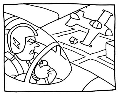
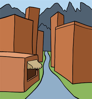
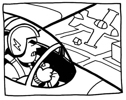
Here we have our starting image. Basically, there are three layers: the cockpit of the plane in the foreground, the middleground plane, and the ground in the background. Right now, this panel looks pretty flat, although we can tell what's going on. The steps in making this panel look deeper using atmospheric perspective will be attached to each layer.

Step One: Foreground Layer


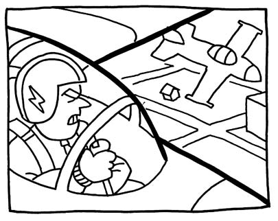
First, let's just pop the layer out a little bit. Thick lines around the main shape start to make it seem a little closer and more vivid. Even though this is kind of an abstraction from real life (things don't really have outlines, I hate to tell you), it reads like an increase in contrast, and, like the atmospheric coloring lesson, the basic concept is that contrast on objects is high close to the viewer, and lower as they recede.


Then, let's just decide that the inside of the cockpit will be dark. It adds a certain weight to it, and makes things simpler and more contrasty. I also thickened up the lines around the cockpit, as well as the bars or whatever they are that go over the canopy. I haven't gone in to work on the pilot yet, but notice that I didn't thicken up the lines ON the wing or around the nose. Those are seams in the surface of the plane and they should seem very flat-- they don't cast shadows, so they should stay as light as possible so as not to detract from the overall shape of the plane.


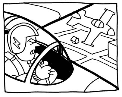
Then I went in and added some more stuff to the pilot. Shadows behind his head, under his chin, and under his arm make him look more like a physical presence, and darkening his eyebrow brings a little bit more focus to his face.


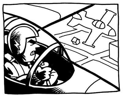
Finally, I was thinking that the foreground didn't look distinct enough, so I added some directional shadows on the near side of his helmet and arm and the outside of the plane. What this does from a logical point of view is establish the light source and give the foreground more contrast, but also, from a compositional point of view, it clusters a bunch of dark areas over into a relatively unified clump in the lower left corner, which helps focus the reader's eye on the main subject of the panel.

Step Two: Middleground Layer

For the upcoming layers, you'll find that treading lightly is your best bet, as less black helps a great deal in making each layer look distant. But we do have to make the middleground distinct from the background, so...


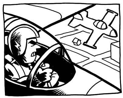
The first thing I did here was thicken the lines of the middleground plane, making certain that I don't make them as thick as the foreground one. You'll see that I screwed up on the nose and wing, and it kind of hurts the illusion. Oh well-- maybe the next step will fix it.


As we've established the direction of the light, let's put some shadows on the near surface of the middleground plane. Restraint is admirable here-- at a glance, the reader only needs to know that something is there, not necessarily every detail of its appearance, so a few blobs of black will work well enough to establish the plane's presence. I also dropped a few blobs into the cockpit to give that a little weight.

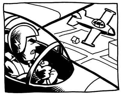
Step Three: Background Layer


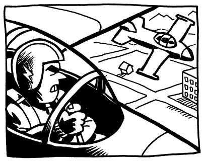
By the time we get back to the background in these sorts of pictures, we're pretty far away, so I don't want to really add any solid black areas, or we'll start flattening things out. The background, particularly in this panel, is like the equivalent of a matte painting in a movie-- it's pretty, and it adds atmosphere, but it isn't something that you can interact with, so there's no point in distinguishing individual physical objects within it. So I just added some windows to the building, and hatched out a shadow that has no solid black in it, then added a little more detail in the distant background to fill in some of the white area, which was starting to look a little flat. If the illustration is going to be in color, you might choose, instead of hatching for the shadow, to just use a thin pen to outline the shadow and then drop in a very slightly darker color into it. Hatching or crosshatching in color work can sometimes look sloppy, and a color shadow in the distant background might look a little nicer.

With that, we've got a relatively effective picture that has depth and weight to it, despite being drawn quickly, and in a very simple art style. Questions? Comments? Join us in the ...comments.

Sunday, March 25, 2007

Far Arden: Chapter Six

HALF DONE!


Well, here we are at the halfway point. 144 pages in the can ... and so much adventure and intrigue yet to unfold!

A few things have changed since the beginning of the process. I'm no longer doing the monthly 24-hour marathons, as it was starting to kill my hand. Plus, pulling an all-nighter was also affecting my day job by making me spend nearly one week out of every month in a groggy haze. So I work on nights and weekends, usually doing a chapter within a one-week period. But I'm still cranking out a page an hour, so it'll still be a 288 hour book at the end of the day.

Alright, after I hit "publish" I'm going to make some lunch and sit down and read this thing from the beginning. Hopefully it'll make some sense...


Read Chapter Six.
Start from the beginning.

Saturday, March 24, 2007

Into the Wild -- the film!

I just discovered that Jon Krakauer's 1996 book "Into the Wild" is currently being made into a feature film.

Fans of "Johnny Cavalier" may remember that my weekly college strips were heavily inspired by Krakauer's book. "Into the Wild" is the true story of a college kid named Chris McCandless who burns his car and his money and hitchhikes to Alaska. He lives for several months in an abandoned bus in the wilderness until he eats some bad seeds and dies.

The backstory of the "Johnny Cavalier" strips is that Johnny and his friend Dean Caveat find the bus in Alaska, fix it up, and drive it down to Grinnell, where they park it in a corn field. Wow, I can't believe that strip is almost a decade old. I feel like a really old man.

Here's Sean Penn and his buddies in Alaska:

Friday, March 23, 2007

Influences: Kieron Dwyer

I've always liked Kieron Dwyer's work on things like Captain America, but I kind of lumped him in with a lot of other good artists whose stuff I would only pick up occasionally. But when he came out with Torch of Liberty from Dark Horse in the mid-90s, I felt like he hit a stride that made me look at every single panel with a laser-like intensity, wondering, "How does he do this sorcery?!"


*Click on the image to bring it up in more detail*

These are the first two panels of the story, an homage to Red Scare paranoia, and they do a beautiful job of establishing the scene (New York City), the characters (acrobatic WWII-style patriotic heroes), and the tone (dark and grim, though the campy writing by John Byrne undercuts that somewhat, to good effect). The thing that made me so fascinated with this work was that he used deep black shadows and imprecise, brushy inking that nonetheless gave a great sense of panel depth and texture. The buildings are distant in the first panel, without using any tricks or cheats, and the way he spotted black areas moves the eye around the panel with perfect precision. The brushy inking also allows the artist to suggest detail without having to slave over every last architectural decoration in a panel that will be read in only seconds.


I find that the thing that thrills me when reading comics is when artists create an image that communicates everything they need to communicate and nevertheless shows the reader the mechanics by which the drawing was created. That is to say-- we see what the subject of the panel is, and the panel has depth and dynamism and weight, but we also can tell that the image is a drawing; we see the brushstrokes, we can see that it is just lines on paper. That little switch that our mind makes between logic-- this is just ink on paper-- to emotion-- "that man just jumped through a glass table!" is one of the fundamental thrills of comics. It is particularly clear in Dwyer's comics; even the sound effect in this panel, which would usually be done by the letterer in a nice clean font, is integrated into the artwork, and its sloppiness adds to the power with which the Torch of Liberty hits the floor.


Dwyer also uses an impressive range of "shots" in his comics (recalling the 5 Purposes of Panels), and shows in this comic how a broad range of panel types makes for exciting reading.

I should mention that Kieron Dwyer is a friend of mine, and I told him all of this (in truncated, and drunkated, form several years ago). He continues to make awesome stuff, and you can check it all out at his site: Kieron Dwyer dot com

Wednesday, March 21, 2007

I Wish Someone Would Invent: An ingredients-based recipe website

Have you ever thought about an invention that maybe YOU can't make, but it sure would be nice if someone else did?

Right now I'm going through an "Eat Everything in My Cupboards and Freezer" phase to save a little money and use up some perfectly good food before it goes bad. The problem is when I get down to the homestretch and I'm left with a can of cream of mushroom soup, ketchup, maple syrup, and these crispy dried onion things (I think they're some kind of casserole topping). I know that all of these things are edible, but I'm not smart enough in the kitchen to make a good meal out of 'em.

I wish someone would invent an online database where you can enter the ingredients in your kitchen and it will spit out a bunch of recipes. Over time, I could see it turning into a YouTube-like site, where users can submit their own recipes. Also, like YouTube, users can give each meal a rating and you can read strings of comments. Photos of the final product could accompany the recipe, as well as videos of preparation.

But all that community and human interaction stuff is extra in my opinion. I'd really just like a site that tells me: "You've got tuna, hot peppers, half an onion and some soy sauce? Mix them up this way and heat them this way for this many minutes."

And hey, I've done no internet research on this idea, so if it exists already and you've used it, please let me know! (Before dinner tonight, preferably.)

So, you want to invent it? Already know about something just like it? Got a reason why it would never work? Got some suggestions? Got your own "I Wish Someone Would Invent..."? See you in the comments!

Tuesday, March 20, 2007

Tips and Tricks: Atmospheric Perspective (Color)

Atmospheric perspective is the effect that you see when looking at objects of varying distances from you. Namely, the farther away you are from an object:

1) the hue of the object becomes increasingly blue, and
2) the contrast of the object decreases.

You can read about the science behind atmospheric perspective at Wikipedia.

As a cartoonist, you can mimic the effect of atmospheric perspective in order to create or accentuate depth in your drawing. Because atmospheric perspective is universal (among earthlings, anyway), you can use this trick in pretty much any context without confusing the reader.

Here is a generic drawing of a small street in a mountain town.


The objects in the drawing all suggest that there is a great deal of space between them. Using logic, we know that the mountain range is very far away. We see the street narrow as it moves up the panel, suggesting that it is moving back in space. We also see buildings layered on top of each other, also suggesting that they are moving back in space.

So why does the panel still seem so flat?

Trick #1: Hue to Blue

Watch what happens when I put a blue mask over the objects in drawing. The opacity changes from 10% to 100% as the objects move back in space.


Trick #2: Decreasing Contrast

Here I'm messing with the lineart layer, changing the black lines to gray as items recede.


You can also create the illusion of distance in black & white drawings, which Zander will talk about in an upcoming "Tips & Tricks" post.

Monday, March 19, 2007

144 Hour Graphic Novel Challenge


Session Number Two of the 144 Hour Graphic Novel Challenge went down on Saturday at the MN Center for Books Arts. Zander was out of town and finished his chapter remotely and I left early after my brush pen crapped out. But Steve marched on, as did a host of fresh faces, there to begin their first chapter.

Dank!, Stwalley, Sievert, Schlosser, Square-Briggs
Not pictured: Petosky, Konrardy, and Lappegard
Update: See the comments section for more info on who showed up...

Hopefully these brave soldiers will host their chapters online. In the meantime, you can read the continuation of "Heck" and "Oceanis" by clicking on the images below:


Read the stories here.

Big Time Attic: The Comic


Friday, March 16, 2007

Influences: Julie Doucet

Alright, so it's a little hard for me to say that Julie Doucet is one of my influences since I only discovered her last fall, but even in that short amount of time I've fallen in love with her work, and kick myself for not seeing it sooner. I lived in NYC for a short period after college and having Doucet's "My New York Diary" would have been a welcome companion insofar as it would have been nice to glance at it whenever I thought my situation seemed frustrating.

Doucet's panels are rich mazes of black scratches, making them seem more like German Expressionist prints than comics panels. Doucet rarely bothers with establishing shots. Instead, she dives right into her world of medium-close square panels, each of which can be generalized as "Julie surrounded by crap."

I'm amazed by the level of detail she puts into each panel -- toys leaning against the wall, empty cans of soup and dirty plates, and cockroaches everywhere. Her constant clutter definitely enhances the voyeuristic nature of her work. I mean, It's understandable that she'd depict her art school's hallways as bastions of trash, but you'd think she'd try to pick up her own apartment just a little bit. ... Of course, a spotless apartment would take away from the "Look at me, I've got so many problems and I can't spell and I'm late on my deadlines and all my boyfriends are losers" vibe that is seemingly proof of her being a legitimate artist. The bottom line is that Doucet has put the intimacies of her life on public display, and regardless of whether that is born out of self-love or self-hatred (or a healthy mix of both), I'm happy her work exists. Most raw, risk-taking autobiographical comics that I've seen are done by well-intentioned cartoonists who can't draw, while the talented artists' stories about themselves are soft and weepy. Doucet is the best of both worlds.

Top five ways that Doucet rules: 1) Heavy blacks on everyone's faces. 2) Adorable Canadian misspellings. 3) Gratuitous nudity. 4) Flexibility with perspective. 5) Complete, seemingly unedited self-disclosure.