Pages

Showing posts with label Tips and Tricks. Show all posts

Tuesday, March 06, 2012

Game Infarcer: The Making of the Mortal Kombat Gag Cover!


It's Game Infarcer time, everyone! I only tend to do a handful of actual illustration jobs each year (that is, single images that are colored by me), and I always look forward to Game Infarcer, Game Informer's snotty look at various games and game trends. I've provided the 'cover' (first page, that is) to this section for seven years now, and it's always great fun to call upon my funny-makin' skills as well as my coloring ones to crank this sucker out.

CONCEPT

As usual, the process starts with a meeting at Game Informer, and I knew I was in for a bit of trouble when Joe Juba said, "I didn't really think it was funny when they first told me, but now I do." Uh oh. Is this drawing going to need a paragraph next to it so anyone will know what they're talking about? But really, I thought, anyone can make a funny illustration when a rock-solid concept is laid in their lap; it's just going to take a little of that little thing I call "The Zander Cannon Magic". Okay, so. If you think that this sounds like foreshadowing for the part later in the story when I shoot the whole thing to hell, I say to you, "Shh, you're going to ruin it."

So I met with Joe Juba, Dan Ryckert, Tim Turi, Jeff Cork, and probably Ben Reeves. I don't know. Probably. Ben's always creeping around somewhere. They told me that the game we're riffing on is Mortal Kombat, then gave me a little back-story. The company that makes Mortal Kombat, NetherRealms, was purchased by Warner Brothers, and they've done some crossover things like Mortal Kombat Vs. The DC Universe, and now they've permanently added Freddy Krueger from Nightmare on Elm Street to the MK roster. So the gag is that Mortal Kombat isn't going to stop there; they're going to start grabbing characters from all of Warner Brothers' movies. They give me a list of notable movies in WB's film catalog, and we start brainstorming. The big idea they wanted in there was to make Tom Cruise's character from Risky Business be pulled across the floor by MK's Scorpion (the guy who says "Get over here!").

Now, whenever anyone says "Warner Bros", the only thing that anyone really knows that they made is Looney Tunes. I know, people might know that The Matrix or Harry Potter were Warner Bros movies, but it's like Disney-- you know the cartoon characters; everything else is a little fuzzy. And obviously as a cartoonist, Bugs Bunny, Elmer Fudd, Daffy Duck and the rest are very appealing things to draw, particularly the idea of them bloodying up -- or being bloodied up by -- Mortal Kombat characters. We even had a gag worked out where Bugs Bunny would be front and center, eating someone's arm like a carrot, and the drippy blood letters that usually say "Finish Him!" in MK would say "That's All, Folks".


Now the problem came when I wanted to flesh this gag out for the full illustration. If you have Bugs Bunny front and center, how do you put Tom Cruise's character in the background and have people realize what's happening? Bugs Bunny puts you in a certain frame of mind, and you're just not going to understand who some guy in his underwear is, and what he's doing there. So I started putting forth the idea that we could have the rest of the illustration populated by the rest of the WB cartoons; they make for great sight gags, their art style clashes appealingly with the "realistic" Mortal Kombat characters, and they're just plain old fun to draw. Wow, great! It's the old "Zander Cannon Magic" that everyone loves, coming through in the clutch!

Except... that's not what the gag is supposed to be. And that's not what they asked for. And with the setup of Freddy Krueger, it doesn't make a whole lot of sense. And finally, it turns out in the world of video games and the internet, the gag of 'cute characters killing or being killed' has been done once or twice or possibly ten million times.

So I went back to the drawing board and really thought about what the GI folks were asking for. The Freddy Krueger setup is there to prepare us for the idea of NetherRealms going back into the film catalog and just looking for brand recognition at the expense of appropriateness. So I took another look at the big list of movies that Dan Ryckert gave me and went back to what we had discussed at the GI offices. So then I dropped in this sketch, assembling it from various mini-sketches into one document.


We've got Free Willy in the foreground, getting uppercut, Harry Potter getting struck by lightning, Tom Cruise about to be speared by Scorpion, and the part I was most happy with -- Bugs Bunny as the uppercut "Toasty!" guy. This illustration, and last year's illustration, are heavy with movie references, so I was really happy to put in a semi-obscure video game reference. In the earlier Mortal Kombat games (i.e. the ones I played), every time you uppercut someone, a little image of one of the programmers came out in a purple shirt and said "Toasty!". And so there was my excuse to put in Bugs Bunny.

LINE ART

Since this drawing was much more about the various gags in it than a unified composition, I took a different approach to the line art. After getting approval for this sketch, I printed out several 10% cyan copies of this layout to use as guides for the final line art. What I ended up with was a pile of illustrations, all having very little to do with each other.


Then I scanned them and assembled them all into one document to figure out the final placement, as well as leaving room for the subhead text and logo.


The nice thing about creating final art elements separately like this is that you can work on the layout and get some solid feedback about how they look together, tweaking them at even a late stage. The tricky thing about it is that you end up with a lot of tangents that you have to futz with. Tangents in this case are places where a line in the foreground just barely touches a line in the background and makes it look like these two things, which are supposedly a large distance apart, are touching. Like this:


Once everything's in its place and I more or less have the kinks worked out, I go in and edit the lines so that things behind other things have their lines obscured, and the whole thing looks like a real drawing.

COLORING

I wanted to keep my ability to move the characters around as long as I could, so I decided to keep all the characters in their own layers as I colored. As you may know if you use Photoshop, having this many layers in a high-resolution file is extremely memory-intensive, and a slow computer like mine was at the time (that also limited the amount of RAM available to Photoshop) was not going to be able to handle it. So I saved the line art as a separate flat image and imported it into my new color file, making it a channel instead of a layer. This places it above all of the other layers, but saves on memory because Photoshop doesn't have to contend with all of the layer properties involved. A nice workaround for a situation where your memory is limited.


Then I went in and colored that sucker. I usually struggle with color for the first 75% of a job because you're basically putting in placeholder colors and everything looks terrible, so for this one, I scrapped that plan and basically just started coloring each character in their own layer. The only guide that I used was that each character was uplit by the lava pits, so I used the established colors of all the characters, cheating them slightly toward yellow, and put shadows on the top of shapes. I dropped in the orange of the lava pits, then put in pools of yellower lava (that's a thing, right?) to give it a texture. The drawing looks pretty solid now; if anything, it needs the people in the foreground to pop, so...


I created a layer above everything else where I then drew in some very harsh, hot rimlights on the top of all of the characters, popping them out of the background. I also made a white glow on the ground where they are standing to draw attention to the environment and not make it look like they're floating.


It's funny to look at the artwork after all that without the line art and realize how I've basically entirely recreated the drawing I already did. And I want to point out here that this is extremely sloppy. Any proper colorist would probably be horrified at the holes in the color and the lack of precision under the lines. I will say don't emulate this, but I will also say that it doesn't matter a great deal as long as 1) no one else has to deal with your sloppy work and fix it up, 2) you're not making any hard-to-fix mistakes like anti-aliasing your lasso tool, paint bucket, or magic wand, or using a pencil tool on less than 100% hardness, and 3) it looks good.

At this point, the drawing is essentially finished, but there were a few things I still wanted to do.

SPECIAL EFFECTS

I'm usually simple man with a simple plan when it comes to special effects in Photoshop, but I needed to give this drawing the sense of unreality that Mortal Kombat has, so I wanted to do two things: give the white highlights a glow, and screen down the background line art. In order to do this, I moved the final, flattened color art back to my line art file and then went in to adjust the colors of the lines.

ATMOSPHERIC DISTANCE


I wanted to give the heated air above the lava pit a sense of thickness, so I placed a low-opacity layer of yellow over the background areas of the color layer, and then went in with the pencil tool and colored the line art of those background a dark brown. It's hard to notice the difference except when it's next to a stark black line, but it really works to push those characters back to the background.


I also colored the line art of the flames and the lightning to add to their effect.

GLOW

What I did with the glow for this final step is:
1. Select the line art with the magic wand tool.
2. Go to the white highlight layer, and delete. This should delete all of the white that was under the lines.

If you look very closely, you can see that it trimmed away a tiny bit of the white. This is because the White layer is going to be above the line art layer, and we don't want it to block any of the line art.
3. Deselect, then copy the white layer. Name the two identical layers 'White' and 'Glow'. 'White' should be on top of 'Glow', and both layers should be above the Line Art layer.


4. On the Glow layer, make sure nothing is selected, and go to Filter>Blur>Gaussian Blur...

5. This makes the Glow layer blurry. In fact, if you're not looking very closely, it may seem to have disappeared altogether. But it's there. The White layer provides the harsh white light, and the Glow seeps the light out over the black and surrounding colors.

PRINTED IMAGE

And there we go! What do ya think?


Tuesday, June 15, 2010

Mini-Comic Process: Zander Edition

After reading Kevin's post about his minicomic creation process, I thought I might go ahead and post an account of my radically different approach.

COMING UP WITH AN IDEA


I'd been posting quotations by my son Jin on my Facebook wall every day via my phone, and people kept bugging me to collect them, or draw them, or do something with them, which was quite at odds with my instinct to not put forth any more effort. But then I had to come up with an idea for Lutefisk Sushi D, and here was one staring me in the face.

FIGURING OUT HOW TO MAKE A MINICOMIC OUT OF THAT IDEA

I wanted to keep things simple, so I decided to make a standard quarter-sheet 8-page mini, and draw it at 100%. Like Kevin said in his post, drawing at size can give you a nice grittiness that, I like to think, lowers expectations to a palatable level.

I decided to grab several of the best quotations from my Facebook page and draw two per page, except for the first and last pages. I also decided that I'd write Jin's dialogue extra big, just to look nice (and to use up space).

PAGINATING THE PAGES

In order to make a printable comic original (rather than organizing it on the computer and introducing another reproduction step), I had to figure out how to paginate the pages so after cutting and folding they would go together into a little magazine. So you have to put everything in a crazy order.


You discover this order by basically taking a scrap piece of paper and folding it in half twice. This represents your minicomic, albeit one with the tops of the pages still attached. You then number each of the pages as you flip through it. After unfolding, you get two sides of the sheet looking like numbers have just been randomly applied. This is your guide for where to put each page. Don't forget that the cover is page 1 and the back cover is page 8.

Now, I've made a lot of minicomics in my day, and I'd say I have above-average spatial reasoning skills, so I winged it a little on this part. This is foreshadowing.

DRAWING THE MINICOMIC

I drew the comic. It took me a day--about 6 hours. I redrew the cover, which I had drawn in brush, because it looked sloppy, and because in the course of the pages, I refined my model for Jin. I used reference for Gamera (a toy) and the flowers (photos on my phone).


For the final art, after the redraw, I used Micron pens (#05 and 08 for the main outlines, #01 for the details, #1 for the panel borders, and #05 for the lettering, big and small). I pencilled just enough to get the idea across, which for images of Jin was just basic lines, and for things like the flowers, Gamera, the fly, and the clothes meant just a bit more detail and shading where the black areas went. I also filled in the big black areas with small pens (#05 and #01), which is not really recommended, because it wastes ink in those pens and leaves you with tiny white holes in your big black areas. But that was precisely the reason I did it; it gave the comic a rougher look, and reminded people of the tools used. That can be fun sometimes.


PASTING UP THE MINICOMIC

Since I redrew the cover on another sheet of paper, I cut that out and taped it down over the original cover so as to keep the two-sheet originals just as they were. I was determined to just photocopy the originals. Why? I mentioned the fact that scanning them would just be one more stage of reproduction (and thus incrementally lower the image quality), but the truth here is it's more work. By scanning it in and futzing with it in Photoshop, I'd touch up the edges, then I'd see some other stray pieces of dirt that got scanned in, then I'd find a place where I hadn't erased the pencils fully, and well, I'd rather just leave those mistakes in there and photocopy the original. It's more true to the quick-and-dirty nature of minicomics. MY minicomics, anyway.
PHOTOCOPYING THE MINICOMIC

I went over to the UPS Store/Mailboxes Etc. that's about a mile from the studio. I like the UPS store because they have decent no-frills photocopiers and a seamless method of storing credits for photocopies. You can buy bulk copies at discounted prices and store them on a tiny key fob, which you then use to activate the copier. You don't even have to talk to the people there; just raise your keyring and arch an eyebrow at them and you're in. It's like the Freemasons.


I like to use colored paper for my minicomics because it classes it up a little bit. It also distracts from flaws in the line art or photocopying, like stray dots of black here and there. Chiefly, however, it differentiates each minicomic from the others. When I'm packing them all up to go to a comic convention, it's nice to just grab a stack of blue minis, a stack of yellow minis, a stack of pink minis, etc. One thing that was nice this time was that I was copying my minicomic onto 8 1/2 x 11 paper, of which they have a lot of different colors. Usually, my minicomics are copied onto 11 x 17", which most copy places only have in white, so I have to go to a paper supply place and buy a ream of whatever color I want.

The first thing I did was copy one side on white just to see how the art looks and see if the contrast was okay on the copier. There were a few pencil lines and paper edges that needed to be touched up. Once those were fixed, I made all the copies I needed for that side on colored paper. Before loading them into the tray to copy the other side, I needed to quickly test how the paper feeds into the machine. I draw an up-arrow on the top sheet in the tray, then copy. By noting how that up-arrow corresponds to the new image, you can know in what orientation to put the one-sided sheets.

Then, just to be certain, I copied a full dummy-copy, front and back, then cut it and folded it. Ah, here's what it'll look like. I was just thinking that this step was overly cautious when...what the crap? These pages are out of order! I'd actually screwed up the order of the pages. On like my 15th minicomic! Luckily for me, the order of the content on the pages didn't actually matter, so I used whiteout and changed the page NUMBERS and refrained from kicking myself until I was somewhere more private. So let that be a lesson to you. Do not wing it.

Once I got all of this sorted out, I finished the copying and cut the sheets (4 at a time, which I had non-scientifically calculated to be the maximum allowable before messing up the cut), paid the people for the colored paper, and got the hell out of there.

COLLATING AND STAPLING THE MINICOMIC

Once the comic is cut, you need to put the two smaller sheets together to make a comic. Doing this for more than 20 copies is a pain, so get ready. What I like to do is fold all of the papers first. Make sure you're folding them all the right way. You can do this in big sections, like 20 sheets at a time. They don't have to be creased, just folded a little bit, in the right place. Then, when you have both stacks folded, sitting in two little tents on your desk, you can quickly put them together, crease them, and set them in a stack. This is a seemingly endless process. You may want to listen to some music or get some serious thinking done about your life.

Once you have all of your books folded and in a stack, you can go through and staple them. Obviously, you could have done this as part of the previous step, but I prefer to separate them because when you only have a few little movements (grab first sheet, grab second sheet, put together, align, crease) you tend to get that muscle memory involved sooner, which gets the process moving pretty fast. Your mileage may vary.


As Kevin mentioned, a regular-sized stapler isn't big enough to accommodate even a 4 1/4"-wide minicomic, so you are going to need to find yourself a long-arm stapler or a booklet stapler. We have both at the studio. The booklet stapler has a little "roof" for you to put the folded sheets over which ensures that you always get the staple right on the spine. That's nice, and it speeds up the process immensely. If you're making a minicomic that's really wide (some of mine have been 5 1/2" x 8 1/2" in the past) you'll have to curl the pages a little bit to get them to fit, which isn't so bad, but in that case a long-arm stapler may be better.


Et VoilĂ ! This minicomic will be part of the Lutefisk Sushi D Bento Box. Come one, come all, to the opening gala on August 6, 2010!

Sunday, May 23, 2010

Lutefisk Sushi Mini-Comic Production Notes

Having run across several tweets and fupdates of people working on their Lutefisk Sushi comics this weekend, I thought I'd not only finish my comic, but document the process. The June 15 deadline is sneaking up fast, so if this post inspires even one local cartoonist to put ink to paper, then I'll feel like it was worth it.

First, a quick reminder:
LUTEFISK SUSHI is a nearly yearly art event where cartoonists from all over Minnesota create an original mini-comic and print up 150 copies. Those comics are then packaged into sushi boxes, while original art from the comics are hung in Altered Esthetics Gallery, and everyone parties and has a good time. This year's box (created by featured artist DANNO KLONOWSKI) will have a 3D theme, but that does not mean your comic has to be in 3D! Your comic can be any size or subject matter you want, as long as it fits in the sushi box and is printed up by June 15. SUBMISSION INFO HERE.


PRODUCTION NOTES on
MAKING A MINI-COMIC


What you will find below will probably seem unnecessarily exhaustive, but I thought it might be interesting to someone who's never made a mini-comic before, or to people from the future wondering what this "tactile media" fad was all about.


STEP 1: THE IDEA

There's no reliable "how-to" for coming up with ideas. Mostly you just have to be ready for them. This particular story was inspired by thinking about what would happen if some neophile walked into a coffee shoppe with a portable typewriter and started clacking away. From there I added a few characters, some sexual tension, and one poop joke.

STEP 2: PRODUCTION NOTES


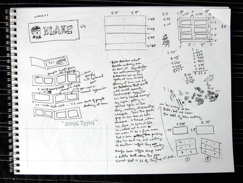
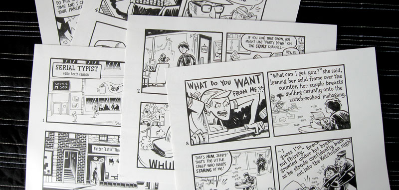
Above is a page of notes I jotted down during SpringCon. I started with the story but then moved into notes on how the mini would look, and how it would need to be produced. For ease of printing I really wanted to have everything fit on one sheet of paper, so I settled on a 12-page story with six pages per side of the printed sheet.

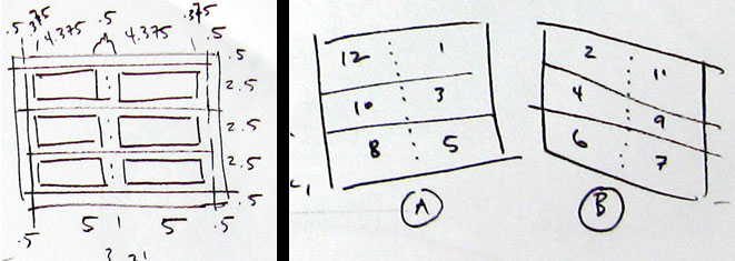
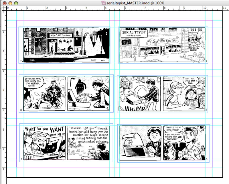
I also wanted to do a bleed on the cover, which meant adding a 1/2" bleed border around each side of the sheet. From there I subtracted a 3/8" margin around each of the panels, and arrived at my final art size per page. It's all about working backwards. On the right you can see a map of how each page would fall on the final double-sided letter size print sheet. Again, that bizarre-looking order is obtained by working backwards.

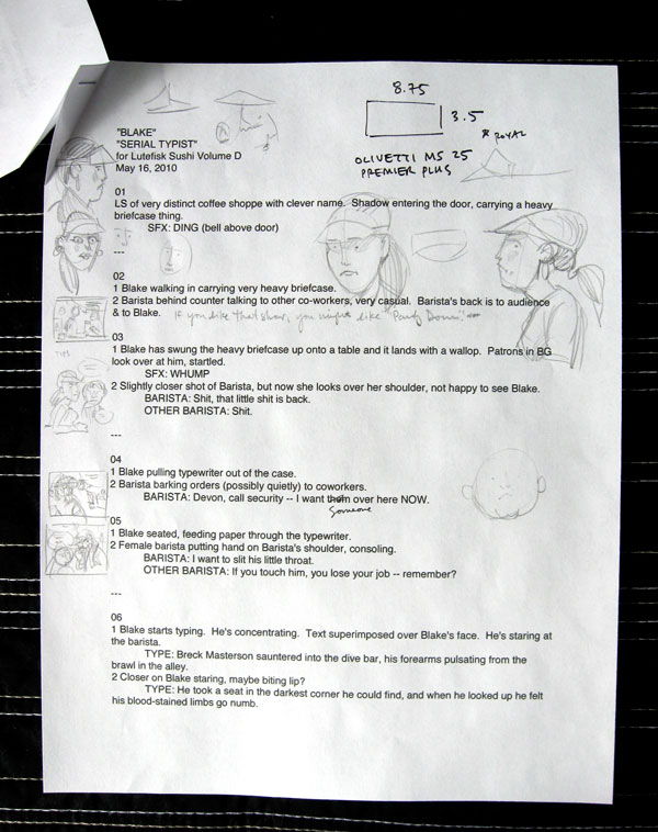
STEP 3: THE SCRIPT


This step is the most fun for me, in that it's the most challenging and yet rife with the most creative possibilities. I'll go through several versions of a script in my head before heading to the keyboard, and then I'll tweak it several times again. This is especially true for a short comic that has very real spatial limitations -- whatever this story is that I want to tell, I HAVE to tell it in 24 panels. Suddenly scenes or lines that I thought were important are cast to the side in favor of a lean, tight narrative. That's one of the highlights of printing a physical comic -- you have these limitations that force you to focus on your message. Yes, webcomics have limitless space and possibilities, and that can lead to some cool things, but if you're not careful it can also lead to a kind of laziness.

STEP 4: DUMMY


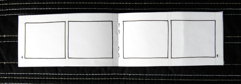
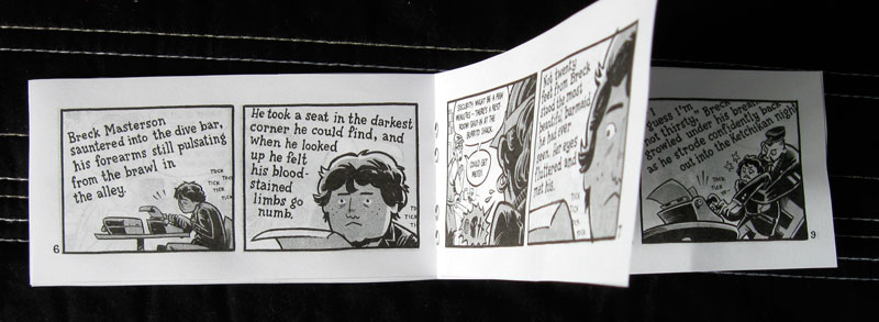
The worst thing you can do (in this context, at least) is spend hours and hours creating your beautiful artwork only to find that your margins or proportions are all screwed up. Making an AT-SIZE DUMMY is a good way to prevent that. Here, I took the mathematical calculations from my page of notes and measured and cut a sample book out accordingly. Fortunately everything worked out (I'm pretty good at fractions when I concentrate) but if there was a calculation error this is where you catch it and correct it.

STEP 5: ART PREP part one: DRAWING SIZE

You know how big your art will be when printed, but how big do you want to draw it? I recommend 150-200% if you want a cleaner look. Drawing at-size or even smaller than at-size will give your book and nice gritty feel. If you draw larger than 200% be aware that your thin lines may disappear when you shrink your art back down to print size. For this comic I chose 200% (mostly because the math is easy).

STEP 6: ART PREP part two: TOOLS


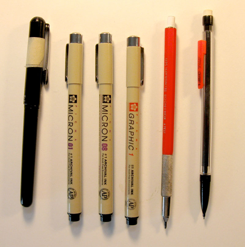
Some cartoonists know exactly which tools they'll use for every project. If that's you, then congratulations. You won. Personally, I need to play around with both paper and drawing utensils before each project to see what works. For this book, for instance, I wanted to go with a rough brush line, so I ended up using a pentel pocket brush pen on Strathmore 70 lb drawing paper. This paper has a good tooth that catches the fat part of the pentel in a fun way -- the only thing I had to be careful of is that pentel brush pen ink dries very slowly on this paper. This means drawing with caution so I don't smudge a lot. The micron #01 (above) is for background details, while the micron 08 and 1 are for lettering. I use a hard pencil (the red one) for light pencilling and the mechanical one (which is pretty soft and dark) for tighter lines.

STEP 7: DRAW


You're on your own for this one.

STEP 8: SCANNING

Remember how I drew these images at 200%? That means I can scan the art in at 600 dpi bitmap, and then change the image size (without resampling) to 1200 dpi and suddenly my art is at the correct print size and at 1200 dpi. It's like magic.

STEP 9: GRAY TONES


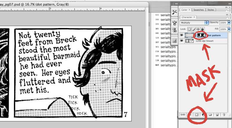
I change the mode to gray and then drop a sheet of dots on top of the art. Then multiply the layer. Then hit the quick mask button (see image) and then hit apple-i to invert it. What you're left with is a dot pattern layer that is completely hidden. To start shading, draw directly in the layer mask. If you mess up, just hit "x" to change your brush to white, which will act as an eraser. This seems complicated, but the beauty is you're left with a mask that can be applied over anything. For instance, if you suddenly want the comic to be in color, you can swap out the dot pattern for a color and your mask will stay the same.

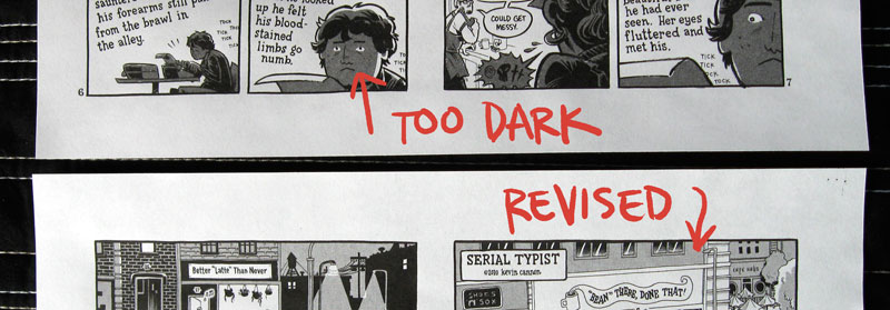
This actually happened to me during this book -- the dot pattern I chose was too dark when I printed it so I swapped each page out with a slightly lighter dot pattern and it only took a matter of minutes. No need to redraw or realign anything.

STEP 10: LAYOUT


Whether you're using InDesign or glue and a ruler, this is the stage when you place the final art on the page in the way that it's going to be printed, as sketched out in step 2. Above is my InDesign layout with all the linked photoshop pages. When I'm done I export as a high resolution pdf. Next I'll print out both sheets and hold them up to a light source to see if they're printing out correctly. Sure enough, while my computer measurements were on target, my printer printed one side too close to the edge. To fix this I went back to the computer artwork and just moved the art on the page enough to offset this error. After another round of printing everything seemed cool.

STEP 11: ANOTHER DUMMY


Before printing out hundreds of copies of this book, I wanted to do one last check to make sure the book was correct, so I printed out another dummy, this time using the art that I would soon be feeding through the photocopier. This stage allowed me to check mechanical things like pagination and margins, as well as aesthetics like checking for dirt and art errors. Indeed, at this stage I discovered that I had forgotten to ink a detail on the first page. It was a small detail -- just a loose piece of paper laying on the ground -- but it was an element that tied in with the narrative so I went back into the computer files and put it back in, and printed everything out one more time.

STEP 12: PRINTING

The most stressful and most expensive part. First, I made "photo-quality" printouts of the front and back of the final comic sheet. To add to the stress it was pouring rain out, so I bundled these two little sheets of paper in some plastic, and ran to the UPS Store. I did a few test sheets to figure out how to print a double-sided sheet, and held these sheets up to the light to make sure they matched up. Then... I hit the green button and let the big machine do all the work.

STEP 13: COVER


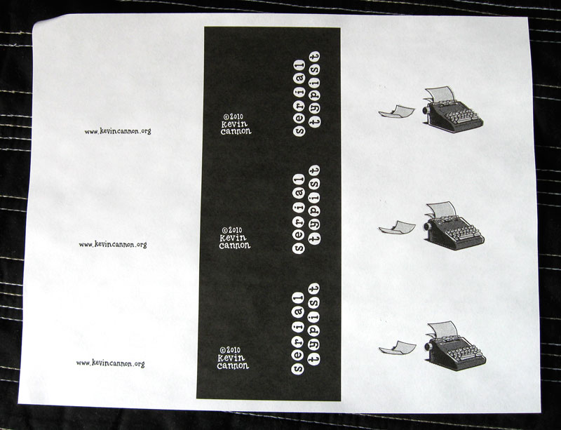
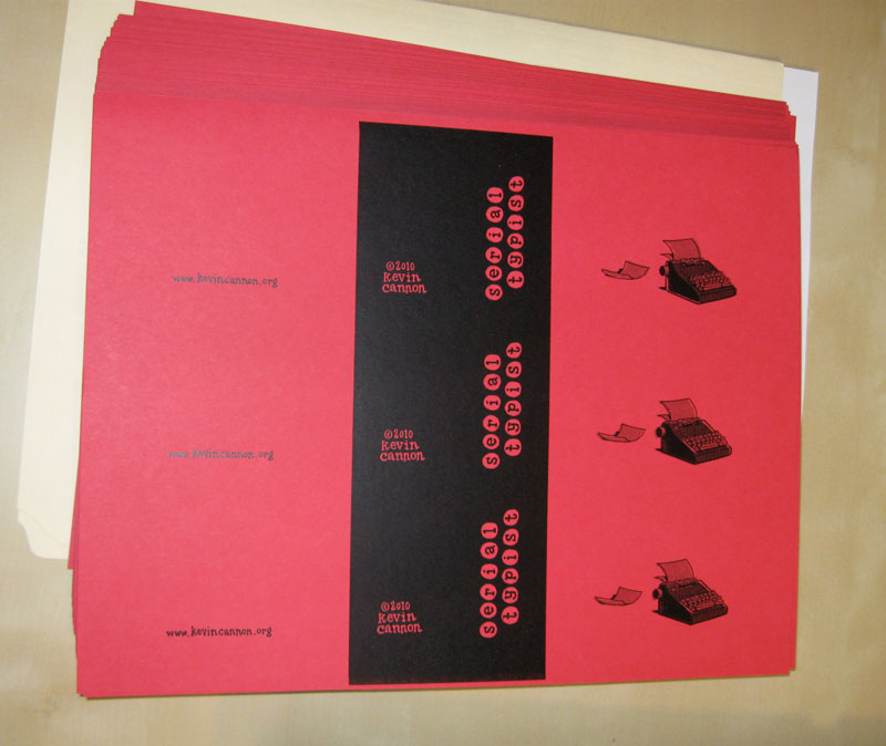
For a lot of mini-comics, the first page of their book will be the cover, so this step does not apply. However, I wanted to add a second color to this story, so I printed up a cover -- using the same specs as the interior -- and took it to the OfficeMax print center, where I had the cover printed on 60 lb red cardstock.

STEP 14: CUTTING


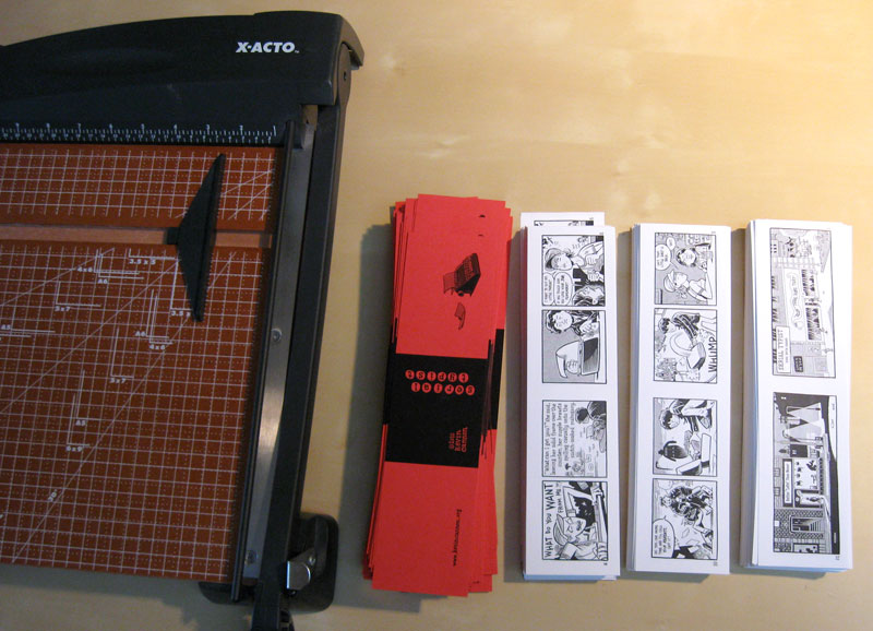
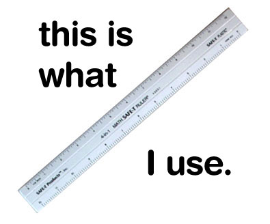
Your book will only be as good as your tools, so if you're going to make a lot of minis I recommend investing in a good home office paper trimmer. Xacto and Swingline make a good product for around $50, like this one. The one I've got has a moveable edge so I can butt each sheet up against it instead of having to line up each page against a ruler.

STEP 15: STAPLING

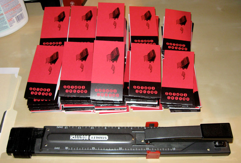
Again, invest in good tools if possible. Unless you're making tiny mini-comics, your office stapler won't do. Try something like this guy for $30.

That's it! I hope this play-by-play hasn't been too boring. If you have a question write it down in the comment section and we'll get you squared away. Also, I'd love to hear how your process differs from this one!

REMEMBER, YOUR LUTEFISK SUSHI COMICS ARE DUE JUNE 15!

Friday, March 12, 2010

Bioshock 3 Game Infarcer cover!

[click on images to see a larger size]
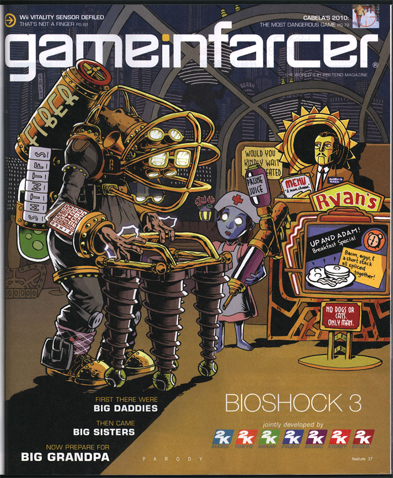
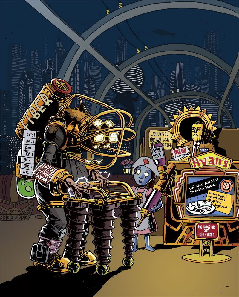
It's that hilarious time of year again, at least as far as magazines are concerned. The April issue of Game Informer magazine, out this week, has a small section inside called Game Infarcer, which mercilessly mocks all the games that they stare at all year. This year: Bioshock 3. HA! Take that, 2K games! We love your game enough to mock it!

This issue marks our fifth year drawing the cover to the section (Thanks, GI!), and to celebrate, we'd like to go through the process of creating the cover, from concept to delivery.

CONCEPT

At the beginning of every February, I start wondering when someone from Game Informer is going to call for the Game Infarcer cover, and sure enough, Bryan Vore calls up and sets up a meeting, and asks if this cover can be "in a more realistic style". Naturally, I say sure thing, then end up drawing it the way I draw everything. Professional secrets revealed!

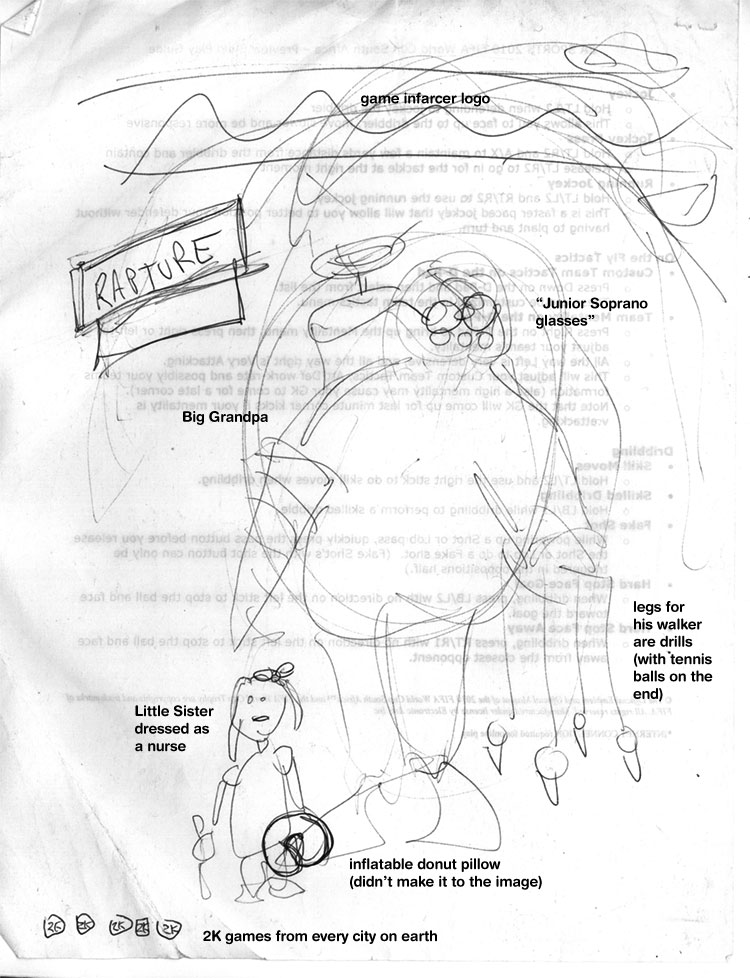
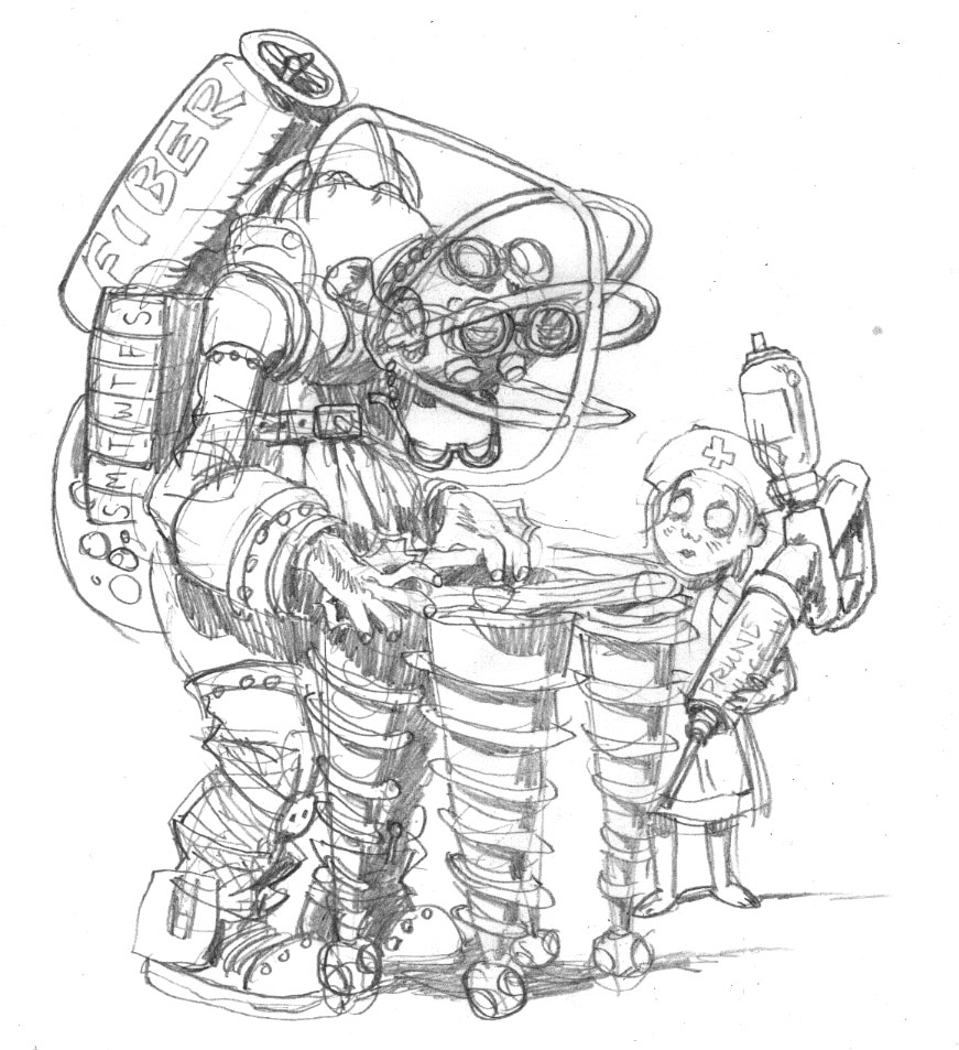
When I get to Game Informer World Headquarters (about 3 miles from here), the guys all sit down with me and give me the pitch: Bioshock 3, with Big Grandpas. But the best part is: they give me a sketch.


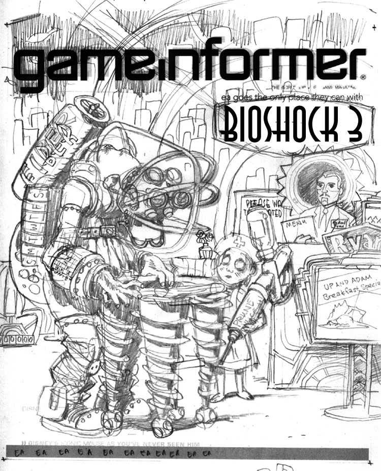
[notation added by me]
I love it when people do sketches. Sometimes people think I'm going to laugh at them or are embarrassed to show what they've done, but I love seeing what people have in mind visually even if they "can't draw a straight line", because it saves me from trying out all the composition pyrotechnics at my disposal. Any artist knows there are millions of ways to lay out the same picture, but the simplest ones are frequently the best, and if that's what the client has firmly in mind, it's usually a good idea to go for it. In the process of making the sketch, the client can also see some potential for ideas and put them down, instead of just making a list or having to remember them. It also lets them see if they can even envision a visual way to communicate the joke, which is a good indicator as to whether I can, as well.

During the meeting, since everyone could see the sketch, we could jump off into ideas a lot faster, and we quickly came up with things like the daily pill container, the Fiber valve (that was Joe Juba), Android Ryan (also Joe), the idea of being at a Denny's-like breakfast place, the Rapture background, and the Prune Juice syringe. These sorts of "list" drawings--ones that contain subtle in-jokes around a given topic--are always my favorite because they're very information-heavy, and are less concerned with rendering, which I enjoy, but is not my particular forte.

Also, Joe lent me a Big Daddy doll--er, action figure at the meeting, which was very helpful in drawing details.

INITIAL PASS

What I like to do when I start a job is to try to ride the wave of enthusiasm as much as I can, and frequently this means I can really make some headway. When I come back from a meeting with the guys at Game Informer, we've been brainstorming and joking about the image, and the game, and other funny obscurities that could make it in there, and so I'm bursting at the seams with ideas. So even though it was late in the day and I needed to get home, I quickly sat down and sketched out what was in my head for the Big Grandpa and the Little Sister Nurse.


This gave me the chance to distill down some ideas, cement some gags in there, and think of some new ones when a corner of the drawing is looking kind of lonely. As you can tell, it also allowed me to basically lock in the general "camera angle" of the drawing. This was a pretty lucky break--it doesn't always happen that way--but just dashing stuff down without overthinking it often gets the simplest (and best) results.

The next day, I took another sheet of paper and drew around all the other elements of the drawing: the environment, the signs, the greeter, etc. I married these two images in Photoshop and dropped in a Game Informer logo and Bioshock 3 graphic for placement so that I could send it off to the guys for feedback.


This part also allowed me to add more jokes--the Denny's-like Ryan logo, the sign advertising the specials that looks like the Plasmid upgrade graphic, the Little Sister ornate escape hatch, the detailing on the seats and host stand that are similar to the doors in the game, and the gold-glowing rose in the tonic container way in the background. If you look closely, there's even a cash register on the far right, just like in the game. But then I realized host stands don't have cash registers. This drawing will be nothing if not accurate!

PENCILS AND INKS

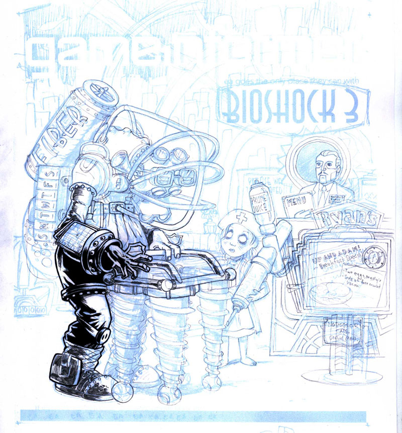
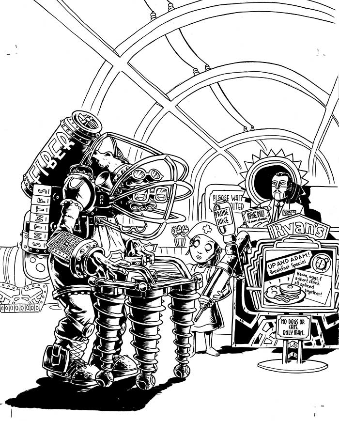
The sketch is relatively tight, as you can see from how similar it is to the final drawing, so the next step is to blow it up in Photoshop and print it out in 10% cyan on a big sheet of paper. From there I can go in with pencil and brush and create the final linework.


Now, normally, people pencil the whole image before inking, but I'm kind of impatient, and sometimes if you're sure about a section of the drawing (that is, you're sure it's going to be in shadow or something), it can be useful to go ahead and ink it. It can frequently give you better ideas on how to pencil the rest of the page, and it sets a certain style.


When I was finished with the foreground inks, I sent the image to Game Informer again, just to show them some progress, and it yielded a valuable addition. While I had added jokes to the sign and the menu, I had entirely neglected the "Please wait to be seated" placard. If you've played Bioshock, you know that there is a perfect addition to make to this sign, and Jeff Cork pointed it out. "Please..." was changed to "Would you kindly..." and our drawing was now officially stuffed as full of jokes as we could make it.

COLORING


Coloring is difficult for me, particularly things that have to be relatively atmospheric. I tend to like to color with flat colors rather than with a layered, textured look, but I tried to blend the two for this illustration.

For the background, I drew outlines of the buildings with dots for windows, then made several layers, each with a layer of blue to indicate distance. Here was the final opportunity to make jokes, so I threw in a few Ayn Rand references (the signs saying "Roark" and "Galt", two Randian heroes, and the Atlas-shaped building (pre-shrug). In case you don't know, Ayn Rand's works, particularly Atlas Shrugged, were a major influence on the philosophy of Bioshock and Rapture, its underground city.

Gloomy blue and glowing gold were the basic colors for the game of Bioshock, so I created a warm gold light spot in the lower right to focus attention, then colored all of the figures with gold highlights coming from that direction to unify the scene. The background could stay a largely uniform neutral blue that would pop out the figures. As a final consideration, I did something I rarely do--I added a glow to certain things: the Big Grandpa's eyes, his lightning bolts on his hands, and the Little Sister's eyes. When put into an image that is mostly flat colors, effects like that can be quite striking.

PRINTED IMAGE


When the image makes it into the magazine, I always hold my breath a little, hoping that it will look okay. These days you can be pretty sure that what's on your screen will print out okay, but you never REALLY know. I was thrilled when I got this one in the mail. As you can see, they moved the image up and zoomed in a tiny bit, overlapping the top of Big Grandpa's fiber tank with the logo (I provided another layer of just the top half of that figure in case they wanted to do that), and they extended the shadow in the lower left to get in the copy for the joke, which I'm glad they did. I feel like the image is solid, and a good joke, but it does need a little explaining.

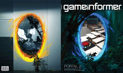
So go out and find the April issue of Game Informer! It's the one with the Portal 2 cover. Ah, not only a drawing in an issue of Game Informer, but one about the sequel to my favorite game. It's the icing on the cake.


Monday, April 06, 2009

Lettering Essentials: the Character Chart

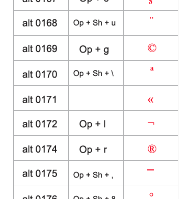
If you letter on the computer you know how much fun it is to dig for those special characters that are hidden somewhere on your keyboard. Through sheer will I've been able to remember where the ellipses (option semicolon) and em dash (shift option dash) are, but after that I'm lost. Fortunately, the nice people at Blambot have created a character chart showing you exactly what to punch when you're in need of an O with an umlaut or the highly prized fraction with one zero in the numerator spot and two zeroes in the denominator spot.


There are several charts like these floating around the web, but I like Blambot's clear PC/Mac distinction and their bold use of the color red. You can find it here.

Friday, October 31, 2008

Tips and Tricks: "It's Who You Know"

When speaking with young cartoonists, at some point the question inevitably comes up, "How do you get work?"  Usually, by the time I draw breath and start talking, they follow up with a sigh and a resigned "...or is it just who you know?"  Well, let me make two things clear.  

One, yes, it is who you know.  
Nearly all of the work that I've gotten and that we at Big Time Attic have gotten together has been through someone one of us knew, worked with previously, met at a convention, was related to, lived or worked close to, or who somehow recommended us out of all of the millions of cartoonists out there.  

Two, that's not exactly that strange.  
People who need work done can't be expected to have an encyclopedic knowledge of every cartoonist out there; they only typically remember at most a dozen off the top of their heads.  If you know them, you instantly jump into that dozen.  But you need a couple things if you want to actually do the work.

Be Ready.
Being thought of is not the same as getting the job.  Everybody gets considered for jobs all the time, but the question is, are you ready for it?  And almost as importantly, do other people KNOW you're ready for it?  When they come to you and say, "Can you draw this many drawings in this style by this deadline?" you have to be able to honestly, and credibly,  answer yes.  

Deliver the Goods.
And then you have to make good on your promises.  This is an important point:  most of the people we work with we work with several times.  So that means you have to turn in work that is good and on time, and you need to be easy to deal with.  Doing this means you stay in people's heads as the right person for the job.  A lot of clients out there will go with someone whose style is ALMOST right over someone whose style is JUST right if they know that person is fast, good, and easy to work with.  This frequently makes the difference between working constantly and bitterly grumbling about how no one appreciates you.

Be a Known Quantity.
I always tell people that when it comes to drawing style, focus on depth rather than breadth.  That is to say, rather than be able to pencil a comic in every style from scary vampires to fluffy ponies, it's better to work in a relatively narrow range (say, just humorous illustration) but be able to pencil, ink, letter, color, and, if necessary, do design and prepress work in that style.  That 1) makes you jump to the top of people's minds when they think, "Who could draw this funny comic?" and 2) makes you an easy choice, since you can take care of everything from the word go.

When you can draw pretty well in every style, you have the problem of never being the best at anything (and, of course, never being KNOWN to be the best at anything).  There will always be a better vampire guy or pony guy than you because that's all they do.  

There's no question that literally only having one style would limit you in what jobs you can take, and so it's important to be able to have a certain range.  If you do humorous stuff, you need to make sure you could do a funny superhero story or a funny vampire story or a funny fluffy pony story, all within what people recognize as your style.  The main thing is that people, when they think of you, can imagine how you would draw the book.  That's how you get the job.

So yes, it is who you know.  But it's not some kind of old boys' network that just gives jobs to people's sons.  It's about preparing your skills so that they are top notch, and then getting out there, whether it's on the internet, at comic conventions, or even at the comics store and showing people your work, so that the next time they need someone to draw something, they call you.

Monday, September 29, 2008

Zander's Tips for 24-Hour Comic Day

Kevin did his tips last year for 24 Hour Comic Day, and so this year I'll do mine.

Some caveats-- I've finished 3 24-Hour Comics in the last 3 years, and every year I swore I'd never do it again. Twelve months has a tendency to make one forget one's swears. But the point is-- I have no secret to avoiding misery. So don't expect me to make it easy on you; it won't be. That's why you can be so proud afterwards.

1. WORK SMALL. Every year I see people bringing in great big sheets of bristol board to work on their 24-Hour comics, and every year I see some or all of them drop out. Why? It's not like they're putting in more detail, it's just the sheer amount of real estate they need to cover. God help them if they set something in space or at the bottom of a well-- that's a good 15 minutes per page of filling in black areas right there. I always work at 8 1/2 by 5 1/2-- half a letter-sized piece of paper, and then reproduce it at 100%. That's a good mini-comic size.

2. WORK CHEAP. Kevin and I have spoken before about the Pentel Pocket Brush Pen. I use that and cheapo HP laser paper from Office Max. With the amount of half-assed drawing that gets done at these things, it would make me feel sick to be using up nice paper, and the cap-it-and-forget-it nature of the PPBP works really well for these extended sessions, much better than a Windsor & Newton brush would. Similarly, Kevin uses a flair pen for his 24-hour comics. That's probably an even better idea because you don't have to rotate the page around when you ink, like you have to with a brush.

3. WORK OUT A DRAWING STYLE. It'll happen anyway while you're working, but it's nice to go into the event with a sense for how to draw simply and effectively, while still being able to communicate things like depth and facial expressions. You'll find that your patience for cross-hatching details on faces will dwindle by about hour 10.

4. KEEP YOUR DESIGNS SIMPLE. No-nos for characters: stubble, Hawai'ian shirts, tentacles, the Jack of Hearts. No-nos for settings: outer space, the middle of a jungle, a junkyard, a balcony overlooking New York City. Don't think that these details will just give you mindless things to do. They will, but you'll hate yourself for it. Your hands are going to hurt by the end of this thing; you don't want to have to put in any detail you don't need to.

5. DECIDE THE GENRE BEFOREHAND. I think it's nice going into the event knowing basically what kind of story you're going to make. If you've decided on a Western, for example, it gives you a bit of time to think about the sorts of things you want to have in your story, the basic structure, and some thoughts on what kinds of characters will populate it. But you should ONLY decide the genre, and then when you start...

6. USE A RANDOMIZER TO GIVE YOU IDEAS. I use a Pictionary card, which has five words on it that are pretty random, but at the same time fairly ordinary words. This is nice because then you have a bunch of unrelated ideas that you have to put into a story, but aren't making a story about yellow-bellied snorklewackers, or something else completely loony, which is exactly what you'd get if you asked your friends. Randomization has several benefits. One is expectation management. Because you can't plan out your story, you don't build it up in your head to be the most interesting story of all time. Drawing a page an hour all night is going to make some pretty shoddy-looking stuff, so it's good if you're not butchering your all-time favorite tale that you've been waiting years to accomplish. Another benefit is that it gives you ideas. When you have a bunch of completely unrelated words, you are working full-time just to create a story that makes sense, which frees you from having to be terribly creative and/or hilarious. You're bound to make some funny jokes or clever plot twists just getting your characters from A to B, so it's nice to not worry about what ingenious idea you have to put in next.

7. PAGINATE YOUR PAGES BEFOREHAND. I like to use this template for paginating 24-page minicomics. It means that other people can't really read your book while you're doing it because when they've had no sleep, there's no way they're figuring out a pagination guide. But it saves you a lot of cutting, pasting, white-taping, and whatnot when you get the thing printed. I always make a mini-comic of my 24-Hour comics, and not having to worry about how to arrange the pages makes me much more relaxed.

8. DO NOT GIVE UP. C'mon, would you rather be exhausted and miserable and finish a 24-page comic or exhausted and miserable and not?

9. BRING A LUNCH. There's always a snack table at our event, but at about lunchtime, people are always having to go to the bar next door and burn valuable time ordering a Reuben sandwich. Just make a sandwich and put it in your fridge the night before. And for God's sake, don't just pig out on the chips. You've got to stay alert and smart for 24 straight hours; Pringles won't do.

10. GET SOME SUN. Just go outside and let the sun wake you up a bit. You won't be that tired when it's still daylight, but it still gives you a little boost to have some real, full-spectrum light getting into your eyes.

11. SHAKE OUT YOUR HANDS A LOT. Give those guys a break. They're working hard. A five-minute break will make them a lot happier than they were.

12. BALANCE FUN AND WORK. If you're too serious, 24-Hour Comic Day can be a real grind. Chat up your fellow cartoonists. Make fun of the panel you just drew. Discuss the music choices that were made at your location. But also remember this: if you're not working, stay out of the way of people who are. 24-Hour Comic Day is a pretty quiet affair, with a few people taking a valuable minute or two to say something to someone, but it's mostly nose-to-the-grindstone, drawing-as-hard-as-you-can work. If you gave up two hours ago and went to the bar to get loaded, don't come back and laugh it up with your buddies, dammit; people are trying to draw here.

Have a good time-- and put your comic online, would ya? They're fun to read.

UPDATE: Number 13. Rereading Kevin's post from last year, I wanted to second his point about not pencilling the whole book, then inking it. One, it sets you up to do a lot of hand-crampingly hard work right at the end of the night. Two, it's hard (especially when sleep-deprived) to truly determine how much pencilling you need to do in order to ink it well. Three, as Kevin mentioned, it makes it far more complicated to gauge your time-usage.  It's far easier, and more useful, to finish a page an hour.  Now, while I keep to this schedule for the most part (probably 75%), my work process is a slow movement from small increments to large.  In the first hours, I do whole pages, written, pencilled, and inked, before I move on to the next page, even to write it.  That break in time (to letter and ink) gives me some time to reflect on what I want to happen next, and it also keeps me from rewriting.  When it's done, it's done.  I have to move on.  As I get more familiar with the story later on, and the plot points are rapidly converging on the end, I will frequently start pencilling three pages at a time before I go back to inking.  Since the story is kind of writing itself at this point, it's good to get a lot of writing done at once, and from a practical standpoint, I have few enough pages left that this deviation from the schedule is not as terrifying.

Wednesday, July 09, 2008

Tips and Tricks: Constructive Criticism, Part I

Being a creative person frequently puts you in the position of critiquing someone else's work, either because you're collaborating, or because you've been asked, or simply because you are part of a group of creators and you're invited to express your opinion here and there. It's easy to go one way or another when criticizing, either becoming a joyless, cynical pedant whose approval is an ever-moving (and possibly imaginary) target, or an airy-fairy omni-acceptor who gets teary-eyed whenever anyone suggests that the undiluted fruits of someone's creative mind are perhaps not up to snuff. Neither is much fun all the time, though the best aspects of each can sometimes come in handy. There are numerous situations you'll find yourself in, criticism-wise, and often you can save yourself a lot of headaches if you keep in mind who, what, when, and how much you are criticizing.

Part I: Collaborations

In collaborations, the two main times that critiques are solicited (or you think they might be) are in brainstorming sessions and while fine-tuning a concept in readiness to start the work (what I like to call "Nuts and Bolts"). These two sessions are distinct, and it's important to make sure that their purposes are not confused.

Brainstorming: Just Coming Up With Ideas
This is pretty widely known, but DON'T criticize an idea when people are brainstorming. C'mon, you're just throwing things at a wall. You're looking for half-ideas and quarter-ideas that you can sew together later into something halfway decent. So some of the ideas are going to be lame. You think people are coming up with dumb ideas? Then come up with something better. Because if you keep cutting everything down, the room is going to start getting eerily quiet.

For the most part, the reason that brainstorming sessions go awry is not that people don't know that you're not supposed to criticize at a brainstorming session, it's that they aren't aware that this is a brainstorming session. They think that the final answer has to be arrived at by the end of the meeting. This is not productive. If people think you're settling on an idea in this session, they start getting worried. When people get worried, they get critical. So it's good to make a general announcement at the beginning that you're all just brainstorming, and someone's writing down the ideas, and they'll all be digested later. Nothing is decided at the end of the meeting; there are just a bunch of half-ideas and quarter-ideas lying around for someone to figure in the Nuts and Bolts session.

Nuts and Bolts: Filtering Through the Ideas.
This is when you can start being critical. If you're getting down to brass tacks, and starting to figure out how something's going to be done, you've probably already narrowed the big ideas down to one or two. This is when ideas start getting implemented if they're approved, so you want to start getting choosy. While in the Brainstorming session, you have only a vague idea of where it's going, here you are thinking about the actual experience someone in your audience is going to have. Now, a key element to this part is that you decide who's doing what. That could mean dividing and subdividing the work into departments so that everyone knows exactly who does what, or it may be as simple as merely defining one person as the "funnel" through which everything goes. Usually this funnel is the person who cares about it the most, and it should definitely be the person who wants to take responsibility for it.

Once the Nuts and Bolts session starts, there should be a moratorium on new ideas that are not basically implementations of existing ideas. This keeps things from becoming disorganized, keeps people's egos from being kicked around, and it keeps the process narrowing down until it gets to the core idea.

This is all tricky stuff, but it's worth it when you create a brainstorming atmosphere in which people are shouting out funny ideas and even the most bizarre, out-there stuff will contribute a germ of an idea that leads somewhere. And when people feel like their ideas are being heard, they bring better and better stuff into the mix.

Thursday, March 13, 2008

Tips and Tricks: Coloring Comics to Look Old

First, some props where props are due to Les McLaine at Jonny Crossbones for his tutorial, How To Color Like A Little Old Lady, which we've adapted and added stuff to. Please visit his site, read his wonderful comic, and buy his stuff.

Coloring Comics To Look Old


COLORING THE IMAGE

1. Get Scan where you want it in Bitmap mode. No gray, just black and white.


2. Convert image to CMYK. Image>Mode>Grayscale, then Image>Mode>CMYK.

3. Select All, then Cut (Ctrl-X).

4. Paste (Ctrl-V) image into the Black channel.

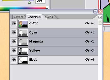
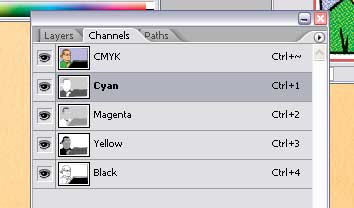
5. Select the C, M, and Y channels.

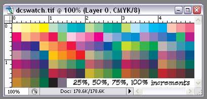
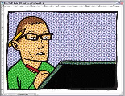
6. Flat the image, using the swatch colors in dcswatch.tif. Use the regular lasso. Don't worry about being slightly sloppy.


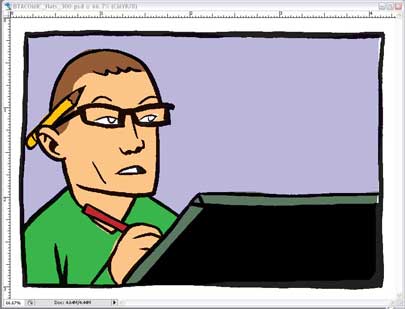
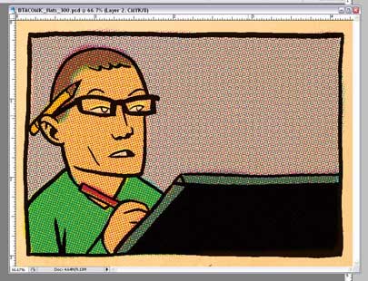
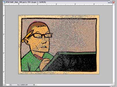
7. Save the image as "[initials of project]_[page number]_flats_[resolution].psd". For instance, page 4 from the BTA Comic, working at a high resolution would be "BTA_04_flats_800.psd". Put this in a flats folder.


These should be the final colors to continue.

PIXELATING THE IMAGE

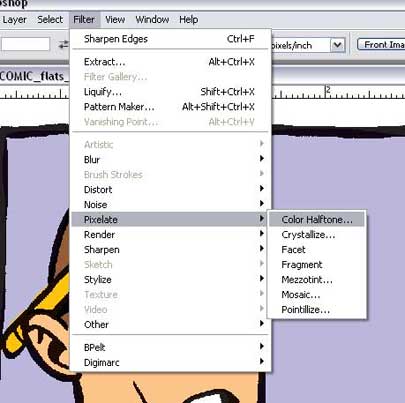
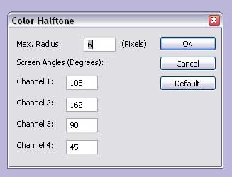
8. With only the C, M, and Y channels selected, go to Filter>Pixelate>Color Halftone...


9. Make the dots' max radius 6 pixels if working at print size, and 12 if working bigger.


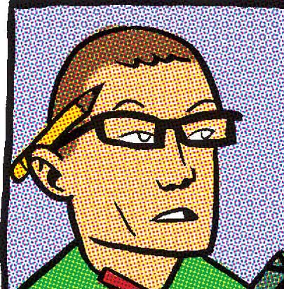
10. Select just the Cyan channel. Nudge it out of alignment, just a little.


11. Do the same with the other two color channels (not black) all in different directions.


YELLOWING THE PAPER

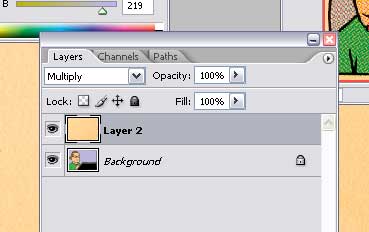
12. Get a scan of some blank newsprint that's old, yellowed, and textured. If its from an old comic or newspaper, that's ideal. Otherwise, get the texture right, from some old paper, and you can adjust the colors to make it look yellowed. Anyway, get the newsprint scan to the same resolution as the image, then paste it into a layer above the background layer, setting the mode to "Multiply".


You might want to save here, but don't overwrite the Flats file. Save as "[project initials]_[page number]_halftone_[resolution].psd" e.g. "BTA_04_halftone_800.psd".


This should look like an old comic, but a little too nice.

DISTRESSING THE BLACK INK

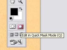
13. Click on "Create Quick Mask". This will create a new temporary channel in the channels palette.


14. Go to your newsprint image again and select all (Ctrl-A).

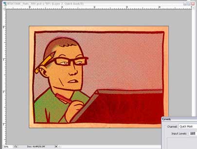
15. Drag or Paste the newsprint image into the Quickmask Channel. This will give your image a slight pink sheen.

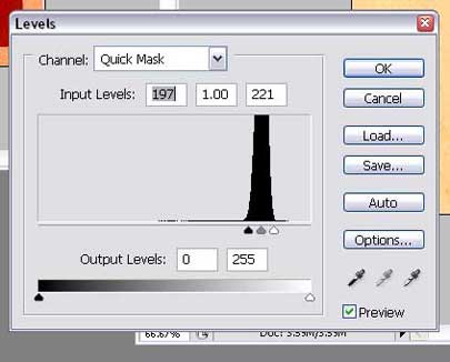
16. Go to Image>Adjustments>Levels (Ctrl-L) and put all three pointers near the center of the curve. This will make the image very red, and textured.


17. Click out of QuickMask mode and there will be a million dancing ants on your image. Hit Ctrl-H to hide them, if you want, but don't forget they're selected.


Select only the Black Channel.

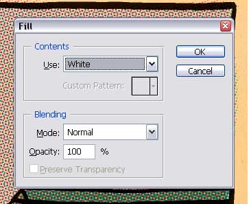
18. Hit Shift-Backspace. This will bring up a window, where you tell it what color to use to fill these spaces. Choose white. This will make the black ink look way too light.


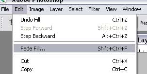
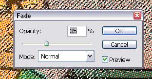
19. Go to Edit>Fade Fill... right away, before doing anything else. Move the slider down to about 35, or until the ink on the page looks nice and faded and old, with some texture, but still reads as an ink line.


DISTRESSING THE COLOR

At this point, the Art should look faded, but the colors are still too bright, so we need to do the same thing to them that we did to the black line, so don't deselect all those dancing ants.

20. Go back into QuickMask mode. It'll look red again.

21. Select all (Ctrl-A), then Transform (Ctrl-T). This will give you a square with handles around the image. This will only affect the Quickmask.

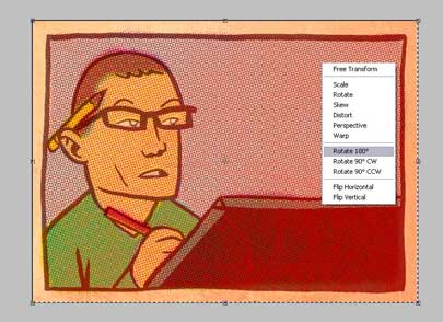
22. Right-click in the square. Select Rotate 180 degrees. This will make the red texture pattern rotate.


23. Exit QuickMask Mode. You'll get the Dancing Ants again.

23. Select the C, M, and Y channels.


25. Hit Shift-Backspace again. Use White.

26. Go right to Edit>Fade Fill... and move the slider down to about 75, lighter than the black lineart, or whatever looks best.


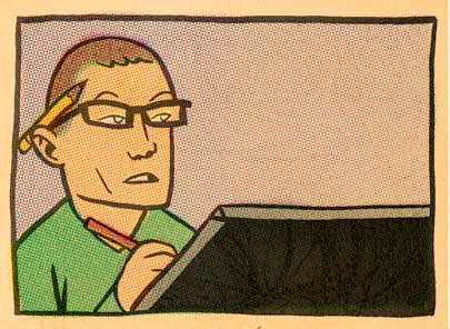
27. You're done!