Coloring Comics To Look Old
COLORING THE IMAGE
1. Get Scan where you want it in Bitmap mode. No gray, just black and white.
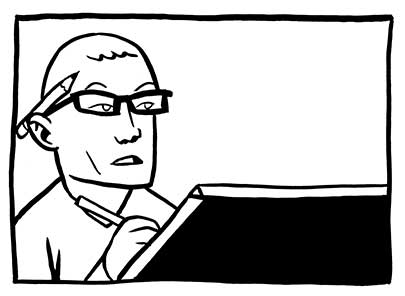
2. Convert image to CMYK. Image>Mode>Grayscale, then Image>Mode>CMYK.
3. Select All, then Cut (Ctrl-X).
4. Paste (Ctrl-V) image into the Black channel.
5. Select the C, M, and Y channels.
6. Flat the image, using the swatch colors in dcswatch.tif. Use the regular lasso. Don't worry about being slightly sloppy.
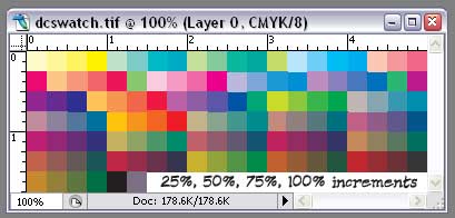
7. Save the image as "[initials of project]_[page number]_flats_[resolution].psd". For instance, page 4 from the BTA Comic, working at a high resolution would be "BTA_04_flats_800.psd". Put this in a flats folder.
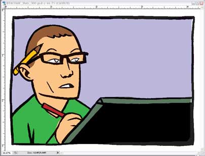
These should be the final colors to continue.
PIXELATING THE IMAGE
8. With only the C, M, and Y channels selected, go to Filter>Pixelate>Color Halftone...
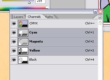
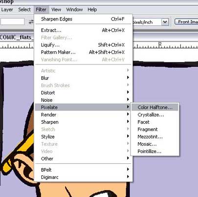
9. Make the dots' max radius 6 pixels if working at print size, and 12 if working bigger.
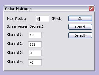
10. Select just the Cyan channel. Nudge it out of alignment, just a little.
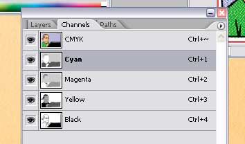
11. Do the same with the other two color channels (not black) all in different directions.
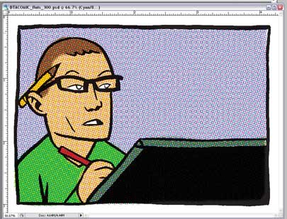
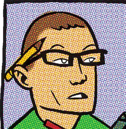
YELLOWING THE PAPER
12. Get a scan of some blank newsprint that's old, yellowed, and textured. If its from an old comic or newspaper, that's ideal. Otherwise, get the texture right, from some old paper, and you can adjust the colors to make it look yellowed. Anyway, get the newsprint scan to the same resolution as the image, then paste it into a layer above the background layer, setting the mode to "Multiply".
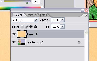
You might want to save here, but don't overwrite the Flats file. Save as "[project initials]_[page number]_halftone_[resolution].psd" e.g. "BTA_04_halftone_800.psd".
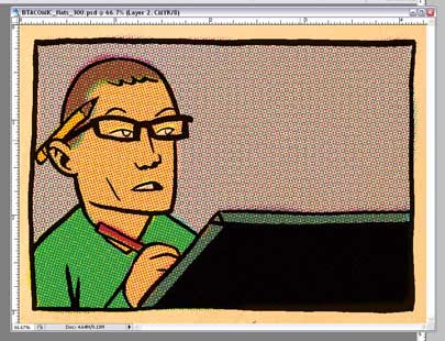
This should look like an old comic, but a little too nice.
DISTRESSING THE BLACK INK
13. Click on "Create Quick Mask". This will create a new temporary channel in the channels palette.
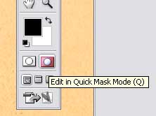
14. Go to your newsprint image again and select all (Ctrl-A).
15. Drag or Paste the newsprint image into the Quickmask Channel. This will give your image a slight pink sheen.
16. Go to Image>Adjustments>Levels (Ctrl-L) and put all three pointers near the center of the curve. This will make the image very red, and textured.
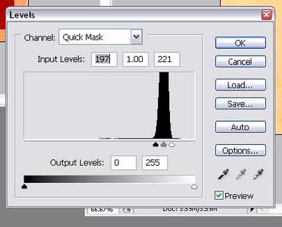
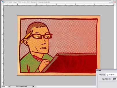
17. Click out of QuickMask mode and there will be a million dancing ants on your image. Hit Ctrl-H to hide them, if you want, but don't forget they're selected.
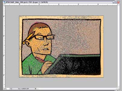
Select only the Black Channel.
18. Hit Shift-Backspace. This will bring up a window, where you tell it what color to use to fill these spaces. Choose white. This will make the black ink look way too light.
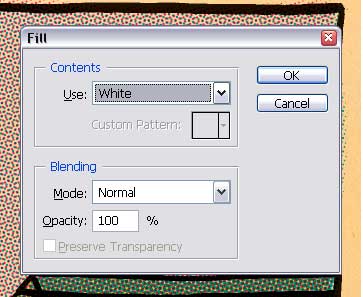
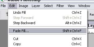
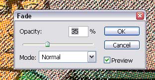
19. Go to Edit>Fade Fill... right away, before doing anything else. Move the slider down to about 35, or until the ink on the page looks nice and faded and old, with some texture, but still reads as an ink line.
DISTRESSING THE COLOR
At this point, the Art should look faded, but the colors are still too bright, so we need to do the same thing to them that we did to the black line, so don't deselect all those dancing ants.
20. Go back into QuickMask mode. It'll look red again.
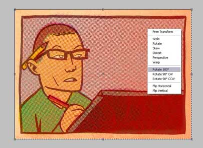
21. Select all (Ctrl-A), then Transform (Ctrl-T). This will give you a square with handles around the image. This will only affect the Quickmask.
22. Right-click in the square. Select Rotate 180 degrees. This will make the red texture pattern rotate.
23. Exit QuickMask Mode. You'll get the Dancing Ants again.
23. Select the C, M, and Y channels.

25. Hit Shift-Backspace again. Use White.
26. Go right to Edit>Fade Fill... and move the slider down to about 75, lighter than the black lineart, or whatever looks best.
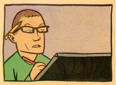
27. You're done!

10 comments:
Stwalley's secret revealed! Crumbling paper my foot.
So, is this why there were old issues of Detective Comics laying around the office when I dropped off my minis today?
Ah ... sounds like YOU'RE the detective!
great.
i owe you many thanks.
*shakes hand* thanks a lot mister!
Thank you so much for this tutorial, it was really helpful - I tested your tips with this pic. :)
Quickmask doesn't seem to do show any of the effects after I hit ctrl h.
Great thanks for this tutorial, I had tons of fun with it.
Thanks for this, just what I needed. Im making a cocktail menu themed after old comics and this is just the post production treatment it needs.
Great stuff.
this is... AWESOME!!!!!!
Post a Comment