It's Game Infarcer time, everyone! I only tend to do a handful of actual illustration jobs each year (that is, single images that are colored by me), and I always look forward to Game Infarcer, Game Informer's snotty look at various games and game trends. I've provided the 'cover' (first page, that is) to this section for seven years now, and it's always great fun to call upon my funny-makin' skills as well as my coloring ones to crank this sucker out.
CONCEPT
As usual, the process starts with a meeting at Game Informer, and I knew I was in for a bit of trouble when Joe Juba said, "I didn't really think it was funny when they first told me, but now I do." Uh oh. Is this drawing going to need a paragraph next to it so anyone will know what they're talking about? But really, I thought, anyone can make a funny illustration when a rock-solid concept is laid in their lap; it's just going to take a little of that little thing I call "The Zander Cannon Magic". Okay, so. If you think that this sounds like foreshadowing for the part later in the story when I shoot the whole thing to hell, I say to you, "Shh, you're going to ruin it."
So I met with Joe Juba, Dan Ryckert, Tim Turi, Jeff Cork, and probably Ben Reeves. I don't know. Probably. Ben's always creeping around somewhere. They told me that the game we're riffing on is Mortal Kombat, then gave me a little back-story. The company that makes Mortal Kombat, NetherRealms, was purchased by Warner Brothers, and they've done some crossover things like Mortal Kombat Vs. The DC Universe, and now they've permanently added Freddy Krueger from Nightmare on Elm Street to the MK roster. So the gag is that Mortal Kombat isn't going to stop there; they're going to start grabbing characters from all of Warner Brothers' movies. They give me a list of notable movies in WB's film catalog, and we start brainstorming. The big idea they wanted in there was to make Tom Cruise's character from Risky Business be pulled across the floor by MK's Scorpion (the guy who says "Get over here!").
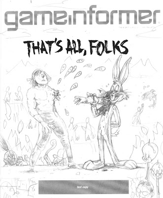
Now, whenever anyone says "Warner Bros", the only thing that anyone really knows that they made is Looney Tunes. I know, people might know that The Matrix or Harry Potter were Warner Bros movies, but it's like Disney-- you know the cartoon characters; everything else is a little fuzzy. And obviously as a cartoonist, Bugs Bunny, Elmer Fudd, Daffy Duck and the rest are very appealing things to draw, particularly the idea of them bloodying up -- or being bloodied up by -- Mortal Kombat characters. We even had a gag worked out where Bugs Bunny would be front and center, eating someone's arm like a carrot, and the drippy blood letters that usually say "Finish Him!" in MK would say "That's All, Folks".
Now the problem came when I wanted to flesh this gag out for the full illustration. If you have Bugs Bunny front and center, how do you put Tom Cruise's character in the background and have people realize what's happening? Bugs Bunny puts you in a certain frame of mind, and you're just not going to understand who some guy in his underwear is, and what he's doing there. So I started putting forth the idea that we could have the rest of the illustration populated by the rest of the WB cartoons; they make for great sight gags, their art style clashes appealingly with the "realistic" Mortal Kombat characters, and they're just plain old fun to draw. Wow, great! It's the old "Zander Cannon Magic" that everyone loves, coming through in the clutch!
Except... that's not what the gag is supposed to be. And that's not what they asked for. And with the setup of Freddy Krueger, it doesn't make a whole lot of sense. And finally, it turns out in the world of video games and the internet, the gag of 'cute characters killing or being killed' has been done once or twice or possibly ten million times.
So I went back to the drawing board and really thought about what the GI folks were asking for. The Freddy Krueger setup is there to prepare us for the idea of NetherRealms going back into the film catalog and just looking for brand recognition at the expense of appropriateness. So I took another look at the big list of movies that Dan Ryckert gave me and went back to what we had discussed at the GI offices. So then I dropped in this sketch, assembling it from various mini-sketches into one document.
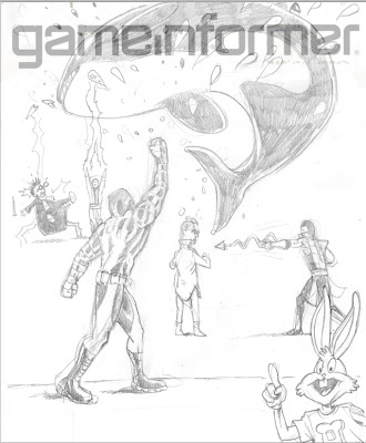
We've got Free Willy in the foreground, getting uppercut, Harry Potter getting struck by lightning, Tom Cruise about to be speared by Scorpion, and the part I was most happy with -- Bugs Bunny as the uppercut "Toasty!" guy. This illustration, and last year's illustration, are heavy with movie references, so I was really happy to put in a semi-obscure video game reference. In the earlier Mortal Kombat games (i.e. the ones I played), every time you uppercut someone, a little image of one of the programmers came out in a purple shirt and said "Toasty!". And so there was my excuse to put in Bugs Bunny.
LINE ART
Since this drawing was much more about the various gags in it than a unified composition, I took a different approach to the line art. After getting approval for this sketch, I printed out several 10% cyan copies of this layout to use as guides for the final line art. What I ended up with was a pile of illustrations, all having very little to do with each other.
Then I scanned them and assembled them all into one document to figure out the final placement, as well as leaving room for the subhead text and logo.
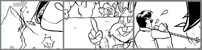
The nice thing about creating final art elements separately like this is that you can work on the layout and get some solid feedback about how they look together, tweaking them at even a late stage. The tricky thing about it is that you end up with a lot of tangents that you have to futz with. Tangents in this case are places where a line in the foreground just barely touches a line in the background and makes it look like these two things, which are supposedly a large distance apart, are touching. Like this:
Once everything's in its place and I more or less have the kinks worked out, I go in and edit the lines so that things behind other things have their lines obscured, and the whole thing looks like a real drawing.
COLORING
I wanted to keep my ability to move the characters around as long as I could, so I decided to keep all the characters in their own layers as I colored. As you may know if you use Photoshop, having this many layers in a high-resolution file is extremely memory-intensive, and a slow computer like mine was at the time (that also limited the amount of RAM available to Photoshop) was not going to be able to handle it. So I saved the line art as a separate flat image and imported it into my new color file, making it a channel instead of a layer. This places it above all of the other layers, but saves on memory because Photoshop doesn't have to contend with all of the layer properties involved. A nice workaround for a situation where your memory is limited.
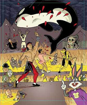
Then I went in and colored that sucker. I usually struggle with color for the first 75% of a job because you're basically putting in placeholder colors and everything looks terrible, so for this one, I scrapped that plan and basically just started coloring each character in their own layer. The only guide that I used was that each character was uplit by the lava pits, so I used the established colors of all the characters, cheating them slightly toward yellow, and put shadows on the top of shapes. I dropped in the orange of the lava pits, then put in pools of yellower lava (that's a thing, right?) to give it a texture. The drawing looks pretty solid now; if anything, it needs the people in the foreground to pop, so...
I created a layer above everything else where I then drew in some very harsh, hot rimlights on the top of all of the characters, popping them out of the background. I also made a white glow on the ground where they are standing to draw attention to the environment and not make it look like they're floating.
It's funny to look at the artwork after all that without the line art and realize how I've basically entirely recreated the drawing I already did. And I want to point out here that this is extremely sloppy. Any proper colorist would probably be horrified at the holes in the color and the lack of precision under the lines. I will say don't emulate this, but I will also say that it doesn't matter a great deal as long as 1) no one else has to deal with your sloppy work and fix it up, 2) you're not making any hard-to-fix mistakes like anti-aliasing your lasso tool, paint bucket, or magic wand, or using a pencil tool on less than 100% hardness, and 3) it looks good.
At this point, the drawing is essentially finished, but there were a few things I still wanted to do.
SPECIAL EFFECTS
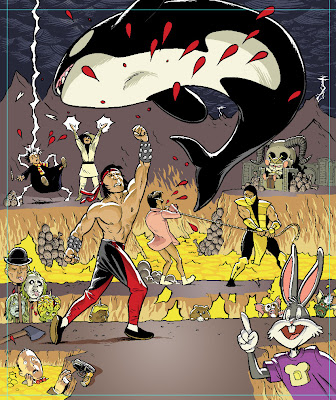
I'm usually simple man with a simple plan when it comes to special effects in Photoshop, but I needed to give this drawing the sense of unreality that Mortal Kombat has, so I wanted to do two things: give the white highlights a glow, and screen down the background line art. In order to do this, I moved the final, flattened color art back to my line art file and then went in to adjust the colors of the lines.
ATMOSPHERIC DISTANCE
I wanted to give the heated air above the lava pit a sense of thickness, so I placed a low-opacity layer of yellow over the background areas of the color layer, and then went in with the pencil tool and colored the line art of those background a dark brown. It's hard to notice the difference except when it's next to a stark black line, but it really works to push those characters back to the background.
I also colored the line art of the flames and the lightning to add to their effect.
GLOW
What I did with the glow for this final step is:
1. Select the line art with the magic wand tool.
2. Go to the white highlight layer, and delete. This should delete all of the white that was under the lines.
If you look very closely, you can see that it trimmed away a tiny bit of the white. This is because the White layer is going to be above the line art layer, and we don't want it to block any of the line art.
3. Deselect, then copy the white layer. Name the two identical layers 'White' and 'Glow'. 'White' should be on top of 'Glow', and both layers should be above the Line Art layer.
4. On the Glow layer, make sure nothing is selected, and go to Filter>Blur>Gaussian Blur...
5. This makes the Glow layer blurry. In fact, if you're not looking very closely, it may seem to have disappeared altogether. But it's there. The White layer provides the harsh white light, and the Glow seeps the light out over the black and surrounding colors.
PRINTED IMAGE
 And there we go! What do ya think?