Here's a video postcard of the best Italian food truck in the Twin Cities, put together by the Delmont brothers. If you like the design of the truck, that's great, because Zander and I may have had something to do with it...
Tuesday, November 22, 2011
Saturday, November 19, 2011
Evolution Makes YALSA, Maverick Lists
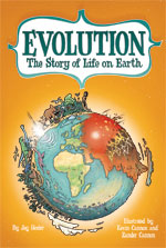
First, the book is a nominee for YALSA's 2012 "Great Graphic Novels for Teens."
Second, and most exciting, is the inclusion in the Texas Library Association's "Maverick Graphic Novel Reading List."
Thank you, YALSA, and TLA -- we're honored!
Wednesday, November 02, 2011
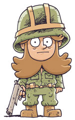
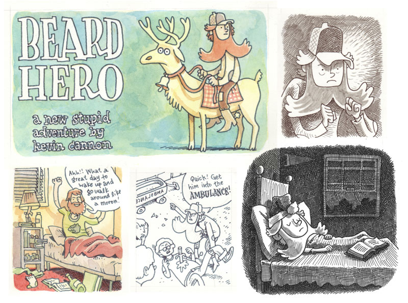
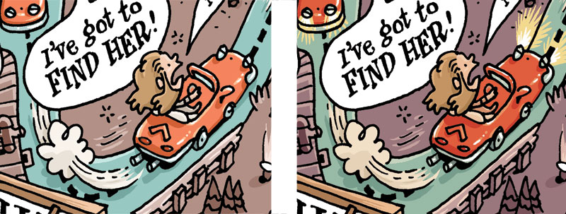
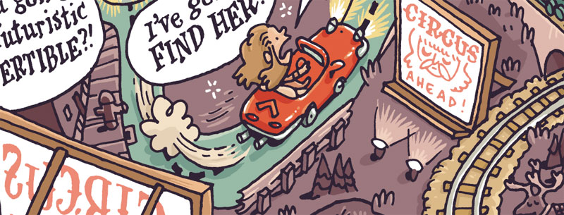
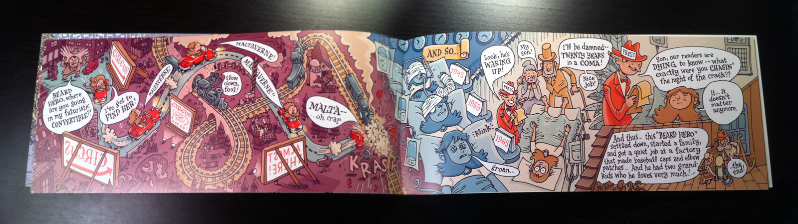
The Making of a Mini-Comic: Beard Hero
 I don't do a lot of mini-comics these days -- for various reasons -- but a few weeks ago I had a burst of inspiration and decided to get something produced in time for MIX. MIX is, of course, the biggest and best indie comix convention in Minnesota, and is celebrating its last year in existence this weekend. You should totally go.
"Beard Hero" is a condensed version of a much longer story that I've been toying with for the last few months. Unfortunately its sheer size was keeping me from actually sitting down and drawing any of it, because long projects, well, take a long time and can be exhausting to even think about. So I decided to compromise and just take the heart of the story and turn it into a mini, and frankly I think it's more interesting because of its condensed nature. The reader can fill in the gaps and frankly it's a one-gag story that probably wouldn't have been able to carry a big tome.
So because I like showing process, here is an annotated look at how I created this mini. I hope you enjoy.
Step 1: Story
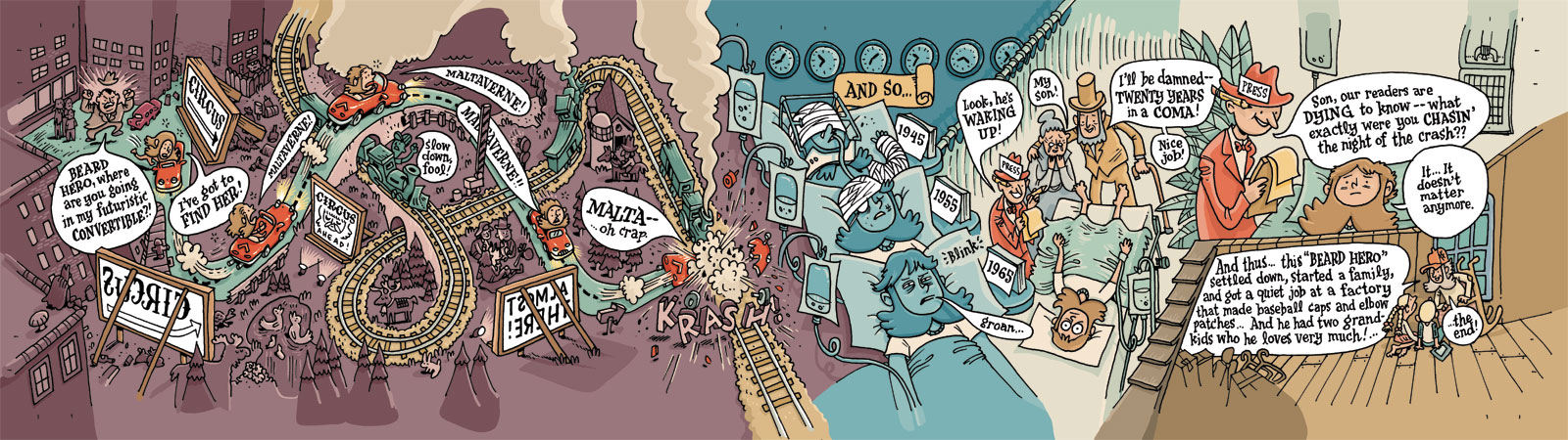
The story was already written, albeit in detailed notes, in a google doc somewhere. It's about a six year old boy who wakes up with a full beard, and his parents take it as a sign that he's now a man and they send him off to war and other various adult-only activities. Along the way the boy falls in love with a bearded circus girl whose visage he sees only on posters and advertisements, and he spends the rest of his life trying to meet her in person. So that's the story in a nutshell. The trick is to fit it all in the size of a mini-comic. That's the next step.
Here are some doodles that eventually inspired the full story:
Step 2: Figuring out the Specs
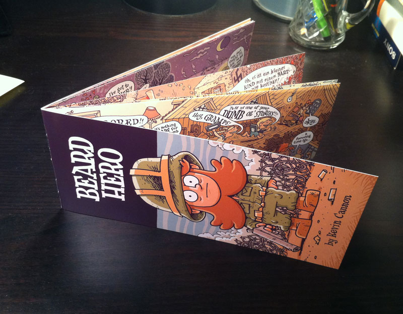
Since this is a peripatetic story, I wanted the mini to have ridiculous, landscape-driven proportions. I also wanted to try a new printing technique, where I would print the entire mini on both sides of an 11x17" poster. Thus, I decided to cut the poster lengthwise three ways, folding in the middle, so that I would end up with a 12 page mini where each page was 3.66" high by 8.5" wide, which would give a maximum length of 17" when the book is opened to an interior spread.
I used a vendor called NextDayFlyers.com for the cover of Just Add Ink, liked their product, and decided to use them again. So I priced out what it would cost to print on a double-sized 11x17 sheet of 100 lbs paper with a 1-sided cover on 14pt card stock. Here's the sheet where I chicken-scratched all that stuff, and figured out pagination.
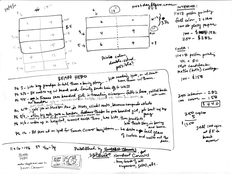
Step 3: Script
I usually like to script out every shot and word balloon before I start drawing, but I wanted this mini to have a more kinetic feel, so I just wrote dialogue on the fly. But I didn't want to leave anything out, so I wrote down what I wanted to have happen on each spread (see the notes page above). If you read the final comic you'll be able to tell that by the end of the story I was leaving out old plot points and adding new ones as the story demanded.
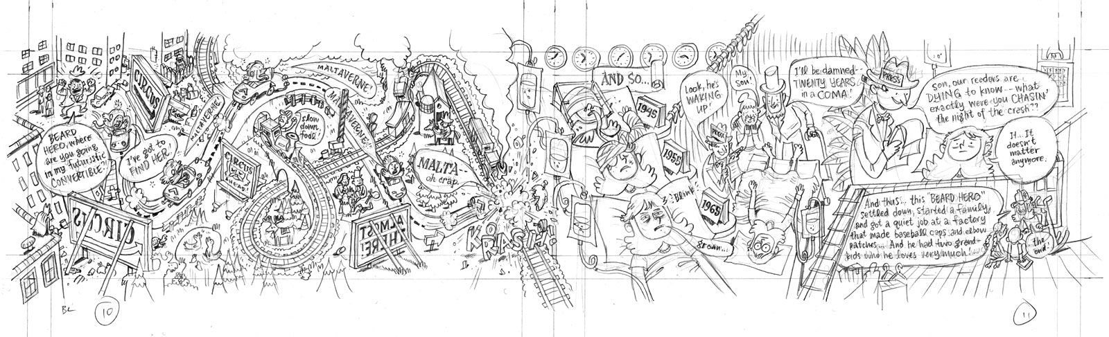
Step 4: Loose Pencils
Now the fun begins. Since there are no panels in this particular comic, the trick was to fit everything in, word balloons and all, while still maintaining a readable flow throughout the page. On a few occasions I drew out the page on a scratch sheet, but normally I just dropped everything in loosely with a light pencil. Here, I'm drawing on a thick Xerox paper I like, called Color Xpressions Planet 20, #3R11811, 12x18". It's heavy, like bristol, but pen & brush pen ink dry on it really fast, so it's virtually smudge-proof (at least with the tools I've used). The pencil I'm using for this stage is a hard lead 2H, applying very light pressure so it's easy to erase.
Note that in this image and the next one I've beefed up the contrast so you can see the lines, but in reality the lines are pretty light.
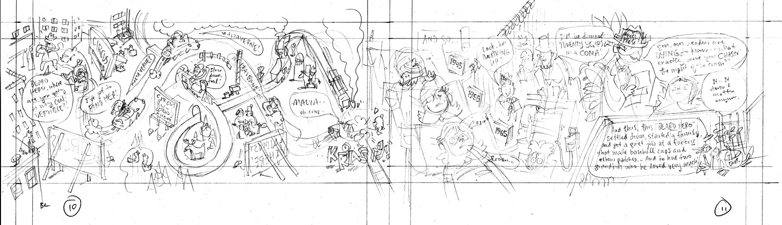
Step 5: Tight Pencils
If everything looked good I went back over the lines with a darker pencil -- nothing fancy, just a drugstore No. 2 Bic mechanical pencil. There was no need to eras or alter the light pencils underneath; I just went over them with the darker pencil and made changes along the way.
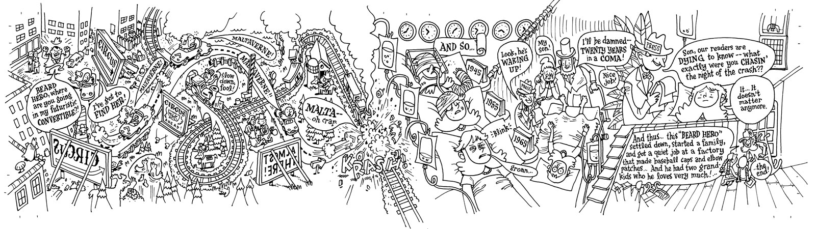
Step 6: Inks
I find that the penciling is the most stressful part of the process, because that step requires the most juggling & problem-solving. The inking stage, however, is a lot more relaxing. Even though I need to be precise and everything, this is the stage when I can crack open a Molson, tune in a hockey game, and turn off most of my brain. For this book I used a Micron 01 for all art, and a Micron 005 for the lettering. Both are available at any art store worth a dime.
Step 7: Scanning
Scanning this was pretty basic. I drew it at size, meaning that the final book would be the exact same size as the original art. Most cartoonists draw larger, usually at 150%, and then shrink the art down when they print it. This makes the art look cleaner and tighter. However, for this book, and for a lot of my work, I want to keep that gritty look, hence drawing at size.
At work we have a large scanner that could easily scan this 4x17" art right at 1200 dpi, no problem. Unfortunately I was at home using my crappy low-budget scanner, so this is how I get to a good scan:
- Scan each section of the art at 600 dpi grayscale (no correction)
- In Photoshop, use the ruler tool to level each section.
- Drop each section into one big canvas and, with each layer on "multiply", line everything up.
- Turn off "multiply" and flatten the canvas. Crop as needed.
- Gaussian blur at 1.0
- In the Image Size window, upsize to 1200 dpi using "bicubic smoother".
- Adjust levels (to your preference).
- Change mode to bitmap, 1200 dpi, at 50% threshold.
- Save your file. Include the info "lineart", "bitmap" and "1200" somewhere in the file name. (e.g. "BH_lineart_bitmap_1200.psd")
To start coloring, I like to flat big sections of the canvas and drop in my basic colors to set the palette. It's a lot easier to change the palette at this stage than later when you're dealing with tons of little details. I prepped my files like so:
- Always "save as" first so you don't overwrite the original lineart. (e.g. "BH_color_600.psd")
- Change image size to 600 dpi using "nearest neighbor." Go down to 300 dpi if you have a slow computer.
- Change mode to grayscale, then to CMYK.
- In the layers palette, double-click on the background to turn it into a layer. Name it "inks." Set it to multiply at 50% opacity.
- Create a new layer underneath called "flats". If you want to be a huge nerd call it "Stochastic Flats" -- it's an Alan Moore reference.
- Choose pencil tool (NOT the brush tool) and set the size to something small like 20 px.
- Start drawing your big shapes of color. Having the "inks" layer set at 50% allows you to see where the edge of your color planes go -- obviously you want to tuck your planes under the lineart so there's overlap.
- Note that there are many ways to flat your art. Some people use the lasso tool, some people use the BPelt plugin. Here, I'm using a pencil.
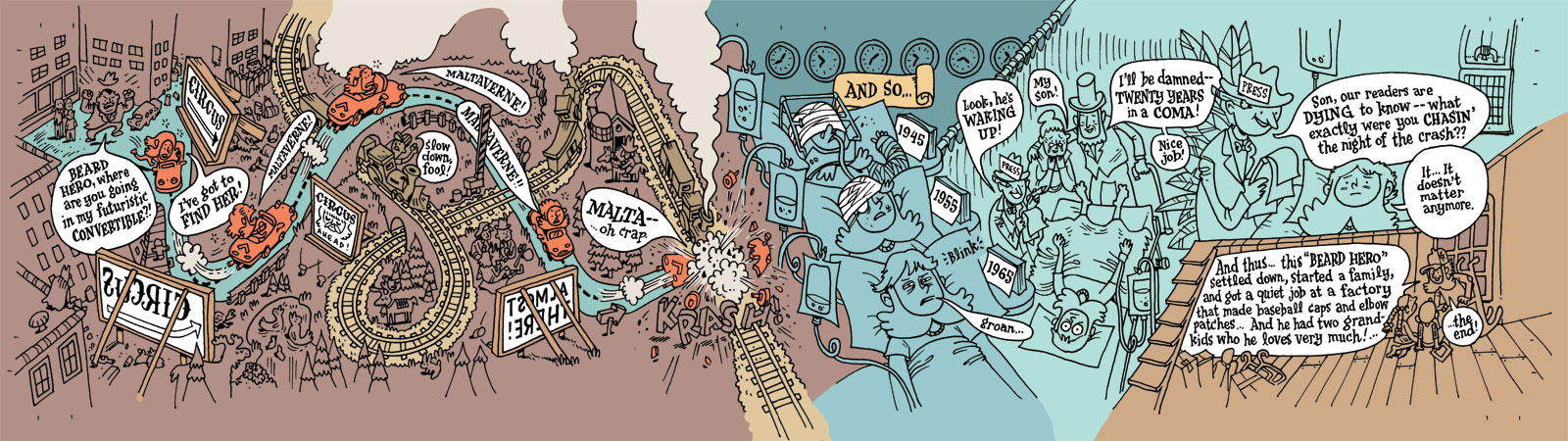
Step 9: Final Colors
I was pretty crunched for time on this project, so I tried to limit the amount of fancy photoshop work I would do. Which is fine, because I try to stay away from lens flares etc. anyway... Here's an example of the level of detail I dropped in after the flats were finished. Again, this is all done with the pencil tool. Note that the lineart looks washed out because it's at 50% opacity.

I use the pencil tool at a high resolution (instead of say, the brush tool at a low resolution) because that allows me to go back in and easily change colors with the bucket tool.
Okay, so after I finished all the detail work I wasn't quite satisfied with the colors, so I played around with color adjustment tools. Here's a snapshot of the layers so you can see what all happened:
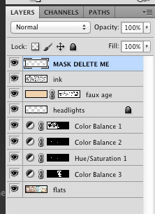
From top to bottom:
- MASK: This is a white border I put around the trim lines so I know what the page will look like when printed. This layer gets trashed before printing.
- INK: The lineart at 50% opacity. This layer will also get trashed before printing (more details later).
- FAUX AGE: This is a cream color that sits over everything and gives it an aged look. In the mask to the right I've knocked out all whites from the mask, so anything that's white (like word balloons) will retain their crisp whiteness. For this particular faux aging I used the color 5/16/34/0 on multiply at 50% opacity.
- HEADLIGHTS: I added headlights to Beard Hero's car.
- COLOR BALANCE & HUE SATURATION: These are a bunch of adjustment layers I messed around with to get the colors I wanted. As you can see, they each have masks attached to them because I was doing very surgical adjustments as opposed to one big global adjustment.
- FLATS: The original flat colors.
... and the whole spread:
Step 10: Post Production
Next I create an InDesign file at the print size, which will be 11x17", double-sided. I then import the flat color file for each page, and then add the 1200 dpi bitmap lineart layer on top (and make sure they're aligned perfectly). For this particular book I split the lineart layer into three distinct files because I wanted three distinct colors: black, white, and red. Here's a detail of how it turned out. Note that the billboard lettering is now red.
Why have both CMYK files and bitmap files in InDesign? Because by keeping your lineart (your ink lines) on a top-level bitmap file, you can keep your lines crisp while keeping your press-ready file size LOW. To see an example, look through the ads in your local alt weekly newspaper. Most have crisp lettering and low-res art. That's because the lettering is separate from the art in InDesign. Now look around until you see an add with blurry lettering. That ad was probably created in Photoshop and was exported at 300 dpi (which is way too low for fine detail). I'll do a blog post later on exactly how to construct this file in InDesign if people want to see it.
Step 11: Print, Collate, Sell
Okay, the rest of the process is pretty obvious. I sent the files to the printer, waited a few weeks, then a few days ago received a 25 lbs shipment with all the pages -- cover and interior -- and everything looks great (phew)! I painstakingly cut the 11x17 poster pages down to 3 2/3" x 17" strips (because I didn't give myself any room for bleed) and stapled them with my handy long arm stapler.
And viola!
If you'd like to learn more, or ask questions directly, I'll be giving a lecture on Photoshop fundamentals on January 5th, and InDesign fundamentals on February 2, 2012, as part of the Nordeast Comics Summit. There's no info on the site just yet, but check back closer to the date for full details. And feel free to leave any questions in the comments section below!
FINALLY... please come to MIX on Saturday and Sunday and if you want to drop five bucks on Beard Hero, I won't stop you.
If you can't make the convention but would like to purchase a copy, here's the solution for that:
Sunday, October 30, 2011
Food Fight!
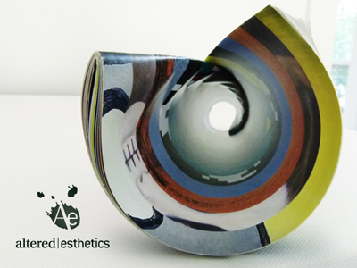
I'm happy to report that I've got some artwork in November's Altered Esthetics "Food Fight" show! While I've been behind the scenes for the AE comics shows over the last few years, this is the first time I've submitted work to a NON-comics show -- you know, like as a regular Joe Artist. So it's pretty exciting to have work accepted by the curatorial team.
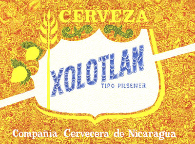
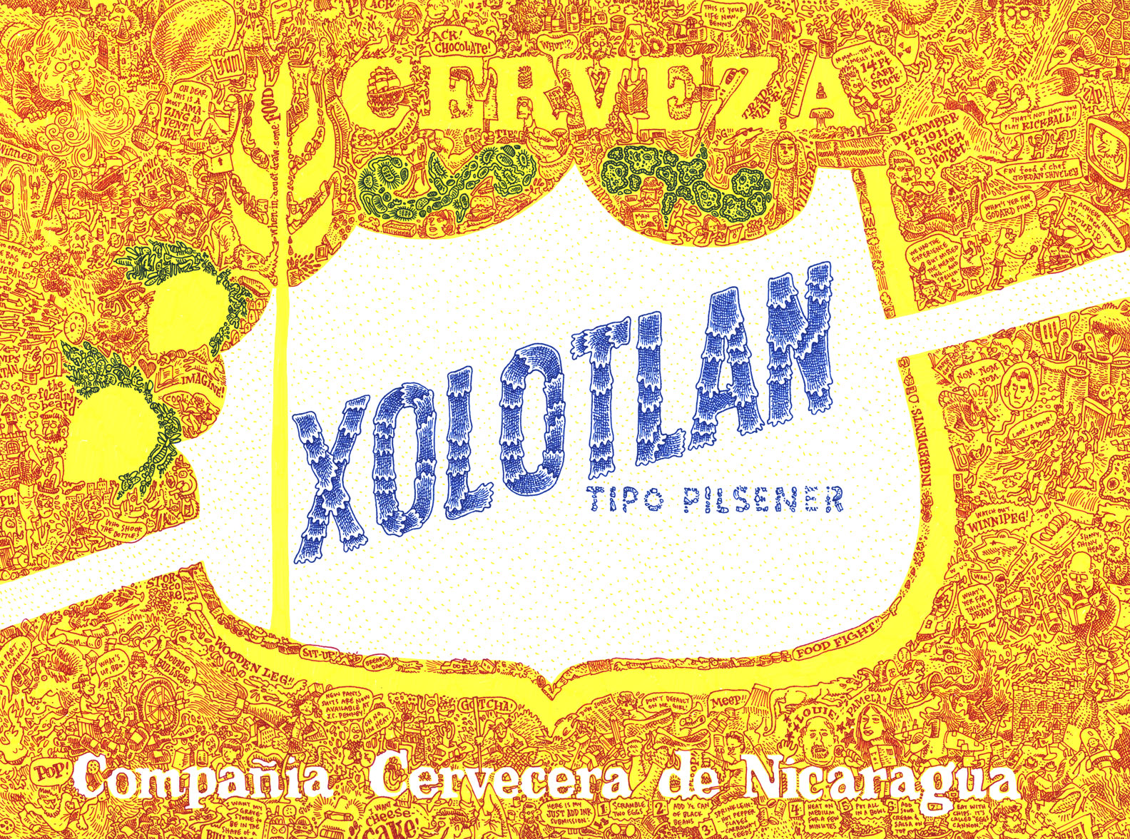
This is "XOLOTLAN" and it's pretty much the most fun I've ever had drawing anything. Please click on the image to view it in detail. See if you can find the caricature of Louis CK.
Anyway, this piece will be part of AE's "Food Fight" show, which opens on Thursday, but the big opening reception is on Friday night. Because MIX parties are also happening on Friday, I will probably start at AE at 7pm, hang out for a little while, and then wander down south to Pink Hobo.
Thursday, October 27, 2011
Help print Altered Esthetics' 2012 Artists Calendar!
Our very own Zander Cannon drew the image for November, as he will be the featured artist for "Lutefisk Sushi: Volume E." Yes, that's "E" as in "E"veryone should chip in. As an added incentive, if AE reaches their goal, we'll post Zander's image here on the blog. If not, well, it will disappear into the ether...
So, please go HERE to donate!
... And here's more info from our good friend Lupi:
Hi, I’m Lupi. I help direct press and communications at Ae, and I’d like you to check out the kickstarter page for Ae’s 2012 calendar. Ae didn’t have a printed calendar for 2011, and a lot of people missed that. I hope we can raise funds to print one for next year.
As you know, Ae is the non-profit gallery in Northeast Minneapolis that collaborates with the Cartoonist Conspiracy each year on a comics exhibition. The Ae board is made up of volunteers who donate hundreds of hours of their time to organize 14 group exhibits each year, plus workshops and a solo exhibitions program.
We work hard to keep our shows inexpensive and accessible for artists, and we encourage all styles and media. If you appreciate what Ae does for the artistic community (and the cartooning community), show some love by helping us print our 2012 calendar. A pledge of only $5 gets you an art calendar, which you can pick up at the gallery. For a pledge of $10, we’ll mail it to you. That’s a fraction of the cost of driving to a store and buying a mass-produced calendar. If you plan on participating in Lutefisk Sushi or any other Ae events next year, this calendar is nice to have, because it lists openings, deadlines, and workshops.
Wednesday, October 26, 2011
MIX Sponsorship Map
As you're well aware, I'll jump at any chance to draw a goofy map of the Twin Cities, so fortunately Sarah Morean didn't roll her eyes too hard when I pitched the idea of drawing a map of all the sponsors of the Minneapolis Indie Xpo. So here is the finished product!
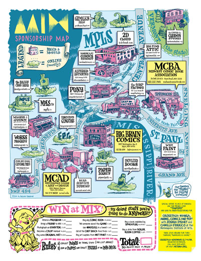
This map will be printed on the back of the catalog, so go to MIX early on Saturday morning and get a hard copy for yourself. The first 500 attendees will also get a free MIX ballpoint pen so you can fill out the scavenger hunt game on the bottom there.
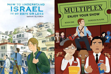
Speaking of MIX, I am also sponsoring two celebrity cartoonist panels that you should attend on Saturday and Sunday. They involve Pizza Island star Sarah Glidden and local digital guru Gordon McAlpin. Full details on the Nordeast Comics site. See you there!
MIX is a little over a week away! November 5 & 6 at the Soap Factory.
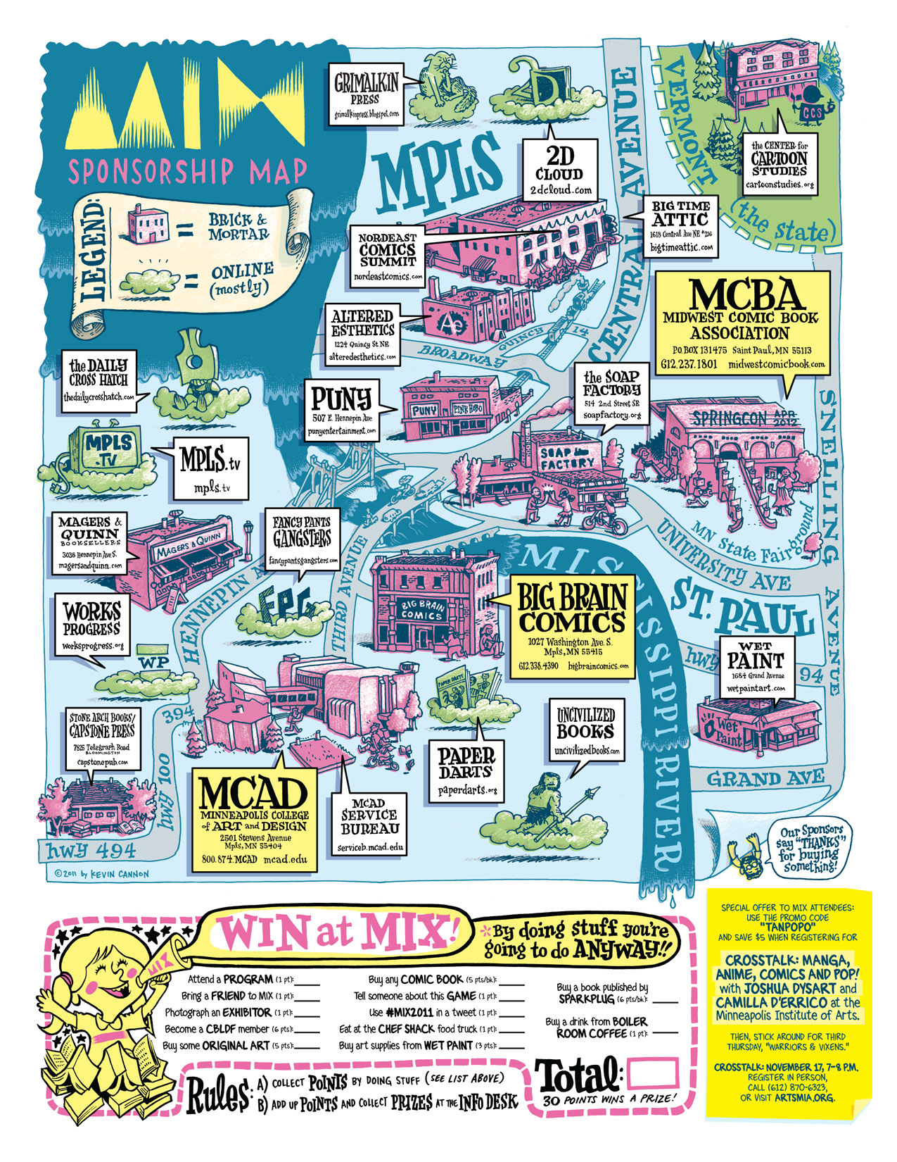
This map will be printed on the back of the catalog, so go to MIX early on Saturday morning and get a hard copy for yourself. The first 500 attendees will also get a free MIX ballpoint pen so you can fill out the scavenger hunt game on the bottom there.
Speaking of MIX, I am also sponsoring two celebrity cartoonist panels that you should attend on Saturday and Sunday. They involve Pizza Island star Sarah Glidden and local digital guru Gordon McAlpin. Full details on the Nordeast Comics site. See you there!
MIX is a little over a week away! November 5 & 6 at the Soap Factory.
Tuesday, October 18, 2011
Big Time Attic Featured in The Journal
Jeremy Zoss wrote a great profile of Big Time Attic in this week's Journal (we found it in the NE Journal, but I'm told it's printed in the SW Journal as well). Anyway, thanks for the ink, Jeremy!
Click on the image below to see a larger version. But if want to actually read the text, go to the Journal's online version of the article.
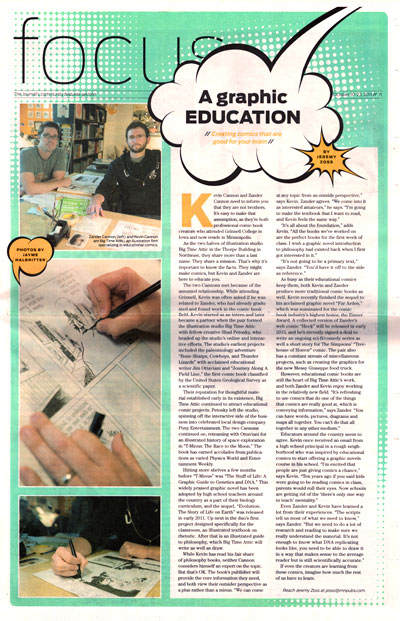
If you're local, go pick up a copy! It should be on news stands until October 23.
Click on the image below to see a larger version. But if want to actually read the text, go to the Journal's online version of the article.
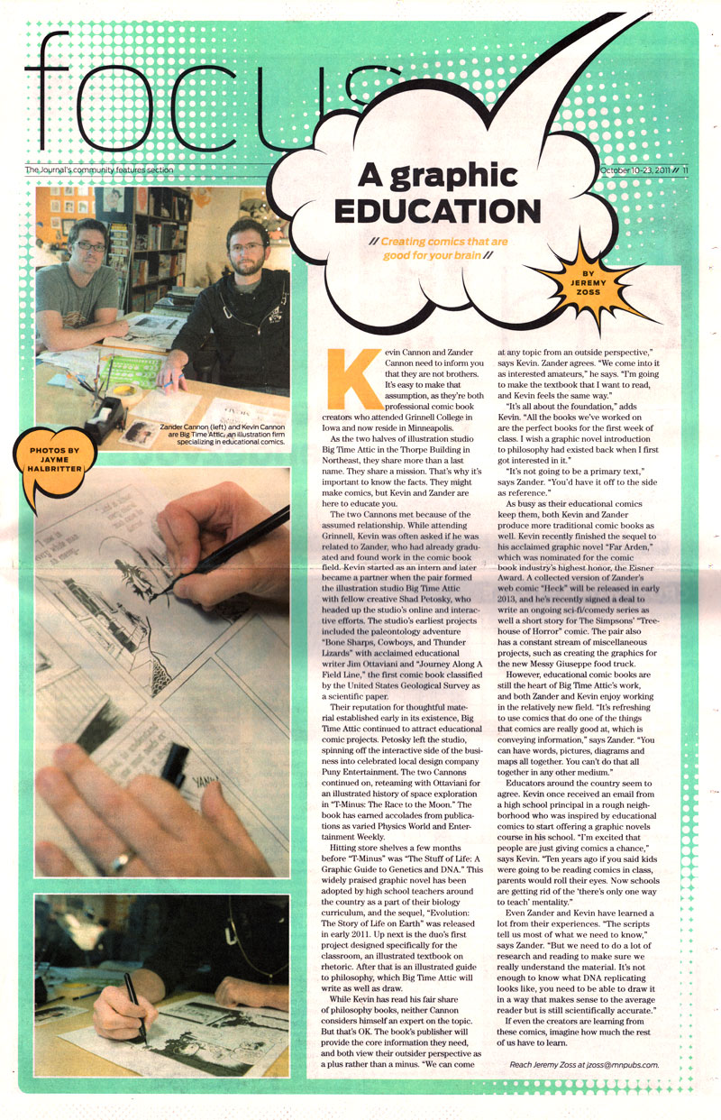
If you're local, go pick up a copy! It should be on news stands until October 23.
Wednesday, October 12, 2011
Huge Convention Weekend Summary
... or more appropriately, "Summary of Huge Convention Weekend."
You have a ton of options for comic book conventions this Saturday, and I highly recommend the three that I know about. In no particular order:
1) RAIN TAXI BOOK FEST
SATURDAY, OCTOBER 15, 10am-5pm
Minneapolis Community & Technical College
1501 Hennepin Ave, Downtown Minneapolis
This one is actually a book festival with an increasingly heavy emphasis on the sequential arts. Big Time Attic has had a table there for most of the last seven years, and it's been great to watch the evolution of book lovers' reactions from "What's a comic book?" to "These are awesome! I'll take one of each."
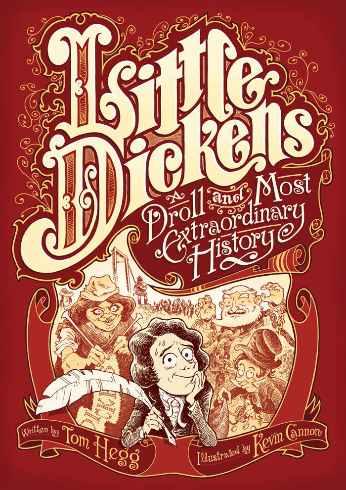
This year I'll be premiering a brand new book, not a comic book mind you but an honest to goodness illustrated long-form poem, written by my old friend and mentor Tom Hegg.
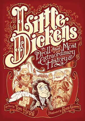
To that end, I'll be signing books with Tom Hegg at the Nodin Press table from 2-3 pm. You should buy lots and lots of copies. Your Christmas shopping could be finished by Saturday afternoon.
Also catch me on a panel discussion about the subject of "place" in literature from 12:30-1:30 pm. The panel is made up of poets, photographers, artists, novelists ... and they even let a cartoonist sit up there to provide some color commentary.
The entire day, from 10 am to 5 pm, Big Time Attic, the Cartoonist Conspiracy, and Altered Esthetics will all have a table together in the comics alley. I'll be selling the aforementioned Little Dickens, as well as Far Arden & Evolution, but you should really stop by and pick up a copy of Just Add Ink, the comic cookbook that came out in August.
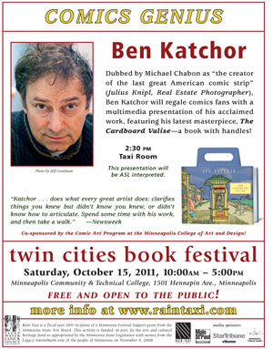
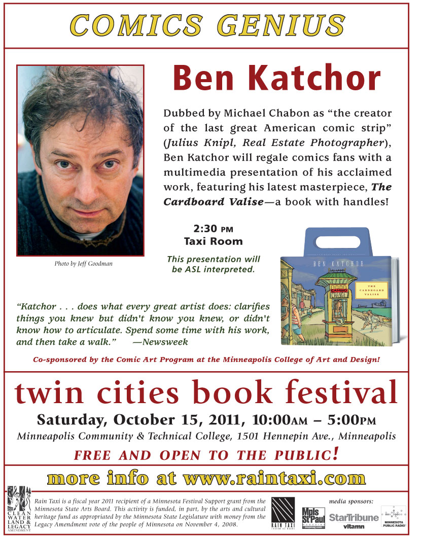
Also, bonus, Ben Katchor will be at Book Fest, and will be giving a talk at 2:30pm! The man is a genius, and his Julius Knipl book is one of the first comic books I read after college and it really made me rethink the modern punchline. Click this little image for more info:
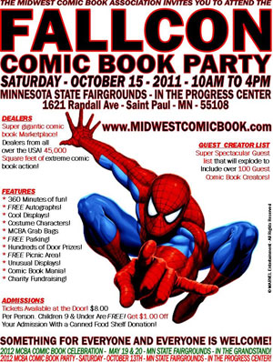
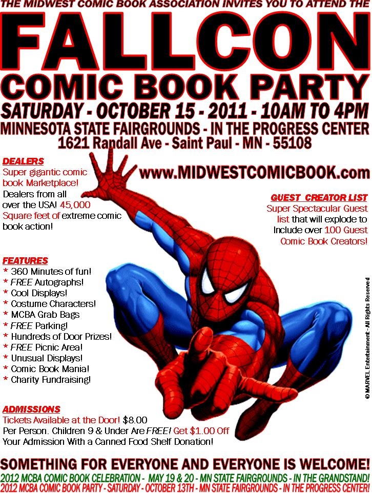
SATURDAY, OCTOBER 15, 10am-4pm
MN State Fairgrounds, in the Progress Center
1621 Randall Ave, St. Paul, MN
I am sad to miss this one as there are going to be many cool comics creators there, and the MCBA always puts on a great show. If I were you, I would spend the morning at Fallcon, and then jet over to the Rain Taxi Book Fest for the afternoon.
SATURDAY, OCTOBER 13-16
Javits Center, Manhattan
I don't know much about the New York con except that Zander Cannon will be there showing off his brand new vinyl banner, so go say hi and buy some books from him so he doesn't have to lug them back on the plane.
You have a ton of options for comic book conventions this Saturday, and I highly recommend the three that I know about. In no particular order:
1) RAIN TAXI BOOK FEST
SATURDAY, OCTOBER 15, 10am-5pm
Minneapolis Community & Technical College
1501 Hennepin Ave, Downtown Minneapolis
This one is actually a book festival with an increasingly heavy emphasis on the sequential arts. Big Time Attic has had a table there for most of the last seven years, and it's been great to watch the evolution of book lovers' reactions from "What's a comic book?" to "These are awesome! I'll take one of each."
This year I'll be premiering a brand new book, not a comic book mind you but an honest to goodness illustrated long-form poem, written by my old friend and mentor Tom Hegg.
To that end, I'll be signing books with Tom Hegg at the Nodin Press table from 2-3 pm. You should buy lots and lots of copies. Your Christmas shopping could be finished by Saturday afternoon.
Also catch me on a panel discussion about the subject of "place" in literature from 12:30-1:30 pm. The panel is made up of poets, photographers, artists, novelists ... and they even let a cartoonist sit up there to provide some color commentary.
The entire day, from 10 am to 5 pm, Big Time Attic, the Cartoonist Conspiracy, and Altered Esthetics will all have a table together in the comics alley. I'll be selling the aforementioned Little Dickens, as well as Far Arden & Evolution, but you should really stop by and pick up a copy of Just Add Ink, the comic cookbook that came out in August.
Also, bonus, Ben Katchor will be at Book Fest, and will be giving a talk at 2:30pm! The man is a genius, and his Julius Knipl book is one of the first comic books I read after college and it really made me rethink the modern punchline. Click this little image for more info:
SATURDAY, OCTOBER 15, 10am-4pm
MN State Fairgrounds, in the Progress Center
1621 Randall Ave, St. Paul, MN
I am sad to miss this one as there are going to be many cool comics creators there, and the MCBA always puts on a great show. If I were you, I would spend the morning at Fallcon, and then jet over to the Rain Taxi Book Fest for the afternoon.
SATURDAY, OCTOBER 13-16
Javits Center, Manhattan
I don't know much about the New York con except that Zander Cannon will be there showing off his brand new vinyl banner, so go say hi and buy some books from him so he doesn't have to lug them back on the plane.
Monday, September 05, 2011
Wally Wood Said It Best...
If you haven't seen a lot of posts from me and Zander in the last year, we apologize! We've just been very, very busy with really cool projects, and stuff like blog posts have fallen to the wayside as a result.
Wally Wood summed up our current situation very well in the last few panels of the premiere issue of "Cannon":
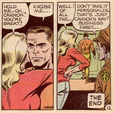
...Except that it's not "the end" of our blog! Keep checking back because we'll eventually post some sneak peeks of these projects that are eating up all of our time...
Wally Wood summed up our current situation very well in the last few panels of the premiere issue of "Cannon":
...Except that it's not "the end" of our blog! Keep checking back because we'll eventually post some sneak peeks of these projects that are eating up all of our time...
Sunday, August 14, 2011
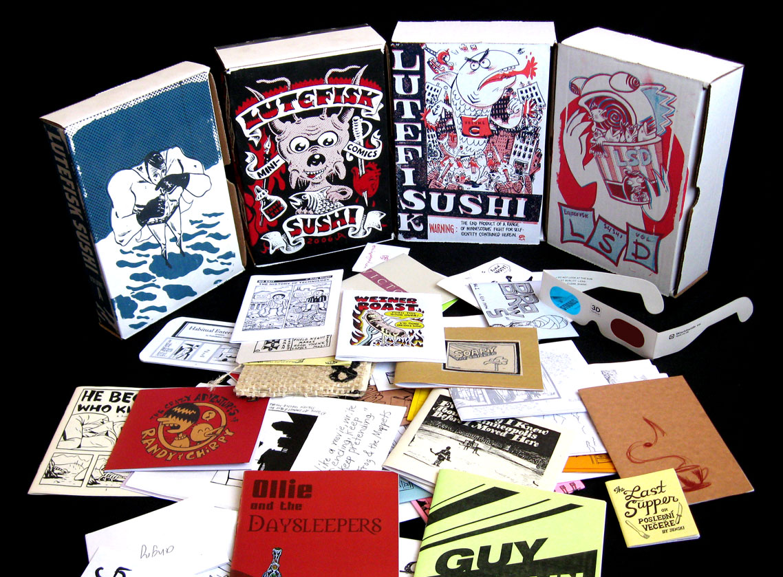
Lutefisk Sushi: Volume E -- The Ballot Boxes Are Open!
Hey cartoonists!
Minnesota's premier comics art show LUTEFISK SUSHI is back for its fifth season in 2012. While the opening reception is over fifteen months away, we need to decide on a featured artist ASAP! As in past years, the featured artist will design the sushi box, and will have a whole wall devoted to their artwork during the gallery show at Altered Esthetics in November, 2012. See websites of past shows here.
NOMINATION PROCESS:
To nominate a cartoonist, please send the following info to nordeastcomics [at] gmail.com:
- The artist's name
- The artist's website (if there is one)
- The artist's email (so we can contact them to confirm if they want to run)
NOTE: Artists must reside in Minnesota or have some strong connection to the state.
NOTE: If an artist does not wish to be nominated, or does not respond to us before August 25, they will not be listed as a nominee.
CALENDAR:
August 15: Nominations open
August 25: Nominations close; Voting begins
September 1: Voting closes at noon; Winner is formally announced at 6pm at the Nordeast Comics Summit, and online.
VOTING PROCESS:
As in past years, voting will take place on www.cartoonistconspiracy.com/conspire. So jump on that site between August 25 and September 1 to vote! Voters must register on the Cartoonist Conspiracy website (it's free). Voters may vote only once.
Past featured artists are Vincent Stall, Ken Avidor, Kevin Cannon, and Danno Klonowski.
Questions? Post them in the comments section below.
Monday, July 04, 2011
Mealtime Hero Viral Video
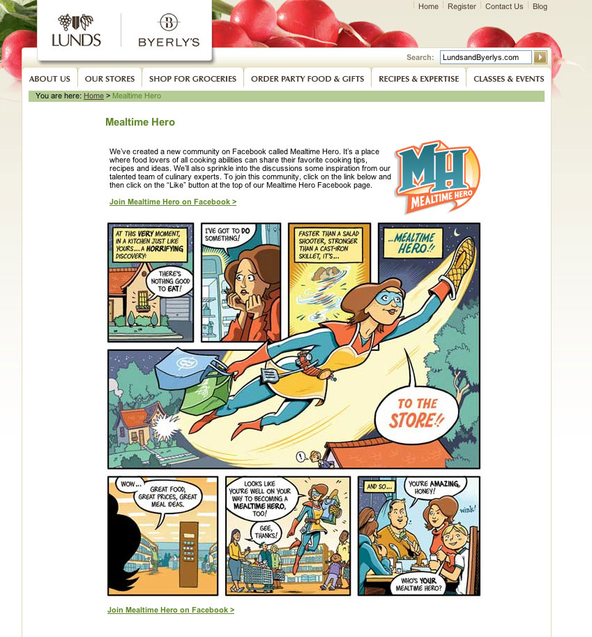
Nearly two years ago Zander and I were asked by Lunds & Byerly's to create a superhero character for their Mealtime Hero campaign. The campaign launch coincided with the revamp of their Golden Valley Byerly's store, and they printed some life-size cardboard cut-outs of our character for the grand opening event.
Here's a small jpeg of the cut-out as well as a screencap of the online comic we produced:
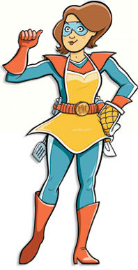

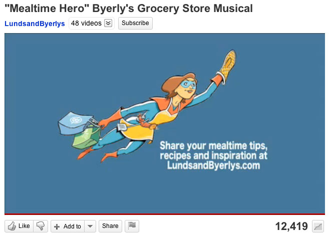
Today I stumbled upon a youtube video showing another aspect of Byerly's campaign -- a surprise in-store musical put on by U of M opera students. Quick eyes will spot our cut-out at 0:07 and also at the end of the video. For those of you with slow eyes, here are some screencaps:
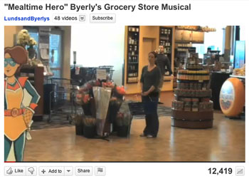

And here's the full video, for your viewing pleasure. Turn up your speakers:
To date, this is the most musical theater I have ever been a part of.
Here's a small jpeg of the cut-out as well as a screencap of the online comic we produced:
Today I stumbled upon a youtube video showing another aspect of Byerly's campaign -- a surprise in-store musical put on by U of M opera students. Quick eyes will spot our cut-out at 0:07 and also at the end of the video. For those of you with slow eyes, here are some screencaps:

And here's the full video, for your viewing pleasure. Turn up your speakers:
To date, this is the most musical theater I have ever been a part of.
Wednesday, June 22, 2011
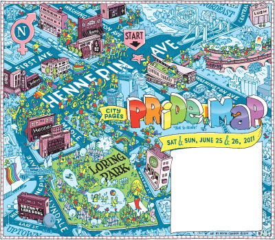
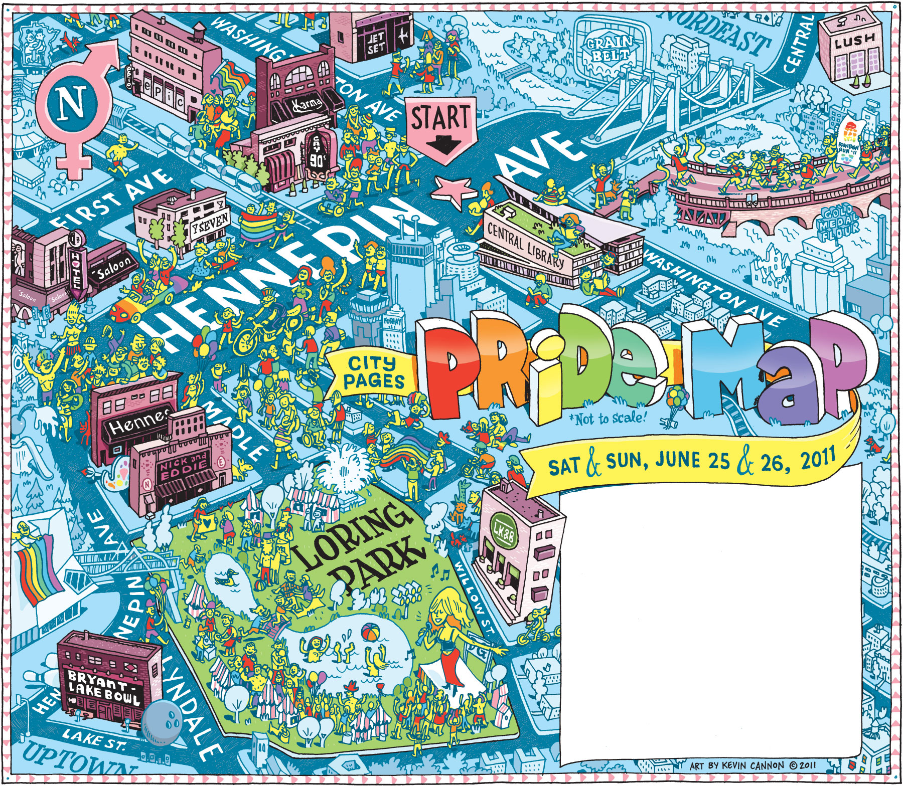
City Pages Pride Map
Some more cartography for you. This is a somewhat navigable map of Downtown Minneapolis, highlighting some of the events and locales from Pride Week 2011. Click the image below for a high resolution version. Visit City Pages' blog to learn more about the map and to see some of the preliminary sketches I sent to the art director.
Tuesday, May 03, 2011
Just Add Ink -- Comics due JUNE 15
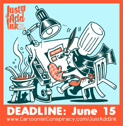
JUST ADD INK: A COMIC COOKBOOK is this summer's blockbuster comics show at Altered Esthetics. Instead of a box of comics or a newspaper of comics, this year we're making a COOKBOOK of comics. Draw whatever you feel like as long as follows the theme of cooking -- Could be an illustrated recipe, a kitchen horror story, or even a "recipe" for how to make great comics (meta, right?).
Like with any good recipe, you need to follow the guidelines EXACTLY. The submission guidelines pdf can be downloaded here!
BONUS: This year a limited number of artists will be REIMBURSED for a big portion of their printing costs! Again, details here.
Good luck, and please TELL YOUR FRIENDS! The more pages in the anthology the
Wednesday, April 13, 2011
Some Recent Watercolor Illustrations
This fall I'll be coloring a graphic novel for a major publisher so I thought it might be time to get out the ol' watercolor tray and take a crack at this subtle yet unforgiving medium. Unforgiving because unlike digital coloring I can't paint on disposable layers or magically hit the UNDO button.
To begin, I reviewed some of my old watercolor "how to" books, but in the end I found it more interesting and educational to crib off the process blogs from watercoloring cartoonists like my old pal Sam Hiti and Pizza Island guru Sarah Glidden. And if I REALLY needed some inspiration I would just stare at this post all day, by Master of the Watercolor Universe Eleanor Davis.
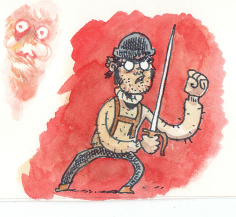
Anyway, the best way to learn is to actually DO something, so here are some sketches, doodled with microns onto Arches hot press paper:

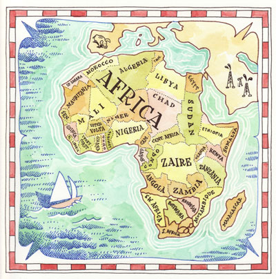
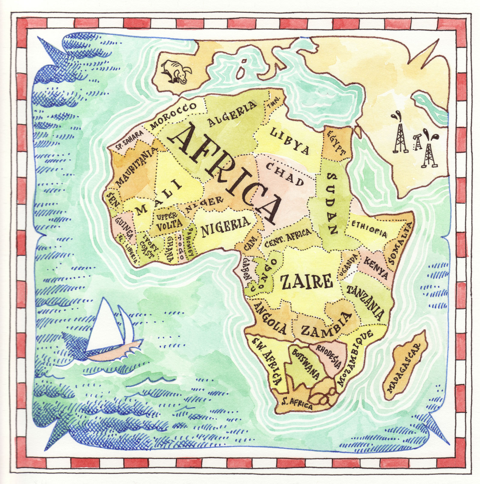
One commission I did recently was a gigantic world map, so here was my "look & feel" sketch for the client. And yes, this was painted BEFORE Sudan split up, so it's not entirely accurate:
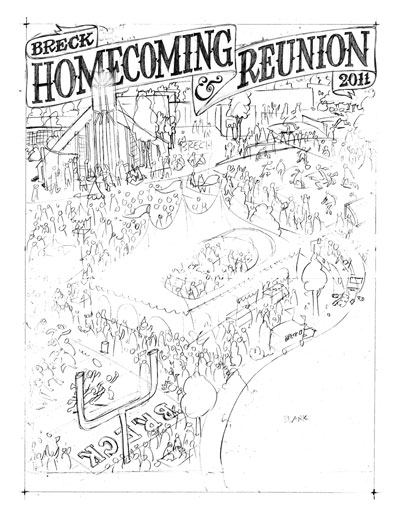
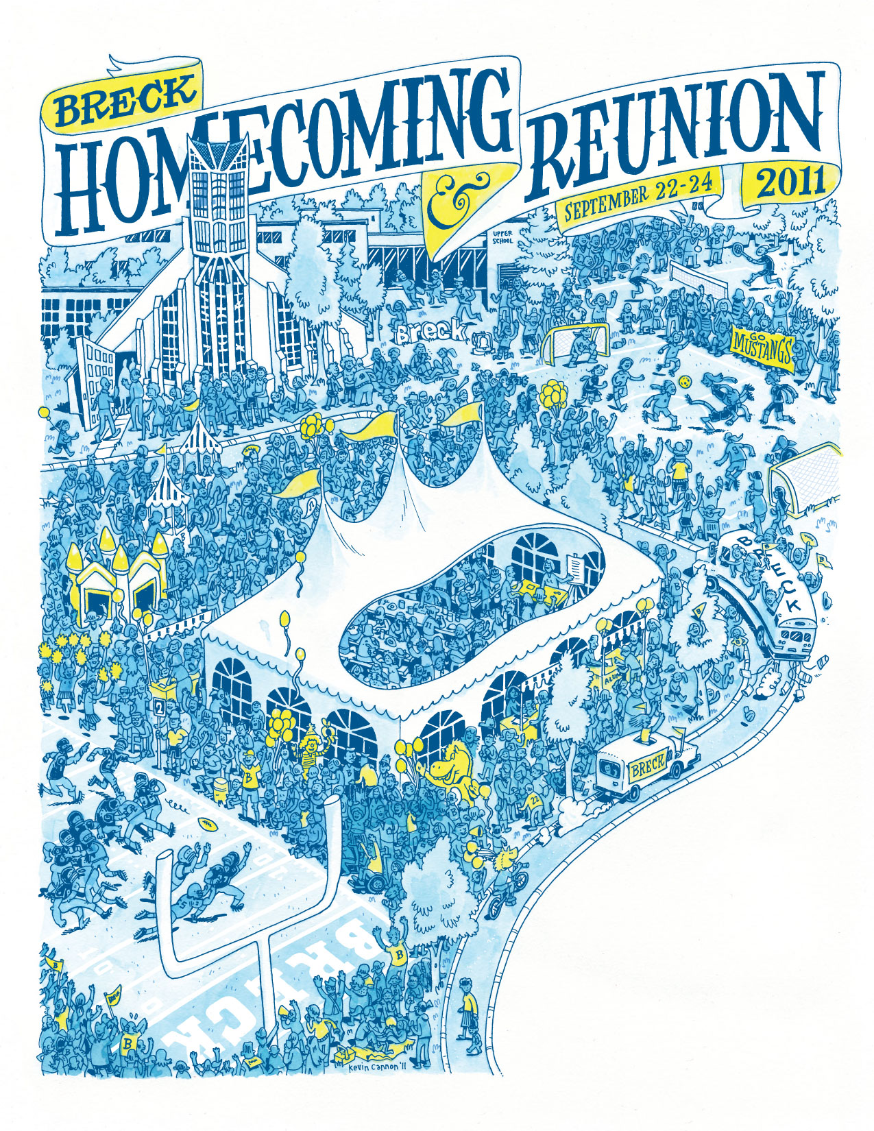
And now another commission, this one for my high school. I usually do computer coloring for their posters, but since I'm on this watercolor kick I thought I'd try out something a little more challenging. For the fun of learning, here are all the steps. You can click on the images to see them in greater detail:
First the rough, at around 150% size. This was done on a thick bristol-like paper I use a lot. Ink bleeds on it a tiny bit but it's soft like butter and mad cheap:
Next, the tight pencils:
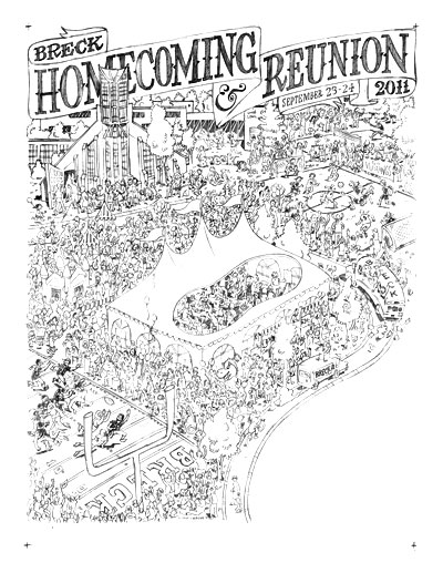
Then the inks. This is all done with an .01 micron:
Then I scanned in the ink and shrunk it down to final size, and changed the black lines to 8% cyan (so light you can barely see it). Then I printed that on a sheet of Arches hot press. Actually, before I printed it I deleted any unnecessary lines, like the words on the banner. That's because when I paint yellow over the 8% cyan it becomes a muddy green, which is bad. Here's how the watercolor turned out:

Then I put the two images together in InDesign. The watercolor is at 300 dpi but the line art layer is at 1200 dpi so it's nice and crisp. As you can see I changed the black lines to blue and made the field lines and some other details white. Although it was difficult to paint over the cyan print-out, I like having the post-production flexibility of being able to change the line art separately from the watercolor layer.

Finally, here's a painting I did for Altered Esthetic's 7th birthday party silent auction. AE has been VERY good to the Minneapolis cartooning community so I thought I'd do something extra time-consuming and hopefully earn them a few bucks during the auction (the auction is April 29, by the way, and you should totally go and bid on this piece or the tons of other great stuff in the show).
This drawing was also done with an .01 micron, but it was drawn right on the watercolor paper. Then I did something really stupid which was to start painting without doing any color samples first. Basically what happened was I started painting in the characters in lots of random colors with no real color scheme and it looked terrible. This is the pitfall of watercolor which is that you can't paint over it like with acrylics and you can't subtract from it so I figured I had just ruined a week's worth of work. Eventually I just painted GREEN over my terrible colors, and after enough layers it looked muddy but at least consistent. Then I painted the rest of the characters green and added some orange coloring to match the muddiness of that first patch. You can see in the lower right how the color looks denser -- that's because there are layers of crappy color I'm trying to hide. Secret's out. And lesson learned: always do test swatches to get your color scheme picked out before jumping into the final.
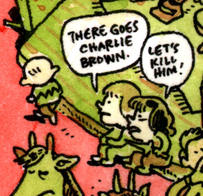
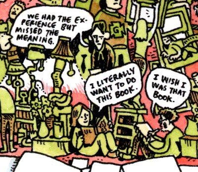
So the painting itself is just a series of random jokes, one-liners, and musings. Here are some of my favorites:
A nod to our neighbor across the river:
T.S. Eliot and some horny bookworms:
This is actual Inuktitut I cribbed from a bilingual arctic newspaper called Nunavut News/North. Each issue has a "man on the street" Q&A (kind of like The Onion does, but for real), and that's where I pulled this from. The first guy is saying something like "What's your best fishing tip?" and the second guy is saying, "Be patient."

Here is the cast of the next Shanks book, which I should really be working on right now instead of blogging:
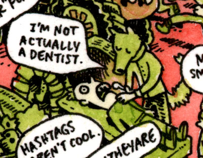
The title of the painting is "I'm Not Actually a Dentist" and this is the gag that the line is from:
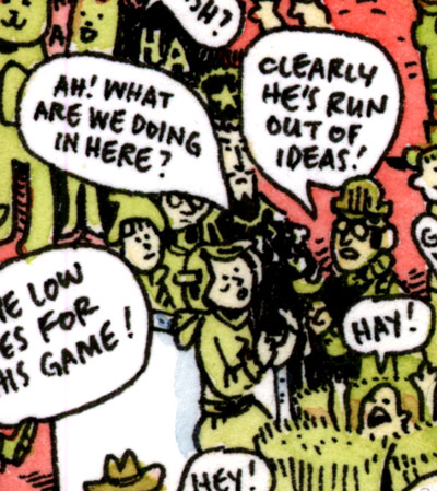
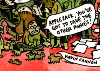
A nod here to Ted Anderson who has openly admitted to buying not one but FOUR happy meals just to get the My Little Pony toys. If you're interested in hearing his defense, it's discussed at length on a recent Geek Report.
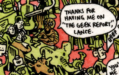
Speaking of the Geek Report, here's a nod to Lance Ward and his ever-evolving crew:
And finally, here's Xeric winner Britt Sabo surrounded by her favorite creatures (not counting ghosts):

As another incentive to come to the Altered Esthetics party on April 29, the gallery printed up posters of this painting that you can have for a small donation. "C U" there!
To begin, I reviewed some of my old watercolor "how to" books, but in the end I found it more interesting and educational to crib off the process blogs from watercoloring cartoonists like my old pal Sam Hiti and Pizza Island guru Sarah Glidden. And if I REALLY needed some inspiration I would just stare at this post all day, by Master of the Watercolor Universe Eleanor Davis.
Anyway, the best way to learn is to actually DO something, so here are some sketches, doodled with microns onto Arches hot press paper:
One commission I did recently was a gigantic world map, so here was my "look & feel" sketch for the client. And yes, this was painted BEFORE Sudan split up, so it's not entirely accurate:
And now another commission, this one for my high school. I usually do computer coloring for their posters, but since I'm on this watercolor kick I thought I'd try out something a little more challenging. For the fun of learning, here are all the steps. You can click on the images to see them in greater detail:
First the rough, at around 150% size. This was done on a thick bristol-like paper I use a lot. Ink bleeds on it a tiny bit but it's soft like butter and mad cheap:

Next, the tight pencils:

Then the inks. This is all done with an .01 micron:

Then I scanned in the ink and shrunk it down to final size, and changed the black lines to 8% cyan (so light you can barely see it). Then I printed that on a sheet of Arches hot press. Actually, before I printed it I deleted any unnecessary lines, like the words on the banner. That's because when I paint yellow over the 8% cyan it becomes a muddy green, which is bad. Here's how the watercolor turned out:
Then I put the two images together in InDesign. The watercolor is at 300 dpi but the line art layer is at 1200 dpi so it's nice and crisp. As you can see I changed the black lines to blue and made the field lines and some other details white. Although it was difficult to paint over the cyan print-out, I like having the post-production flexibility of being able to change the line art separately from the watercolor layer.
Finally, here's a painting I did for Altered Esthetic's 7th birthday party silent auction. AE has been VERY good to the Minneapolis cartooning community so I thought I'd do something extra time-consuming and hopefully earn them a few bucks during the auction (the auction is April 29, by the way, and you should totally go and bid on this piece or the tons of other great stuff in the show).
This drawing was also done with an .01 micron, but it was drawn right on the watercolor paper. Then I did something really stupid which was to start painting without doing any color samples first. Basically what happened was I started painting in the characters in lots of random colors with no real color scheme and it looked terrible. This is the pitfall of watercolor which is that you can't paint over it like with acrylics and you can't subtract from it so I figured I had just ruined a week's worth of work. Eventually I just painted GREEN over my terrible colors, and after enough layers it looked muddy but at least consistent. Then I painted the rest of the characters green and added some orange coloring to match the muddiness of that first patch. You can see in the lower right how the color looks denser -- that's because there are layers of crappy color I'm trying to hide. Secret's out. And lesson learned: always do test swatches to get your color scheme picked out before jumping into the final.

So the painting itself is just a series of random jokes, one-liners, and musings. Here are some of my favorites:
A nod to our neighbor across the river:
T.S. Eliot and some horny bookworms:
This is actual Inuktitut I cribbed from a bilingual arctic newspaper called Nunavut News/North. Each issue has a "man on the street" Q&A (kind of like The Onion does, but for real), and that's where I pulled this from. The first guy is saying something like "What's your best fishing tip?" and the second guy is saying, "Be patient."
Here is the cast of the next Shanks book, which I should really be working on right now instead of blogging:
The title of the painting is "I'm Not Actually a Dentist" and this is the gag that the line is from:
A nod here to Ted Anderson who has openly admitted to buying not one but FOUR happy meals just to get the My Little Pony toys. If you're interested in hearing his defense, it's discussed at length on a recent Geek Report.
Speaking of the Geek Report, here's a nod to Lance Ward and his ever-evolving crew:
And finally, here's Xeric winner Britt Sabo surrounded by her favorite creatures (not counting ghosts):
As another incentive to come to the Altered Esthetics party on April 29, the gallery printed up posters of this painting that you can have for a small donation. "C U" there!
Subscribe to:
Posts (Atom)