Pages

Showing posts with label Lutefisk Sushi D. Show all posts

Monday, July 26, 2010

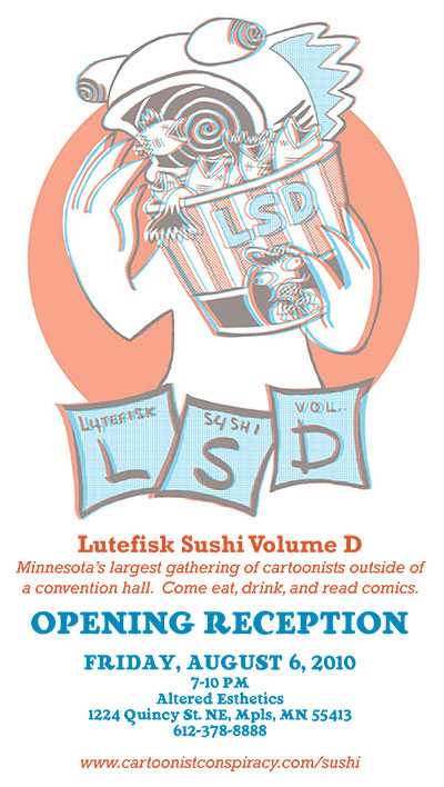
Lutefisk Sushi Happens August 6! So Soon!

It's hard to believe that August is right around the corner, but even harder to believe that Lutefisk Sushi Volume D will drop on August 6. Details are below. And why not RSVP on facebook?


Comic Art: Lutefisk Sushi D
A bento box full of mini-comics from Minnesota artists! Served to you with love by the kind folks at Big Time Attic, Altered Esthetics, and the International Cartoonist Conspiracy.

Opening Reception
Friday, August 6, 7pm-10pm

Artists' Discussion Panel
Saturday, August 21, 6pm-8pm
Join us for the Artists' Discussion Panel to hear what the artists of the show have to say about their work and their process. Artists' Discussions are casual, free, and open to the public. Anyone may join the discussion or simply stop by to listen.

Show runs August 5 -26, 2010

Visit the show pages:
www.alteredesthetics.com/events/66
cartoonistconspiracy.com/sushi


Now, steal this image and send it to all yer friends:

Wednesday, July 21, 2010

Lutefisk Sushi Collating Party

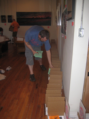
Lupi McGinty documents one of my favorite traditions: the Lutefisk Sushi collating party. This year we raised the excitement level up a notch by tacking on some off-menu pizza and starlight bowling at Elsie's, accompanied by lots of Grain Belt.

Click HERE to view the productive portion of the night.


Tuesday, June 15, 2010

Mini-Comic Process: Zander Edition

After reading Kevin's post about his minicomic creation process, I thought I might go ahead and post an account of my radically different approach.

COMING UP WITH AN IDEA


I'd been posting quotations by my son Jin on my Facebook wall every day via my phone, and people kept bugging me to collect them, or draw them, or do something with them, which was quite at odds with my instinct to not put forth any more effort. But then I had to come up with an idea for Lutefisk Sushi D, and here was one staring me in the face.

FIGURING OUT HOW TO MAKE A MINICOMIC OUT OF THAT IDEA

I wanted to keep things simple, so I decided to make a standard quarter-sheet 8-page mini, and draw it at 100%. Like Kevin said in his post, drawing at size can give you a nice grittiness that, I like to think, lowers expectations to a palatable level.

I decided to grab several of the best quotations from my Facebook page and draw two per page, except for the first and last pages. I also decided that I'd write Jin's dialogue extra big, just to look nice (and to use up space).

PAGINATING THE PAGES

In order to make a printable comic original (rather than organizing it on the computer and introducing another reproduction step), I had to figure out how to paginate the pages so after cutting and folding they would go together into a little magazine. So you have to put everything in a crazy order.


You discover this order by basically taking a scrap piece of paper and folding it in half twice. This represents your minicomic, albeit one with the tops of the pages still attached. You then number each of the pages as you flip through it. After unfolding, you get two sides of the sheet looking like numbers have just been randomly applied. This is your guide for where to put each page. Don't forget that the cover is page 1 and the back cover is page 8.

Now, I've made a lot of minicomics in my day, and I'd say I have above-average spatial reasoning skills, so I winged it a little on this part. This is foreshadowing.

DRAWING THE MINICOMIC

I drew the comic. It took me a day--about 6 hours. I redrew the cover, which I had drawn in brush, because it looked sloppy, and because in the course of the pages, I refined my model for Jin. I used reference for Gamera (a toy) and the flowers (photos on my phone).


For the final art, after the redraw, I used Micron pens (#05 and 08 for the main outlines, #01 for the details, #1 for the panel borders, and #05 for the lettering, big and small). I pencilled just enough to get the idea across, which for images of Jin was just basic lines, and for things like the flowers, Gamera, the fly, and the clothes meant just a bit more detail and shading where the black areas went. I also filled in the big black areas with small pens (#05 and #01), which is not really recommended, because it wastes ink in those pens and leaves you with tiny white holes in your big black areas. But that was precisely the reason I did it; it gave the comic a rougher look, and reminded people of the tools used. That can be fun sometimes.


PASTING UP THE MINICOMIC

Since I redrew the cover on another sheet of paper, I cut that out and taped it down over the original cover so as to keep the two-sheet originals just as they were. I was determined to just photocopy the originals. Why? I mentioned the fact that scanning them would just be one more stage of reproduction (and thus incrementally lower the image quality), but the truth here is it's more work. By scanning it in and futzing with it in Photoshop, I'd touch up the edges, then I'd see some other stray pieces of dirt that got scanned in, then I'd find a place where I hadn't erased the pencils fully, and well, I'd rather just leave those mistakes in there and photocopy the original. It's more true to the quick-and-dirty nature of minicomics. MY minicomics, anyway.

PHOTOCOPYING THE MINICOMIC

I went over to the UPS Store/Mailboxes Etc. that's about a mile from the studio. I like the UPS store because they have decent no-frills photocopiers and a seamless method of storing credits for photocopies. You can buy bulk copies at discounted prices and store them on a tiny key fob, which you then use to activate the copier. You don't even have to talk to the people there; just raise your keyring and arch an eyebrow at them and you're in. It's like the Freemasons.


I like to use colored paper for my minicomics because it classes it up a little bit. It also distracts from flaws in the line art or photocopying, like stray dots of black here and there. Chiefly, however, it differentiates each minicomic from the others. When I'm packing them all up to go to a comic convention, it's nice to just grab a stack of blue minis, a stack of yellow minis, a stack of pink minis, etc. One thing that was nice this time was that I was copying my minicomic onto 8 1/2 x 11 paper, of which they have a lot of different colors. Usually, my minicomics are copied onto 11 x 17", which most copy places only have in white, so I have to go to a paper supply place and buy a ream of whatever color I want.

The first thing I did was copy one side on white just to see how the art looks and see if the contrast was okay on the copier. There were a few pencil lines and paper edges that needed to be touched up. Once those were fixed, I made all the copies I needed for that side on colored paper. Before loading them into the tray to copy the other side, I needed to quickly test how the paper feeds into the machine. I draw an up-arrow on the top sheet in the tray, then copy. By noting how that up-arrow corresponds to the new image, you can know in what orientation to put the one-sided sheets.

Then, just to be certain, I copied a full dummy-copy, front and back, then cut it and folded it. Ah, here's what it'll look like. I was just thinking that this step was overly cautious when...what the crap? These pages are out of order! I'd actually screwed up the order of the pages. On like my 15th minicomic! Luckily for me, the order of the content on the pages didn't actually matter, so I used whiteout and changed the page NUMBERS and refrained from kicking myself until I was somewhere more private. So let that be a lesson to you. Do not wing it.

Once I got all of this sorted out, I finished the copying and cut the sheets (4 at a time, which I had non-scientifically calculated to be the maximum allowable before messing up the cut), paid the people for the colored paper, and got the hell out of there.

COLLATING AND STAPLING THE MINICOMIC

Once the comic is cut, you need to put the two smaller sheets together to make a comic. Doing this for more than 20 copies is a pain, so get ready. What I like to do is fold all of the papers first. Make sure you're folding them all the right way. You can do this in big sections, like 20 sheets at a time. They don't have to be creased, just folded a little bit, in the right place. Then, when you have both stacks folded, sitting in two little tents on your desk, you can quickly put them together, crease them, and set them in a stack. This is a seemingly endless process. You may want to listen to some music or get some serious thinking done about your life.

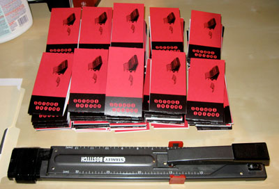
Once you have all of your books folded and in a stack, you can go through and staple them. Obviously, you could have done this as part of the previous step, but I prefer to separate them because when you only have a few little movements (grab first sheet, grab second sheet, put together, align, crease) you tend to get that muscle memory involved sooner, which gets the process moving pretty fast. Your mileage may vary.


As Kevin mentioned, a regular-sized stapler isn't big enough to accommodate even a 4 1/4"-wide minicomic, so you are going to need to find yourself a long-arm stapler or a booklet stapler. We have both at the studio. The booklet stapler has a little "roof" for you to put the folded sheets over which ensures that you always get the staple right on the spine. That's nice, and it speeds up the process immensely. If you're making a minicomic that's really wide (some of mine have been 5 1/2" x 8 1/2" in the past) you'll have to curl the pages a little bit to get them to fit, which isn't so bad, but in that case a long-arm stapler may be better.


Et VoilĂ ! This minicomic will be part of the Lutefisk Sushi D Bento Box. Come one, come all, to the opening gala on August 6, 2010!

Last Minute Sushi Submission?

Fellow MN cartoonists: If you are planning on submitting a mini-comic for Lutefisk Sushi but don't think you'll make today's deadline, don't fear. We've received numerous emails from people just on the cusp of finishing, but who need a few more days.

If that sounds like you, please do the following:

1) Register yourself and your comic here: http://www.alteredesthetics.com/events/66/new_show_art

2) Email contact [at] alteredesthetics.org to let them know that you have a submission coming, and when.

3) Print up your 160 minis within the next week or so and get them to Altered Esthetics (1224 Quincy St NE, Mpls MN 55413) during their office hours (Tuesdays & Thursdays 1pm–7pm, Saturdays 1pm–5pm) or by mail.

As always, for more info go to:
cartoonistconspiracy.com/sushi/


GOOD LUCK!

Sunday, May 23, 2010

Lutefisk Sushi Mini-Comic Production Notes

Having run across several tweets and fupdates of people working on their Lutefisk Sushi comics this weekend, I thought I'd not only finish my comic, but document the process. The June 15 deadline is sneaking up fast, so if this post inspires even one local cartoonist to put ink to paper, then I'll feel like it was worth it.

First, a quick reminder:
LUTEFISK SUSHI is a nearly yearly art event where cartoonists from all over Minnesota create an original mini-comic and print up 150 copies. Those comics are then packaged into sushi boxes, while original art from the comics are hung in Altered Esthetics Gallery, and everyone parties and has a good time. This year's box (created by featured artist DANNO KLONOWSKI) will have a 3D theme, but that does not mean your comic has to be in 3D! Your comic can be any size or subject matter you want, as long as it fits in the sushi box and is printed up by June 15. SUBMISSION INFO HERE.


PRODUCTION NOTES on
MAKING A MINI-COMIC


What you will find below will probably seem unnecessarily exhaustive, but I thought it might be interesting to someone who's never made a mini-comic before, or to people from the future wondering what this "tactile media" fad was all about.


STEP 1: THE IDEA

There's no reliable "how-to" for coming up with ideas. Mostly you just have to be ready for them. This particular story was inspired by thinking about what would happen if some neophile walked into a coffee shoppe with a portable typewriter and started clacking away. From there I added a few characters, some sexual tension, and one poop joke.

STEP 2: PRODUCTION NOTES
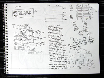

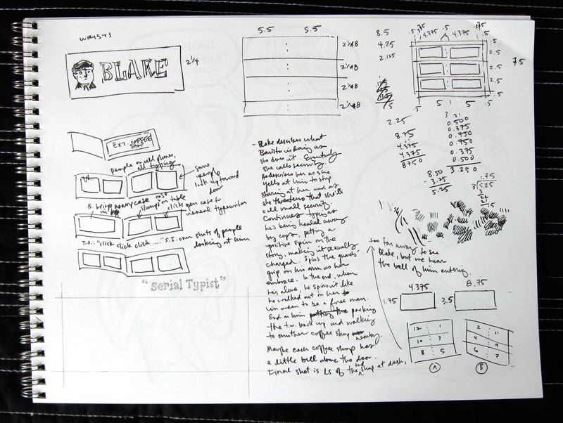
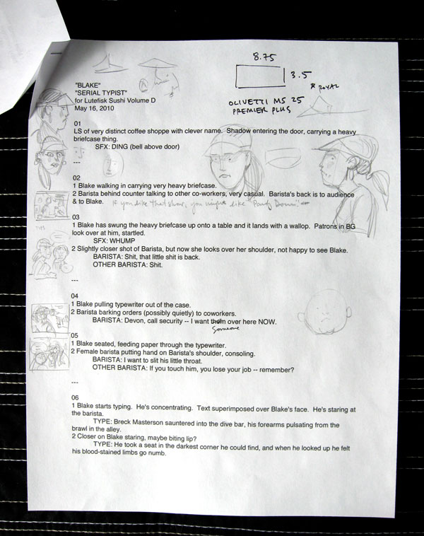
Above is a page of notes I jotted down during SpringCon. I started with the story but then moved into notes on how the mini would look, and how it would need to be produced. For ease of printing I really wanted to have everything fit on one sheet of paper, so I settled on a 12-page story with six pages per side of the printed sheet.
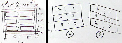
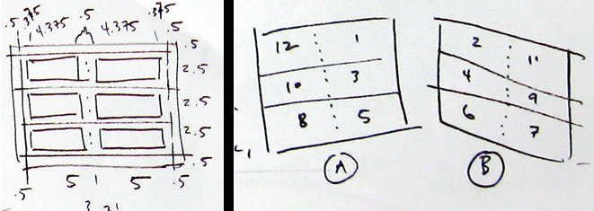
I also wanted to do a bleed on the cover, which meant adding a 1/2" bleed border around each side of the sheet. From there I subtracted a 3/8" margin around each of the panels, and arrived at my final art size per page. It's all about working backwards. On the right you can see a map of how each page would fall on the final double-sided letter size print sheet. Again, that bizarre-looking order is obtained by working backwards.

STEP 3: THE SCRIPT
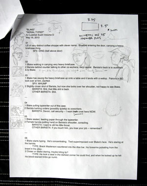

This step is the most fun for me, in that it's the most challenging and yet rife with the most creative possibilities. I'll go through several versions of a script in my head before heading to the keyboard, and then I'll tweak it several times again. This is especially true for a short comic that has very real spatial limitations -- whatever this story is that I want to tell, I HAVE to tell it in 24 panels. Suddenly scenes or lines that I thought were important are cast to the side in favor of a lean, tight narrative. That's one of the highlights of printing a physical comic -- you have these limitations that force you to focus on your message. Yes, webcomics have limitless space and possibilities, and that can lead to some cool things, but if you're not careful it can also lead to a kind of laziness.

STEP 4: DUMMY
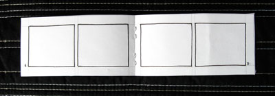

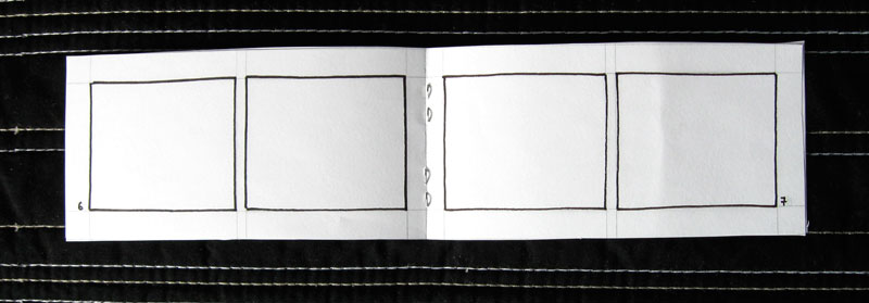
The worst thing you can do (in this context, at least) is spend hours and hours creating your beautiful artwork only to find that your margins or proportions are all screwed up. Making an AT-SIZE DUMMY is a good way to prevent that. Here, I took the mathematical calculations from my page of notes and measured and cut a sample book out accordingly. Fortunately everything worked out (I'm pretty good at fractions when I concentrate) but if there was a calculation error this is where you catch it and correct it.

STEP 5: ART PREP part one: DRAWING SIZE

You know how big your art will be when printed, but how big do you want to draw it? I recommend 150-200% if you want a cleaner look. Drawing at-size or even smaller than at-size will give your book and nice gritty feel. If you draw larger than 200% be aware that your thin lines may disappear when you shrink your art back down to print size. For this comic I chose 200% (mostly because the math is easy).

STEP 6: ART PREP part two: TOOLS
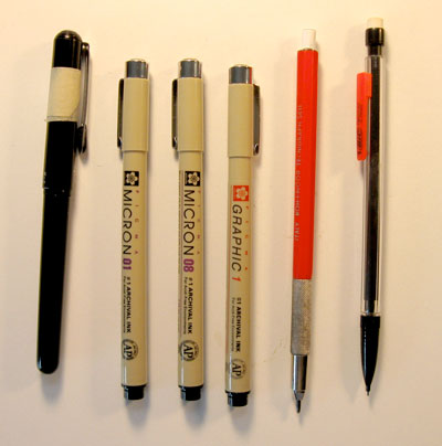

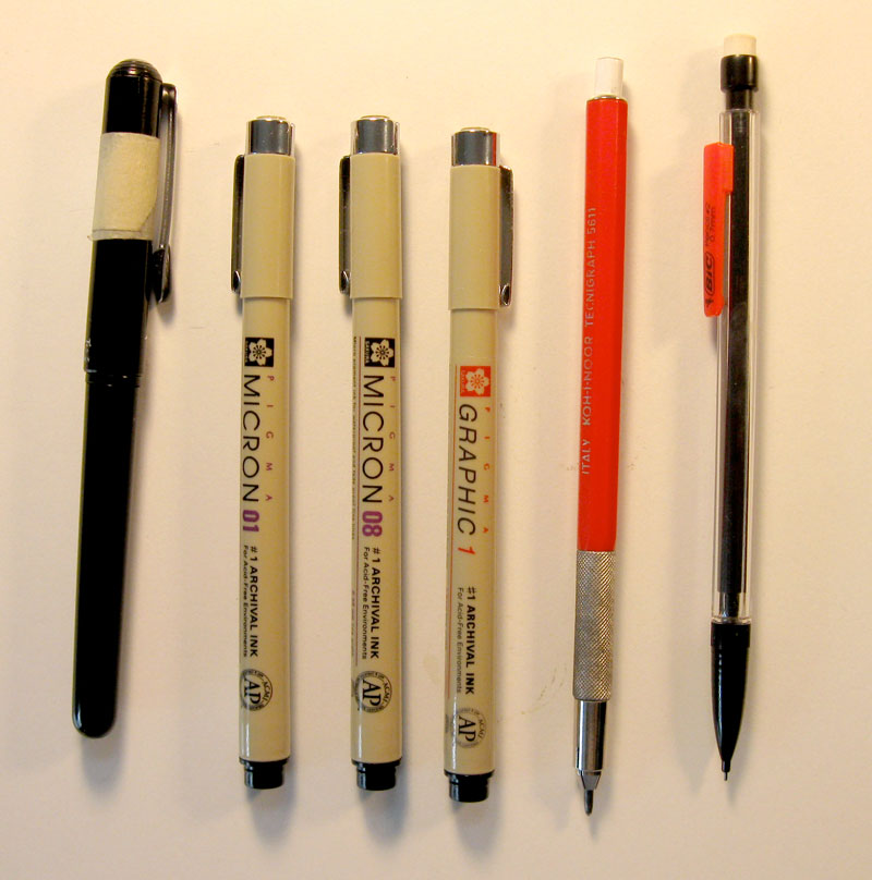
Some cartoonists know exactly which tools they'll use for every project. If that's you, then congratulations. You won. Personally, I need to play around with both paper and drawing utensils before each project to see what works. For this book, for instance, I wanted to go with a rough brush line, so I ended up using a pentel pocket brush pen on Strathmore 70 lb drawing paper. This paper has a good tooth that catches the fat part of the pentel in a fun way -- the only thing I had to be careful of is that pentel brush pen ink dries very slowly on this paper. This means drawing with caution so I don't smudge a lot. The micron #01 (above) is for background details, while the micron 08 and 1 are for lettering. I use a hard pencil (the red one) for light pencilling and the mechanical one (which is pretty soft and dark) for tighter lines.

STEP 7: DRAW
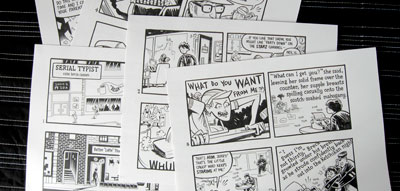

You're on your own for this one.

STEP 8: SCANNING

Remember how I drew these images at 200%? That means I can scan the art in at 600 dpi bitmap, and then change the image size (without resampling) to 1200 dpi and suddenly my art is at the correct print size and at 1200 dpi. It's like magic.

STEP 9: GRAY TONES
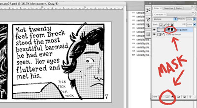

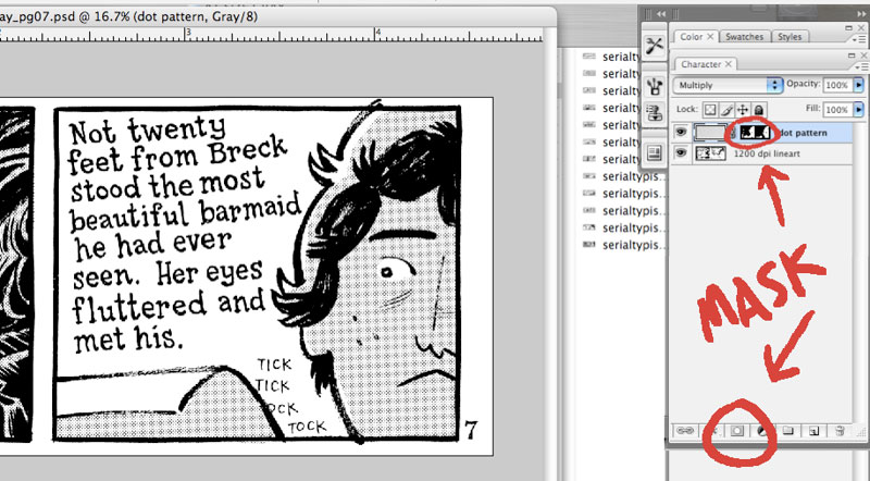
I change the mode to gray and then drop a sheet of dots on top of the art. Then multiply the layer. Then hit the quick mask button (see image) and then hit apple-i to invert it. What you're left with is a dot pattern layer that is completely hidden. To start shading, draw directly in the layer mask. If you mess up, just hit "x" to change your brush to white, which will act as an eraser. This seems complicated, but the beauty is you're left with a mask that can be applied over anything. For instance, if you suddenly want the comic to be in color, you can swap out the dot pattern for a color and your mask will stay the same.
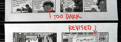
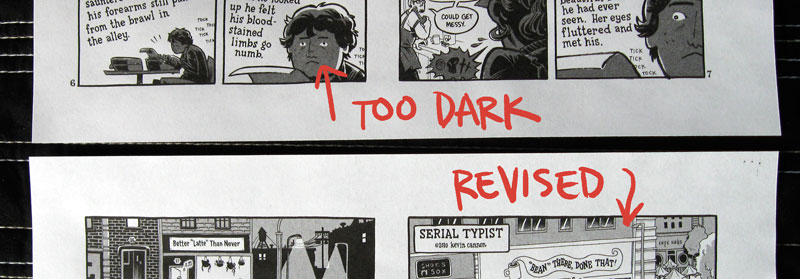
This actually happened to me during this book -- the dot pattern I chose was too dark when I printed it so I swapped each page out with a slightly lighter dot pattern and it only took a matter of minutes. No need to redraw or realign anything.

STEP 10: LAYOUT
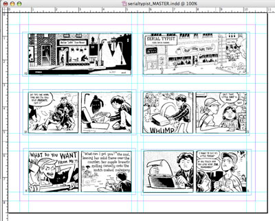

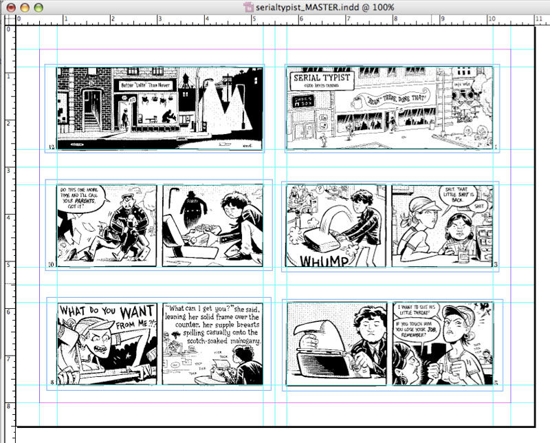
Whether you're using InDesign or glue and a ruler, this is the stage when you place the final art on the page in the way that it's going to be printed, as sketched out in step 2. Above is my InDesign layout with all the linked photoshop pages. When I'm done I export as a high resolution pdf. Next I'll print out both sheets and hold them up to a light source to see if they're printing out correctly. Sure enough, while my computer measurements were on target, my printer printed one side too close to the edge. To fix this I went back to the computer artwork and just moved the art on the page enough to offset this error. After another round of printing everything seemed cool.

STEP 11: ANOTHER DUMMY
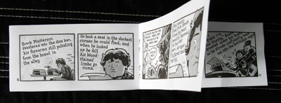

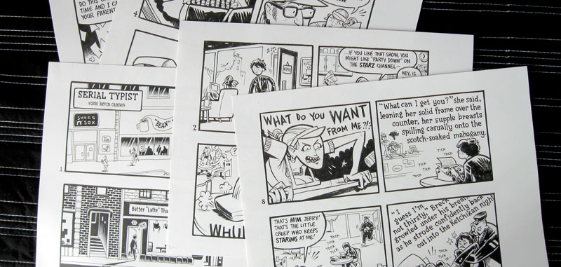
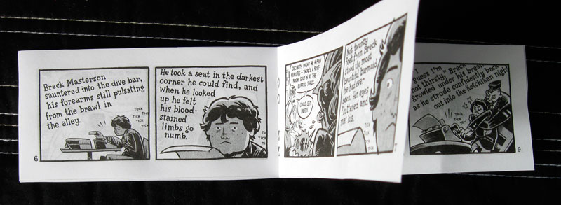
Before printing out hundreds of copies of this book, I wanted to do one last check to make sure the book was correct, so I printed out another dummy, this time using the art that I would soon be feeding through the photocopier. This stage allowed me to check mechanical things like pagination and margins, as well as aesthetics like checking for dirt and art errors. Indeed, at this stage I discovered that I had forgotten to ink a detail on the first page. It was a small detail -- just a loose piece of paper laying on the ground -- but it was an element that tied in with the narrative so I went back into the computer files and put it back in, and printed everything out one more time.

STEP 12: PRINTING

The most stressful and most expensive part. First, I made "photo-quality" printouts of the front and back of the final comic sheet. To add to the stress it was pouring rain out, so I bundled these two little sheets of paper in some plastic, and ran to the UPS Store. I did a few test sheets to figure out how to print a double-sided sheet, and held these sheets up to the light to make sure they matched up. Then... I hit the green button and let the big machine do all the work.

STEP 13: COVER
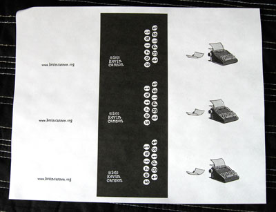
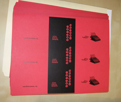


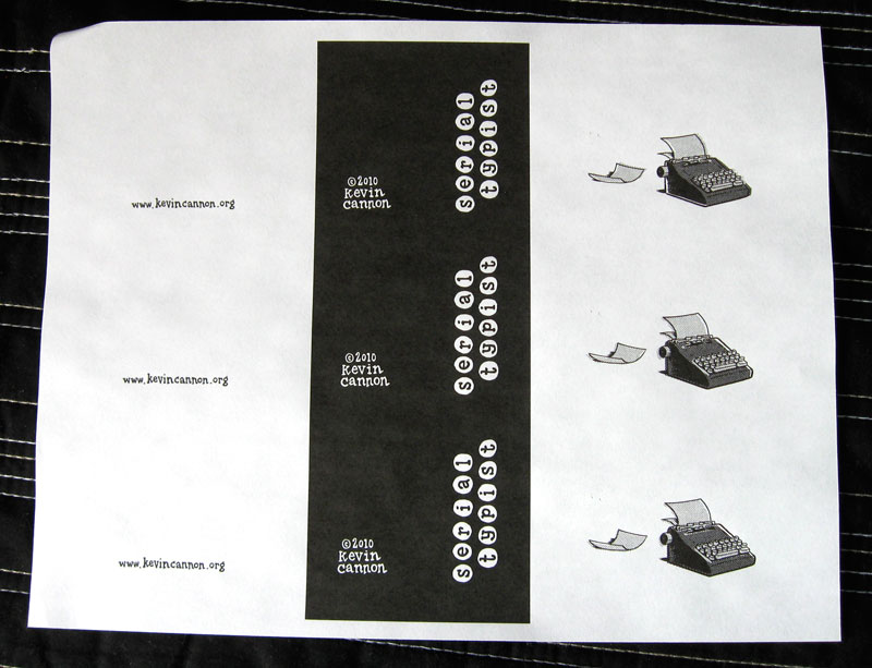
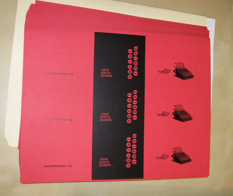
For a lot of mini-comics, the first page of their book will be the cover, so this step does not apply. However, I wanted to add a second color to this story, so I printed up a cover -- using the same specs as the interior -- and took it to the OfficeMax print center, where I had the cover printed on 60 lb red cardstock.

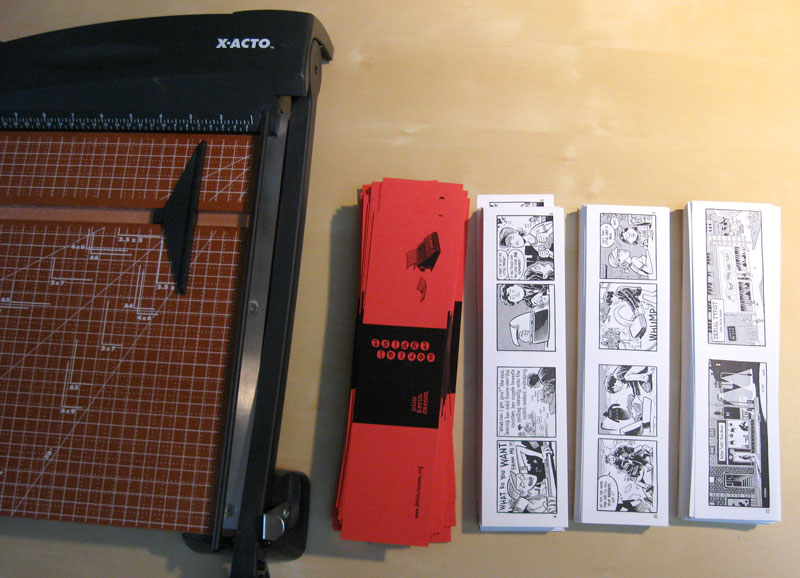
STEP 14: CUTTING
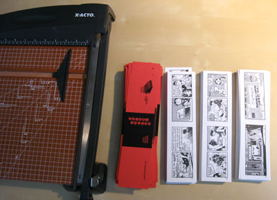

Your book will only be as good as your tools, so if you're going to make a lot of minis I recommend investing in a good home office paper trimmer. Xacto and Swingline make a good product for around $50, like this one. The one I've got has a moveable edge so I can butt each sheet up against it instead of having to line up each page against a ruler.

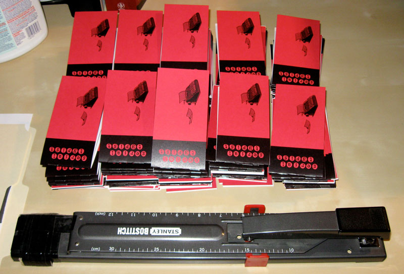
STEP 15: STAPLING

Again, invest in good tools if possible. Unless you're making tiny mini-comics, your office stapler won't do. Try something like this guy for $30.

That's it! I hope this play-by-play hasn't been too boring. If you have a question write it down in the comment section and we'll get you squared away. Also, I'd love to hear how your process differs from this one!

REMEMBER, YOUR LUTEFISK SUSHI COMICS ARE DUE JUNE 15!
Friday, March 26, 2010

Lutefisk Sushi Volume D

Ladies and gentlemen, it's time for another round of Lutefisk Sushi!


Pretty much everyone reading this blog is either a) familar with Lutefisk Sushi, or b) on the Lutefisk Sushi planning committee, but for those not in the know, here's a rough outline:

Lutefisk Sushi is a nearly-yearly art show that invites Minnesota cartoonists to create and submit 160 copies of an original mini-comic. These comics then get divvied up into 160 screen-printed bento boxes (hence the "sushi"). Submissions are due June 15, but the fun starts in August when the actual gallery show opens at Altered Esthetics. The show features the sushi boxes, as well as original art from the mini-comics. Best of all, the show is NOT curated, so any Minnesota cartoonist who can print up 160 comics will get in the box.

The home base for everything sushi is: www.cartoonistconspiracy.com/sushi.

To be involved, just follow these simple steps:

1) Be a Minnesotan.

2) Create a mini-comic. How? Check out this pdf for a handy tutorial.

3) Make 160 copies of your mini. A "mini-comic" can be anything, as long as it fits in a 6" x 8.5" box. Read this to find out how to get a discount on printing in the Twin Cities.

4) Scan your cover. You will need a jpeg of it for the next step.

5) Fill out a submission form HERE.

6) Drop off or mail your mini-comics to: Altered Esthetics, 1224 Quincy St NE, Minneapolis, MN 55413 Comics must be received by JUNE 15, 2010.

7) OPTIONAL: Frame your original art from the mini-comic. Although it's not a requirement, we HIGHLY encourage you to frame and submit your art to the show -- the more art on the walls, the better! You may sell your art or label it NFS (not for sale). Mail or drop off art at the address above. Clearly label all pieces with your NAME, TITLE, MEDIUM, and PRICE. Frames should be black and NOT have glass (i.e. use plexiglass).

8) Get the word out! Blog about Lutefisk Sushi using the jpegs below, follow the show on Twitter, and most importantly... become a FACEBOOK FAN!

9) Finally, toss these dates on your e-calendar:
  1. JUNE 15 -- Mini comics due
  2. JULY 31 -- Framed artwork due.
  3. JULY 31, 1-3pm -- Artists' Potluck (come and hang out, meet fellow cartoonists, and drop off your artwork).
  4. AUGUST 6, 7-10pm -- Show opens at Altered Esthetics.
  5. AUGUST 21, evening -- Party at AE with the Sushi crowd and the folks from the Minneapolis Indie Xpo.


If you have any more questions, check the website or email artist liaison Dan Olson: bewilderedkid [at] gmail.com with the subject line "Lutefisk Sushi Question." If you have questions specifically regarding the gallery show or about submitting framed art, contact Kristin at kristin [at] alteredesthetics.org.


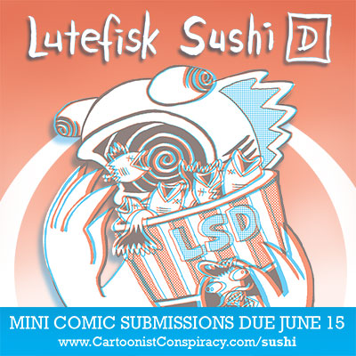
One of the cool thing's about this year's show is that the featured artist, Danno Klonowski, has drawn the cover in classic red/blue 3D. Your comics are obviously not required to be in 3D (because that would be a huge hassle), but if you like a challenge, consider doing a 3D comic or submit some 3D art to the show. Each box will come with 3D glasses, so go wild! Over the next few weeks I'll be writing tutorials on how to create 3D comics.

If you want to help spread the word about Lutefisk Sushi, here's some art you can use:


Alright, now get drawing! We (the sponsors and organizers) can't wait to read this year's batch of minis!