To begin, I reviewed some of my old watercolor "how to" books, but in the end I found it more interesting and educational to crib off the process blogs from watercoloring cartoonists like my old pal Sam Hiti and Pizza Island guru Sarah Glidden. And if I REALLY needed some inspiration I would just stare at this post all day, by Master of the Watercolor Universe Eleanor Davis.
Anyway, the best way to learn is to actually DO something, so here are some sketches, doodled with microns onto Arches hot press paper:

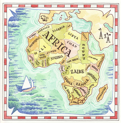
One commission I did recently was a gigantic world map, so here was my "look & feel" sketch for the client. And yes, this was painted BEFORE Sudan split up, so it's not entirely accurate:
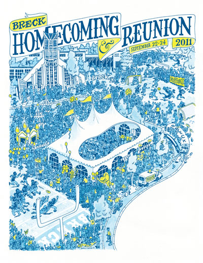
And now another commission, this one for my high school. I usually do computer coloring for their posters, but since I'm on this watercolor kick I thought I'd try out something a little more challenging. For the fun of learning, here are all the steps. You can click on the images to see them in greater detail:
First the rough, at around 150% size. This was done on a thick bristol-like paper I use a lot. Ink bleeds on it a tiny bit but it's soft like butter and mad cheap:
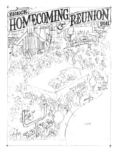
Next, the tight pencils:
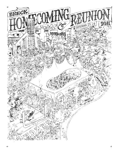
Then the inks. This is all done with an .01 micron:
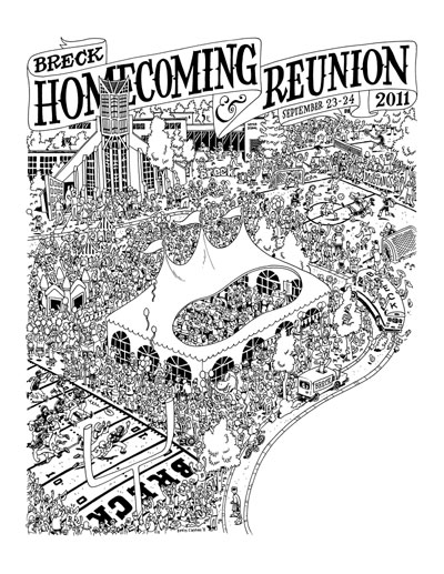
Then I scanned in the ink and shrunk it down to final size, and changed the black lines to 8% cyan (so light you can barely see it). Then I printed that on a sheet of Arches hot press. Actually, before I printed it I deleted any unnecessary lines, like the words on the banner. That's because when I paint yellow over the 8% cyan it becomes a muddy green, which is bad. Here's how the watercolor turned out:

Then I put the two images together in InDesign. The watercolor is at 300 dpi but the line art layer is at 1200 dpi so it's nice and crisp. As you can see I changed the black lines to blue and made the field lines and some other details white. Although it was difficult to paint over the cyan print-out, I like having the post-production flexibility of being able to change the line art separately from the watercolor layer.
Finally, here's a painting I did for Altered Esthetic's 7th birthday party silent auction. AE has been VERY good to the Minneapolis cartooning community so I thought I'd do something extra time-consuming and hopefully earn them a few bucks during the auction (the auction is April 29, by the way, and you should totally go and bid on this piece or the tons of other great stuff in the show).
This drawing was also done with an .01 micron, but it was drawn right on the watercolor paper. Then I did something really stupid which was to start painting without doing any color samples first. Basically what happened was I started painting in the characters in lots of random colors with no real color scheme and it looked terrible. This is the pitfall of watercolor which is that you can't paint over it like with acrylics and you can't subtract from it so I figured I had just ruined a week's worth of work. Eventually I just painted GREEN over my terrible colors, and after enough layers it looked muddy but at least consistent. Then I painted the rest of the characters green and added some orange coloring to match the muddiness of that first patch. You can see in the lower right how the color looks denser -- that's because there are layers of crappy color I'm trying to hide. Secret's out. And lesson learned: always do test swatches to get your color scheme picked out before jumping into the final.
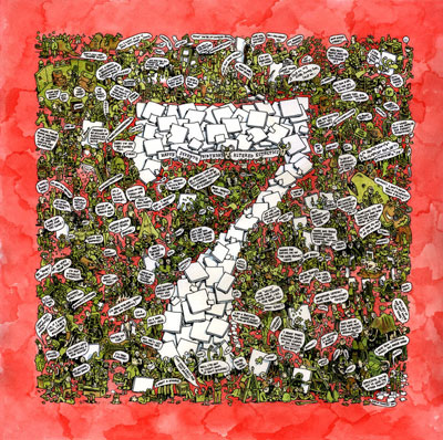
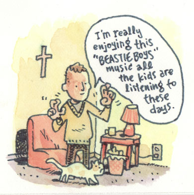
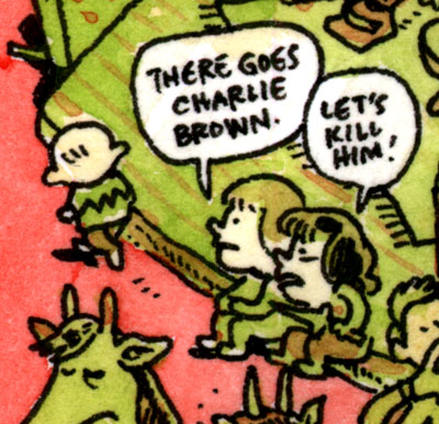
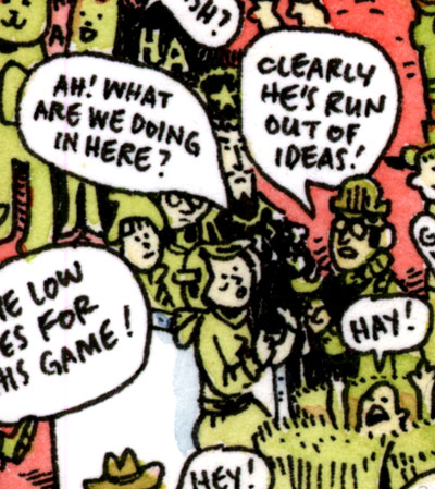
So the painting itself is just a series of random jokes, one-liners, and musings. Here are some of my favorites:
A nod to our neighbor across the river:
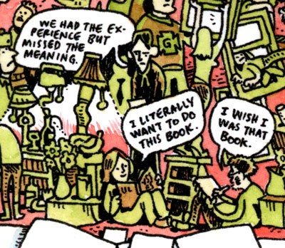
T.S. Eliot and some horny bookworms:
This is actual Inuktitut I cribbed from a bilingual arctic newspaper called Nunavut News/North. Each issue has a "man on the street" Q&A (kind of like The Onion does, but for real), and that's where I pulled this from. The first guy is saying something like "What's your best fishing tip?" and the second guy is saying, "Be patient."

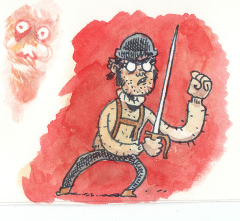
Here is the cast of the next Shanks book, which I should really be working on right now instead of blogging:
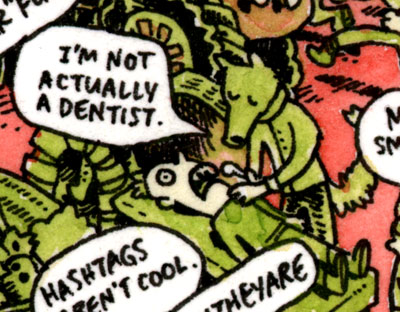
The title of the painting is "I'm Not Actually a Dentist" and this is the gag that the line is from:
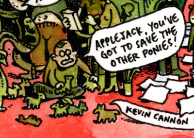
A nod here to Ted Anderson who has openly admitted to buying not one but FOUR happy meals just to get the My Little Pony toys. If you're interested in hearing his defense, it's discussed at length on a recent Geek Report.
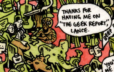
Speaking of the Geek Report, here's a nod to Lance Ward and his ever-evolving crew:
And finally, here's Xeric winner Britt Sabo surrounded by her favorite creatures (not counting ghosts):

As another incentive to come to the Altered Esthetics party on April 29, the gallery printed up posters of this painting that you can have for a small donation. "C U" there!

