Pages

Monday, February 25, 2008

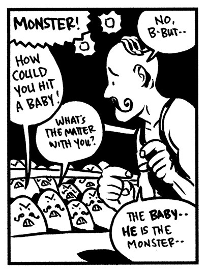
Panels Without Borders at MCAD

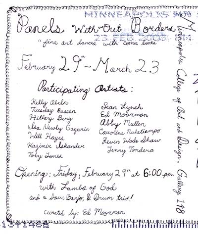
Boy do we love getting postcards here at the Attic. Here's one that floated our way today for a show coming up this Friday at MCAD:


Panels Without Borders
"Fine Art Dances With Comic Books"

February 29 - March 23


Opening:
Friday, February 29 at 6 pm
with Lambs of God and a saw, banjo, & drum trio
Curated by Ed Moorman

Minneapolis College of Art and Design
2501 Stevens Avenue
Mpls, MN 55404

Friday, February 22, 2008

Thursday, February 21, 2008

That Salty Air Review


Is Tim Sievert the next Herman Melville??? Greg McElhatton seems to think so in his review of Sievert's debut graphic novel, That Salty Air. Melville was broke and alone during his life, so let's hope the similarity is purely a literary one.

ReadAboutComics.com

Wednesday, February 20, 2008

Tips and Tricks: How To Align Objects in Illustrator

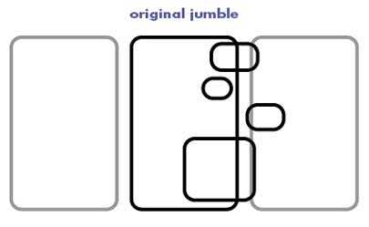
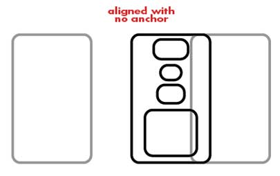
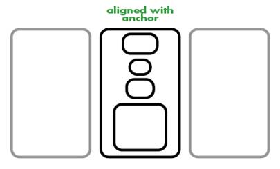
Here's a neat trick that I just learned in Adobe Illustrator. When I'm putting stuff together, I make liberal use of the Align function. It allows you to make sure your objects are lined up with mathematical precision, saving you the hassle of eyeballing the whole thing. But the problem has always been (or so I thought) that the align function takes the average horizontal position of all of the objects and aligns them all to that. That's great if nothing is integrated as part of a larger plan, but if you have placed one object perfectly, aligning other objects with it throws it completely out of whack. If I wanted to put all of these objects dead center in the panel, I could do that, but it puts that panel itself out of line with the other panels.


But don't worry. It turns out you can designate one object in the bunch that you've selected to be the anchor and make all other objects align to it. After you've selected all of your objects, single-click on the anchor (in this case, the middle panel), which will appear to do nothing whatsoever. Then hit one of the align buttons. Voila! They are all aligned to that one object.


This might seem to you like a monumentally insignificant post, but once I realized this, it practically changed my life. Not having to realign all of those panels saves me a huge amount of time.

Tuesday, February 19, 2008

Bone Sharps on HBO

In a previous post, we told you that for over two years now we've known that our graphic novel Bone Sharps, Cowboys, and Thunder Lizards would appear in a scene from HBO's "Tell Me You Love Me" pilot.

Well, the dvd is out and we finally get to watch the scene! Shad has posted a clip on YouTube:


At first I was a little disappointed. Initially it looked to me like the actors were adlibbing lines -- treating our precious book as nothing more than a prop. But NO! The two parents read an actual panel from page 55 AND, to smother icing on an already towering cake, the way the panel is read provides the only humor in an albeit intentionally humorless show.

We should note that the scene was shot in a mirror, hence the horizontal flip of the cover. Something to do with metaphors.

Will Bone Sharps continue to be featured in every episode of "Tell Me You Love Me?" Probably. We'll just have to watch closely and find out.


UPDATE
In episode 4, at 0:12, the dad (Dave) implies that he has read Bone Sharps to his son one hundred times.

Friday, February 15, 2008

BTA friend Ryan Kelly has an Illustration in this week's City Pages!

Everyone likes chimpanzees! That's why ol' Ryan Kelly did this dazzling illustration for the City Pages, Minneapolis/St. Paul's free lefty weekly paper.

Click on the image to get the whole thing, all big.


Ryan's blog is Funrama, and here he talks about drawing the City Pages image.

Friday, February 08, 2008

Big Time Attic: The Comic: The Do-It-Yourself Kit

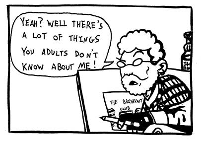
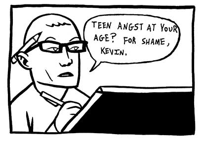
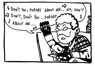
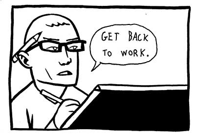
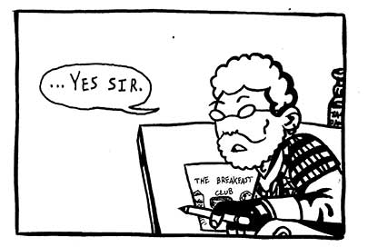
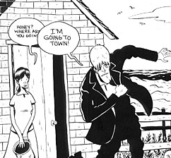
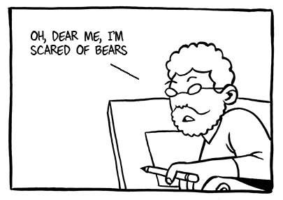
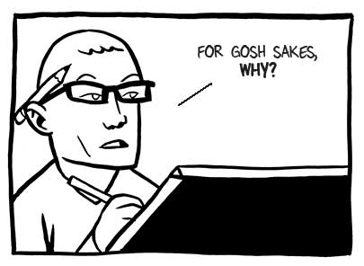
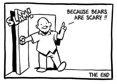
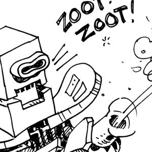
The Big Time Attic Comic is a perennial favorite around here at the BTA offices, but why should we have all the fun? As you may have guessed, there are not that many different panels in these comics, and so now we offer them to you, our esteemed friends and colleagues, to do with as you will.

Here are the panels in web-ready size. Just type dialogue right into them in Photoshop or Illustrator or InDesign. If people have other programs they recommend for this, or any questions, please leave a comment.


And here are the panels in a higher resolution, in case you want to print them out and alter the artwork in some way.

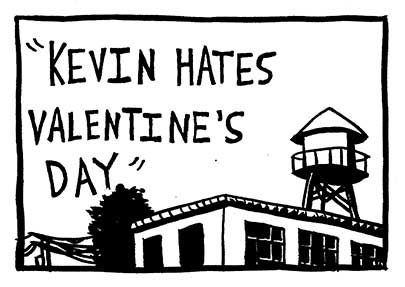
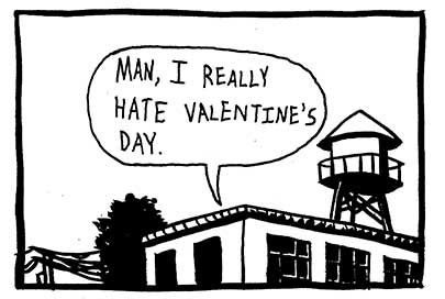
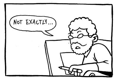
And here is a little sample, created at web-size with a couple of the delightful Kevin Cannon fonts.


Enjoy!

Thursday, February 07, 2008

Cream City Comics Interview

Hey folks, check out Amado's blog "Cream City Comics" for an interview with yours truly.

Here's the link

You can skip over what I said. The fun part is reading Amado's side notes!

Wednesday, February 06, 2008

Muscles and Fights submission by Zander Cannon and Steven Stwalley

Steve Stwalley and I did another "Versus" comic for Muscles and Fights volume 3. Click on the below image for the fight of your life.


Also, here's the previous one Steve and I did for Muscles and Fights Volume 2:


And-- it just struck me. It seems counter to the spirit of the Muscles and Fights anthology to call the stories "submissions". Perhaps they should solicit "dominations" instead. Food for thought!

Doodle Dump

The worst slash best slash worst again thing about working with huge photoshop files is the wait time for opening, saving, and editing these files. So, until I get a faster computer, I'll spend that dead time not weeping but doodling. Here are some time-wasters from the past few months.

[ Click the images to see a big placemat of the doodles. ]


Tuesday, February 05, 2008

Tips and Tricks: Boredom and Laziness

Boredom and Laziness: Your Friends for an Improved Aesthetic.

They may seem like an unpleasant state of being and a negative character trait, respectively, but boredom and laziness and the forces behind them play a valuable role in an artist's growth. No, really!


Any time you ask people how to get better at any artistic discipline, they always hit you with the old "practice, practice, practice" saw horse. By the time someone has been told that ten times, they think, "yeah, yeah, I'll do that," and no longer hear that suggestion at all. They want to hear something interesting. I mean, practicing is BORING.

That's exactly why it's useful. Whenever you figure out how to do something logically, you are doing every single step and putting in every single line, and your drawing may look okay, but your overly-thought-out process is going to show in the drawing's stiffness, its tentative line, and its overall lack of confidence. Now, he next time you draw it, you might look ahead a couple steps and say, "Oh, those three lines could be smoothed out to be one long line" and then swoosh! you have one smoother, more dynamic, and more confident line in your drawing. What is that strange feeling that compels you to change your drawing process in order to make it more interesting? Aha, you guessed it: BOREDOM.

Boredom is a powerful force, and so when, instead of fighting against it, you leverage it and use its strength, you take some of the pressure off of your conscious mind. Forcing yourself into a situation in which you have two options-- be bored or create something interesting-- can result in some great ideas, drawings, stories, or what have you.


The other natural habit that practice makes use of is laziness. You may notice that when you see an cartoonist's style evolve over the course of many years, their work tends to take on a smoother, simpler quality. The early work tends to have a lot of wasted lines and extraneous detail that is dropped out once the artist gets a sense for exactly what is needed and what is not. Is he thinking consciously throughout his career, "should I keep this line? Should I simplify this style of rendering?" Almost certainly not. He's LAZY. He's drawing the same things over and over again, and he's getting sick of putting in every last line. He wants these drawings to look just as good, but to involve less work, so he organically developed a way to draw more simply. Our instinct to save ourselves some effort drives us to innovate, and those innovations allow us to spend less time and effort on run-of-the-mill illustrations, and focus our energy on creating something new.

Reinhard Engels, in his Everyday Systems website, posits that will is weak and habit is strong (he refers to it as the "800-pound mega-gorilla") and so the basis of all of his self-help programs he's created on that site is this: Leverage your willpower to make habit work for you. This works for the mega-gorillas of boredom and laziness, too. Put yourself in a situation where they are the forces that drive you, and you almost can't help but improve.
Sunday, February 03, 2008

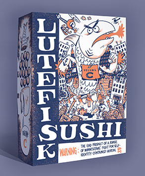
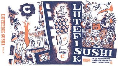
Lutefisk Sushi Volume C: Box Art Unveiled!

Hopefully everyone out there is writing, drawing, or at least thinking about their Lutefisk Sushi minicomic! In the meantime, here is the artwork that will appear on the bento box and the promotional materials. Enjoy!


[ click for larger image ]

The top image is just a digital mock-up of the box. The REAL DEAL will be printed by our friends at Puny Entertainment.

And no, I haven't seen Cloverfield, but this image MAY have been influenced by Danno's review of said film.