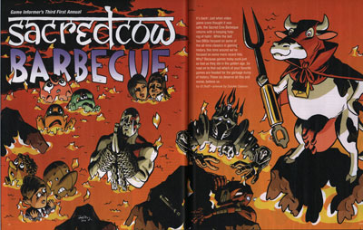
The recurring feature Sacred Cow Barbecue, a no-doubt-very-satisfying opportunity for GI's editors to say bad things about all of the games that people love, is fun in a different way than Game Infarcer (the April Fool's drawing) for a couple reasons. One, it allows me to draw a bunch of characters from a bunch of different games rather than from just one. Two, it goes across two pages, plus little spot illustrations interspersed throughout the rest of the article, so it's more piecemeal, and individual figures or groups are more important than the overall composition. And three, from a technical standpoint, since the illustrations are likely to be in the hands of the production department who have to fit them around all the text, the image has to be delivered in many, many layers so that they don't have to chop it up more than necessary.
The first thing that happens is that I go down to GI and talk with some editors (who I won't name this time so that they don't get hate mail). They give me the list of the games that are going to get a kicking in the article, and I write them down. One thing that I did differently this year is that because the last two Sacred Cows were in picnic environments, with the characters being grilled, skewered, roasted, and otherwise mishandled, I wanted to change from that and show something different. One idea was that the figures would be cows in a field, dressed up as the game characters, but since the games chosen are not as iconic as things like Mario or Halo, we figured that it might not work well as a gag. My other idea, and one that fit in well with the idea of giving the production department the most leeway in their layouts, was all of the characters in a lake of fire. It doesn't have as many opportunities for good gags the way a picnic environment does, but it ends up being kind of fun from a cartooning point of view, focusing on characters' body language and expressions.
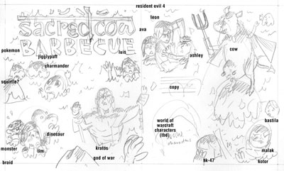
After going back to the studio, I worked up this sketch for GI, which basically laid out the characters, their expressions, their placement, and where I thought the text (introducing the article) could go. I also went ahead and did a title treatment because why not.
The idea here, in terms of delivering the image, was that the characters were all independent of each other and the perspective the illustration takes didn't limit where they could be placed (though you want characters to be facing inward for the most part, and asymmetrical characters like Kratos can't be flipped, so there are some parameters here). I was trying to make the drawing as flexible as possible for the layout people.
PENCILS
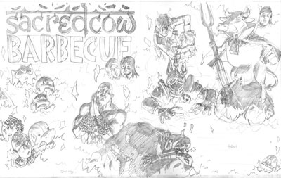
Once that was settled on (and I figured out which World of Warcraft character I'd put in there), I worked up the pencil stage. I was really trying to have variable sizes of all the characters, such as the rock with HK-47 on it and the devil cow, on down to the concerned-looking Bastila in the upper right corner and Darth Malak in the lower right. I tried to throw in some sight gags as well, such as Kratos praying for mercy (not a likely scenario in God of War), Leon Kennedy pushing Ashley into the lava (she's a real pain in the neck in Resident Evil 4), and Luis looking like he's getting awfully cozy with Ada Wong (no reason, just thought it was funny). Also, it's pretty satisfying to draw Pokemon with big teary eyes as they burn. Sorry, Pokemans.
INKS
Next come the inks, and while this is a single image, all of the characters were inked separately-- I blew up the pencils on the computer and printed out several sections in non-photo blue, then inked them all so none of them were touching each other. You can tell this by some of the flames intersecting each other here. If you look closely, you'll see that I did something pretty lazy, too: the rock on the very bottom of the image is the same as the one on the left, just flipped left-to-right. Man, I saved myself like 90 seconds there.
COLORS
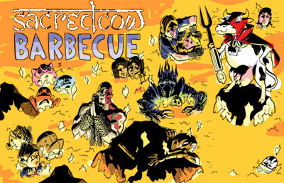
The colors here were pretty straightforward from an aesthetic point of view. I made a color sketch at a low resolution just to get the feel of things.
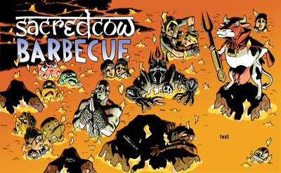

From this, I knew the overall color was going to be a lava orange, and that that color was going to affect every other color on there. So then what I basically did was color every character their normal color, as if they were in neutral, full-spectrum light, but lit from below, then put a yellowish-orange low-opacity layer over them so that every color shifts toward that. Beyond how warm that makes the drawing look, it also unifies everything and makes it so you don't even really notice. Greens still look green, but if you saw that color by itself, with no orange-yellow around it, it might not look green at all.
I also quickly whipped up some cooled lava in the upper left corner to pop out the logo, which I inverted. If I had thought of it earlier, I might have put in more of that dark lava to give the drawing a darker, more ominous look, but I felt like it worked well, and I still wanted to keep the drawing adjustable.
GLOWY EYES
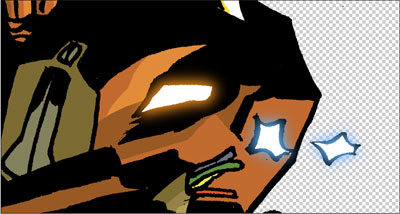
I also did something that I like to do every once in a great while. I usually like to keep the color mostly flat and cartoony (and simple to do), but sometimes there's someone that just needs to have glowing eyes. So without having to make it a big hairy deal, I have this quick, 4 step process:
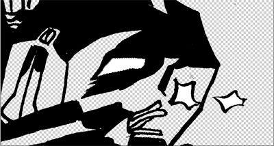
1. Once everything's colored, go to the line art layer and select the inside of the area you want to glow. It shouldn't go under the black lines at all, just right up to them.
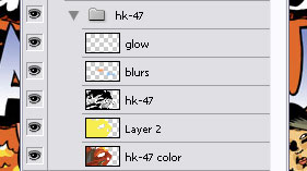
2. Make two new layers above the line art layer. They should be the top two layers. Call one "Blur" and one "Glow". With the area still selected, color it white on the "Glow" layer and orange or whatever color the glowing thing is on the "Blur" layer. Deselect.
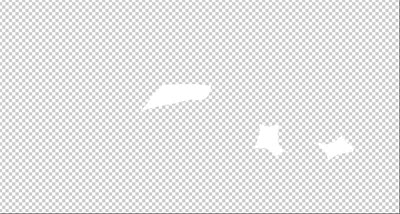
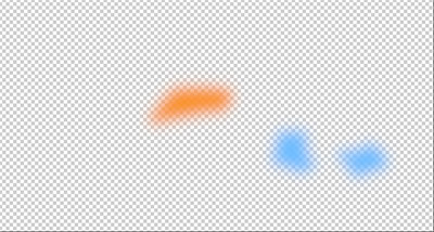
3. On the Blur layer, do not select anything, but go to Filter>Blur>Gaussian Blur... you can move the slider to see how many pixels you want to blur it. It all depends on your resolution.

4. Voila! You have a glowing eye or thing. The white looks just like it's an ultra-bright orange when it has that orange glow around it.
ADDITIONAL SPOT ILLUSTRATIONS
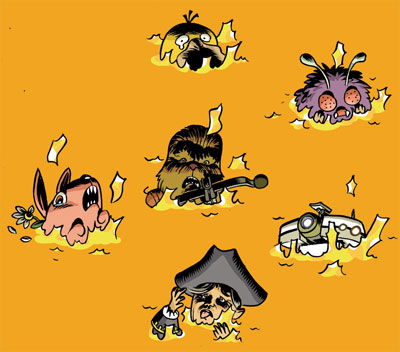
Last time I did a drawing for Sacred Cow Barbecue, the layout guys reshuffled my layout quite a bit and sampled illustrations from the main spread to use throughout the article. I liked that idea, but I wanted to make sure there were enough original illustrations that we didn't end up using things twice. So I drew up a number of single spots that could work anywhere on a lava background and colored them, providing them as individual Photoshop files for the production department.
ALL THIS PLANNING...DID IT WORK?

Kind of. Here's how the two-page splash looked in the magazine. I was starting to worry as I got close to the deadline that my layout was not leaving a lot of room for text. I mean, it left some, but they were going to have to keep it pretty short if it was going to fit in there. I figured that something like that was going to happen.
Obviously I'm open to reshuffling the details in an illustration; I built the concept of this drawing around it. Unfortunately, two things which I didn't foresee happened. One is that they enlarged the devil cow by quite a bit. That sort of thing is fine when you're dealing with painted images or photographs, provided that they are high enough resolution. But the problem with cartoons drawn with pen or brush is that the line weight and quality is a dead giveaway for scale. So when you blow up a drawing, even if the lines are still crisp, you can tell that it was not originally that size because all of the lines are thicker than everything around it.
The second thing is that the Lich King (center) is rotated about 5 degrees. Eh. Weird.
What they did right was that this is an excellent layout. It's asymmetrical, it has a lot of weight opposite the logo, and it moves your eyes around, not to mention leaves room for text. If I had thought more about that, my version and theirs might not have been so different.
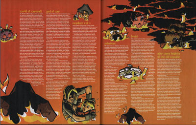
They ended up moving a lot of characters from the first spread to the second and creating shapes there to move the text around, which is a fine idea; perhaps cramming 16 characters on one page was a bit much.
And boy did they get their money's worth on that rock. It's there twice--that's four times in four pages!
WHAT DO YOU THINK ABOUT THE ARTICLE?
This was a funny article, though they've pretty well run through the classic games by now and are beating on games that are 3 years old. I actually loved 2/3 of these games: Resident Evil 4, God of War series, Knights of the Old Republic, and Braid are some of my favorite games ever. World of Warcraft and Pokemon could drop off the face of the Earth and I'd never notice.
Basically, I like drawing video game characters and if they're burning in a pit of fire, so much the better! Thanks again, GI!


4 comments:
I don't know about their magazine article, but I certainly enjoyed YOUR how-to article, Zander. I like reading about the nuts and bolts. It's kind-of amazing the liberties the designers take with your art.
An aside: The computer gives designers so much power it's easy to abuse it. Like how CGI effects in movies often make things look too perfect. The director/designer got just what he/she wanted, but the final product no longer feels real.
0816jejeDe nike air jordan 1 mid eastbay nombreux sujets utilisent la marche comme programme d'exercices. Les comprar tnis nike dynamo free infantil exercices d'assouplissement avaient un aspect magique chaussures nike mode femme que Vaughan Thomas a écrit dans les nike air jordan yeezy 2 femme activités scientifiques et sportives. Même asics stormhawk homme avis si les baskets initiales Nike Shox chaussure nike basketball pas cher Qualify étaient des constructions faciles, les chaussure de running nike air zoom pegasus 32 pour femme innovations apportées récemment ont fait grimper chaussure nike cortez bordeaux le taux de sneakers jusqu'à basket adidas nike pas cher parfois bien au-delà de cent dollars la paire.
nmd
curry 5
yeezys
nike shoes
nike vapormax
nike kd 11
yeezy boost 350 v2
lebron james shoes
kobe shoes
michael kors outlet online
b7v02q7h45 v5y45m9t72 k6n41i0h86 s3l42v6v70 b7n18e4i19 m7v56w8r08
Post a Comment