Pages

Thursday, June 28, 2007

Sketch Challenge: Drawing Without Reference

The Cannon boys are cartoonists. That's what they are and what they do. They draw all day and dream about drawing all night. They can draw anything you can think of. They will draw things you have never heard of. They will draw a box. They will draw in socks. SKETCH CHALLENGE GO!

Today the boys are continuing Kevin's theme from last week about trying to draw things without looking them up. Easy, right? READY GO.

1. Grasshopper
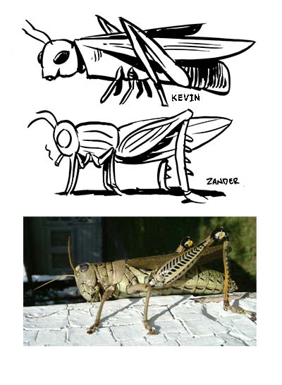
KEVIN: No doubt you'll immediately notice that I didn't draw the correct pattern on the hind leg. If you're sharp you may also notice that the hind leg is BACKWARDS.

ZANDER: YESSS! Got the major details right, though I'd deduct points for that cigarette. I should mention I drew a grasshopper from reference about 2 years ago. I guess that's kind of cheating. Oh, and I should deduct points for that cigarette, too.

2. Pelican
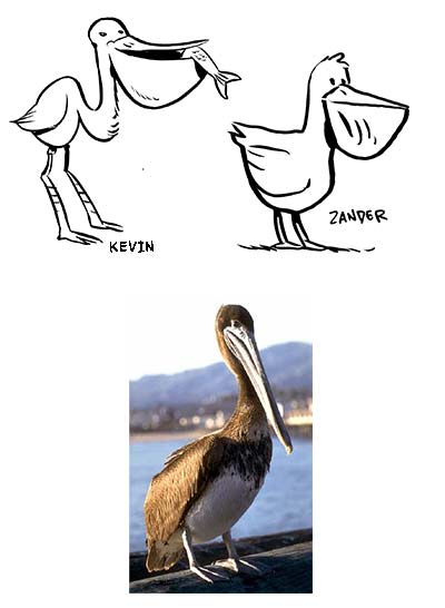
KEVIN: I win this one, because even though the photo doesn't show it, all pelicans have fish in their mouths.

ZANDER: I wasn't as far off as I thought. I don't know why I think of pelicans' lower beak areas as hanging flaccid like that all the time. What disgusting birds they'd be.

3. Mole
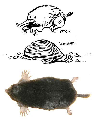
KEVIN: We actually have a live mole in our office, so as you can tell from the bottom image, we just threw him on the scanner bed. Uh... just kidding. I'm pretty proud that I got his front feet right, but pretty not proud that my mole looks like a big puff ball. And has a bicycle horn nose.

ZANDER: Mine is a star-nosed mole, and I'm going to have to assume I got him right, nose-wise. And I'll know from now on that moles have five claws. How interesting.

4. Giraffe
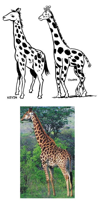
KEVIN: I can't believe I forgot those horn things. What are those for, anyway?

ZANDER: AARGH! The tail! I've never seen a tuft of hair that long on a giraffe's tail!! What gives? Ooh, and I'll have to remember the spots fit together like puzzle pieces instead of looking free-floating like I drew them.

5. Platypus
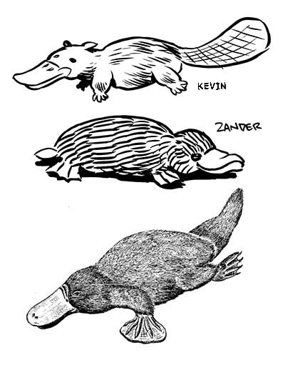
KEVIN: My platypus is perfect. Ignore the reference image, which has the platypus holding silver dollars in its paws.

ZANDER: Nice job, me, on the lack of ears. The rest: man, I obviously have never seen one of these things. Wrong feet, wrong tail, and my duck bill looks like Uncle Scrooge's.

note: all photographs were found on google image search. We don't own 'em or anything.

Wednesday, June 27, 2007

Cartooning Tips and Tricks: Committing a Visual Subject to Memory

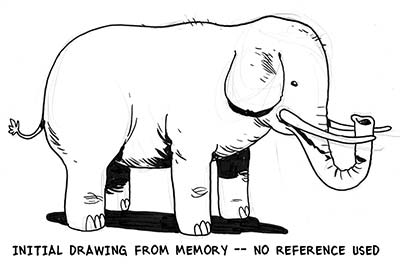
Let's say that twice a year you find yourself having to draw an elephant. Maybe last September you found yourself drawing a political cartoon and wanted to caricature the Democratic party. Then, a few months later, a six year old begged you for a "totally sweet" elephant (riding a snowboard).

If you're like me, you would have run for the nearest computer to do a Google image search. But the truth is, you don't always have a computer with you. So until someone comes out with an image phone, or "i-phone," we're all going to have to get better at committing to memory some of the things we could normally just look up.

The technique below could be described as "learning by humiliation." That is, you feel humiliated when you realize how little you know about something you've seen your entire life -- like, say, an elephant. Try this technique, and see if it doesn't help you stay away from Google image search...

STEP ONE: Pick Your Subject
Pick a subject, but don't look at photo reference first. Maybe it's an animal, maybe it's a person's face, maybe it's a cartoon character. You can see a vague image in your mind, but how well does that image translate to pen & paper?

STEP TWO: Draw Your Subject

Draw directly from your mind, without any visual reference around you. Try to draw your subject as accurately as possible. Think about each line while you're drawing it: which parts of the subject are you most comfortable with? Which parts are giving you the most trouble? It's important here that you really concentrate on and struggle with the unknown parts of your subject.

STEP THREE: Look at Visual Reference

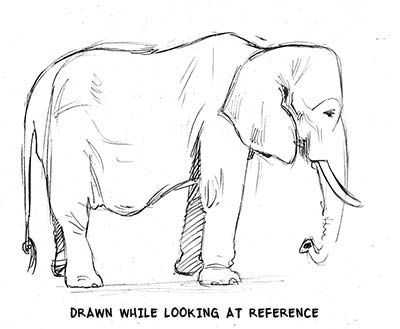
Okay, NOW run to your computer and find the thing you're drawing. Print it out. Put the reference and your Step Two drawing side-by-side and compare. If you really concentrated on each line, you should feel three different things about different parts of your drawing:

"a-HA!" for areas where you had no idea how to draw it, but you struggled and tried to make an educated guess. You may have drawn it wrong, but now you know the right answer!

"WhaaaAAA--" for areas that you thought you were comfortable with, but it turned out you were off.

"NAILED IT." or "PAT ON THE BACK, KEV." for areas that you got right.


STEP FOUR: Draw the Subject Again

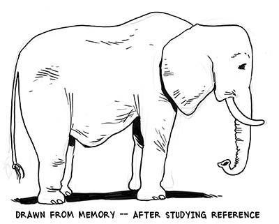
This may seem tedious, but put the visual reference away and draw the same exact subject. This time use the memory of your experience with Step Three. You should remember which parts of the drawing were correct, and repeat those, and remember which parts were off, and do your best to get them right this time.

STEP FIVE: Look at Visual Reference Again
Hopefully, you're spot on. If not, why not? Maybe the details are right, but the shape is off. If you're drawing a character, perhaps you got the eyes in the right spot but the line weight is all off.

NEXT STEPS:
If you're a perfectionist you may want to repeat Steps Four and Five until your drawing is beyond reproach.

For the rest of you, try repeating Steps Four and Five in a day, or a month. Notice what deteriorates in your memory of this specific subject.

Try a host of subjects. What do you consistently get wrong or consistently get right? See if certain kinds of subjects stick in your mind better than others.

BONUS STEP:
Simply to impress people (or piss people off), use these steps to memorize something extremely complicated and unnecessary. Maybe it's a portrait of Queen Elizabeth, or the complete rigging on a clipper ship. Who knows, maybe this completely random visual knowledge will win you points with the nephew ... or liven up a dull party.

Maybe it will save your life.

Tuesday, June 26, 2007

Video Blogs Are The Media Now

CNN Headline News will be showing a fancy smancy edit of the "Comic Con What's Your Day Job," video from this here blog at :56 after the hour all weekend. (plus a little interview) It'd be great if someone could send us a copy if you can TIVOorwhateverifyit.


Also, you may have caught the Drunk Squirrel on Carson Daly this week. That thing is getting around; Fox, Maury, Country Music Television, Spun Gold UK, and over four million views on googleable video sites where kids repost.

Our message to the world who is apparently watching...drunk animals are not as fun as comics.

Thursday, June 21, 2007

Sketch Challenge: 700 Zombies

The Cannon boys are cartoonists. That's what they are and what they do. They draw all day and dream about drawing all night. They can draw anything you can think of. They will draw things you have never heard of. They will draw a box. They will draw in socks. SKETCH CHALLENGE GO!

Today the Cannon boys are contributing to the 700 Zombies Flickr pool.

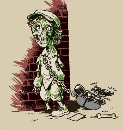
251. Timothy the Shoeshine Boy


Poor ol' Timothy. He just wanted to make an honest living for his nine brothers. But one of them went to public school and came home with the plague. Now his shoes, once his pride and joy, are nothing but a burden. How sad.

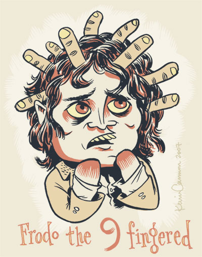
46. Frodo the Nine-Fingered


Apparently this person "Frodo" is based on a book or movie character or something. However, the only film I've ever seen is 1993's "The Good Son," so I decided to model my zombie after Macaulay Culkin's fictional brother in that film, Elijah Wood.
Wednesday, June 20, 2007

Zander Cannon at Mocca Art Fest 2007!

Hey folks, come one, come all, to the Puck Building on LaFayette and Jersey St. in New York City this weekend (June 23-24) for Mocca Art Fest 2007! I will be there to sell some comics, do some sketches, and chew some fat with all you good comics folks. Come on by and meet Joolie Doolie, my crafty better half, and tell us all about y'self. See you there!

Tuesday, June 19, 2007

Cartooning Tips and Tricks: Crosshatching

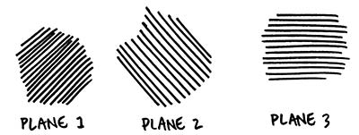
Crosshatching is the layering of planes of parallel lines on top of each other in order to create a gradient or texture in a drawing.

Crosshatching has an "old-fashioned" stigma, probably for good reason: drawing lines side-by-side, and then on top of each other, is a great solution to a problem inherent in pen & ink drawing and printmaking: How do you make a drawing tonal if all you have to work with is black and white?

With digital tools at our disposal, as well as relatively new products like Zipotone, Craftint and DuoShade, it's easy to see why crosshatching isn't considered cutting edge. However, I don't personally believe that a technique in itself can be old-fashioned; I think that comes out of how the artist uses the technique.

Below is a primer on crosshatching for the beginner or for those who want to hone their craft. Professionals -- we'd love to hear your advanced tips and tricks in the comments!

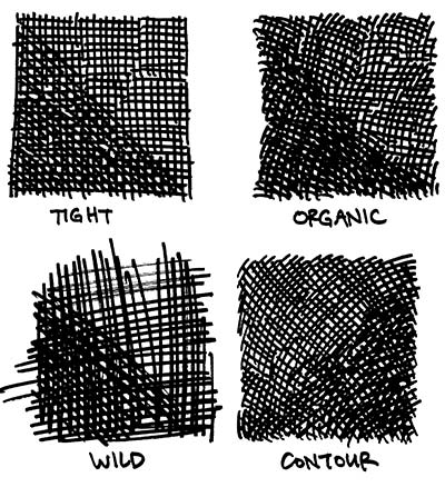
Styles of Crosshatching
1) Tight, accurate lines. Plane 2 is arranged at 90 degrees, plane 3 at 45 degrees.
2) Organic lines. Gives a softer feel.
3) Fast, wild lines. Energetic and frantic.
4) Lines that follow the contour of the surface.


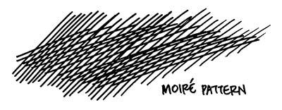
Moire Pattern
When an overlapping plane doesn't have much of directional shift from the plane below it, you can end up with an effect like below. It looks jarring and will take attention away from your drawing.

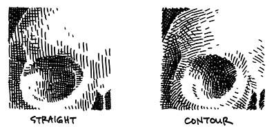
Contours
When drawing a 3D object like a skull, do you keep your lines straight or follow the contours of the object? Examples:


Gradients
Two kinds of gradients below. On the left, the planes of lines end abruptly, in chunks. On the right, however, there is a greater attempt to smooth the transistion through the use of small lines that "dissolve" from one plane into the next.


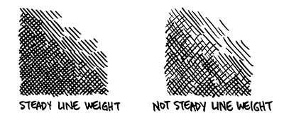
Consistency

There is no right way to crosshatch, but being consistent in whatever style you choose can go a long way towards making your work look competent.

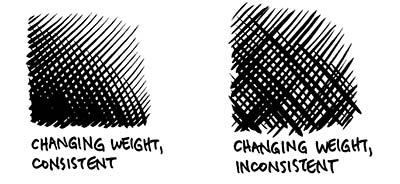
Consistent line weight. Keeping a steady line is easier with an inflexible tip pen like a rapidograph. If you're using a flexible crow-quill nib, however, keeping steady line weight will be a chore.


However, consistency and a changing line weight can go hand in hand, but takes concentration:

Monday, June 18, 2007

Stumbling on Picasso...


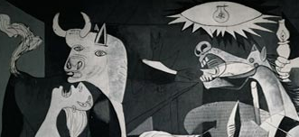
Tonight was a night for stumbling on Picasso... first catching the tail end of a PBS show about Guernica, and just now finding a great site called You Ain't No Picasso. The site's got reviews of shows coupled with mp3s of live recordings. I love gritty, "as if taped through a bathroom stall door" recordings*, but rarely make it to actual shows, so YANP is right up my alley. Perhaps it may also be up yours?

* How Zander describes an Of Montreal live album I make him listen to over and over.

Big Time Attic: The Comic


Friday, June 15, 2007

Fan Club: Stella


Here are two truisms about Stella:

1. Stella is hilarious.
2. You won't get it.

Or maybe you will get it if you think that comedy gold means using a "shattering glass" sound effect on a broken trowel, or having a park ranger refer to the female deputy as "the female deputy."

A quick history (as I understand it): Stella is a three man comedy troupe that started as a stand-up act and moved into television and films (although the films aren't technically "Stella," but involve all or most of the players). The triumvirate (shown above) are (L-R) Michael Ian Black (currently a Sierra Mist spokesmodel), David Wain (director of The Ten, coming out soon, presumably the big screen sequel to ABC's Emmy award-winning series "The Nine"), and Michael Showalter (currently starring on the really small screen in The Michael Showalter Showalter).

Watching Wet Hot American Summer (Wain and Showalter's camp masterpiece) a few years ago with my roommate Zach and his friends was the closest thing I've had to a religious awakening. After accepting WHAS as The Truth, I then converted my brother, who then converted most of his high school friends. I admit, I got a little over-zealous back then, and even hid "WHAS" in braille in a homecoming t-shirt commissioned by my brother's high school. That furvor culminated in a short friendster message conversation with David Wain himself, an exchange that boils down to:
ME: Mr. Wain, I really enjoyed WHAS.
WAIN: Thanks.

I don't normally get this stupid about movies or directors, so I thought Stella was a natural choice for this "Fan Club" category that Zander devised.

Wednesday, June 13, 2007

Tips and Tricks: Writing for Comics

So you want to write comics, but you can't draw? No problem. You want to write comics but you don't want to think visually? Problem.

Most comics these days are written as full scripts, with the panels broken down, described, and dialogued by the script writer, which puts him or her in the position of author/director, controlling the pace of the story and the general experience of reading. If a writer is in that all-important position, he needs to think visually about the way the story is playing out, or else he is cheating both the artist and the reader out of a satisfying experience. So here at Big Time Attic, we have a stripped-down, basic primer on how to write comics and maximize the experience both for yourself and for your collaborators. And that's what will make good comics, too.

1. Think about panel layouts. You have to really think about what the reader will be seeing as he or she reads the story. What is the pacing? Where are the big revelations? Who is the focus of the narrative? While any good artist will add an atmosphere that will help all of these things, the writer of a comic has to give him something to work with. A good panel structure will make art more effective and easier to read, so it's good to have a plan as you write your script.

a. Use a standard layout for most of your story.
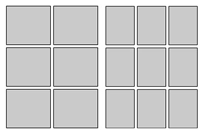
These are two good templates to stick to.


Action-heavy stories work well with the size of panels in the 6-panel grid, whereas denser, more dialogue-heavy stories are more at home in the smaller panels. This is not to say always use these pages; you should adjust them as necessary, putting a panel the width of the page in the top tier to show a surprise, or one 2/3 the width to show a few more characters or more background. And you should throw in a splash page here and there, sure. But the point is-- if you keep to a reasonable template for your panels, you'll do two things: regulate the pacing of the story so that you slow the readers down and let them get absorbed in the characters and plot, and set them up for the big KA-POW panel that you've been saving up for that page turn.

b. Try to put surprises on the page turn. It's a rare comic that can effectively put a surprise at the bottom of a page. People instinctively scan a page before starting to read, and if the surprise is a visual one, or in a big panel, they're sure to have it spoiled for them before they read the set-up. If you have it on the next page, or better yet, on the page turn, you'll get a lot more of the reactions you're hoping for.

c. Don't put more than 9 panels on a page. A lot of writers will try to cram too much on each page, both in each panel and in the number of panels. Unless you're drawing the comic too, never put more than 9 panels on a page. And if you have nine panels, put them in the 3x3 grid. Anything smaller than that is just not going to hold the information you want it to.

2. Know the four types of panels. As mentioned in this post, there are basically 4 things a panel can communicate: Scale, Relative Position, Emotion, and Detail. These will basically get you through most comic storytelling problems, and you should have all types in your stories.


Think about every panel as serving one of these purposes, and keep in mind, you shouldn't count on a panel having more than one purpose. The artist may be able to put something in there, but if, for example, you have a wide shot of a guy standing in a line and you want to show that he's angry about it, you'll want to cut to a closer shot of him to get his facial expression.
Don't get too caught up in thinking about what purpose each panel is serving, but these are things you can consider if you're feeling like you're stuck.

3. Most importantly, create layouts. The truth of the matter is, to write a comic, particularly in full script form, you need a sense for what the comic is going to look like. You also need to know what can and can't fit on a page. For this, you need to create some layouts. The method I like to use is this one.
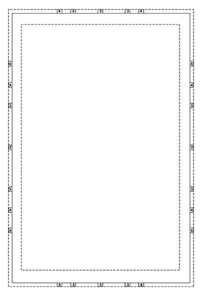
a. Download and print out this template. Basically, it's a set of crop marks that looks like this:


It will give you guidelines for a dividing the page in thirds or fourths, horizontally and vertically, with wide, short 1/6th page panels thrown in there. Its approximately the size of a standard comic book after it's been printed. This is important because if anything is too small or illegible on this page, it will be in the final comic, too. If you're too wordy, you'll start realizing it as soon as you start writing it in those word balloons.

b. Create staging with these basic tools. You can't draw? Don't worry, we're not talking about really drawing. You just need to be able to draw:


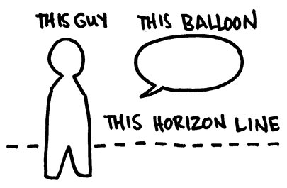
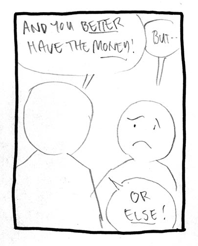
It's as easy to draw as a stick figure, but it does a far better job of approximating what will be in the panel. Now, once you draw out some borders (I did this one in ink, for clarity, but normally I just rule them with pencil) you can draw your little people talking to each other. As I mentioned in this post, remember that the horizon line is eye level. Most panels are going to be at more or less eye level, so you should generally put your people's heads at the same level, on the horizon line, no matter how far they are from the "camera".


When you look at layouts, especially if the shots are not terribly innovative like this one, you may think, "Big deal. I can get that across in a script." That's true, you can. But when you do this you know how much space your word balloons take up, what order you look at the images (1st word balloon, 2nd word balloon, back of head, face, 3rd word balloon), how tight the panel is on someone's face or certain details, and absolutely most importantly, how well the comic reads as a comic. All of a sudden, you know that the story is too wordy, or that there are too many small panels, or that the dialogue reads weird in balloons even though it sounded great when read aloud.

c. Let the artist take care of the tough ones. Now, not all panels are going to be like this one. Really, anyone can draw two people standing in a room, at least so that you could guess what it was. But if this is the big reveal of your characters walking across a rickety bridge into the cavern holding the giant steam-powered steel zeppelin floating over a pit of lava, just let the artist handle that one. He'll have a better idea on how to frame it anyway. But if you have a panel set aside for it, you'll at least know how big it will be when printed, and then you can have a far better sense for how much information and detail you can reasonably ask for.

4. Let the artist alter the plans.
This one's important. You're not necessarily doing these layouts so that the artist will slavishly follow them, but rather so that you know what to include and leave out, so that you know what the final comic will basically look like, and so that you know what experience you're giving to both your collaborators and your fans. Artists know comics, and they know comics storytelling (if they don't, you'll really be glad you made these) and they frequently have excellent ideas on how to get a story across. Defer to their judgment, not just because they might know better, but also because no one wants to be the jerk who gets all over everyone's case when you're supposed to be done.

Good luck!