Most comics these days are written as full scripts, with the panels broken down, described, and dialogued by the script writer, which puts him or her in the position of author/director, controlling the pace of the story and the general experience of reading. If a writer is in that all-important position, he needs to think visually about the way the story is playing out, or else he is cheating both the artist and the reader out of a satisfying experience. So here at Big Time Attic, we have a stripped-down, basic primer on how to write comics and maximize the experience both for yourself and for your collaborators. And that's what will make good comics, too.
1. Think about panel layouts. You have to really think about what the reader will be seeing as he or she reads the story. What is the pacing? Where are the big revelations? Who is the focus of the narrative? While any good artist will add an atmosphere that will help all of these things, the writer of a comic has to give him something to work with. A good panel structure will make art more effective and easier to read, so it's good to have a plan as you write your script.
a. Use a standard layout for most of your story. These are two good templates to stick to.
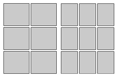
Action-heavy stories work well with the size of panels in the 6-panel grid, whereas denser, more dialogue-heavy stories are more at home in the smaller panels. This is not to say always use these pages; you should adjust them as necessary, putting a panel the width of the page in the top tier to show a surprise, or one 2/3 the width to show a few more characters or more background. And you should throw in a splash page here and there, sure. But the point is-- if you keep to a reasonable template for your panels, you'll do two things: regulate the pacing of the story so that you slow the readers down and let them get absorbed in the characters and plot, and set them up for the big KA-POW panel that you've been saving up for that page turn.
b. Try to put surprises on the page turn. It's a rare comic that can effectively put a surprise at the bottom of a page. People instinctively scan a page before starting to read, and if the surprise is a visual one, or in a big panel, they're sure to have it spoiled for them before they read the set-up. If you have it on the next page, or better yet, on the page turn, you'll get a lot more of the reactions you're hoping for.
c. Don't put more than 9 panels on a page. A lot of writers will try to cram too much on each page, both in each panel and in the number of panels. Unless you're drawing the comic too, never put more than 9 panels on a page. And if you have nine panels, put them in the 3x3 grid. Anything smaller than that is just not going to hold the information you want it to.
2. Know the four types of panels. As mentioned in this post, there are basically 4 things a panel can communicate: Scale, Relative Position, Emotion, and Detail. These will basically get you through most comic storytelling problems, and you should have all types in your stories.

Think about every panel as serving one of these purposes, and keep in mind, you shouldn't count on a panel having more than one purpose. The artist may be able to put something in there, but if, for example, you have a wide shot of a guy standing in a line and you want to show that he's angry about it, you'll want to cut to a closer shot of him to get his facial expression.
Don't get too caught up in thinking about what purpose each panel is serving, but these are things you can consider if you're feeling like you're stuck.
3. Most importantly, create layouts. The truth of the matter is, to write a comic, particularly in full script form, you need a sense for what the comic is going to look like. You also need to know what can and can't fit on a page. For this, you need to create some layouts. The method I like to use is this one.
a. Download and print out this template. Basically, it's a set of crop marks that looks like this:
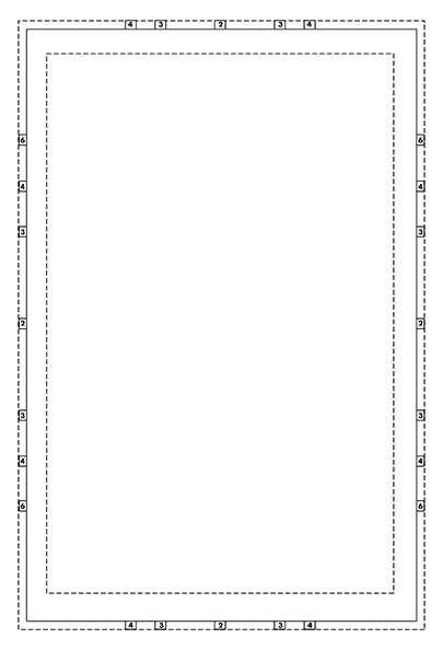
It will give you guidelines for a dividing the page in thirds or fourths, horizontally and vertically, with wide, short 1/6th page panels thrown in there. Its approximately the size of a standard comic book after it's been printed. This is important because if anything is too small or illegible on this page, it will be in the final comic, too. If you're too wordy, you'll start realizing it as soon as you start writing it in those word balloons.
b. Create staging with these basic tools. You can't draw? Don't worry, we're not talking about really drawing. You just need to be able to draw:
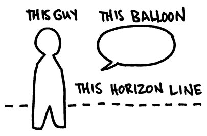
It's as easy to draw as a stick figure, but it does a far better job of approximating what will be in the panel. Now, once you draw out some borders (I did this one in ink, for clarity, but normally I just rule them with pencil) you can draw your little people talking to each other. As I mentioned in this post, remember that the horizon line is eye level. Most panels are going to be at more or less eye level, so you should generally put your people's heads at the same level, on the horizon line, no matter how far they are from the "camera".
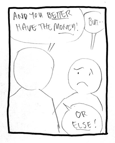
When you look at layouts, especially if the shots are not terribly innovative like this one, you may think, "Big deal. I can get that across in a script." That's true, you can. But when you do this you know how much space your word balloons take up, what order you look at the images (1st word balloon, 2nd word balloon, back of head, face, 3rd word balloon), how tight the panel is on someone's face or certain details, and absolutely most importantly, how well the comic reads as a comic. All of a sudden, you know that the story is too wordy, or that there are too many small panels, or that the dialogue reads weird in balloons even though it sounded great when read aloud.
c. Let the artist take care of the tough ones. Now, not all panels are going to be like this one. Really, anyone can draw two people standing in a room, at least so that you could guess what it was. But if this is the big reveal of your characters walking across a rickety bridge into the cavern holding the giant steam-powered steel zeppelin floating over a pit of lava, just let the artist handle that one. He'll have a better idea on how to frame it anyway. But if you have a panel set aside for it, you'll at least know how big it will be when printed, and then you can have a far better sense for how much information and detail you can reasonably ask for.
4. Let the artist alter the plans. This one's important. You're not necessarily doing these layouts so that the artist will slavishly follow them, but rather so that you know what to include and leave out, so that you know what the final comic will basically look like, and so that you know what experience you're giving to both your collaborators and your fans. Artists know comics, and they know comics storytelling (if they don't, you'll really be glad you made these) and they frequently have excellent ideas on how to get a story across. Defer to their judgment, not just because they might know better, but also because no one wants to be the jerk who gets all over everyone's case when you're supposed to be done.
Good luck!




20 comments:
Zander, will you draw me a picture of your characters walking across a rickety bridge into the cavern holding the giant steam-powered steel zeppelin floating over a pit of lava?
Please?
I was just about to ask you the same thing!!
hello friend excellent post about Tips and Tricks: Writing for Comics thanks for sharing I'm looking information about generic viagra thanks for your help and information
Wow, this is perfect, Zander! Thanks!
I really enjoyed this post, especially the “examples in this post” portion which made it really easy for me to SEE what you were talking about without even having to leave the article. Thanks
ptc
This article is very unique, informative and interesting. I will keep on coming here to see new updates. Thanks for posting.
marketing dissertation
I have been searching for such information for months now. Thanks God I have found your blog, it has helped me a lot in working on my project. Thanks a lot
logo design prices
logo design packages
Your post is excellent. I feel like reading it again and again. I have been searching for it for many days. I will come again to see new updates.
UK Dissertation Writing
These pictures are awesome. I have never seen pictures like these before. You have done a good work. I admire your efforts. I will come again to see new pictures. Keep on posting such pictures. Thank you.term paper writing service
I would like to say that your article is awesome. You have good command on the topic. I will tell my friends about your website. Thanks for posting.
Free business term papers example
In the network’s We wandered. By chance following your internet website, study your posting. Really fruitful,thank a person for discussing. On the web, It's difficult to get helpful information. Many thanks
This post is actually amazing .This kind of reduced the situation a whole lot inside my study. We enjoy function. I'll show up below yet again to find out refreshing improvements. We appreciate you publishing.
Thank you for share this informative post.
I sincerely relished reading the item, you are an excellent article author. I will bookmark your blog and can generally revisit sometimes quickly. I must really encourage that you simply proceed your current wonderful writing.
script writing services
It's a tough theme - copyright.
This is a point of lots of discussions and this was always difficult for novice writers to protect themselves from stealing their papers.
Very often employers just steal their works while asking for preview before paying.
And so you should learn how to write essays, how to make cool topics, how to protect your papers, etc.
www0417
chargers jerseys
ray ban sunglasses
jets jersey
christian louboutin uk
ralph lauren outlet
reebok outlet
nike outlet
nike outlet
cleveland cavaliers
houston texans jerseys
A well-researched topic, a good plan, proper format, appropriate research methodology, and a well researched literature review provide a strong foundation for a scholarly dissertation. Best Dissertation Writing Service UK
My Name is Abhay Kumar. I’m a Blogger living in India. I am a fan of technology, design, and writing. I’m also interested in programming and blog. I would like to share articles related to SEO, blogging tutorials, WordPress Tutorial, Make money online. You can read my blog.https://www.ducatindia.com/java-training-course-in-gurgaon
Best CRM software consulting service in Pakistan, UAE, KSA, and Bahrain.
Zoho Software consulting services.
Best CRM For Professional Services
Thanks admin for the post, Its really a nice post and Looking for more blogs like this. Please stay updated..!
Spray Foam Insulation In Dallas TX
Post a Comment