Common Mistake #1: Mismatched Perspective
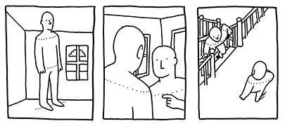
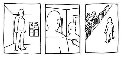
I often see young artists that are in most other ways fairly accomplished that make the mistake of not incorporating their characters into the perspective of the background. I gather (from my own experience) that it's because people are hard to draw, and you learn how to draw them first from only a couple perspectives, and then, in the interest of making the best-looking drawing you can, you try to shoehorn that person into a background that's not quite right.

Always remember that people are subject to perspective just like everything else, and in almost all cases, they want to have their heads and shoulders level. I know, I know, it's an action comic. But unless your character is doing backflips, dodging bullets, rolling under spinning blades, or some other such thing, he or she is probably going to be standing up relatively straight. Here are some preferable solutions to the problem.

Keep in mind that a solution is always available via photographs. Take a quick photo of a friend or of yourself doing what you want your character to be doing, and then-- don't copy it, but absorb it. Think about where all the arms and legs are, what angle the head's at, what angle the shoulders are at, etc. Try drawing it from another perspective. Draw it using only the simplest shapes and stop worrying about the folds of the fabric. Need some action shots? Get a kung-fu movie on DVD and frame-advance through an action scene. Draw those! You're not only guaranteed to get accurate poses, you're likely to find some far more expressive and non-cliched ones as well.
Got some perspective-related portfolio tips, cartoonists? Got some questions for the cartoonists, young students of comics? Join us in the comments.


3 comments:
very usefull post. thanks.
i gess i have just the problem you mention, but that´s a tuff one to resolve, it´s a matter of really drawing more and accepting what may come. tuff to some, fundamental to all!
I found the tips very helpful. I am always watching cartoons and observing how the artist handels the situation. The article put into words and better describes what i need to improve on
20160524meiqing
adidas superstars
jordan pas cher
ray ban sunglasses
christian louboutin uk
adidas pure boost
yeezy boost 350 black
coach outlet store
cheap jerseys wholesale
air max 95
ray bans
timberlands
ralph lauren outlet
abercrombie and fitch
lacoste shoes
designer bags
nike blazer
ray ban outlet
michael kors outlet
nike air force 1
polo outlet
sac longchamp
toms shoes
ray ban sunglasses
puma shoes
fitflops clearance
burberry outlet online
cheap ferragamo shoes
fitflops
canada goose
true religion outlet
fake oakleys outlet
ray ban sunglasses
coach purses
michael kors outlet online
hollister clothing
hollister shirts
Post a Comment