Now, certainly there are times in which you have to really do it right. Cityscapes, roads, massive shelves of books, cars, etc., those panels all really need you to take some time and figure it all out. But what we're talking about today is the other 85% of the time-- when all you need is for things to look right enough. That's where the cheating comes in.
Getting perspective right can be a thankless job. If you nail it, no one notices, but get one thing wrong and your whole panel goes kerflooey. What we need to do is make a believable environment without having to get out the yardstick.
One: The Horizon Line is Eye Level
When you're drawing a lot of panels and you want to keep them looking basically structurally sound, one of the best things you can remember is this one simple fact: the horizon line is eye level. If you are looking horizontally, and you will find that most comic panels more or less are, the horizon line is at your eye level, and so it will cross everything at that level. Say you are 5'6". The horizon line will cross everything in the panel at five feet. Is someone much taller than you? Then it crosses them at the chest. A building in the background? About 3/4 the way up the door. A hobbit? Way above their head.
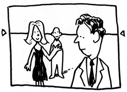
But apart from a few outliers, most people in a crowd scene, for example, will have their heads more or less right on the horizon line. This is helpful from a layout point of view because then all of the people's heads that you need to look at are lined up neatly in a row, anchoring the panel and making it much easier to read.
Two: Don't Worry About the Vanishing Point
Perspective books always talk about the vanishing point, and while that's important if you want your perspective to be bang on perfect, what I find is more useful on a daily basis is just worrying about whether things go basically up or down as they recede into the distance. If they are above the horizon line (eye level, remember), they will go down as they recede. If they are below it, they go up.
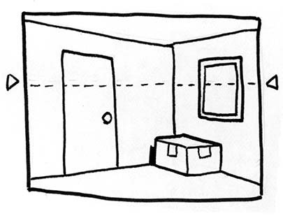
When drawing a room interior like this one, in my experience, it can be counterproductive to really extend the lines all the way to the horizon, which would put the vanishing point way off the page. I like to instead just imagine the angles of horizontal lines on the wall as simply getting shallower as they come toward the horizon. The picture on the wall, for example, has its lines going in the same directions as the top and bottom of the wall, just less extreme.
You'll notice I didn't use a ruler for this panel. Some people would be horrified, but I find that it's so much easier to do it like this than by ruling it out. Besides, once you start ruling things, everything that's not ruled starts looking bad, and you have to make every line straight, and every oval perfect, and quite honestly, then you will want to quit and go play video games.
Three: Putting It All Together (And A Trick!)
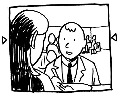
You will find that anchoring your people and objects to a horizon line will immensely improve your panel layouts. People will look much less like they are floating around, and two people talking will look very engaged in what they are doing, rather than two images just cut and pasted into the same panel. Also, a scene which has a horizontal line of people that are more-or-less the same height going across it can have a similar calming effect to a panel with an actual horizontal line, which is nice if you want a scene to be relaxed, despite having a bunch of people in it.
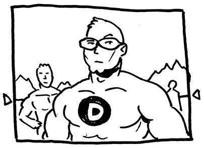
One trick that is used very often to great effect is drawing heroic characters from a low point of view; that is, putting the horizon line at about their chest level, as if we were only about 80% of their height. Now, when you see one single character like this, with no background or other characters around him, you don't really get the effect, but as soon as you put in some other people, or background, you really get it. That guy's big!
Four: Testing your work.
Much like all things with comics, the best way to test your perspective is, first of all, does it look right to you? Second, does it look right to your friends? Third, does it look right to an art teacher or professional artist? Fourth, does it look right to Gene Ha? If the answer to any of the first three are no, then you should definitely fix it right away. If it's the fourth, well, then you've probably been following this guide to a T.
Five: A Few Other Cheats
Models: A few good plane and car models are nice to have around-- even Matchbox cars are pretty useful, considering how cheap they are. Sometimes it's useful to take a photograph of them from the right point of view and work from that, as it makes it easier to get the perspective right.
Photographs: Can't beat 'em, if you're drawing the same building from the same perspective. Do that too much, or from photographs that you didn't take, however, and people will notice.
Sketchup: Google Sketchup is a fantastic free 3D modeling tool that allows you to create environments relatively easily and then texture them, light them, and rotate them to get just the angle you need. You can also download models people have created of buildings, cars, and anything else you need to get just right. It's cheating at its very best!




6 comments:
I should note Donn's been helping me correct my perspective. On human heads. I have a weird distortion where the eyes don't line up right.
I wish I could run all of my heads past Donn for approval, sigh.
Gene, I was actually referring to the fact that you are so meticulous and precise about your perspective that people who don't measure up to your standards shouldn't be too hard on themselves.
It was one of those compliment things.
I had just finished reading "Perspective for the Comic Book Artist" - a graphic-novel-style instructional book in which David Chelsea at first appears to be capable of explaining perspective in simple terms, but by the end of the book the reader is keenly aware that the man clearly has Aspergers and is in fact quite obsessive about everything being perfect no matter how much time it takes, and who will exclaim how EASY it is the entire time - when I decided "Fuck it, I'll just go download Sketchup."
The more I thought about it, it seemed like genius. I googled "sketchup perspective cheating" to see if I'm the first to stumble upon this little trick. Turns out: nope. But I did find a very readable and reassuring blog about perspective - Thanks!
-Matt in Seattle
Matt in Seattle-- I have that book too, and while I think it's an excellent resource for people who are really persnickety about perspective, it does, in aggregate, make the whole process feel pretty forbidding.
I'm glad this post made you feel reassured. I feel like a fear of perspective keeps a lot of people from doing great work, and the knowledge that it doesn't have to be mathematically perfect is a great relief.
Zander
Great post!
I'm an art student who came across this while searching how to build an attic on a rooftop in 2 point perspective for a project, and surprisingly I find the link to Google Sketchup quite useful ;)
Reading this in 2017. Great post. Thanks!
Post a Comment