
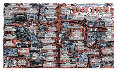
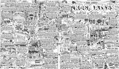
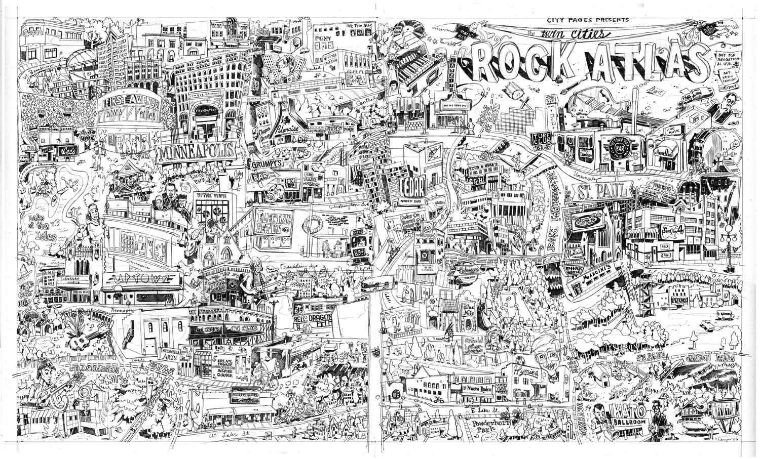
Between now and Wednesday pick up a copy of City Pages and turn to page 50 to be magically transported to a land of rock and roll. This map was a huge undertaking -- one that I'm thrilled to have been a part of -- and for fun I thought I'd jot down some notes on its production.
So ... here is way more than anyone should ever want to know about the Twin Cities Rock Atlas:
CONCEPT
Nick Vlcek of City Pages approached me for this project based on the style he'd seen in the Comix Issue in July. For the rock atlas, Peter S. Scholtes wrote captions for over forty venues around the Twin Cities, several of which had to be cut due to space constraints.
LETTERING
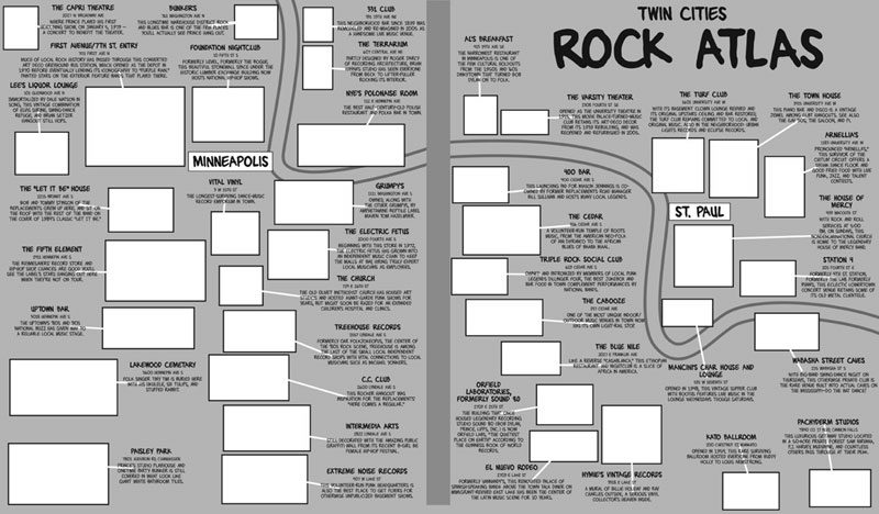
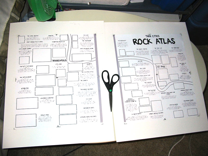
Drawing the map was easy compared to the front-end work, namely making sure that all of the venues on the list would fit on the map. I made an InDesign document with the dimensions (12 x 20.5") and pasted in the text from the Word document. A year ago I would have hand-lettered the whole thing, but fortunately we made some handwriting fonts recently (roman, bold, lowercase and title) with FontLab. Using the fonts allowed me to get the lettering part of the map nailed down on the front end, so there was no guesswork later. If I didn't have a font, I would have hand-lettered everything separately, scanned it in, and moved each caption around as a separate object in InDesign.
My main balancing act with the lettering was how to get it as small as possible while still making it legible. I learned from the Comix Issue that small lines tend to bleed on CP's newsprint. Nick and I wanted the captions to be small enough to be able to show as much art as possible, but not so small that everything's illegible, thus ruining the whole point of the map and disgruntling everyone who tries to use it for navigational purposes.* We eventually settled on something small but conservative. The main risk was with the addresses, which use the smallest font size -- the thinking being that the address is the least important part of the caption.

CAPTION BORDERS
Initially I put huge balloons around each caption (see above), worried that black and white text, especially handwriting text, would get lost against the final artwork. The Comix Issue had used a lot of white space under the text, and that seemed to work well. The problem with the rock atlas was that with forty captions, all that white space on the edges of the captions added up. We eventually dropped the borders and brought the font size down, thereby clearing up space for more art.
VENUE PLACEMENT
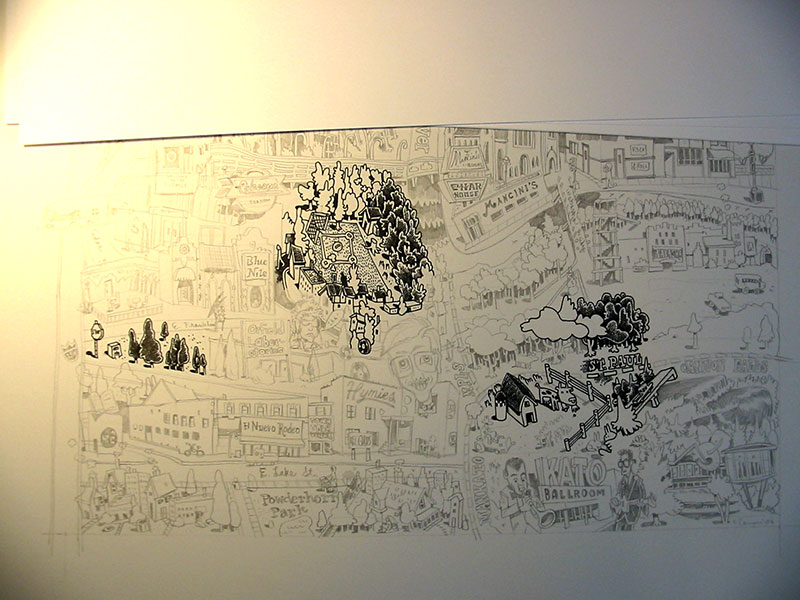
This was complicated, trying to place these pretty disparate venues on one landscape template so that they made some sort of geographical sense, but ALSO find room for their captions. My first go at this had all Minneapolis venues on the left, and every thing else (title, St. Paul, and outlying cities) on the right. I would have liked for the title to be on the upper left but there were just too many Minneapolis venues to make that feasible. To make this initial set-up work I had to bunch up captions so that arrows were hiding under other captions to reach their destination. It was crazy busy. Thankfully Nick nixed this idea, and also wanted Paisley Park to be in the lower left so that it was more geographically accurate. Good call, Nick.
I made a layer in InDesign with lots of little boxes representing the venues (see above). Using blank boxes let me move them around without getting too precious about their placement or about how each venue interacted with one another -- I knew that level of magic would happen at the pencil stage. In retrospect I should have made the boxes more horizontal, or at least have known what all the buildings looked like before making the boxes. There's almost nothing vertical about Orfield, for example, but I didn't know it at the time.
Eventually Nick came back to me with a revised venue list which let me pull a few venues and their captions. I also stopped being precious about having all Minneapolis venues on the left and pushed everything from Cedar and east of Cedar to the right side. That worked out because I was finally able to put a caption next to each venue.

GOOGLE MAPS
One of the first things I did, even before making the InDesign file, was to plug all of the addresses into a personalized Google map. Turns out CP did the same thing -- good thinking, guys! Right off the bat I was able pick out patterns in the map, such as clusters of buildings that should be close to each other. For example, from an artistic standpoint I don't like that the Capri is isolated in the upper left, but it makes a lot of sense geographically.
PHOTOGRAPHS
The Google map also came in handy when I went out to take photos. The biggest mistake I made during this project was assuming that I would be able to find most of the reference photos online. Nope. Most of what I found online were indoor shots of the clubs (for good reasons) or outdoor shots that zoomed in so close on one part of the building (a cool sign for instance) that I didn't have enough context for knowing how that sign fit in to the rest of the building.
Anyway, I paid my price for procrastinating. I went out on two photographing journeys, two traffic-free Saturday and Sunday mornings from 6-11 am. It was FREEZING and there was a lot of snow (there would have been no snow had I gone out a week before). But worse yet, the Church was gone! The initial copy for the Church caption said that the building was in danger of being razed. Well, the copy had to be changed because the whole thing was gone. Fortunately I found a photo online, but it was only of the top of the church, which is why the bottom and sides are hiding behind trees in my drawing.
PENCIL PREP
Finally, with 240 photos in hand (and many more from Google Image Search), I was able to start getting my hands dirty.
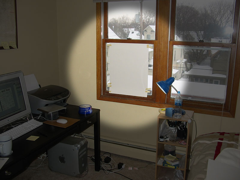
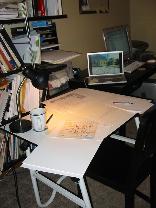
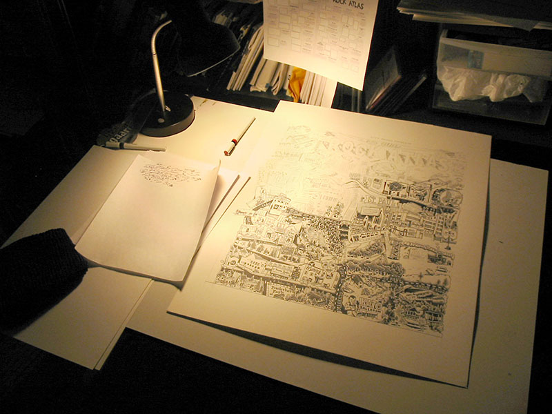
I wanted to draw at 150%, which meant a canvas size of 18 x 30.75". I bought a pad of smooth Bristol, 19 x 24", and divided my drawing in half. Nick asked me to leave a dead zone of about an inch in the middle of the map to allow for the magazine's gutter, which meant that no venues or captions were affected when I split up the art.
On the final art pages, I ruled pencil borders at 18 x 15.375".
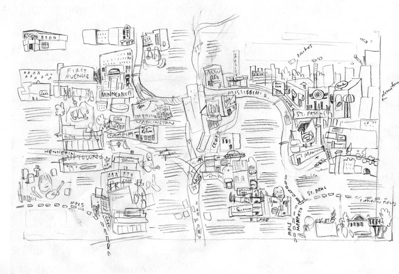
Putting the final art pages aside, I ruled out two more sheets of bristol. This was for the rough draft of the map.
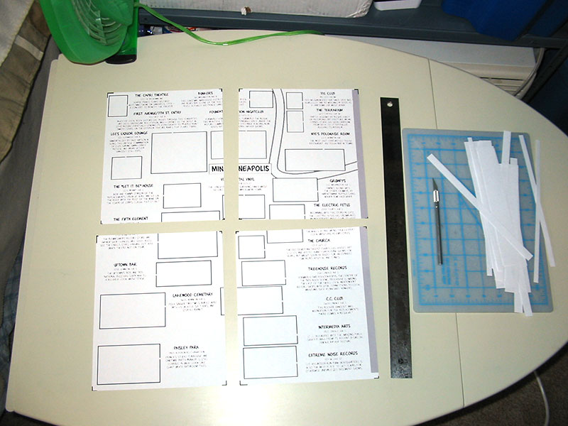 |  |
Next, I made a jpeg of the InDesign map, bumped that up 150% to final size, split that in half and printed it out. I was using a letter-size printer, so I had to print out the map in eight sections (above, left). I drew black boxes at the corners of each section so that lining them up on the page would be a breeze.
On the rough draft bristol pages, I taped down the oversize jpeg of the rough draft map (above, right).
 |
One side at a time, I taped the rough draft of the map onto my ultra high tech light table, and then taped the final art bristol on top. I pencilled in the outlines of the boxes where the buildings should go, as well as the outlines of where the text would sit. Once all that was done, I had my final art pages ready, complete with the live areas for each venue. Now the fun begins.
Rough draft of the map:
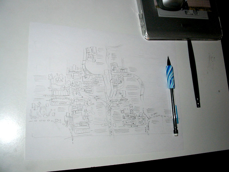
PENCILS
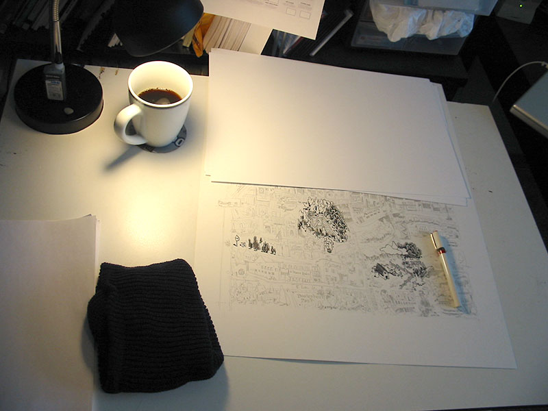
TOOLS: Bic #2 mechanical pencil with multi-colored foam grip
Creatively, this is the hardest step. I set up my workspace so that I could easily flip through the photos on my laptop. I started at the bottom of each page and worked up, because I knew that often buildings and elements would hide behind the buildings below it. Essentially, the bottom venues became the foreground, and the higher up on the page a venue was, the more it sat in the background.
Without having a ton of room for each venue, I had to choose which details would make each drawing recognizable. So in most of the drawings -- which are essentially caricatures of the buildings -- certain elements are blown way out of proportion and other elements are left off completely. Some buildings had only one interesting face while others -- like Blue Nile and Intermedia Arts -- had great murals that wrapped around the whole building. I tried to squeeze in as much of the good stuff as possible.
All told, pencils took about 3 days to do. Fortunately Nick got back to me with only a few minor changes.
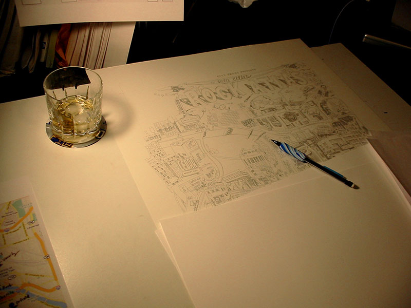
INKING
TOOLS: Rapidograph, #2 (red) and #3 (green)
Inking can be tedious because most of the creative hard work is done, although seeing your pencils become final is pretty satisfying. One trick I've started using since Shanks is to have a wool cap (preferably dark blue) under my left elbow while I'm drawing. I got this one at the Rainbow in the Quarry for about two bucks.
All the linework was done using a #2 (red) rapidograph. I was using a brand new one because I broke my last one on Bob Lipski's project. Right away I could feel that I was using a new pen with fresh ink. Flow wasn't a problem at all. To help save the wire I used a green rapidograph to fill in any black areas and to do the heavy crosshatching on the river and streets.
COLORING
As much as I wanted to relax (read: collapse) after finishing the inking, I still had to scan and color the map, and I had only two days left until the deadline.
I scanned the art in piece by piece using an oversize scanner (ScanMaker 9800XL) and pieced together the bits in photoshop. For archival purposes, I saved a 1200 dpi bitmap version at original art size (150% of print size). Next, I dropped down the whole image to a print size 300 dpi CMYK file and started playing around with colors. I spent six hours specially coloring each venue with their actual palette before finally realizing that a blue/red scheme would look a lot better. Nick and I went back and forth about the red because while I wanted a deep red behind the black, like on Julie Doucet's "My New York Diary" cover, Nick knew that what I had would print really muddy. So we ended up lightening up the blues and changing the red to this lighter, salmony color. I'm not thrilled with the digital red, but the printed version looks great.
EASTER EGGS
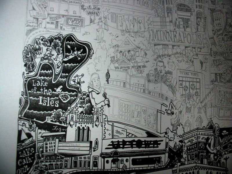
Knowing that nearly half of the drawing would be covered by text, I took some liberties with the elements that appeared underneath the text. Some are buildings that I have a personal attachment to (Diamond's, Handicraft Guild) while the rest are just recognizable or make sense geographically.
Here are some parts of the drawing that you won't see in the City Pages version**:
For the FULL UNCENSORED version of the map, come see the original art at the Lutefisk C show at Altered Esthetics this May. Stay tuned this spring for more details on the show and the submission process...
* Not recommended
** Here's what I WISH I'd hidden in the picture.
Creatively, this is the hardest step. I set up my workspace so that I could easily flip through the photos on my laptop. I started at the bottom of each page and worked up, because I knew that often buildings and elements would hide behind the buildings below it. Essentially, the bottom venues became the foreground, and the higher up on the page a venue was, the more it sat in the background.
 |
Without having a ton of room for each venue, I had to choose which details would make each drawing recognizable. So in most of the drawings -- which are essentially caricatures of the buildings -- certain elements are blown way out of proportion and other elements are left off completely. Some buildings had only one interesting face while others -- like Blue Nile and Intermedia Arts -- had great murals that wrapped around the whole building. I tried to squeeze in as much of the good stuff as possible.
 |  |
All told, pencils took about 3 days to do. Fortunately Nick got back to me with only a few minor changes.
INKING
Inking can be tedious because most of the creative hard work is done, although seeing your pencils become final is pretty satisfying. One trick I've started using since Shanks is to have a wool cap (preferably dark blue) under my left elbow while I'm drawing. I got this one at the Rainbow in the Quarry for about two bucks.
All the linework was done using a #2 (red) rapidograph. I was using a brand new one because I broke my last one on Bob Lipski's project. Right away I could feel that I was using a new pen with fresh ink. Flow wasn't a problem at all. To help save the wire I used a green rapidograph to fill in any black areas and to do the heavy crosshatching on the river and streets.
 |  |
 |  |
 |  |
COLORING
As much as I wanted to relax (read: collapse) after finishing the inking, I still had to scan and color the map, and I had only two days left until the deadline.
I scanned the art in piece by piece using an oversize scanner (ScanMaker 9800XL) and pieced together the bits in photoshop. For archival purposes, I saved a 1200 dpi bitmap version at original art size (150% of print size). Next, I dropped down the whole image to a print size 300 dpi CMYK file and started playing around with colors. I spent six hours specially coloring each venue with their actual palette before finally realizing that a blue/red scheme would look a lot better. Nick and I went back and forth about the red because while I wanted a deep red behind the black, like on Julie Doucet's "My New York Diary" cover, Nick knew that what I had would print really muddy. So we ended up lightening up the blues and changing the red to this lighter, salmony color. I'm not thrilled with the digital red, but the printed version looks great.
EASTER EGGS
Knowing that nearly half of the drawing would be covered by text, I took some liberties with the elements that appeared underneath the text. Some are buildings that I have a personal attachment to (Diamond's, Handicraft Guild) while the rest are just recognizable or make sense geographically.
Here are some parts of the drawing that you won't see in the City Pages version**:
| My dad on the stone arch bridge | 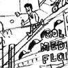 | 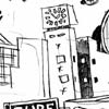 | The evergreen building on Snelling |
| Craig Finn sticker |  |  | Craig Finn's guitar |
| The Metrodome, may she rest in peace | 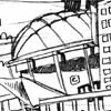 |  | My cousin's boyfriend's band |
| Local pub | 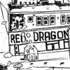 | 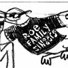 | Quillan Roe's and Adam Wirtzfeld's band |
| The ultra-creepy "You Otter Stop Inn" mural |  |  | The Handicraft Guild, 10th & Nicollet |
For the FULL UNCENSORED version of the map, come see the original art at the Lutefisk C show at Altered Esthetics this May. Stay tuned this spring for more details on the show and the submission process...
* Not recommended
** Here's what I WISH I'd hidden in the picture.
12 comments:
Whoa.
my only question is how much dough does someone have to offer to make you do something like this?
It sounds like a full months worth of work, so I imagine the equivalent of a month's sallary?
Pricing for comics, or any artwork, can be the toughest part of the job. And at the end of the day, the dollar figure you receive is only one part of your payment. I like to think of these factors when trying to estimate what a job is worth:
- Where does the client fall on the scale of means? That is, is the client a non-profit, a huge corporation or somewhere in between?
- How many hours will this take? (This is the "Could I make more hourly by working at Starbucks?" question.)
- How many eyes will look at this? City Pages print distribution is something like 120,000, not to mention online distribution. That's a nice intangible.
- Can I resell the original artwork? Being able to sell the original could be double or triple what you get for the job itself.
- Is the illustration something I'd want to put in my portfolio? Does it represent my style and would I want to do more work like this?
Keeping in mind all of these factors, sometimes you can do a job for free and it will still end up being an extremely lucrative project down the road.
Thanks for putting your process together for this... what a complex project to figure out. Hope it paid well up front... I'm sure it will pay off for you in the long run, and it certainly paid off creatively.
You snuck in Big Brain too! Good deal.
As always, your work is very impressive. Thanks for the process it was insightful.
Hardcore.
I am blown away. The entire process broken down is amazing.
... wait... could you repeat that again?
Congratulations on winning first place for this in the Association of Alternative Weeklies' Innovation category:
The "Innovation" category focuses on creativity in journalism, which may be expressed in print, online or a combination. The City Pages Rock Atlas, both in print (12.3 megabyte PDF) and online, took first place in that category. Artist Kevin Cannon, author Peter Scholtes and Web editor Jeff Shaw received the award.
Contrats on the AAN. Kenny and I came in second for our literary map of Denver. Fantastic job.
Thanks, Amy!
Post a Comment