The 5 Purposes Of Panels
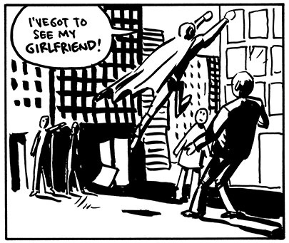
One of the most important things a panel can do in a comic, particularly a comic that has a lot of action, is define the relative positions of characters, or a character and a prop, or two elements of the background, etc. Usually these panels are pretty unemotional and wide, so that we can really tell, for instance, how far apart two kung-fu fighters are standing. It will do little to show their emotions, however, and a comic that has too many of these types of panels will, in total, seem to be physically exciting, but may lack a certain emotional depth. Like, the hero beat up all the henchman, and threw the switch that blew up the evil king's tower, but none of it seems like any of your business.
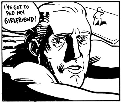
You would not be too far off to think of these mostly as close-ups of people's faces. We tend to look at the face as the main way to determine how someone is feeling. But a wide shot of someone alone as a car is pulling away or a close-up of a clenching fist also serve the purpose of making us aware of the character's emotions. Rendering and coloring style has a great deal to do with how these panels come across; certain dynamic style choices can also add to the emotion of a panel. Adding striations to muscles or speed lines or even flying sweat drops add a subjectivity to the panel that can give it a little emotional weight. A story with too many emotion panels will often seem a little cramped, and will sometimes lose a sense of being in a real world, and have a dreamlike quality to it that makes points of the plot seem meaningless.
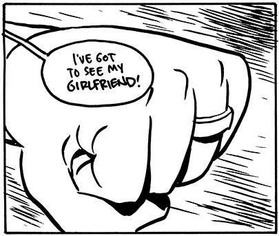
Where Emotion panels are often closeups, so are Detail panels, but they usually concern plot elements rather than emotional ones. A shot of the map that the treasure hunters are following. A shot of a someone's name coming up on Caller ID. A detailed close-up of a clue in a murder mystery. These tell us about the intricacies of the plot. A story with too many of these will seem overly nitpicky and distant. You will also wonder if there are any people in the story.
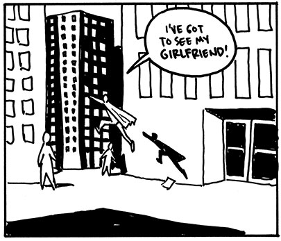
When I have a large panel, I like to make sure that I use it to communicate Scale. If you're telling a long, intricate story, you don't always have a lot of big panels to spare, so it's nice to use them for something that small panels just can't do very well. Sometimes it's nice to show that Superman is just a speck against those skyscrapers he flies past. Or that Godzilla is as big as a mountain.
This is the one that everyone already knows. I almost didn't include it because it conjures up such a standard image in everyone's mind: a wide shot of the exterior of a building. So boring. But an establishing shot can be anything that immediately puts you into the time and place of a scene. And it can use most of the preceding panel types. If someone says, "Let's go somewhere and talk" and the next shot is a close up of a coffee cup, someone's hands and an empty sugar packet (a Detail), you know they're in a coffee shop. An establishing shot can also take place in the middle of a scene. Example: Two swordsmen are dueling, and the bad guy is pressing the good guy over the edge of a parapet. The good guy suddenly rallies and kicks the bad guy down some stairs. With a change of location like that, you'll probably want to cut to a establishing shot to show where these two fighters are in relation to each other (their Relative Position). Even the classic big establishing shot of a building's exterior is often one that communicates Scale by showing how large a building, or castle, or spaceship, is. Overall, the effect is that we know where we are so that we can begin or continue a scene. Sometimes, using several Emotion panels instead of an establishing shot will leave the reader so hungry for information about where the action is taking place that they will pay particular attention to what is being said.
Though these purposes of panels are independent of the panel size, they do tend to lend themselves to certain usages. When I have a large panel, I like to use it to define Scale as well as anything else. When I have a series of small panels, I like them to be at least partially devoted to Emotion or Detail. Wide shallow panels in a sequence are good to reestablish Relative Position if it has changed during the scene.
The main thing is that a panel should always accomplish at least one of these purposes, or it risks looking dull and pointless. Every time a panel seems like it isn't working, it's good to think about these five types and make sure that at least one is in evidence-- if not, you have a starting point for fixing it.
For more about panels, there's Wally Wood's 22 Panels That Always Work. Another take on it from Scott McCloud's Understanding Comics is the 5 types of panel transitions.






1 comment:
I've never approached it from this angle . . . I've been too caught up with the 'cinematography' of the panels and not their purpose or relation to the story as it should be.
Post a Comment