
There are a number of skills, even artistic ones, that you can easily describe how to implement and use to your advantage. This is not one of them. Spotting blacks is a subjective process that wildly varies depending on your art style, inking process, subject matter, and mood you want to convey.
That said, not all aspects of spotting blacks are a complete mystery, as many young cartoonists think (and as I certainly thought as a young cartoonist).
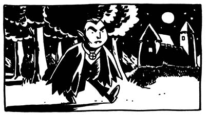
Let us start with a drawing that has its lines inked in, to avoid discussion of inking technique.
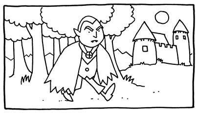
1. Color
When starting to spot blacks in a drawing, you must first fill in the areas that are unavoidably colored black. Space, the bottom of a well, a black t-shirt. Those things are colored black and in your drawing, they're going to be black no matter what the lighting situation is.
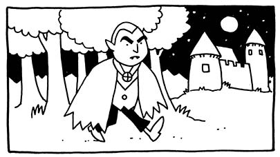
With our Dracula picture, we pop in a night sky (with some stars to make it seem a little more distant), and color his pants and eyebrows black. Now, his cloak, hair, shoes, and vest are almost certainly all going to be black as well, but before we do this, let's take a look at what the lighting is going to be like.
After this process, you've made a nice start. Already things are starting to feel more real.
2. Lighting and Mass
In real life, you never see any huge mass without a shadow. In a drawing, therefore, this must also be true, or you risk making a huge building look like, well, a ghost of a building (which would be too scary to draw). So the purpose of this step is to define all of the major masses present in your drawing, and to do that, you have to choose where your light source is. Some obvious ones are the sun, a light in the room, an explosion, etc. These are pretty easy from a planning point of view-- you just put shadows on the far side of the shapes. Let's save the cast shadows on the ground for the next step and just think about the shapes themselves.In our example, we'll divide this into two sub-steps: one for the black-colored objects, and one for other objects.
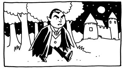
Okay, let's put in that dark hair, cloak and shoes. Now that we know where the light source is (the moon), we can direct the highlights in his hair, on his cloak, and on his shoes toward it. I'm going to wait on the vest. Something about it. I'm just not sure.
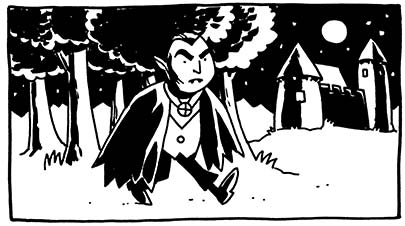
Now we start putting in shadows on the rest of the objects that are going to be defined by the light source. So we drop in some shadows on the tree trunks and leaves to show that they are physical objects. In order to not have everything blend into the background I keep a little rimlight on the far edges of the trees. I call this "cheating". You may want to experiment with that a little and see if you need it. I might think about it more for a more detailed picture, but for ol' Dracula, I think simpler is better. We also put in shadows on the castle, and please note that the shadows are not unidirectional. Where the light source is in relation to the tower determines where the dark side of that tower will be.
I dropped a little shadow in on Dracula's face, to give his head some dimension. I try to keep shadows on people's faces as simple as possible, to not make them look too sculpted-- you want them to seem as alive as possible (Dracula's undead status notwithstanding).
3. Shadow
Next you want to think about the shadows that are cast by objects onto the ground or onto adjacent objects. This can be a scary step because you may have spent a lot of time rendering out some objects or characters and then notice that they're going to be in shadow. Well, get tough, because when you start cheating too much on this step, things look pretty artificial. The process here is simple-- you've got your light source, and now you have to use your artistic brain to determine what shape of shadow each object would cast on other objects. Obviously, this can get complicated, but you don't have to get into mental 3D object rendering if all you want to do is make it look good. Just give it your best guess, and most people will not even pay attention.
A lot of times there will be a situation where lighting is more generalized and shadows are softer and less intrusive. Even so, in a black and white drawing like this one, it just means that you make the shadows a little smaller and think less about how far they cast. For example, you keep the shadow directly under the chin, but lose the shadow that someone's arm casts 3 feet away on the ground.
A lot of times there will be a situation where lighting is more generalized and shadows are softer and less intrusive. Even so, in a black and white drawing like this one, it just means that you make the shadows a little smaller and think less about how far they cast. For example, you keep the shadow directly under the chin, but lose the shadow that someone's arm casts 3 feet away on the ground.
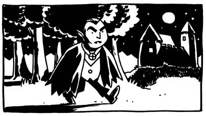
For our picture here, we put in a shadow for Dracula, angling away from the moon (with a little of the cape shape in it, just to look like we're trying), and a shadow of the castle, broken up by the texture of the grass. That can make things look a little more dimensional, as deep dark solid blacks can be disorienting in a drawing as dark as this one. Dropping some of the shadows from the trees on the trunks makes them look as if they interact with one another and are part of the same picture.
4. Squint & Touch-Up
By now, you may well be done. But the thing that separates an adequate drawing from a good one is right here-- take a look at your drawing in a different way. Squint at it. That will allow you to see which objects seem insubstantial and weightless, and then add shadows to them. Try looking at your picture in the mirror or holding it up backwards to the light. Sometimes that change in perspective will highlight another missed black area or shadow.
For our picture here, I put a small shadow under Dracula's nose, then finally went and did some shadowing on his vest. I also went into the background and put some shadows and textures on the far sides of the mountains, to make them look farther away. I think that for a drawing this simple, detailing the mountains is optional and probably overkill-- you don't want to clutter up a drawing too much, but it's good in general to go through and check how all of your elements react to the lighting.
The primary purpose of spotting blacks like we've done here is to provide weight and dimension to the drawing, and as you practice, you'll notice that you'll instinctively notice when something feels insubstantial, and know that you need to give it some shadowing to pop it out. Until it's instinctive, this guide should be a good checklist.
6 comments:
This is maybe my favorite tip you've given.
I'm just awful with shadows and light sources and all that.
my "instincts" aren't exactly there and my schooling is minimal, so its really all a guessing game for me.
Dark areas, among other things, are a constant struggle of mine while drawing.
so THANKS for these tips!
You're certainly welcome. I feel like this is a pretty obscure skill. Many artists are excellent at it, but it almost seems like a by-product of being a good penciller or inker. I like the idea of focusing specifically on this step, since it's not really a physical step in and of itself.
You've made this concept nice and IDIOT PROOF so I am totally getting it! LOL! I've always been told that spotting blacks was something I needed to do but always always avoided and ignored because of LACK of knowledge. Thanks SO MUCH for explaining this so concisely. I actually feel more confident to go out and do some experimenting.
Excellent! I'm glad you like it. Your stuff looks fantastic, by the way; I don't know what help this will be, but for me it makes all the difference when going from character designs and single-character illustrations to comics.
This tutorial was extremely helpful. I've been struggling in my Sequential classes and the walk-through that you did just makes sense. The only con I have is with the Dracula's vest. I think it should be left relatively white. Once I squint my eyes it's hard to make him out. the image you did before you colored his vest I think is more successful, but adding detail to the mountains and his nose I think was a good call. Awesome job.
Reading this in 2018. Still good!
Post a Comment