Pages

Showing posts with label Friends of BTA. Show all posts

Wednesday, March 23, 2011

"How Do I Make a Mini Comic?"

If you've asked the above question, it's time to head on over to Wet Paint in St. Paul. Specifically, go on Thursday, March 24, from 5:30-7:30pm. There you'll witness a bevy of local mini-comic greats spewing forth tons of knowledge on the subject. And by "greats" I'm talking about Steve Stwalley, Danno Klonowski, Athena Currier and BTA's own Zander Cannon.

What size paper to use?
What kinds of materials?
How do I work a photocopier?

All of these questions and more will be answered. Plus you'll be inside the warm, dry oasis called Wet Paint -- Minnesota's (and possibly the nation's) best and friendliest art supply store. The Wet Paint crew are the ones who sponsor tons of local art events and have even been known to give away goodie bags of art supplies during 24 Hour Comics Day.

FULL DETAILS:

Wet Paint
Thursday, March 24th 5:30-7:30PM
1684 Grand Avenue
Saint Paul, MN 55105
651.698.6431
email: info(at)wetpaintart.com

Friday, January 28, 2011

Sketch Night at the Opera

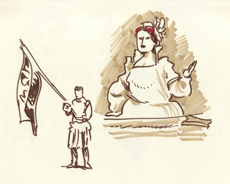
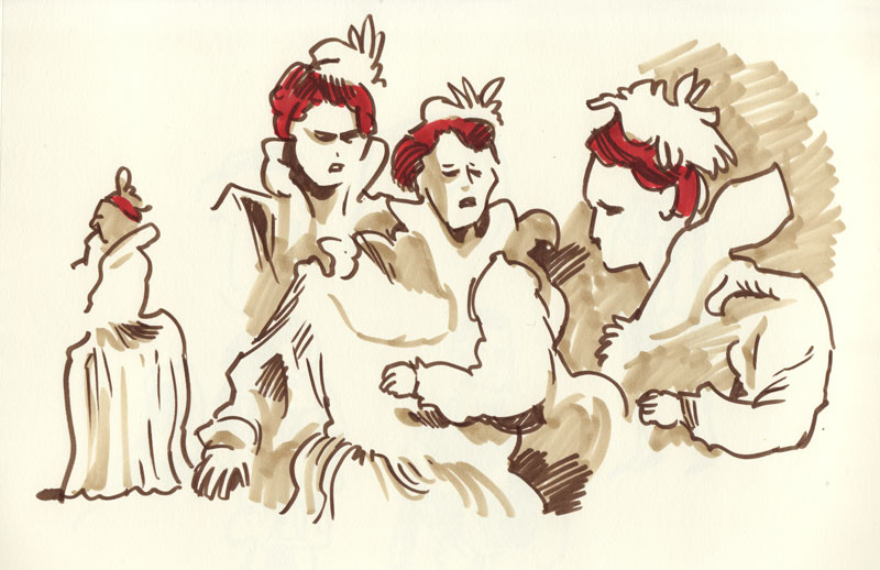
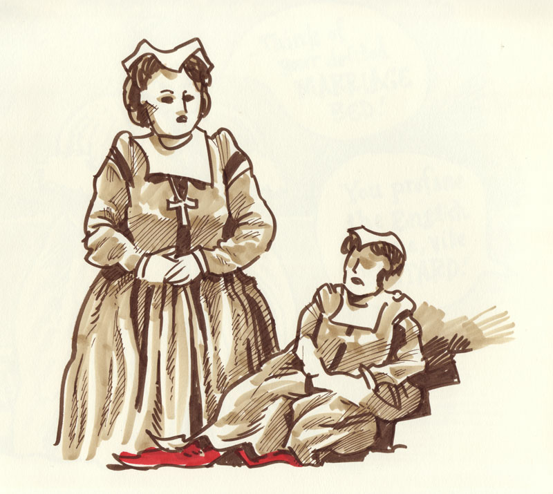
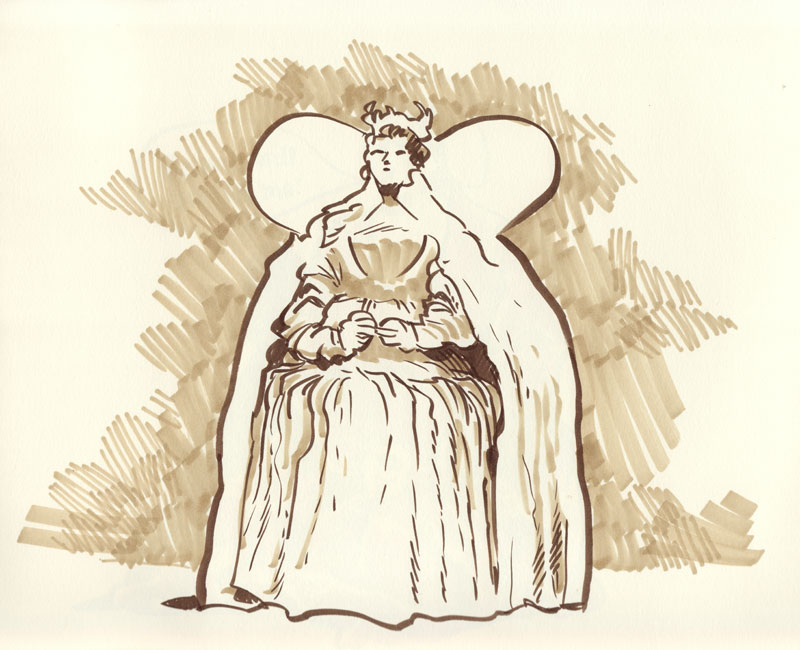
Last night I had the good fortune of being able to doodle during a dress rehearsal of the Minnesota Opera's Mary Stuart at the Ordway Center. I was invited by Tempo and the Black Hat Collective, and was part of a group of about fifteen cartoonists who tried to visually capture the opera. Our little group must have looked strange from the stage, fifteen dark-clad cartoonists scribbling madly under a haze of blue booklights, our rapt silence broken only by paper rustling or the occasional pencil dropping on the floor.

I haven't done any life drawing since college, when I spent a ridiculous amount of time drawing in coffee shops and around campus, drawing people who either didn't notice me sketching them or didn't care. This guerilla sketching style forced me to get used to drawing people who moved around a lot, resulting in distorted or fractured drawings like this one:


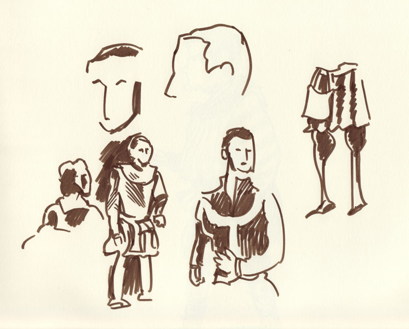
The actors in last night's opera, however, moved around significantly more than someone sitting in a coffee shop, so it was a major challenge trying to capture a pose. Because of this, my first sketches of the night are kind of a mess:

[ Click for larger versions of each pic ]


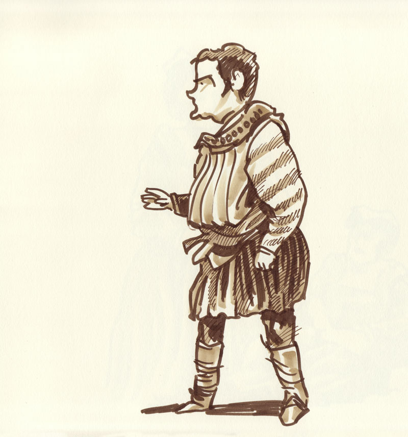
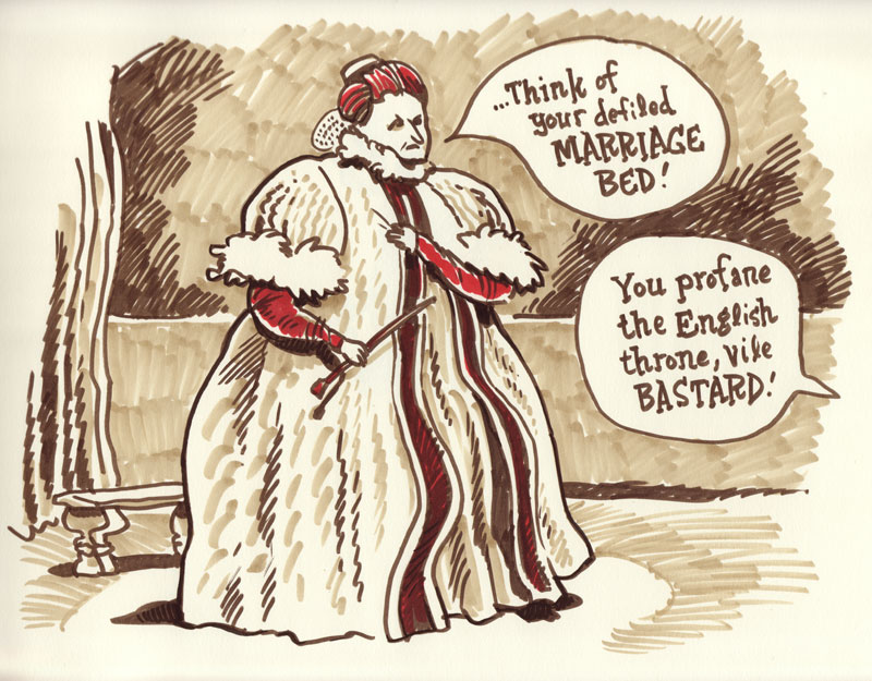
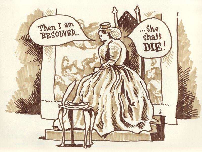
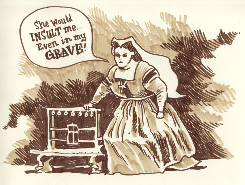
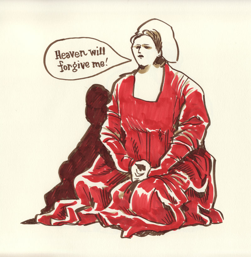
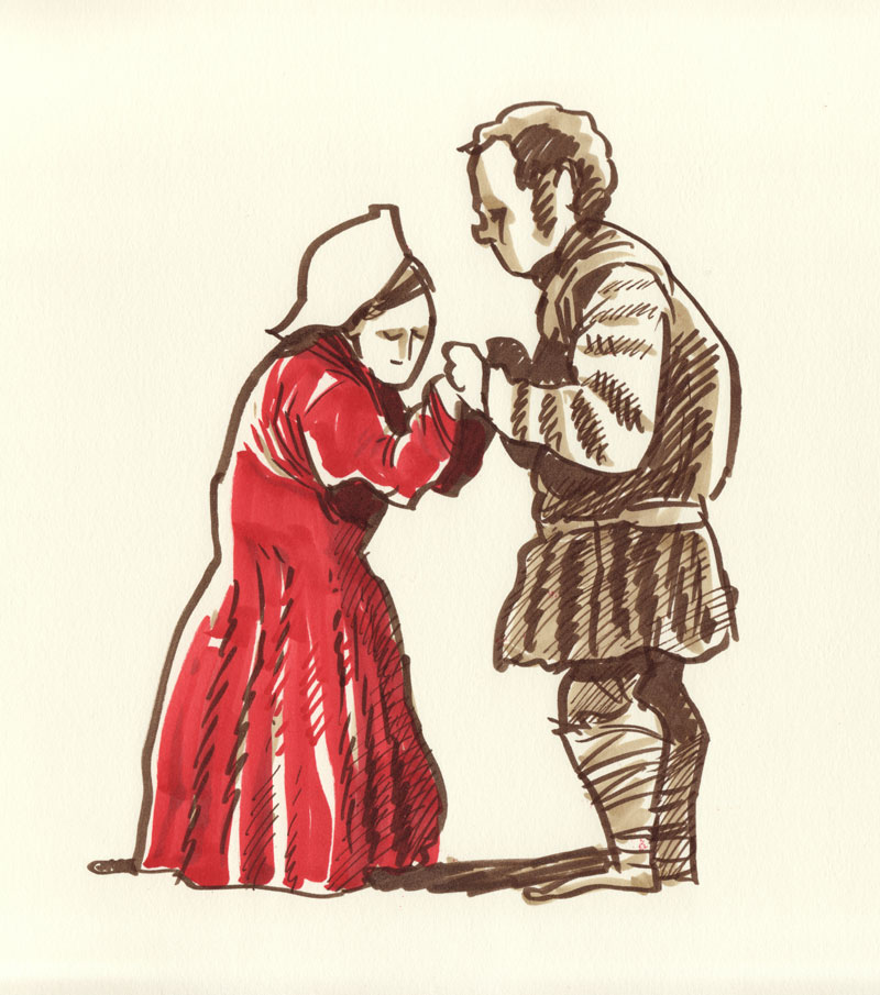
Realizing that I didn't want to end the night with a jumble of frantic half-drawn sketches, I decided to try a blend of life drawing and imagination. I took a mental snapshot of something that happened on stage and stuck with that pose, even while the actors were busy moving around standing in different positions. I also thought it would be fun to incorporate lines from the opera, translations of which were conveniently shown on a screen above the stage. So here's the result of the less-lifelike, more imaginative set:


A note on materials: These were drawn on 80 lb Strathmore drawing paper (the sketchbook with the brown cover) and I used sepia Pitt brush pens for the linework and Copic markers for the tones and color.

The only downside of the night is that I spent so much time focused on drawing that I failed to grasp exactly what was happening on stage. But whatever plot was lost to me was made up in a greater appreciation for all the little details in costume and background that I don't usually catch when watching a performance like this. All in all a terrific experience and I highly recommend that other cartoonists jump at the chance to do this should the opportunity come up again.

Thanks to Tempo and the Black Hat folks for allowing us to sneak in and draw for three hours. It was a blast!

Update: MinnPost's Max Sparber wrote a review of "Mary Stuart" and he even mentions our little sketch troupe and includes a photo of yours truly.

Thursday, November 04, 2010

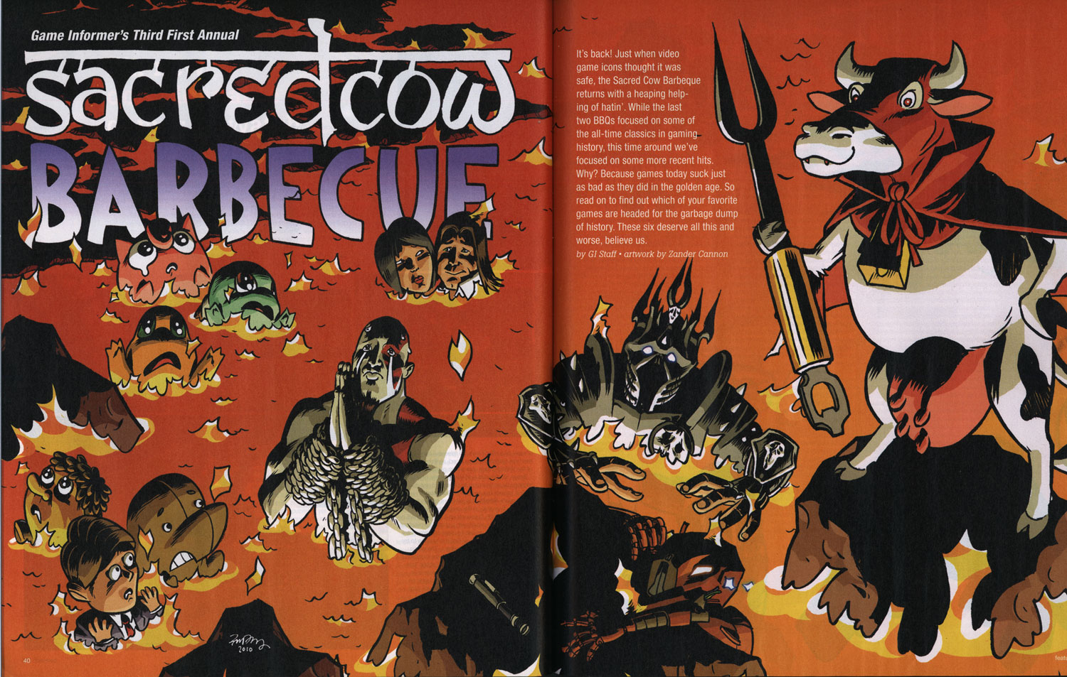
Zander's Game Informer Sacred Cow Barbecue Illustration

Game Informer, the best video game magazine out there, has once again sent a gentle whisper out onto the wind saying they need an illustration that has lots of video game related gags in it. And I respond by kicking down their front door and saying I'm the man to do it!


The recurring feature Sacred Cow Barbecue, a no-doubt-very-satisfying opportunity for GI's editors to say bad things about all of the games that people love, is fun in a different way than Game Infarcer (the April Fool's drawing) for a couple reasons. One, it allows me to draw a bunch of characters from a bunch of different games rather than from just one. Two, it goes across two pages, plus little spot illustrations interspersed throughout the rest of the article, so it's more piecemeal, and individual figures or groups are more important than the overall composition. And three, from a technical standpoint, since the illustrations are likely to be in the hands of the production department who have to fit them around all the text, the image has to be delivered in many, many layers so that they don't have to chop it up more than necessary.

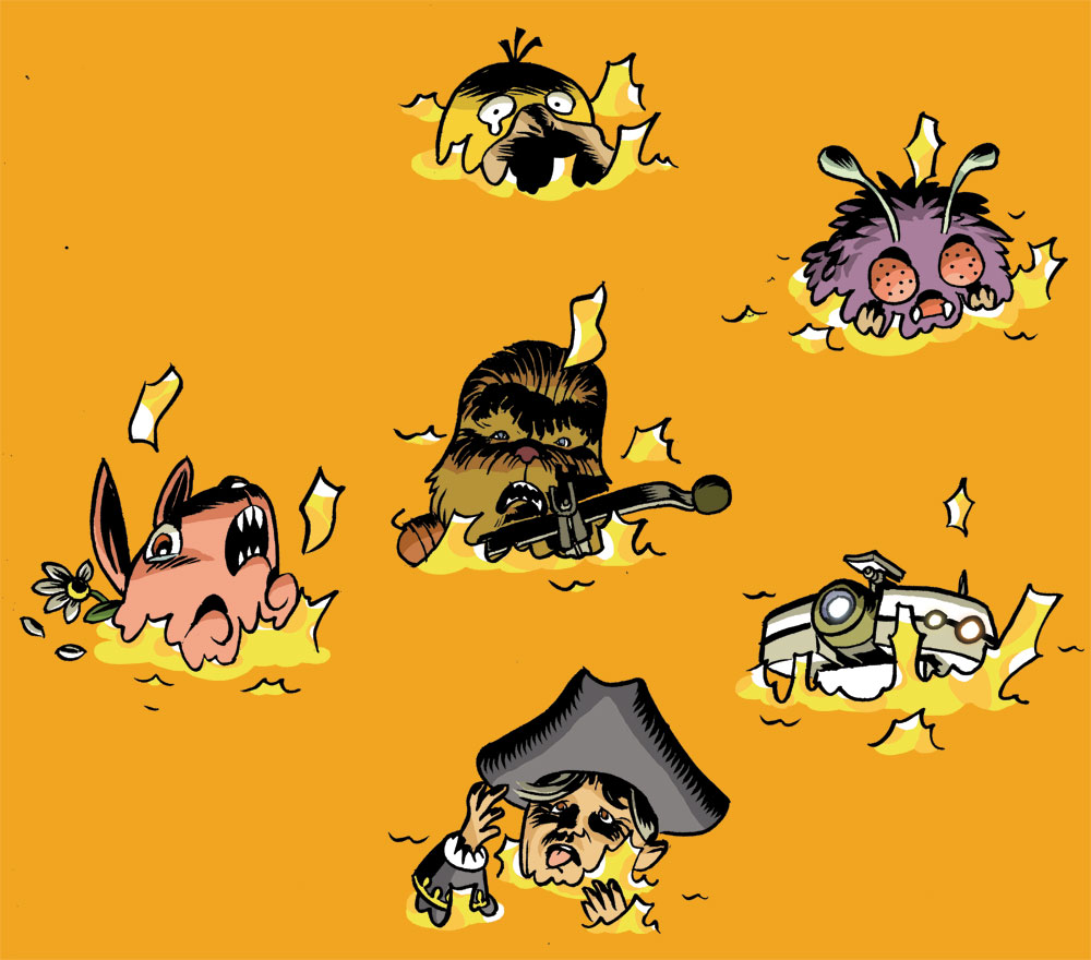
The first thing that happens is that I go down to GI and talk with some editors (who I won't name this time so that they don't get hate mail). They give me the list of the games that are going to get a kicking in the article, and I write them down. One thing that I did differently this year is that because the last two Sacred Cows were in picnic environments, with the characters being grilled, skewered, roasted, and otherwise mishandled, I wanted to change from that and show something different. One idea was that the figures would be cows in a field, dressed up as the game characters, but since the games chosen are not as iconic as things like Mario or Halo, we figured that it might not work well as a gag. My other idea, and one that fit in well with the idea of giving the production department the most leeway in their layouts, was all of the characters in a lake of fire. It doesn't have as many opportunities for good gags the way a picnic environment does, but it ends up being kind of fun from a cartooning point of view, focusing on characters' body language and expressions.

SKETCH

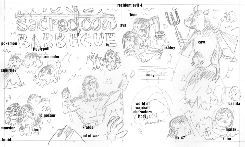
After going back to the studio, I worked up this sketch for GI, which basically laid out the characters, their expressions, their placement, and where I thought the text (introducing the article) could go. I also went ahead and did a title treatment because why not.

The idea here, in terms of delivering the image, was that the characters were all independent of each other and the perspective the illustration takes didn't limit where they could be placed (though you want characters to be facing inward for the most part, and asymmetrical characters like Kratos can't be flipped, so there are some parameters here). I was trying to make the drawing as flexible as possible for the layout people.

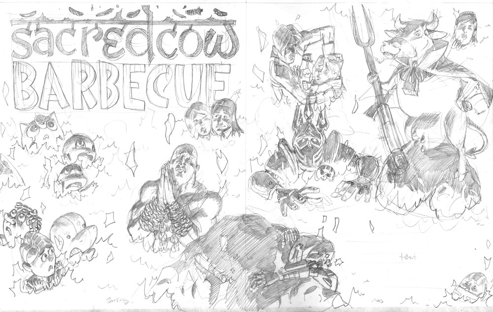
PENCILS


Once that was settled on (and I figured out which World of Warcraft character I'd put in there), I worked up the pencil stage. I was really trying to have variable sizes of all the characters, such as the rock with HK-47 on it and the devil cow, on down to the concerned-looking Bastila in the upper right corner and Darth Malak in the lower right. I tried to throw in some sight gags as well, such as Kratos praying for mercy (not a likely scenario in God of War), Leon Kennedy pushing Ashley into the lava (she's a real pain in the neck in Resident Evil 4), and Luis looking like he's getting awfully cozy with Ada Wong (no reason, just thought it was funny). Also, it's pretty satisfying to draw Pokemon with big teary eyes as they burn. Sorry, Pokemans.

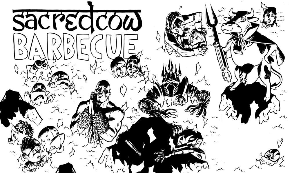
INKS


Next come the inks, and while this is a single image, all of the characters were inked separately-- I blew up the pencils on the computer and printed out several sections in non-photo blue, then inked them all so none of them were touching each other. You can tell this by some of the flames intersecting each other here. If you look closely, you'll see that I did something pretty lazy, too: the rock on the very bottom of the image is the same as the one on the left, just flipped left-to-right. Man, I saved myself like 90 seconds there.

COLORS


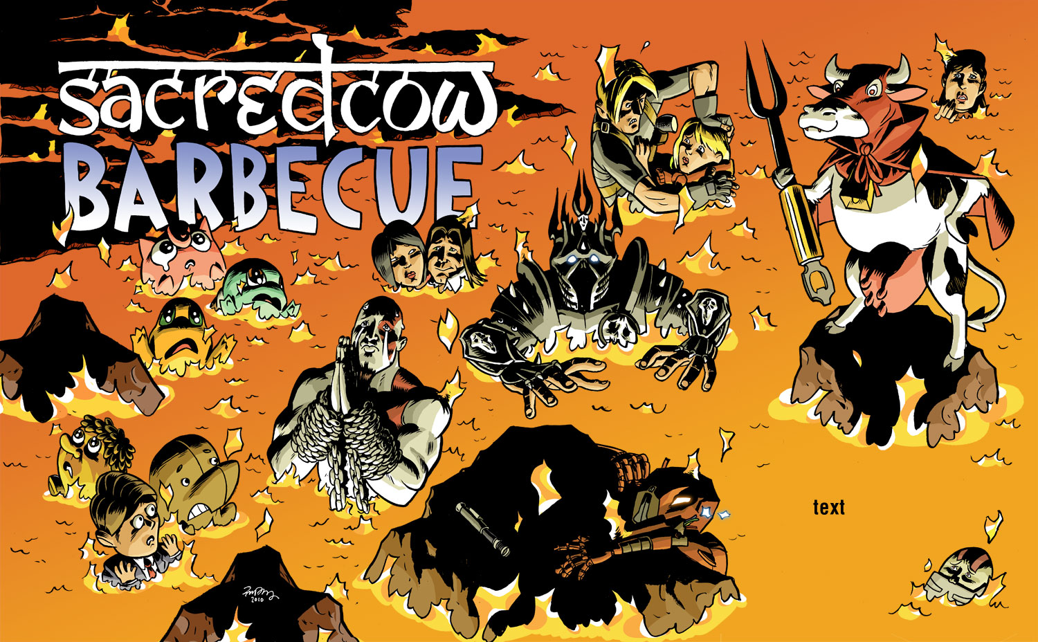
The colors here were pretty straightforward from an aesthetic point of view. I made a color sketch at a low resolution just to get the feel of things.

From this, I knew the overall color was going to be a lava orange, and that that color was going to affect every other color on there. So then what I basically did was color every character their normal color, as if they were in neutral, full-spectrum light, but lit from below, then put a yellowish-orange low-opacity layer over them so that every color shifts toward that. Beyond how warm that makes the drawing look, it also unifies everything and makes it so you don't even really notice. Greens still look green, but if you saw that color by itself, with no orange-yellow around it, it might not look green at all.

I also quickly whipped up some cooled lava in the upper left corner to pop out the logo, which I inverted. If I had thought of it earlier, I might have put in more of that dark lava to give the drawing a darker, more ominous look, but I felt like it worked well, and I still wanted to keep the drawing adjustable.

GLOWY EYES


I also did something that I like to do every once in a great while. I usually like to keep the color mostly flat and cartoony (and simple to do), but sometimes there's someone that just needs to have glowing eyes. So without having to make it a big hairy deal, I have this quick, 4 step process:


1. Once everything's colored, go to the line art layer and select the inside of the area you want to glow. It shouldn't go under the black lines at all, just right up to them.

2. Make two new layers above the line art layer. They should be the top two layers. Call one "Blur" and one "Glow". With the area still selected, color it white on the "Glow" layer and orange or whatever color the glowing thing is on the "Blur" layer. Deselect.


3. On the Blur layer, do not select anything, but go to Filter>Blur>Gaussian Blur... you can move the slider to see how many pixels you want to blur it. It all depends on your resolution.
4. Voila! You have a glowing eye or thing. The white looks just like it's an ultra-bright orange when it has that orange glow around it.

ADDITIONAL SPOT ILLUSTRATIONS


Last time I did a drawing for Sacred Cow Barbecue, the layout guys reshuffled my layout quite a bit and sampled illustrations from the main spread to use throughout the article. I liked that idea, but I wanted to make sure there were enough original illustrations that we didn't end up using things twice. So I drew up a number of single spots that could work anywhere on a lava background and colored them, providing them as individual Photoshop files for the production department.

ALL THIS PLANNING...DID IT WORK?


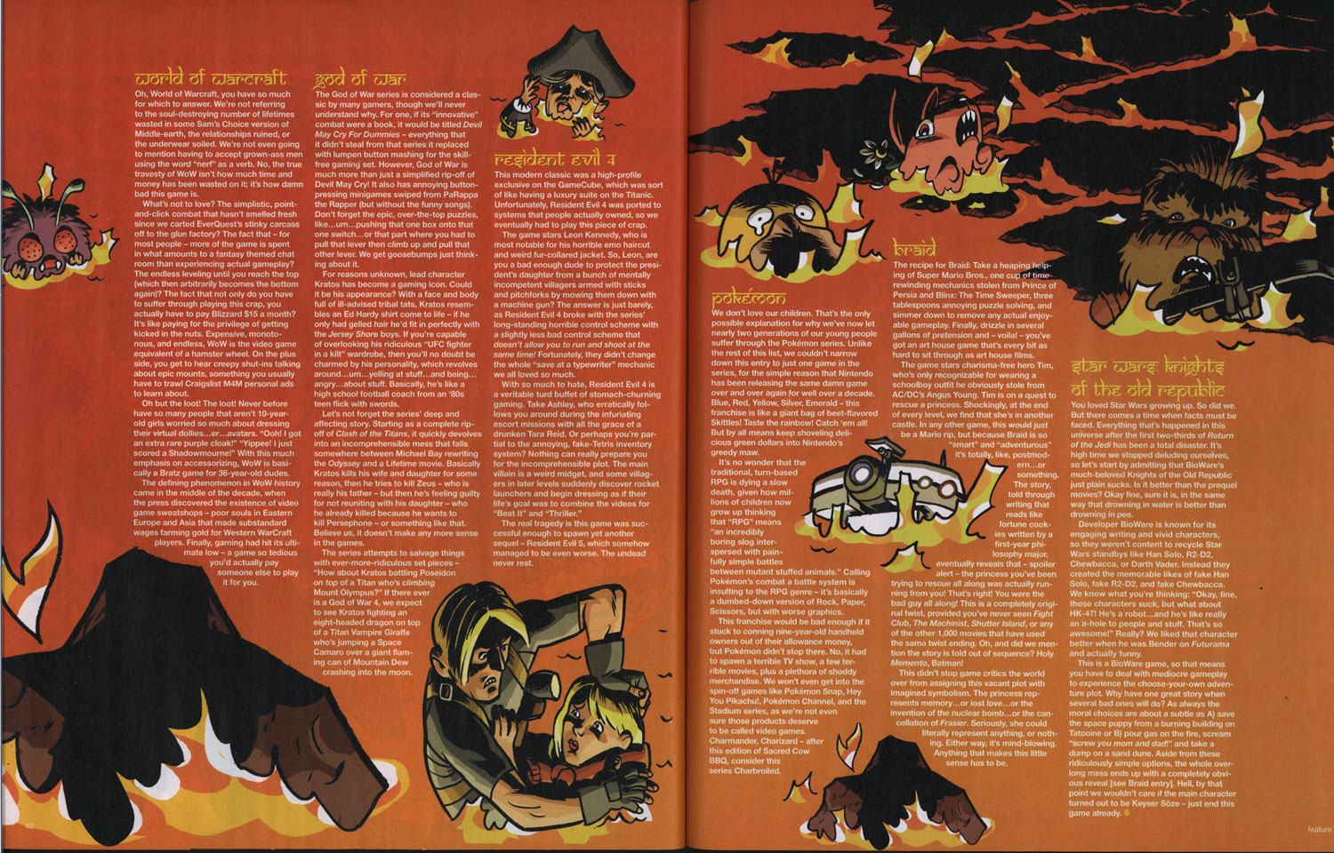
Kind of. Here's how the two-page splash looked in the magazine. I was starting to worry as I got close to the deadline that my layout was not leaving a lot of room for text. I mean, it left some, but they were going to have to keep it pretty short if it was going to fit in there. I figured that something like that was going to happen.

Obviously I'm open to reshuffling the details in an illustration; I built the concept of this drawing around it. Unfortunately, two things which I didn't foresee happened. One is that they enlarged the devil cow by quite a bit. That sort of thing is fine when you're dealing with painted images or photographs, provided that they are high enough resolution. But the problem with cartoons drawn with pen or brush is that the line weight and quality is a dead giveaway for scale. So when you blow up a drawing, even if the lines are still crisp, you can tell that it was not originally that size because all of the lines are thicker than everything around it.

The second thing is that the Lich King (center) is rotated about 5 degrees. Eh. Weird.

What they did right was that this is an excellent layout. It's asymmetrical, it has a lot of weight opposite the logo, and it moves your eyes around, not to mention leaves room for text. If I had thought more about that, my version and theirs might not have been so different.


They ended up moving a lot of characters from the first spread to the second and creating shapes there to move the text around, which is a fine idea; perhaps cramming 16 characters on one page was a bit much.

And boy did they get their money's worth on that rock. It's there twice--that's four times in four pages!

WHAT DO YOU THINK ABOUT THE ARTICLE?

This was a funny article, though they've pretty well run through the classic games by now and are beating on games that are 3 years old. I actually loved 2/3 of these games: Resident Evil 4, God of War series, Knights of the Old Republic, and Braid are some of my favorite games ever. World of Warcraft and Pokemon could drop off the face of the Earth and I'd never notice.

Basically, I like drawing video game characters and if they're burning in a pit of fire, so much the better! Thanks again, GI!


Monday, October 04, 2010

Top 20 Wildstorm Comics, featuring Zander Cannon

Comic Book Resources, in memory of the now-defunct (though continuing as part of DC) Wildstorm line of comics, has ranked the top 20 books released through the imprint. Not surprisingly, Alan Moore is well-represented, but as it happens, so am I! No fewer than 3 titles (Smax, Top 10, and Tom Strong*) that I worked on appear in this list.

15. "Smax," by Alan Moore and Zander Cannon

The stoic Jeff Smax from "Top 10" turns out to come from a fairytale world and Moore and Cannon are brave enough to show it. Completely different in look and tone from "Top 10," this series is a lot of fun, kind of an Alan Moore-doing-"Shrek" story, though with more humanity than that might imply. It's apparently been compared to "Fables," and it does bear some superficial resemblances, but then this is "Fables" done with more wit and charm. It reads smarter and doesn't get in its own way as it tells its story.

10. "Tom Strong," by Alan Moore and Chris Sprouse

There's a coldness to this series that it never quite shakes, and Alan Moore doesn't write all the issues - though his tend to be the best, of course. But that doesn't make this comic any less impressive as a high-wire adventure comic full of super-science and family and dimension-hopping and worlds of wonder. Tom Strong is Doc Savage mixed with Tom Swift mixed with whatever else is on Alan Moore's mind. Out of all the comics on this list, I think this is the one that will most grow in esteem as the years march on.

4. "Top 10," by Alan Moore and Gene Ha

Though this series was promoted as a simple "what would cops be like in a world in which everyone had super-powers," it immediately established itself as a strong ensemble series about a group of well-defined characters. That they were visually interesting only helped. That Gene Ha hid panel after panel of Easter eggs featuring characters from every era and genre only made it more interesting. That Alan Moore takes all this and then uses it to comment on comic book absurdities while still making the characters feel real - that makes it astonishing.


* I did layouts for Tom Strong #7. And Kevin worked on Smax #1 as my intern in 2001!

Thanks to the also-well-represented Gene Ha for the tip!

Wednesday, June 30, 2010

ITCHY KEEN Interview


If you'd like to listen in on a chat between myself and 2D Cloud's Raighne and Meghan, go have a peek over at their new blog, Itchy Keen Art Fiends. Better yet, check out their other interviews, like this one with Lupi!

Sunday, April 25, 2010

Oregon History Comics Seeks Funding

Remember all those hours of enjoyment you had as a kid playing Oregon Trail? Well, now's your chance to give back.

Longtime friend of BTA Sarah Mirk is seeking funding for a series of comics that tell the history of Oregon (or some of the history, anyway -- Oregon's a big state). If you're on the fence, consider this: 1) many of the donation levels include awesome gift packages, and 2) this video they produced is reason enough to shell out several Hamiltons:

Oregon History Comics from dill pickle club on Vimeo.


You can follow the progress -- or better yet, make a donation -- here:


Good luck, Sarah & co.!

Friday, April 09, 2010

Zander's Fleming Hazmat/Tommy Chicago/Uptown Girl pinup is online at Staplegenius!


Some time ago, Danno Klonowski asked me to do a pinup for his massive crossover adventure that brought three of the best minicomics characters ever together for a romp through space and time and whatever, and so I said sure. I love drawing these characters, and in particular you may notice how similar Fleming Hazmat looks to a certain lieutenant who now graces the deltoids of a certain cartoonist.

And you should definitely go about reading the entire book here at Staplegenius!

Thursday, March 18, 2010

Klonowski on Klonowski


Danno Klonowski, local comics raconteur, has paid me a significant compliment. When told his name and his/his character's likeness would be used in a Transformers comic that I was scripting, he boldly declared that he would get a tattoo of the panel in which the character appeared. Well, I made darn sure that that character got a panel in which he was prominent, and brandished a large weapon. Yes, my storytelling choices are influenced by only the highest muses.

As for what happened then, Danno tells the whole story in some detail at his blog, StapleGenius. But here's a hint:


Holy crap.

Friday, March 12, 2010

Bioshock 3 Game Infarcer cover!

[click on images to see a larger size]
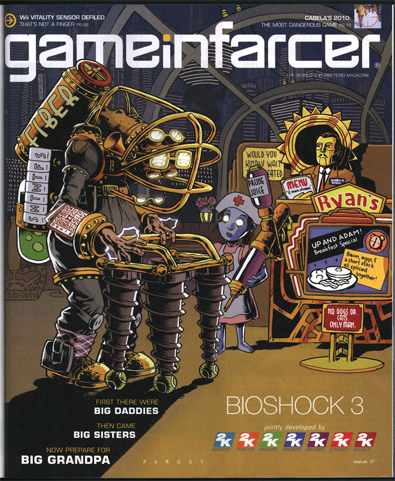
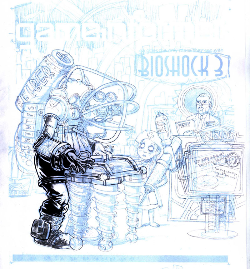
It's that hilarious time of year again, at least as far as magazines are concerned. The April issue of Game Informer magazine, out this week, has a small section inside called Game Infarcer, which mercilessly mocks all the games that they stare at all year. This year: Bioshock 3. HA! Take that, 2K games! We love your game enough to mock it!

This issue marks our fifth year drawing the cover to the section (Thanks, GI!), and to celebrate, we'd like to go through the process of creating the cover, from concept to delivery.

CONCEPT

At the beginning of every February, I start wondering when someone from Game Informer is going to call for the Game Infarcer cover, and sure enough, Bryan Vore calls up and sets up a meeting, and asks if this cover can be "in a more realistic style". Naturally, I say sure thing, then end up drawing it the way I draw everything. Professional secrets revealed!

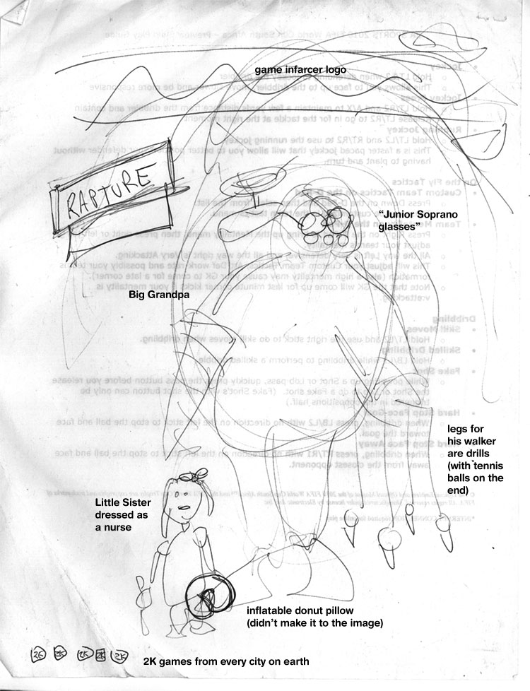
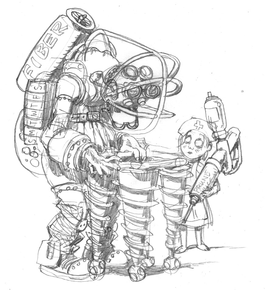
When I get to Game Informer World Headquarters (about 3 miles from here), the guys all sit down with me and give me the pitch: Bioshock 3, with Big Grandpas. But the best part is: they give me a sketch.


[notation added by me]
I love it when people do sketches. Sometimes people think I'm going to laugh at them or are embarrassed to show what they've done, but I love seeing what people have in mind visually even if they "can't draw a straight line", because it saves me from trying out all the composition pyrotechnics at my disposal. Any artist knows there are millions of ways to lay out the same picture, but the simplest ones are frequently the best, and if that's what the client has firmly in mind, it's usually a good idea to go for it. In the process of making the sketch, the client can also see some potential for ideas and put them down, instead of just making a list or having to remember them. It also lets them see if they can even envision a visual way to communicate the joke, which is a good indicator as to whether I can, as well.

During the meeting, since everyone could see the sketch, we could jump off into ideas a lot faster, and we quickly came up with things like the daily pill container, the Fiber valve (that was Joe Juba), Android Ryan (also Joe), the idea of being at a Denny's-like breakfast place, the Rapture background, and the Prune Juice syringe. These sorts of "list" drawings--ones that contain subtle in-jokes around a given topic--are always my favorite because they're very information-heavy, and are less concerned with rendering, which I enjoy, but is not my particular forte.

Also, Joe lent me a Big Daddy doll--er, action figure at the meeting, which was very helpful in drawing details.

INITIAL PASS

What I like to do when I start a job is to try to ride the wave of enthusiasm as much as I can, and frequently this means I can really make some headway. When I come back from a meeting with the guys at Game Informer, we've been brainstorming and joking about the image, and the game, and other funny obscurities that could make it in there, and so I'm bursting at the seams with ideas. So even though it was late in the day and I needed to get home, I quickly sat down and sketched out what was in my head for the Big Grandpa and the Little Sister Nurse.


This gave me the chance to distill down some ideas, cement some gags in there, and think of some new ones when a corner of the drawing is looking kind of lonely. As you can tell, it also allowed me to basically lock in the general "camera angle" of the drawing. This was a pretty lucky break--it doesn't always happen that way--but just dashing stuff down without overthinking it often gets the simplest (and best) results.

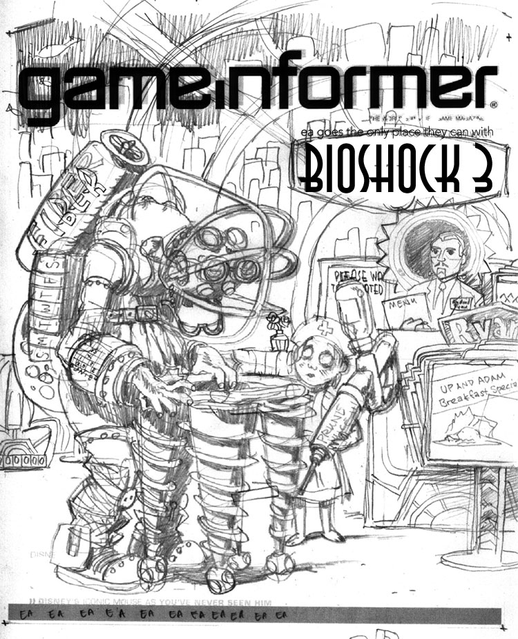
The next day, I took another sheet of paper and drew around all the other elements of the drawing: the environment, the signs, the greeter, etc. I married these two images in Photoshop and dropped in a Game Informer logo and Bioshock 3 graphic for placement so that I could send it off to the guys for feedback.


This part also allowed me to add more jokes--the Denny's-like Ryan logo, the sign advertising the specials that looks like the Plasmid upgrade graphic, the Little Sister ornate escape hatch, the detailing on the seats and host stand that are similar to the doors in the game, and the gold-glowing rose in the tonic container way in the background. If you look closely, there's even a cash register on the far right, just like in the game. But then I realized host stands don't have cash registers. This drawing will be nothing if not accurate!

PENCILS AND INKS

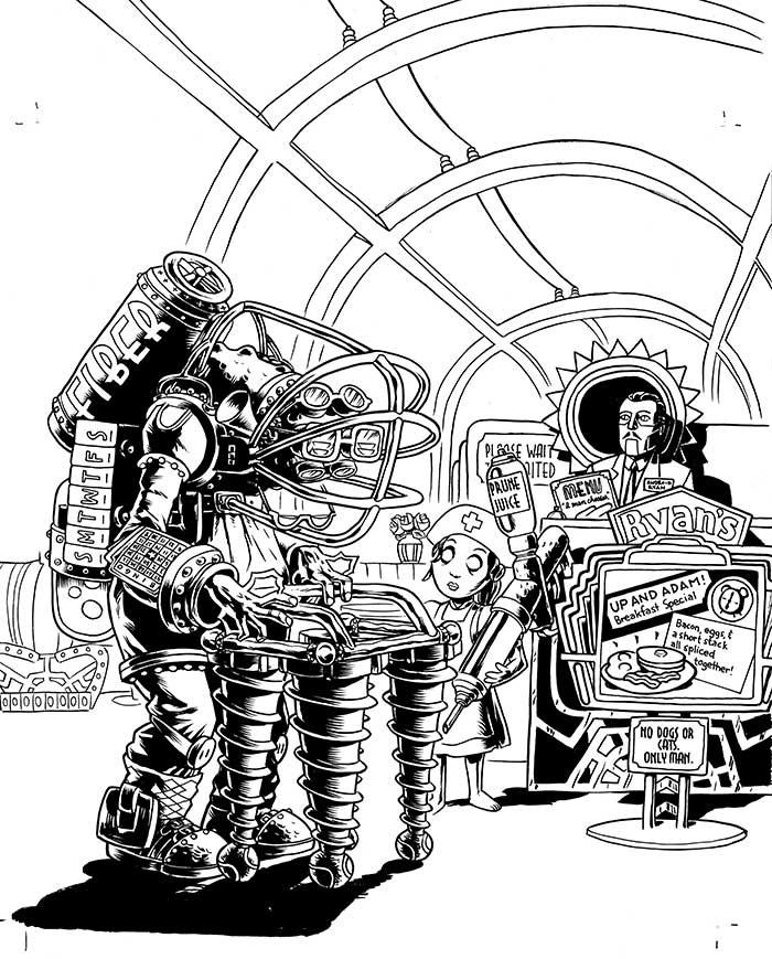
The sketch is relatively tight, as you can see from how similar it is to the final drawing, so the next step is to blow it up in Photoshop and print it out in 10% cyan on a big sheet of paper. From there I can go in with pencil and brush and create the final linework.


Now, normally, people pencil the whole image before inking, but I'm kind of impatient, and sometimes if you're sure about a section of the drawing (that is, you're sure it's going to be in shadow or something), it can be useful to go ahead and ink it. It can frequently give you better ideas on how to pencil the rest of the page, and it sets a certain style.


When I was finished with the foreground inks, I sent the image to Game Informer again, just to show them some progress, and it yielded a valuable addition. While I had added jokes to the sign and the menu, I had entirely neglected the "Please wait to be seated" placard. If you've played Bioshock, you know that there is a perfect addition to make to this sign, and Jeff Cork pointed it out. "Please..." was changed to "Would you kindly..." and our drawing was now officially stuffed as full of jokes as we could make it.

COLORING


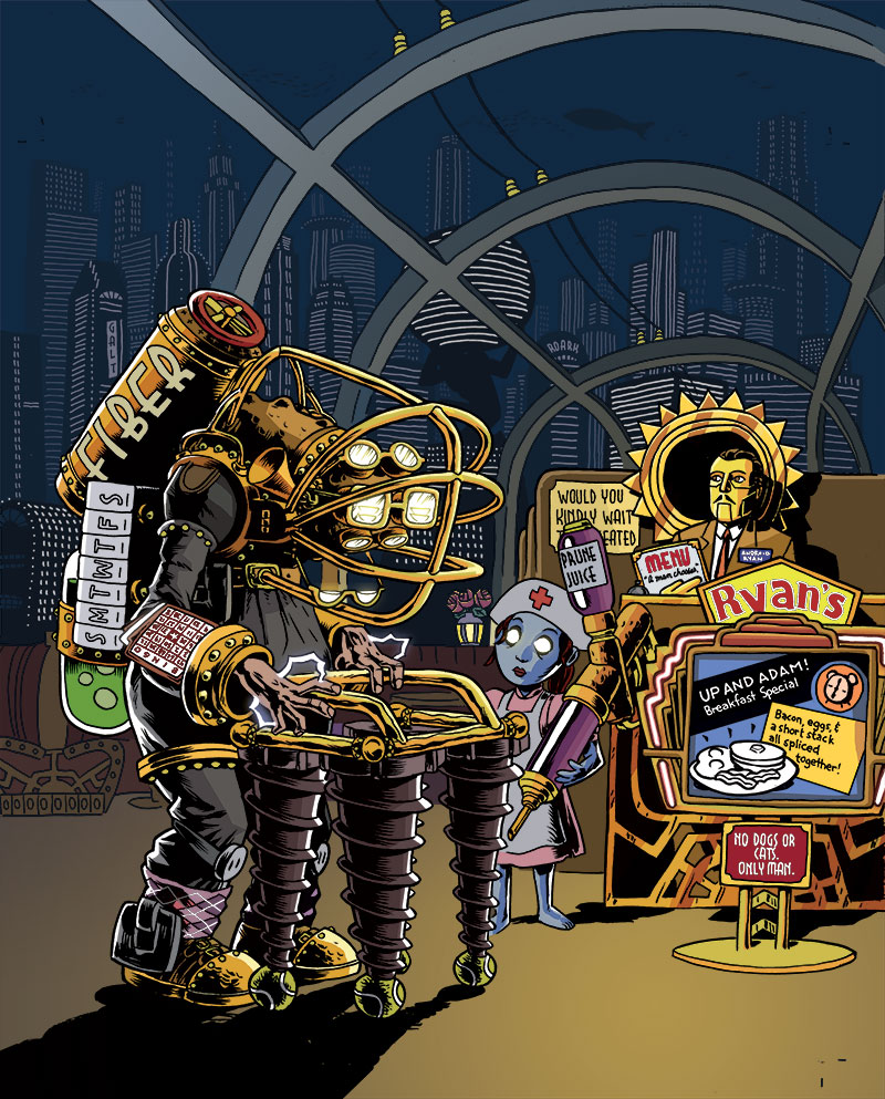
Coloring is difficult for me, particularly things that have to be relatively atmospheric. I tend to like to color with flat colors rather than with a layered, textured look, but I tried to blend the two for this illustration.

For the background, I drew outlines of the buildings with dots for windows, then made several layers, each with a layer of blue to indicate distance. Here was the final opportunity to make jokes, so I threw in a few Ayn Rand references (the signs saying "Roark" and "Galt", two Randian heroes, and the Atlas-shaped building (pre-shrug). In case you don't know, Ayn Rand's works, particularly Atlas Shrugged, were a major influence on the philosophy of Bioshock and Rapture, its underground city.

Gloomy blue and glowing gold were the basic colors for the game of Bioshock, so I created a warm gold light spot in the lower right to focus attention, then colored all of the figures with gold highlights coming from that direction to unify the scene. The background could stay a largely uniform neutral blue that would pop out the figures. As a final consideration, I did something I rarely do--I added a glow to certain things: the Big Grandpa's eyes, his lightning bolts on his hands, and the Little Sister's eyes. When put into an image that is mostly flat colors, effects like that can be quite striking.

PRINTED IMAGE


When the image makes it into the magazine, I always hold my breath a little, hoping that it will look okay. These days you can be pretty sure that what's on your screen will print out okay, but you never REALLY know. I was thrilled when I got this one in the mail. As you can see, they moved the image up and zoomed in a tiny bit, overlapping the top of Big Grandpa's fiber tank with the logo (I provided another layer of just the top half of that figure in case they wanted to do that), and they extended the shadow in the lower left to get in the copy for the joke, which I'm glad they did. I feel like the image is solid, and a good joke, but it does need a little explaining.

So go out and find the April issue of Game Informer! It's the one with the Portal 2 cover. Ah, not only a drawing in an issue of Game Informer, but one about the sequel to my favorite game. It's the icing on the cake.


Wednesday, December 09, 2009

Steinlicht Book Signing This Saturday!

This Saturday at Big Brain Comics, David Steinlicht will be signing copies of his new book Cornered!, which is a collection of his strips from the Pioneer Press. David writes:
Now available: “Cornered!” A collection of comics from the Pioneer Press newspaper by David Steinlicht — published by Nodin Press.

This Saturday, from 4 to 6 p.m., you can buy the book and get it signed by the author, at Big Brain Comics in downtown Minneapolis.

Great Christmas gift. Excellent Chanukah gift. Perfect Kwanzaa gift. Super solstice gift. Nice stocking stuffer. Use ‘em for holiday party favors. Just the thing for grads. Mom will love it — Dad, Sis and Junior will, too.

And at $19.95 per copy, it’s budget friendly. Color cover, 274-page B&W interior.

(Note to those of you who purchased the self-published edition of “Cornered!”: Don’t get all worked up. It’s the same book, mostly. There are 11 additional comics, one more intro page, another index page, a Library of Congress number, a ISBN number, a bar code, an author picture and a snappy new cover design.)

The signing is from 4-6 pm, but if you can't get enough Steinlicht in just those two hours, swing by the MCBA next door from 12-4 for Saturday Open Studio.

Details on the BOOK SIGNING.

Details on the OPEN STUDIO.

Wednesday, October 14, 2009

Fallcon Fotos 2009

Convention neighbor and collaborator Gene Ha

The convention floor

Verily, only the worthiest may lift yon mighty hammer!

The closest safe distance from Lord Vader and his entourage

The drawing I later bought from...

...Brittney Sabo.

Jin "Little Jin" Cannon meets Gene "Big Jin" Ha.

Peter Gross wearing his new adjustable reading glasses. And holding a Gene Ha drawing of Phantom Girl (for his Legion of Superheroes fangirl daughter).

Ryan Kelly

Paul Fricke