Pages

Monday, June 04, 2012

Time to Update Your Rolodex…


WE'VE MOVED! FIND US AT:
BarrelMag.com


Hello to the few and faithful Big Time Attic readers! Zander and I are pleased to announce that we both have brand new graphic novels that are going to be published through Top Shelf next spring. Zander's HECK is about a washed-up high school football player who discovers a portal to the Underworld in his basement. And my book, CRATER XV, is the sequel to 2009's FAR ARDEN. Army Shanks is back, and this time gets himself caught up in a black market space race heating up in the Canadian High Arctic.

But the BETTER news is that we'll be serializing both books through our brand new monthly magazine, DOUBLE BARREL (Two Cannons... double barrel... get it?).

DOUBLE BARREL is a digital-only monthly magazine that will serialize the aforementioned graphic novels, plus have lots of great bonus content like short stories, guest strips, a letters page, and an in-depth tips & tricks section. The first issue comes out in just two days, on Wednesday, June 6, and you can get it pretty much anywhere you get your ebooks -- Comixology, iVerse, iBooks, or the Top Shelf Digital app. Each issue will have over 50 pages of content for just $1.99. Yep. A buck a barrel.

I'm going to put this next part in bold, because it's pretty important:

Zander and I will now be writing all of our blog posts on BarrelMag.com -- the Double Barrel homepage. Please add barrelmag.com to your RSS feed!


If you're in town on Thursday, swing by Big Time Attic for our launch party. Here's your official invitation:


With that, we're going to shut off the lights here and shutter the windows. We're not shutting the Big Time Attic blog down completely, but we might be gone for a while. Thanks for reading, and we'll see you at BarrelMag.com!

Thursday, April 26, 2012

MN Original Video on the Cartoonist Conspiracy

Thanks to Joel Zimmerman over at MN Original for producing this great video postcard. It's a snapshot of what we do during our monthly jams and I apologize if I screwed up any facts in the interview!


If you're a Twin Cities cartoonist and want to kill some time hanging out and drawing with some of the nicest folks around, stop by Diamond's Coffee Shoppe on the first Thursday of every month. The jam officially starts at 6:30pm, but people trickle in and out between then and 10pm. If you're shy and worried about being the "new guy" don't worry, just come in and put your head down and draw -- that's basically what I did for the first two years of Conspiracy. But seriously, these are the nicest people in Minneapolis.

And if you'd much rather draw on table cloths and drunkenly shout out answers to trivia questions (I mean write them down quietly) while eating the best food in Uptown, then come to the monthly Bad Cartoonist Trivia Night hosted by Danno Klonowski. Last Mondays of every month at the Bad Waitress on 26th & Nicollet. The next one is Monday, April 30th. 9 pm start time but come early and grab dinner!

Tuesday, March 06, 2012

Game Infarcer: The Making of the Mortal Kombat Gag Cover!


It's Game Infarcer time, everyone! I only tend to do a handful of actual illustration jobs each year (that is, single images that are colored by me), and I always look forward to Game Infarcer, Game Informer's snotty look at various games and game trends. I've provided the 'cover' (first page, that is) to this section for seven years now, and it's always great fun to call upon my funny-makin' skills as well as my coloring ones to crank this sucker out.

CONCEPT

As usual, the process starts with a meeting at Game Informer, and I knew I was in for a bit of trouble when Joe Juba said, "I didn't really think it was funny when they first told me, but now I do." Uh oh. Is this drawing going to need a paragraph next to it so anyone will know what they're talking about? But really, I thought, anyone can make a funny illustration when a rock-solid concept is laid in their lap; it's just going to take a little of that little thing I call "The Zander Cannon Magic". Okay, so. If you think that this sounds like foreshadowing for the part later in the story when I shoot the whole thing to hell, I say to you, "Shh, you're going to ruin it."

So I met with Joe Juba, Dan Ryckert, Tim Turi, Jeff Cork, and probably Ben Reeves. I don't know. Probably. Ben's always creeping around somewhere. They told me that the game we're riffing on is Mortal Kombat, then gave me a little back-story. The company that makes Mortal Kombat, NetherRealms, was purchased by Warner Brothers, and they've done some crossover things like Mortal Kombat Vs. The DC Universe, and now they've permanently added Freddy Krueger from Nightmare on Elm Street to the MK roster. So the gag is that Mortal Kombat isn't going to stop there; they're going to start grabbing characters from all of Warner Brothers' movies. They give me a list of notable movies in WB's film catalog, and we start brainstorming. The big idea they wanted in there was to make Tom Cruise's character from Risky Business be pulled across the floor by MK's Scorpion (the guy who says "Get over here!").

Now, whenever anyone says "Warner Bros", the only thing that anyone really knows that they made is Looney Tunes. I know, people might know that The Matrix or Harry Potter were Warner Bros movies, but it's like Disney-- you know the cartoon characters; everything else is a little fuzzy. And obviously as a cartoonist, Bugs Bunny, Elmer Fudd, Daffy Duck and the rest are very appealing things to draw, particularly the idea of them bloodying up -- or being bloodied up by -- Mortal Kombat characters. We even had a gag worked out where Bugs Bunny would be front and center, eating someone's arm like a carrot, and the drippy blood letters that usually say "Finish Him!" in MK would say "That's All, Folks".


Now the problem came when I wanted to flesh this gag out for the full illustration. If you have Bugs Bunny front and center, how do you put Tom Cruise's character in the background and have people realize what's happening? Bugs Bunny puts you in a certain frame of mind, and you're just not going to understand who some guy in his underwear is, and what he's doing there. So I started putting forth the idea that we could have the rest of the illustration populated by the rest of the WB cartoons; they make for great sight gags, their art style clashes appealingly with the "realistic" Mortal Kombat characters, and they're just plain old fun to draw. Wow, great! It's the old "Zander Cannon Magic" that everyone loves, coming through in the clutch!

Except... that's not what the gag is supposed to be. And that's not what they asked for. And with the setup of Freddy Krueger, it doesn't make a whole lot of sense. And finally, it turns out in the world of video games and the internet, the gag of 'cute characters killing or being killed' has been done once or twice or possibly ten million times.

So I went back to the drawing board and really thought about what the GI folks were asking for. The Freddy Krueger setup is there to prepare us for the idea of NetherRealms going back into the film catalog and just looking for brand recognition at the expense of appropriateness. So I took another look at the big list of movies that Dan Ryckert gave me and went back to what we had discussed at the GI offices. So then I dropped in this sketch, assembling it from various mini-sketches into one document.


We've got Free Willy in the foreground, getting uppercut, Harry Potter getting struck by lightning, Tom Cruise about to be speared by Scorpion, and the part I was most happy with -- Bugs Bunny as the uppercut "Toasty!" guy. This illustration, and last year's illustration, are heavy with movie references, so I was really happy to put in a semi-obscure video game reference. In the earlier Mortal Kombat games (i.e. the ones I played), every time you uppercut someone, a little image of one of the programmers came out in a purple shirt and said "Toasty!". And so there was my excuse to put in Bugs Bunny.

LINE ART

Since this drawing was much more about the various gags in it than a unified composition, I took a different approach to the line art. After getting approval for this sketch, I printed out several 10% cyan copies of this layout to use as guides for the final line art. What I ended up with was a pile of illustrations, all having very little to do with each other.


Then I scanned them and assembled them all into one document to figure out the final placement, as well as leaving room for the subhead text and logo.


The nice thing about creating final art elements separately like this is that you can work on the layout and get some solid feedback about how they look together, tweaking them at even a late stage. The tricky thing about it is that you end up with a lot of tangents that you have to futz with. Tangents in this case are places where a line in the foreground just barely touches a line in the background and makes it look like these two things, which are supposedly a large distance apart, are touching. Like this:


Once everything's in its place and I more or less have the kinks worked out, I go in and edit the lines so that things behind other things have their lines obscured, and the whole thing looks like a real drawing.

COLORING

I wanted to keep my ability to move the characters around as long as I could, so I decided to keep all the characters in their own layers as I colored. As you may know if you use Photoshop, having this many layers in a high-resolution file is extremely memory-intensive, and a slow computer like mine was at the time (that also limited the amount of RAM available to Photoshop) was not going to be able to handle it. So I saved the line art as a separate flat image and imported it into my new color file, making it a channel instead of a layer. This places it above all of the other layers, but saves on memory because Photoshop doesn't have to contend with all of the layer properties involved. A nice workaround for a situation where your memory is limited.


Then I went in and colored that sucker. I usually struggle with color for the first 75% of a job because you're basically putting in placeholder colors and everything looks terrible, so for this one, I scrapped that plan and basically just started coloring each character in their own layer. The only guide that I used was that each character was uplit by the lava pits, so I used the established colors of all the characters, cheating them slightly toward yellow, and put shadows on the top of shapes. I dropped in the orange of the lava pits, then put in pools of yellower lava (that's a thing, right?) to give it a texture. The drawing looks pretty solid now; if anything, it needs the people in the foreground to pop, so...


I created a layer above everything else where I then drew in some very harsh, hot rimlights on the top of all of the characters, popping them out of the background. I also made a white glow on the ground where they are standing to draw attention to the environment and not make it look like they're floating.


It's funny to look at the artwork after all that without the line art and realize how I've basically entirely recreated the drawing I already did. And I want to point out here that this is extremely sloppy. Any proper colorist would probably be horrified at the holes in the color and the lack of precision under the lines. I will say don't emulate this, but I will also say that it doesn't matter a great deal as long as 1) no one else has to deal with your sloppy work and fix it up, 2) you're not making any hard-to-fix mistakes like anti-aliasing your lasso tool, paint bucket, or magic wand, or using a pencil tool on less than 100% hardness, and 3) it looks good.

At this point, the drawing is essentially finished, but there were a few things I still wanted to do.

SPECIAL EFFECTS

I'm usually simple man with a simple plan when it comes to special effects in Photoshop, but I needed to give this drawing the sense of unreality that Mortal Kombat has, so I wanted to do two things: give the white highlights a glow, and screen down the background line art. In order to do this, I moved the final, flattened color art back to my line art file and then went in to adjust the colors of the lines.

ATMOSPHERIC DISTANCE


I wanted to give the heated air above the lava pit a sense of thickness, so I placed a low-opacity layer of yellow over the background areas of the color layer, and then went in with the pencil tool and colored the line art of those background a dark brown. It's hard to notice the difference except when it's next to a stark black line, but it really works to push those characters back to the background.


I also colored the line art of the flames and the lightning to add to their effect.

GLOW

What I did with the glow for this final step is:
1. Select the line art with the magic wand tool.
2. Go to the white highlight layer, and delete. This should delete all of the white that was under the lines.

If you look very closely, you can see that it trimmed away a tiny bit of the white. This is because the White layer is going to be above the line art layer, and we don't want it to block any of the line art.
3. Deselect, then copy the white layer. Name the two identical layers 'White' and 'Glow'. 'White' should be on top of 'Glow', and both layers should be above the Line Art layer.


4. On the Glow layer, make sure nothing is selected, and go to Filter>Blur>Gaussian Blur...

5. This makes the Glow layer blurry. In fact, if you're not looking very closely, it may seem to have disappeared altogether. But it's there. The White layer provides the harsh white light, and the Glow seeps the light out over the black and surrounding colors.

PRINTED IMAGE

And there we go! What do ya think?


Tuesday, February 21, 2012

Crowded Comics -- Now in Beta!

If you've been around me the last few weeks you've probably heard rumblings of a "secret project" that I've been working on in the off-hours. Well, I'm happy to announce that after months of brainstorming, planning, and building, the project is no longer a secret -- it's live, and I'd love for you to be a part of it.

CROWDED COMICS is a one part social media site, one part online newspaper, and one part toy. It's a website that offers up timely editorial cartoons -- minus the punch line. That part is up to you.


Our goal with the site is to democratize the editorial cartoon by letting you add your own captions and rate the captions of others. We also want to get people more engaged with current events, so we've got news briefs and news article links to go along with each cartoon.

The idea for the site came from my friend David Burnett, who I went to Grinnell College with. After several years working as a business consultant, he left in order to build a start-up company that would be fun, profitable, and give something back to the community. David pitched Crowded Comics to me last November, and we've been having early morning Skype meetings ever since (he lives in New York). The third founder of the site is Oleg Terenchuk, who is a drupal wizard. I say "wizard" because the things he's able to do with the site might as well be magic, they're so complex. We're fortunate to also have the help of Rob Simon, who has been instrumental in testing the site, and my mom, who has been helping with copywriting.

Currently we've got four great cartoonists on board: Ken Avidor, Kirk Anderson, Lance Ward, and Dan Murphy, and we hope to expand the stable in the future.

Right now the site is in BETA, meaning there are still a few minor glitches to work out. If you go to the BETA site you'll see that registration is required. That will disappear once we're out of BETA, but I hope it won't deter you from signing up now, checking out the site, and adding some captions. I think you'll find the process of writing and rating captions pretty addicting -- but not Skyrim addicting, so don't worry.

Here's a simple primer showing how the site works:

After you play with the site we'd love to hear your feedback and suggestions for improvement. You should see a Feedback button on the right side of your screen.

If you like the site, PLEASE spread the word. We're bootstrapping this start-up and have no real marketing budget to speak of, so word of mouth goes a long way.

Thanks, and happy captioning!

PS - you can follow us on Twitter (@crowdedcomics) and see behind the scenes photos on our tumblr and on Instagram.

Sunday, February 05, 2012

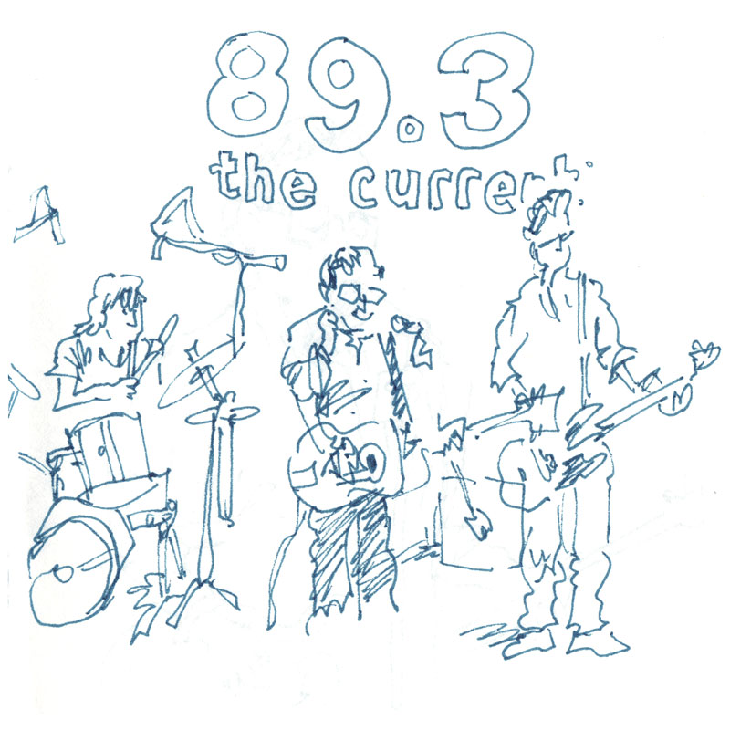
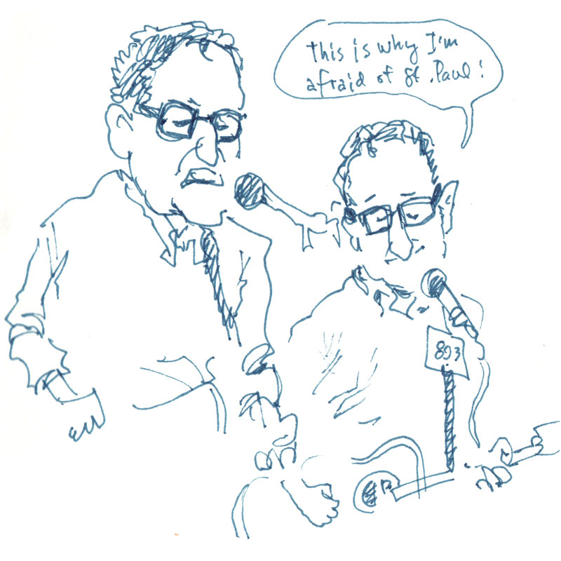
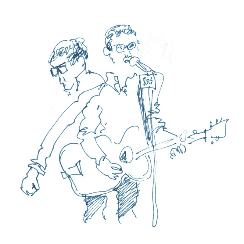
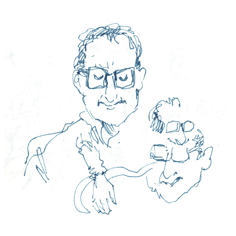
Craig Finn Live Concert Drawings

Today I got to see one of my musical idols, Craig Finn, taping a live in-studio performance for Minnesota Public Radio, so I thought I'd bring along a sketchbook and see what I could muster up. This was a big deal for me because I played Finn's "Separation Sunday" album on repeat for pretty much all of 2007, and only recently did I learn that we both went to school together in '87 (I was in first grade and he was in high school, which means that while he was skipping class and going to Replacements concerts, I was feeding our classroom's pet rabbit, Twinkles, and listening to Raffi albums).

The concert will air on Wednesday at 5pm, and I'm sure a video of the whole thing will be on The Current's site shortly thereafter.

So anyway, here are some live drawings I did during the concert. You can click these thumbnails to see a larger version:


Thanks for the ticket, Jamie!

Tuesday, November 22, 2011

Messy Giuseppe Video Postcard

Here's a video postcard of the best Italian food truck in the Twin Cities, put together by the Delmont brothers. If you like the design of the truck, that's great, because Zander and I may have had something to do with it...

Saturday, November 19, 2011

Evolution Makes YALSA, Maverick Lists

We're happy to share that our most recent graphic novel, Evolution: The Story of Life on Earth, has made two prestigious lists.

First, the book is a nominee for YALSA's 2012 "Great Graphic Novels for Teens."

Second, and most exciting, is the inclusion in the Texas Library Association's "Maverick Graphic Novel Reading List."

Thank you, YALSA, and TLA -- we're honored!

Wednesday, November 02, 2011

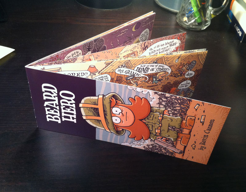
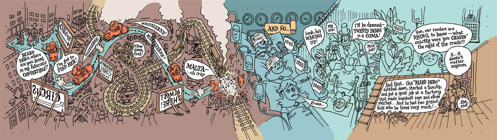
The Making of a Mini-Comic: Beard Hero

I don't do a lot of mini-comics these days -- for various reasons -- but a few weeks ago I had a burst of inspiration and decided to get something produced in time for MIX. MIX is, of course, the biggest and best indie comix convention in Minnesota, and is celebrating its last year in existence this weekend. You should totally go.

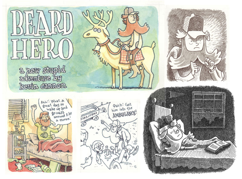
"Beard Hero" is a condensed version of a much longer story that I've been toying with for the last few months. Unfortunately its sheer size was keeping me from actually sitting down and drawing any of it, because long projects, well, take a long time and can be exhausting to even think about. So I decided to compromise and just take the heart of the story and turn it into a mini, and frankly I think it's more interesting because of its condensed nature. The reader can fill in the gaps and frankly it's a one-gag story that probably wouldn't have been able to carry a big tome.

So because I like showing process, here is an annotated look at how I created this mini. I hope you enjoy.

Step 1: Story

The story was already written, albeit in detailed notes, in a google doc somewhere. It's about a six year old boy who wakes up with a full beard, and his parents take it as a sign that he's now a man and they send him off to war and other various adult-only activities. Along the way the boy falls in love with a bearded circus girl whose visage he sees only on posters and advertisements, and he spends the rest of his life trying to meet her in person. So that's the story in a nutshell. The trick is to fit it all in the size of a mini-comic. That's the next step.

Here are some doodles that eventually inspired the full story:


Step 2: Figuring out the Specs

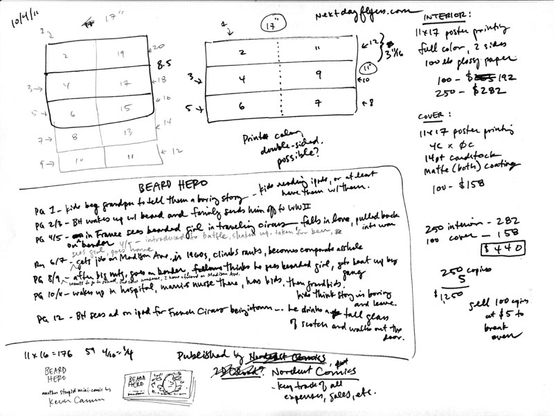
Since this is a peripatetic story, I wanted the mini to have ridiculous, landscape-driven proportions. I also wanted to try a new printing technique, where I would print the entire mini on both sides of an 11x17" poster. Thus, I decided to cut the poster lengthwise three ways, folding in the middle, so that I would end up with a 12 page mini where each page was 3.66" high by 8.5" wide, which would give a maximum length of 17" when the book is opened to an interior spread.

I used a vendor called NextDayFlyers.com for the cover of Just Add Ink, liked their product, and decided to use them again. So I priced out what it would cost to print on a double-sized 11x17 sheet of 100 lbs paper with a 1-sided cover on 14pt card stock. Here's the sheet where I chicken-scratched all that stuff, and figured out pagination.


Step 3: Script

I usually like to script out every shot and word balloon before I start drawing, but I wanted this mini to have a more kinetic feel, so I just wrote dialogue on the fly. But I didn't want to leave anything out, so I wrote down what I wanted to have happen on each spread (see the notes page above). If you read the final comic you'll be able to tell that by the end of the story I was leaving out old plot points and adding new ones as the story demanded.

Step 4: Loose Pencils

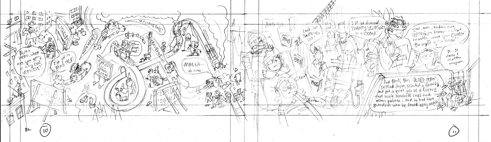
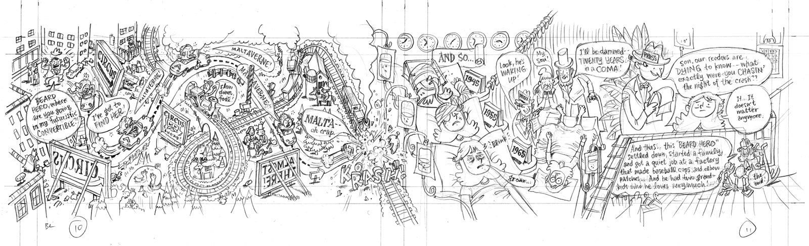
Now the fun begins. Since there are no panels in this particular comic, the trick was to fit everything in, word balloons and all, while still maintaining a readable flow throughout the page. On a few occasions I drew out the page on a scratch sheet, but normally I just dropped everything in loosely with a light pencil. Here, I'm drawing on a thick Xerox paper I like, called Color Xpressions Planet 20, #3R11811, 12x18". It's heavy, like bristol, but pen & brush pen ink dry on it really fast, so it's virtually smudge-proof (at least with the tools I've used). The pencil I'm using for this stage is a hard lead 2H, applying very light pressure so it's easy to erase.

Note that in this image and the next one I've beefed up the contrast so you can see the lines, but in reality the lines are pretty light.


Step 5: Tight Pencils

If everything looked good I went back over the lines with a darker pencil -- nothing fancy, just a drugstore No. 2 Bic mechanical pencil. There was no need to eras or alter the light pencils underneath; I just went over them with the darker pencil and made changes along the way.


Step 6: Inks

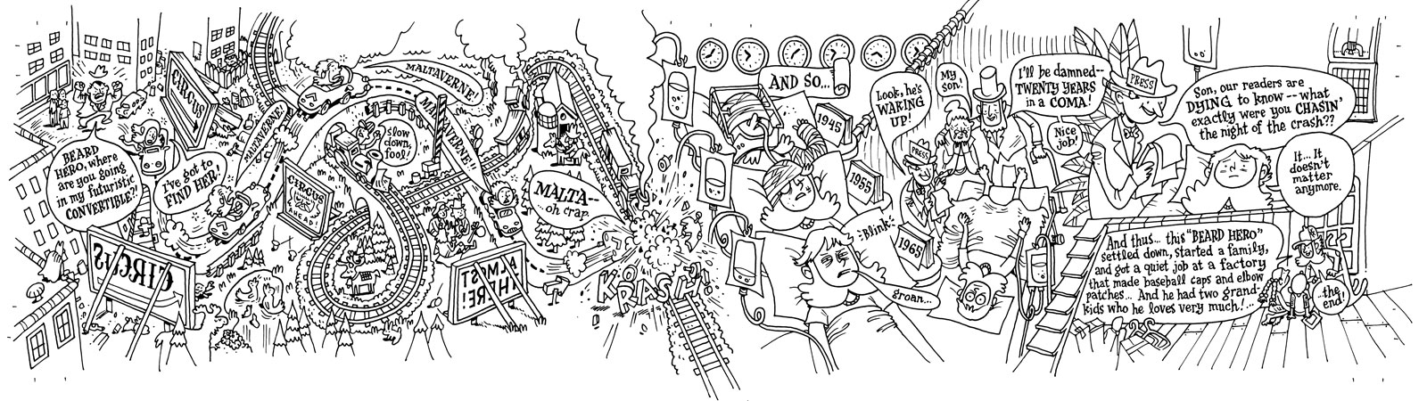
I find that the penciling is the most stressful part of the process, because that step requires the most juggling & problem-solving. The inking stage, however, is a lot more relaxing. Even though I need to be precise and everything, this is the stage when I can crack open a Molson, tune in a hockey game, and turn off most of my brain. For this book I used a Micron 01 for all art, and a Micron 005 for the lettering. Both are available at any art store worth a dime.


Step 7: Scanning

Scanning this was pretty basic. I drew it at size, meaning that the final book would be the exact same size as the original art. Most cartoonists draw larger, usually at 150%, and then shrink the art down when they print it. This makes the art look cleaner and tighter. However, for this book, and for a lot of my work, I want to keep that gritty look, hence drawing at size.

At work we have a large scanner that could easily scan this 4x17" art right at 1200 dpi, no problem. Unfortunately I was at home using my crappy low-budget scanner, so this is how I get to a good scan:

  1. Scan each section of the art at 600 dpi grayscale (no correction)
  2. In Photoshop, use the ruler tool to level each section.
  3. Drop each section into one big canvas and, with each layer on "multiply", line everything up.
  4. Turn off "multiply" and flatten the canvas. Crop as needed.
  5. Gaussian blur at 1.0
  6. In the Image Size window, upsize to 1200 dpi using "bicubic smoother".
  7. Adjust levels (to your preference).
  8. Change mode to bitmap, 1200 dpi, at 50% threshold.
  9. Save your file. Include the info "lineart", "bitmap" and "1200" somewhere in the file name. (e.g. "BH_lineart_bitmap_1200.psd")
Step 8: Basic Colors

To start coloring, I like to flat big sections of the canvas and drop in my basic colors to set the palette. It's a lot easier to change the palette at this stage than later when you're dealing with tons of little details. I prepped my files like so:

  1. Always "save as" first so you don't overwrite the original lineart. (e.g. "BH_color_600.psd")
  2. Change image size to 600 dpi using "nearest neighbor." Go down to 300 dpi if you have a slow computer.
  3. Change mode to grayscale, then to CMYK.
  4. In the layers palette, double-click on the background to turn it into a layer. Name it "inks." Set it to multiply at 50% opacity.
  5. Create a new layer underneath called "flats". If you want to be a huge nerd call it "Stochastic Flats" -- it's an Alan Moore reference.
  6. Choose pencil tool (NOT the brush tool) and set the size to something small like 20 px.
  7. Start drawing your big shapes of color. Having the "inks" layer set at 50% allows you to see where the edge of your color planes go -- obviously you want to tuck your planes under the lineart so there's overlap.
  8. Note that there are many ways to flat your art. Some people use the lasso tool, some people use the BPelt plugin. Here, I'm using a pencil.


Step 9: Final Colors

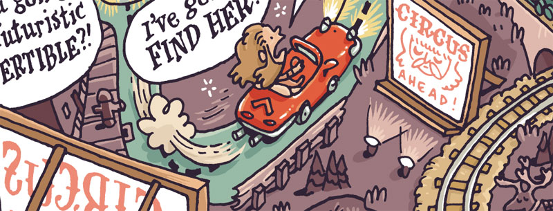
I was pretty crunched for time on this project, so I tried to limit the amount of fancy photoshop work I would do. Which is fine, because I try to stay away from lens flares etc. anyway... Here's an example of the level of detail I dropped in after the flats were finished. Again, this is all done with the pencil tool. Note that the lineart looks washed out because it's at 50% opacity.


I use the pencil tool at a high resolution (instead of say, the brush tool at a low resolution) because that allows me to go back in and easily change colors with the bucket tool.

Okay, so after I finished all the detail work I wasn't quite satisfied with the colors, so I played around with color adjustment tools. Here's a snapshot of the layers so you can see what all happened:


From top to bottom:
  • MASK: This is a white border I put around the trim lines so I know what the page will look like when printed. This layer gets trashed before printing.
  • INK: The lineart at 50% opacity. This layer will also get trashed before printing (more details later).
  • FAUX AGE: This is a cream color that sits over everything and gives it an aged look. In the mask to the right I've knocked out all whites from the mask, so anything that's white (like word balloons) will retain their crisp whiteness. For this particular faux aging I used the color 5/16/34/0 on multiply at 50% opacity.
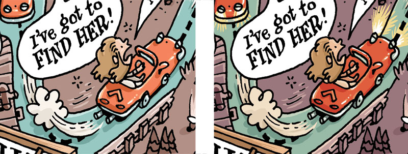
  • HEADLIGHTS: I added headlights to Beard Hero's car.
  • COLOR BALANCE & HUE SATURATION: These are a bunch of adjustment layers I messed around with to get the colors I wanted. As you can see, they each have masks attached to them because I was doing very surgical adjustments as opposed to one big global adjustment.
  • FLATS: The original flat colors.
And here is another closeup of the result:


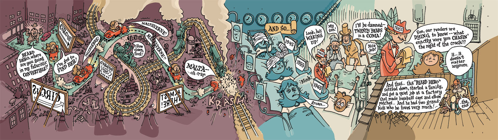
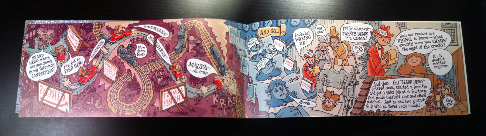
... and the whole spread:


Step 10: Post Production

Next I create an InDesign file at the print size, which will be 11x17", double-sided. I then import the flat color file for each page, and then add the 1200 dpi bitmap lineart layer on top (and make sure they're aligned perfectly). For this particular book I split the lineart layer into three distinct files because I wanted three distinct colors: black, white, and red. Here's a detail of how it turned out. Note that the billboard lettering is now red.


Why have both CMYK files and bitmap files in InDesign? Because by keeping your lineart (your ink lines) on a top-level bitmap file, you can keep your lines crisp while keeping your press-ready file size LOW. To see an example, look through the ads in your local alt weekly newspaper. Most have crisp lettering and low-res art. That's because the lettering is separate from the art in InDesign. Now look around until you see an add with blurry lettering. That ad was probably created in Photoshop and was exported at 300 dpi (which is way too low for fine detail). I'll do a blog post later on exactly how to construct this file in InDesign if people want to see it.

Step 11: Print, Collate, Sell

Okay, the rest of the process is pretty obvious. I sent the files to the printer, waited a few weeks, then a few days ago received a 25 lbs shipment with all the pages -- cover and interior -- and everything looks great (phew)! I painstakingly cut the 11x17 poster pages down to 3 2/3" x 17" strips (because I didn't give myself any room for bleed) and stapled them with my handy long arm stapler.

And viola!


If you'd like to learn more, or ask questions directly, I'll be giving a lecture on Photoshop fundamentals on January 5th, and InDesign fundamentals on February 2, 2012, as part of the Nordeast Comics Summit. There's no info on the site just yet, but check back closer to the date for full details. And feel free to leave any questions in the comments section below!

FINALLY... please come to MIX on Saturday and Sunday and if you want to drop five bucks on Beard Hero, I won't stop you.

If you can't make the convention but would like to purchase a copy, here's the solution for that:

Thanks!

Sunday, October 30, 2011

Food Fight!

I'm happy to report that I've got some artwork in November's Altered Esthetics "Food Fight" show! While I've been behind the scenes for the AE comics shows over the last few years, this is the first time I've submitted work to a NON-comics show -- you know, like as a regular Joe Artist. So it's pretty exciting to have work accepted by the curatorial team.

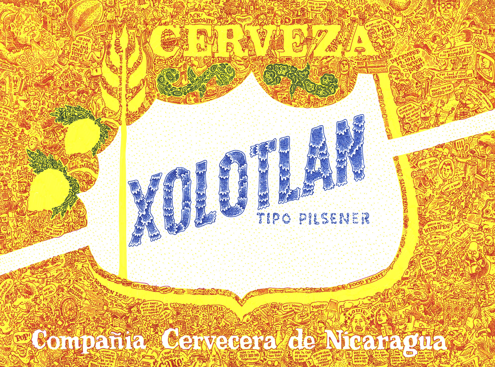
This is "XOLOTLAN" and it's pretty much the most fun I've ever had drawing anything. Please click on the image to view it in detail. See if you can find the caricature of Louis CK.

This piece is part of my CMYK phase, where I'm trying to draw color images only using cyan, magenta, yellow, and black ink. So a while ago I bought microns and pitt brush pens with those colors and have been experimenting with trying to get different colors like green, brown, etc.

In XOLOTLAN, above, the first thing I laid down was the yellow base with a yellow pitt brush, and then used a magenta micron over it to make red, and used a blue micron over other parts to make green. The same blue micron was used in the center, but since I was drawing over white paper and not yellow, it just stayed cyan.

Anyway, this piece will be part of AE's "Food Fight" show, which opens on Thursday, but the big opening reception is on Friday night. Because MIX parties are also happening on Friday, I will probably start at AE at 7pm, hang out for a little while, and then wander down south to Pink Hobo.

Thursday, October 27, 2011

Help print Altered Esthetics' 2012 Artists Calendar!

Altered Esthetics, a community-run art gallery here in Nordeast Minneapolis, has bent over backwards to help the local comics scene, and now we have a chance to help Altered Esthetics! Please consider donating to their Kickstarter fund which will go toward printing AE's 2012 calendar.
Our very own Zander Cannon drew the image for November, as he will be the featured artist for "Lutefisk Sushi: Volume E." Yes, that's "E" as in "E"veryone should chip in. As an added incentive, if AE reaches their goal, we'll post Zander's image here on the blog. If not, well, it will disappear into the ether...

So, please go HERE to donate!

... And here's more info from our good friend Lupi:

Hi, I’m Lupi. I help direct press and communications at Ae, and I’d like you to check out the kickstarter page for Ae’s 2012 calendar. Ae didn’t have a printed calendar for 2011, and a lot of people missed that. I hope we can raise funds to print one for next year.

As you know, Ae is the non-profit gallery in Northeast Minneapolis that collaborates with the Cartoonist Conspiracy each year on a comics exhibition. The Ae board is made up of volunteers who donate hundreds of hours of their time to organize 14 group exhibits each year, plus workshops and a solo exhibitions program.

We work hard to keep our shows inexpensive and accessible for artists, and we encourage all styles and media. If you appreciate what Ae does for the artistic community (and the cartooning community), show some love by helping us print our 2012 calendar. A pledge of only $5 gets you an art calendar, which you can pick up at the gallery. For a pledge of $10, we’ll mail it to you. That’s a fraction of the cost of driving to a store and buying a mass-produced calendar. If you plan on participating in Lutefisk Sushi or any other Ae events next year, this calendar is nice to have, because it lists openings, deadlines, and workshops.

Wednesday, October 26, 2011

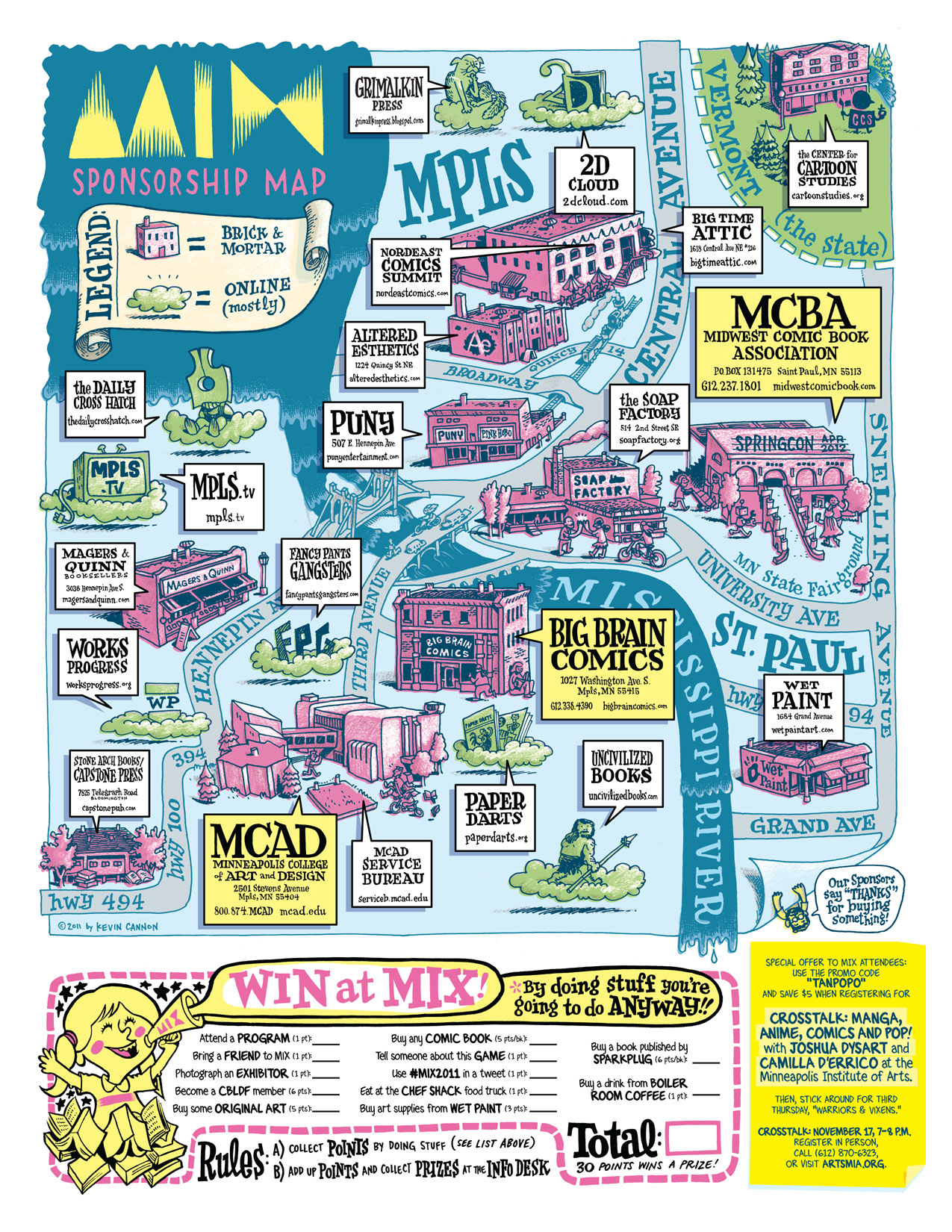
MIX Sponsorship Map

As you're well aware, I'll jump at any chance to draw a goofy map of the Twin Cities, so fortunately Sarah Morean didn't roll her eyes too hard when I pitched the idea of drawing a map of all the sponsors of the Minneapolis Indie Xpo. So here is the finished product!


This map will be printed on the back of the catalog, so go to MIX early on Saturday morning and get a hard copy for yourself. The first 500 attendees will also get a free MIX ballpoint pen so you can fill out the scavenger hunt game on the bottom there.


Speaking of MIX, I am also sponsoring two celebrity cartoonist panels that you should attend on Saturday and Sunday. They involve Pizza Island star Sarah Glidden and local digital guru Gordon McAlpin. Full details on the Nordeast Comics site. See you there!

MIX is a little over a week away! November 5 & 6 at the Soap Factory.

Tuesday, October 18, 2011

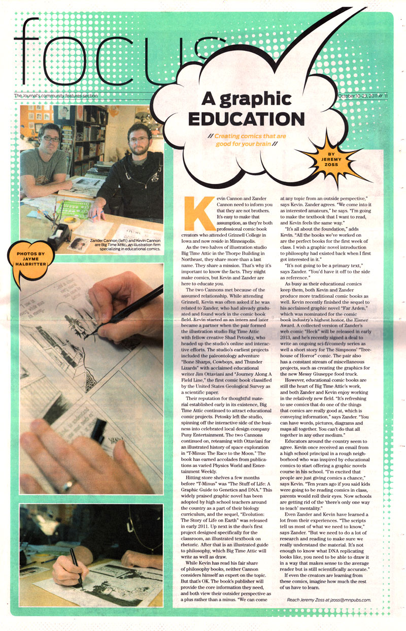
Big Time Attic Featured in The Journal

Jeremy Zoss wrote a great profile of Big Time Attic in this week's Journal (we found it in the NE Journal, but I'm told it's printed in the SW Journal as well). Anyway, thanks for the ink, Jeremy!

Click on the image below to see a larger version. But if want to actually read the text, go to the Journal's online version of the article.


If you're local, go pick up a copy! It should be on news stands until October 23.